


American rail in crisis
In 1960s America, the locomotive industry was nearing a crisis point. Rail was competing with newer modes of transport in an era that saw significant developments throughout the automotive industry; from rising international vehicle imports to improved interstate road networks. A huge impact came from mail services which began to favour trucks and air transport. Rail saw a substantial loss in revenue, from both passengers and business, contributing to the discontinuation of many trains and routes.
Rescue came in the form of the National Railroad Passenger Corporation (NRPC), a private entity that would receive taxpayer funding and operate the country’s intercity passenger rail system. This was newly formed after the Rail Passenger Service Act was passed in Congress, and signed into law by Nixon, in October 1970.
Key Takeaways
Rail in crisis
By the 1960s American passenger rail was losing out to cars, trucks and planes, leading to the creation of the NRPC in 1970.
Lippincott & Margulies
Walter Margulies led a team of 20 consultants researching passenger and employee attitudes to build a new corporate identity.
A short, powerful name
From hundreds of options, Amtrak, a blend of American and track, was chosen as a snappy, memorable name.
Explore more like this in Metro and Public Transport Logos →
Go behind the logos. Explore 200+ in-depth and meticulously researched logo histories revealing the designers, design decisions and ideas behind the world’s most iconic logos and important brand identities.

From Railpax to Amtrak
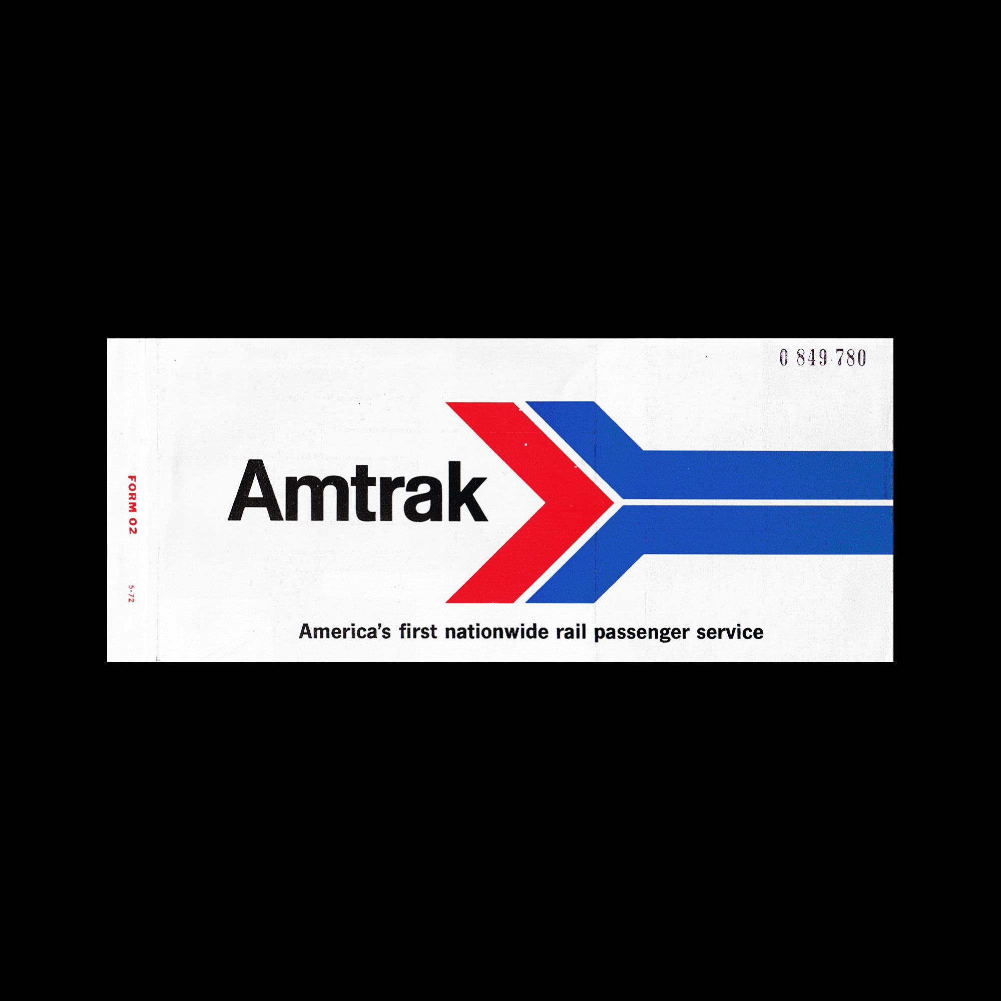
The informal working name for NRPC, Railpax, was derived from telegraphers’ code name for “railroad passenger,” and was required to change for legal reasons. Undergoing a complete brand makeover, the new company would move towards a unifying corporate image that could hold its own in what was a pivotal era for rail. The overarching marketing plan had two important objectives in mind: To provide an improved, dynamic, and contemporary service for the passenger public; and to create an identity that will aid the company in competing with airlines, businesses, and the automotive industry.
The new marketing programme and corporate identity was developed by Lippincott & Margulies, Inc. (L&M) - an international marketing, communications, and design consultants who had been working with the corporation for three months. Led by President Walter P. Margulies, a team of 20 L&M consultants undertook extensive research and analysis of the attitudes and opinions among both passengers and railroad employees. Data provided a more precise framework from which to design the new system. A press release issued weeks before the rail company began operations (on May 1, 1971) explains this further, noting that this criteria included:
“A short powerful name,” that was easy to pronounce and memorable, “with high visual impact for easy recognition” so it could be identifiable on both moving trains and within busy train carriages.
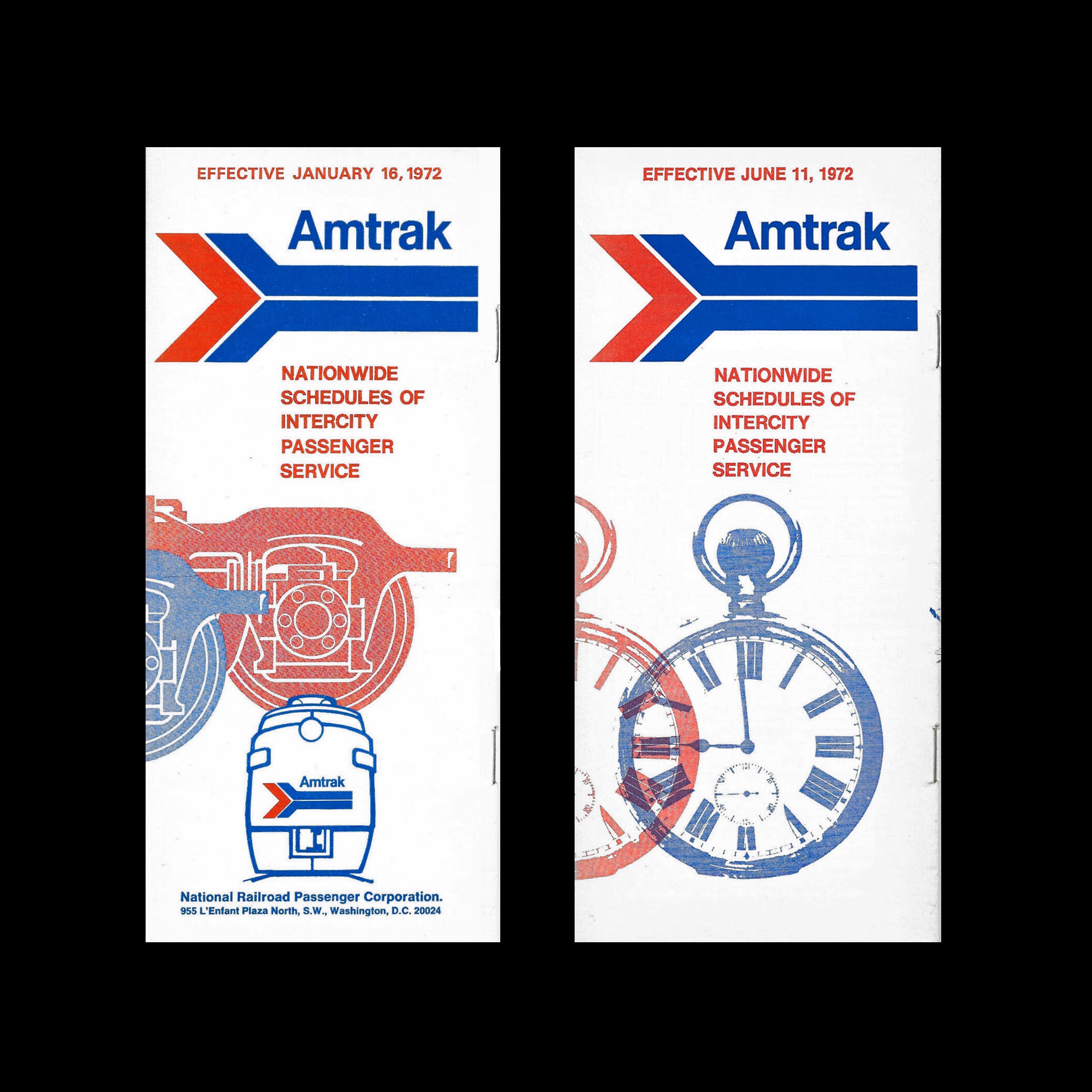
After screening hundreds of verbal and visual options, alongside graphic design and symbols, ‘Amtrak’ was chosen by the corporation’s board of directors. A blend of American and track, the new name not only communicated the concept of an American railroad passenger service but also met the established criteria of a snappy, memorable title.
Continue reading to discover the Amtrak arrow, its customised Helvetica logotype, and how it was rolled out from timetables to trains →

