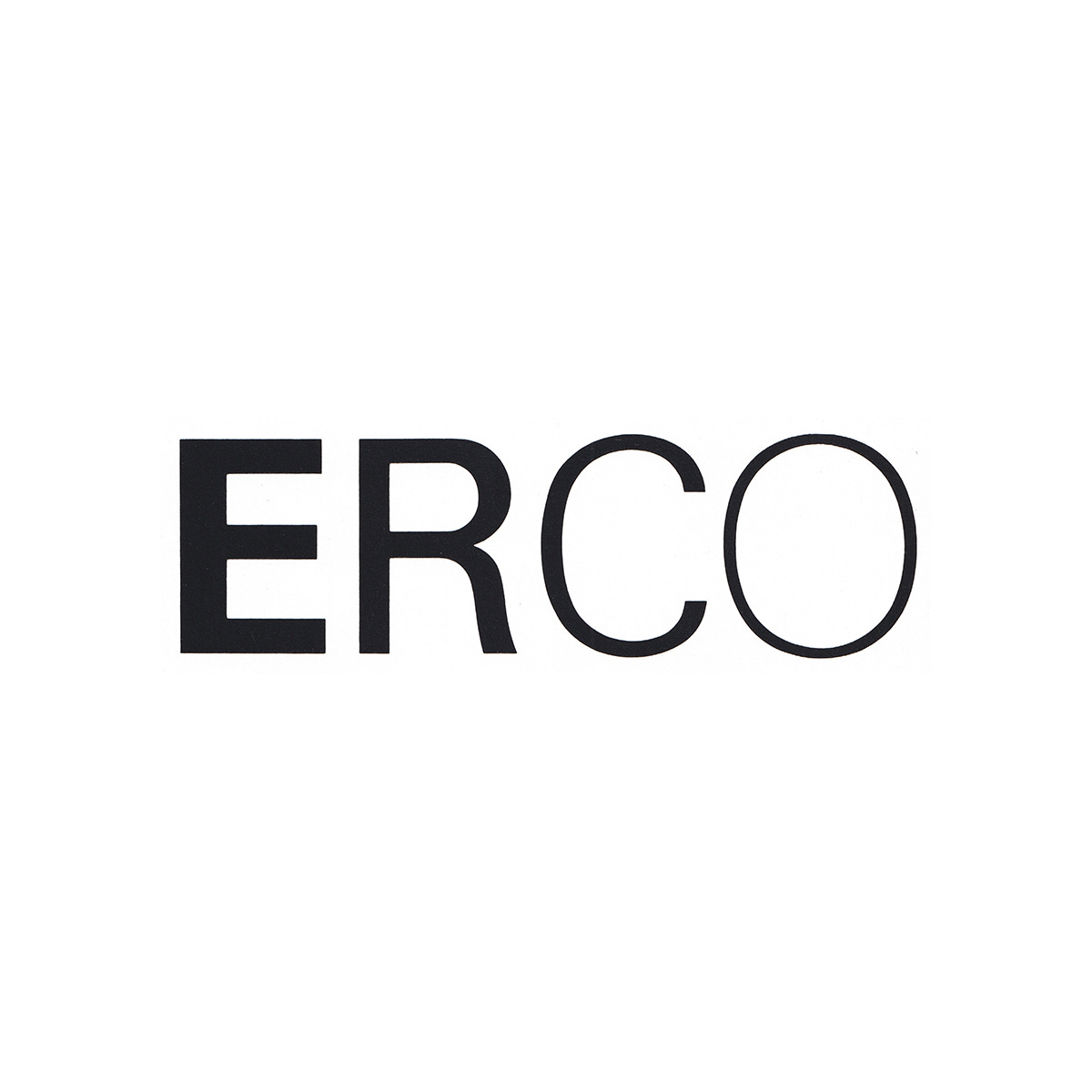
ERCO Logo, 1976
Otl Aicher's logo for German lighting company ERCO.
This post is supported by LogoArchive – The home of historical logos. Discover over 5000 of history’s greatest designs from the world’s finest designers. Always find the logo inspiration you need for your next project here.
The genesis of the name ‘ERCO’–a family-owned lighting company located in Lüdenscheid, Germany–stems from its founder Emil Reimann’s vision and aspirations for the company. Derived from his initials, and partner Dr. Schmitt providing the ‘and Co.’, the name ‘ERCO’ embodied the company’s collaborative and entrepreneurial spirit since its founding in 1934 and set its course as it grew to become a pioneer in architectural lighting in the 1960s.
The origin of the company’s 1976 corporate identity stemmed from the usage rights of the pictograms devised by Otl Aicher for the Munich Olympics. In the autumn of 1974 Aicher met with Klaus Jürgen Maack, managing director of ERCO, to sort out questions regarding the copyright of these pictograms as the lighting company wanted to use these in an illuminated signage system.
During this conversation further issues were raised by Maack around the ERCO corporate identity, and specifically, the trouble faced when attempting to use the company's logo with Helvetica, the corporate typeface at the time. Aicher suggested that the issue stemmed from poor typographic principles. This would mark the beginning of a nearly two-decade collaboration.
The criteria for developing ERCO products were based on ‘vision’, ‘efficiency’, and ‘economics’ rather than fashion. Norms and standards were seen as a ‘precondition for creativity’ that aesthetic form should be derived from the necessary; and the usual and banal should not be decorated and made special. Instead it was important to make the normal, such as illumination, be understood as essential and to present it as self-evident. Even before Aicher began to work for ERCO, the company and its managing director were concerned with objectivity, which was well-suited the designer’s approach.
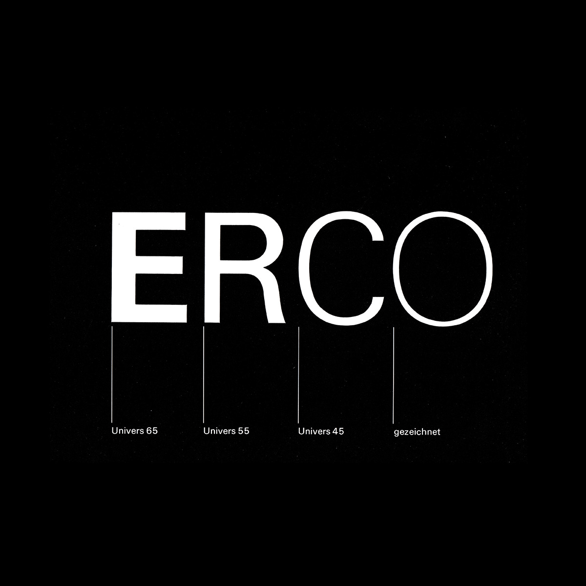
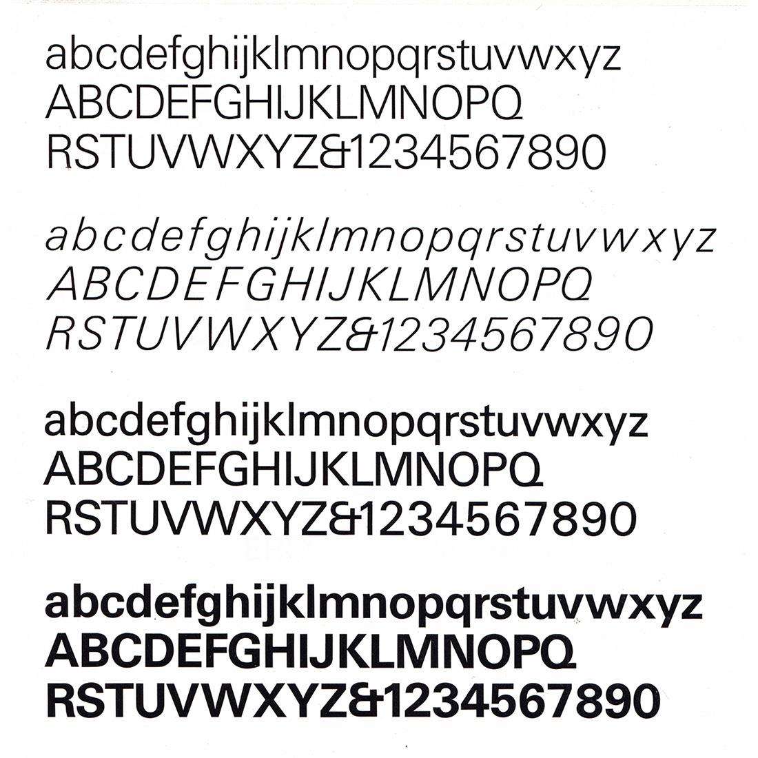
In 1976, a ‘typographic program’ was developed that started with the redesign of the logo, corporate stationery, and other graphic materials.' The redesign would also address ERCO's use of colour and the type of promotional publications the company created. Before Aicher, the company's standard typeface had been Helvetica, which reflected a ‘technical organisation’ but Aicher felt this choice was ‘incorrect’. He instead made Univers the standard.
While Aicher worked on the corporate identity he also explored the ERCO philosophy and how this impacted its products. Aicher spent time sketching the interplay of light and shadow on wall surfaces, and were similar to studies ERCO had also performed when experimenting with how lighting worked in controlled spaces.
As an extension of this exploration, Aicher thought about typography as it related to light when he designed the new logotype for ERCO. Aicher did not consider using the sort of illustrative logo (such as a lamp or light bulb common to the industry and previous identity) but rather a more elegant solution with a greater degree of nuance. His design was a simple resolution of the complex requirements of light and architectural structure. The ERCO logotype developed represents more than just the name of the company; it expresses visually what the company does economically by way of four letters set in three weights of Univers (the final letter, the ‘O’, was custom drawn). These progressed from bold to light. The impression given is the logotype appears to incrementally illuminate, or dim when set on black. Aicher's logotype for ERCO conveys in a typographical manner ERCO’s desire to sell the idea of light rather than devices for illumination.
ERCO's corporate font was then Univers, considered to have the highest degree of effectiveness in terms of readability and thus its form was a product of its function. ERCO placed great value on consistently striving for the optimum, right down to the smallest details. This ‘design awareness’ should be evident in its persistence throughout tis application. Precise standards, even on minor matters, characterised Aicher’s identity for ERCO as it was applied across many contexts.
Aicher created an ERCO manual. This laid out guidelines for photography, product catalogues, typography, vehicle liveries and company colours. Just as ERCO sought to create functional lighting products that were not strictly aesthetic objects in and of themselves, Aicher's drawing for publicity materials showed the products in their simplified forms, focusing not on surfaces but intrinsic form. The stationery for ERCO was standardised and designed to suit a specific company typewriter in terms of horizontal and vertical units. For typesetting these units were translated into the Didot system. A grid system was established to afford the company both continuity and flexibility as it grew.
On the question of the rights to the Munich Olympic pictograms, ERCO gained control over these and further pictograms later designed by Aicher for Frankfurt Airport, based on the same rationalised system and extensive research.
The identity programme, as it stood at the time, won the German Marketing Award in 1980. And, the logotype, just like Aicher’s logos for FSB and Metro Bilboa, remains in use and unchanged today, and is an fine example of a synthesis of both a philosophical and programmatic approach that rarely exists today.
Thank you for subscribing to Logo Histories. If you enjoy reading this you may also enjoy these resources from the same team:
Brand Archive – Research tool for brand designers.
LogoArchive Website – Searchable modernist logo archive & research tool.
LogoArchive Shop – Vintage design books & LogoArchive Zines.
BP&O – Contemporary design editorial.


This 1976 logo for ERCO looks to be quite solid. I'm liking it very, very much. The designers did right by it.