Expo 1990 Logo History
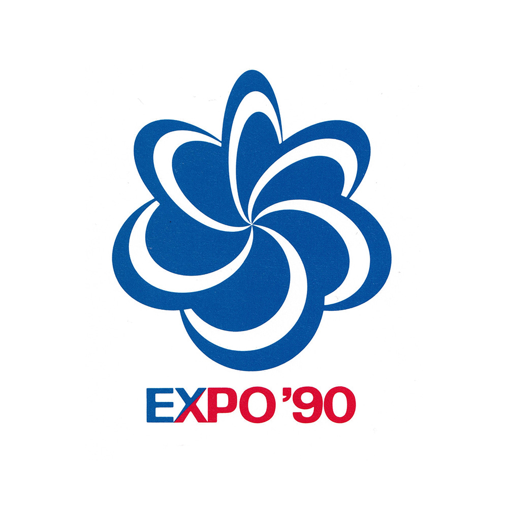
Mitsuo Katsui's 1987 logo for the International Horticultural Expo 1990.
This post is supported by LogoArchive – The home of historical logos. Discover over 4000 of history’s greatest designs from the world’s finest designers. Always find the logo inspiration you need for your next project. Start here.
Having successfully hosted Expo ‘70, the Japanese coastal city of Osaka returned to the world stage two decades later with another. Rather than a ‘World’s Fair’, which explored a central and current theme through cultural, societal, environmental and technological lenses, the International Garden and Greenery Exposition, Osaka, Japan 1990, shortened to Expo ’90, was a more focused International Horticultural Expo. Although lesser-known, the Horticultural Expos have a long history, with the first taking place in the Netherlands back in the 1960s.
The theme for this Expo was ‘The Harmonious Coexistence of Nature and Mankind’. This intended to promote a more humanistic world for the 21st century and was part of a strategy devised by Osaka City and the Japanese Government to raise awareness around key environmental issues and triple the amount of green space in Japan.
The event was formalised by the 99th General Assembly of the BIE on 4th June, 1986. Work on the Expo event began shortly after, and in 1987 Japanese designer Mitsuo Katsui became involved in the design of the Expo’s official symbol, mascot and visual guidelines.
Expo ‘90 was held at Tsurumi Ryokuchi between April 1st and September 30th, 1990 and was host to 83 national and international exhibitors.
The 140 hectares Expo grounds was divided into three key zones: The Mountain Area, which made use of the area’s natural topography. This featured international and national gardens nestled between sloped and wooded valleys. Here, there was a Bonsai exhibit, a large rose garden and an Ōga Lotus garden. The Field Area, located in the centre of the site, included the ‘Sea of Life’ lake, a 90-metre ‘Tower of Life’ and Osaka City’s Great Conservatory that displayed 15,000 plants from 8 different cultivation zones from across the world. Finally, The City Area. This hosted the corporate pavilions. These used technology to explore the Expo’s theme, bring to life photosynthesis and take Expo visitors on a journey into a living plant cell.
The harmonious relationship between nature and humanity was a recurring theme throughout, and was expressed by the Expo ‘90 symbol, created by Japanese designer Mitsuo Katsui / 勝井三雄.
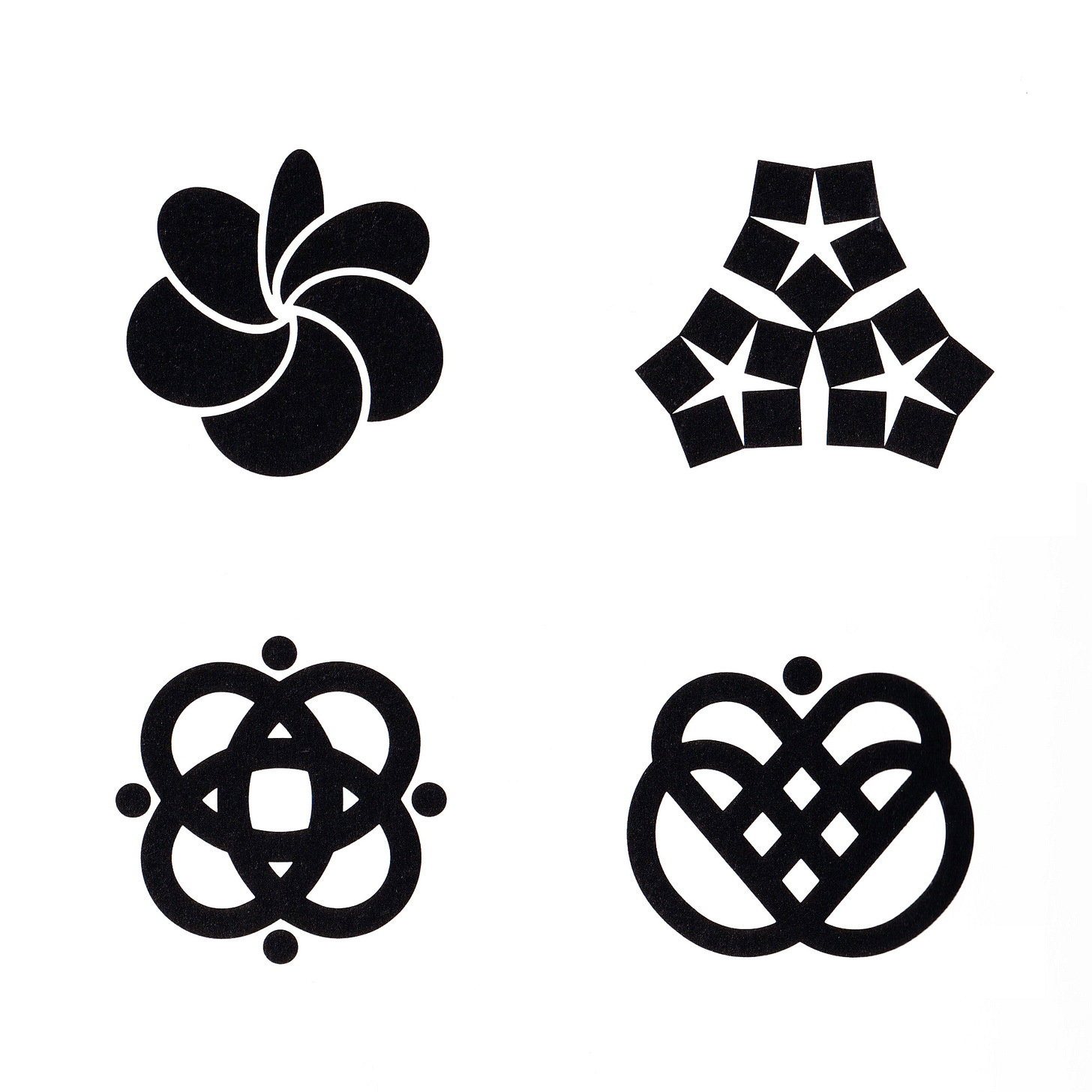
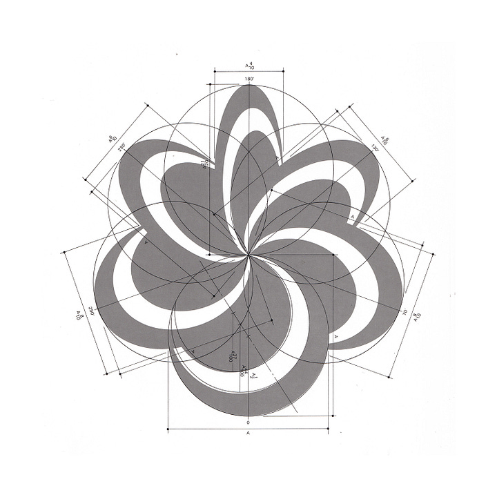
In an introduction to the symbol, the Expo 90 brochure notes that the progress of science and technology is remarkable and rapid. This is reflected within Mitsuo Katsui's dynamic symbol of intersecting disks. Through its unusual form it connected this with nature, taking on the qualities of a flower alluding to the ‘mysteriousness of life’.
The composition of disks, seen to be spinning around a central point, intended to call to mind petals. These petals, in rotation, represented their continual movement towards the sun.
The brochure goes on to describe how each petal represents an essential element of life such as water, air, earth, and the cycles of warmth and frost as the seasons pass. In the intersection of the disks, the symbol impresses upon the viewer, a sense of coexistence, and how each essential element is connected and part of an ongoing and supporting cycle, of which humans play a part.
The form was also conceived of as a ‘symbol of sympathy’ between ‘the green earth and the graceful and powerful lives that live there’.
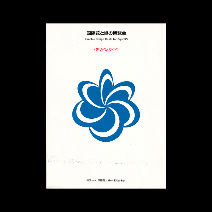

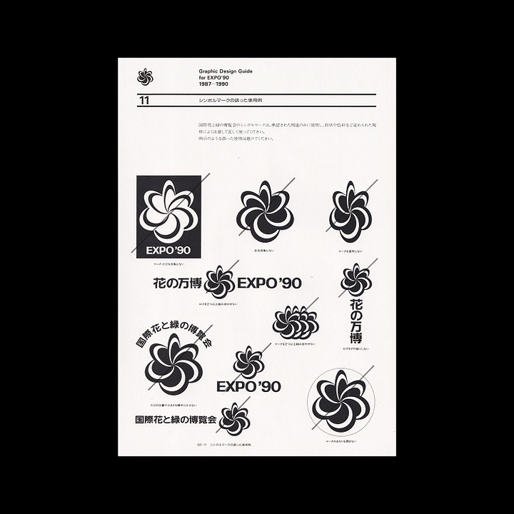
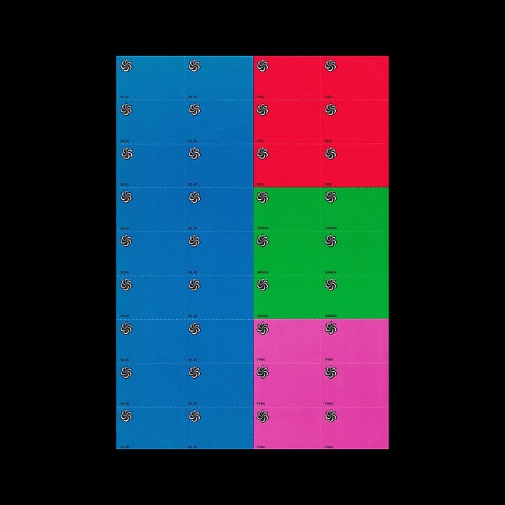
In the same spirt as the Tokyo ‘64 brand guidelines, Mitsuo Katsui produced a folder and set of guideline sheets.
The Tokyo ‘64 visual guidelines had to cover every aspect of the event, and so it was necessary to create a format that could be constantly updated and amended as it was developed years ahead of the Games. These loose sheets were then contained within a sleeve, box or folder. Tokyo ‘64 was a pioneering program and the ‘loose leaf’ approach influenced many Japanese designers, including Mitsuo Katsui, who continued to use this format for other projects.
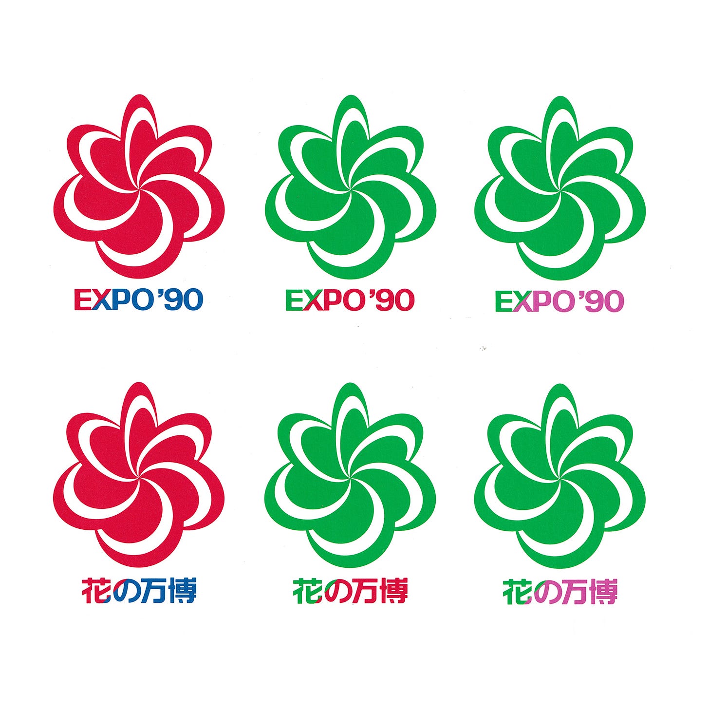
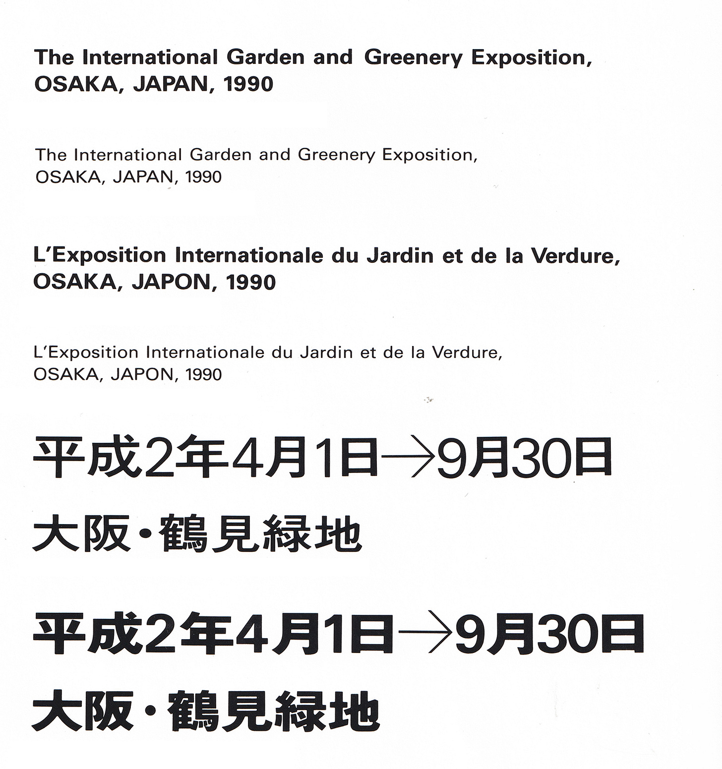
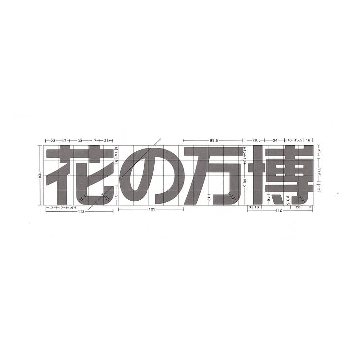
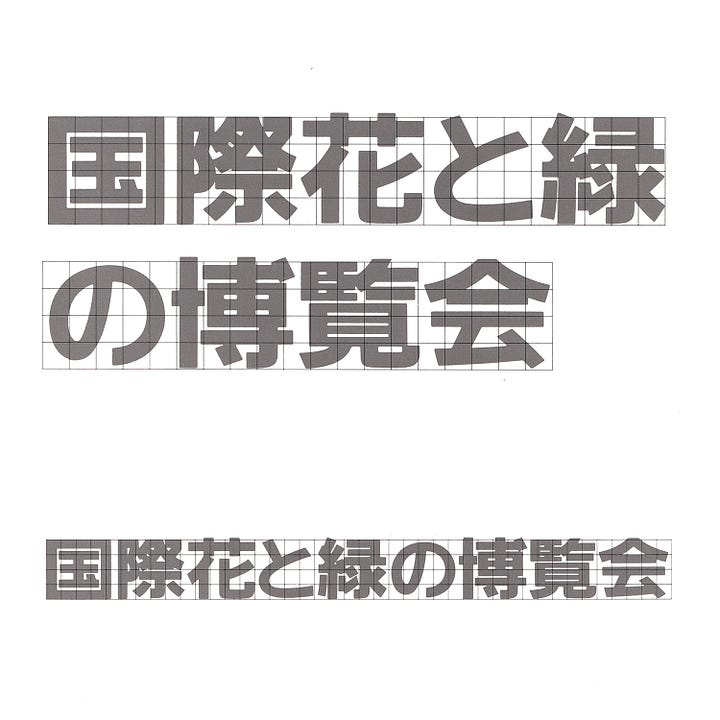
For Expo 90, a set of 14 A4 sheets were issued and held within a folder. These laid out the basic parameters of the Expo identity. In it, typographic and compositional rules were established, specifying logo lock-ups, the typefaces for English (Univers) and Japanese, and colour chips to formalise the Expo colour palette. This colour palette captured aspects of the natural world through a combination of sky/water blue, a grass green and floral pink and red.

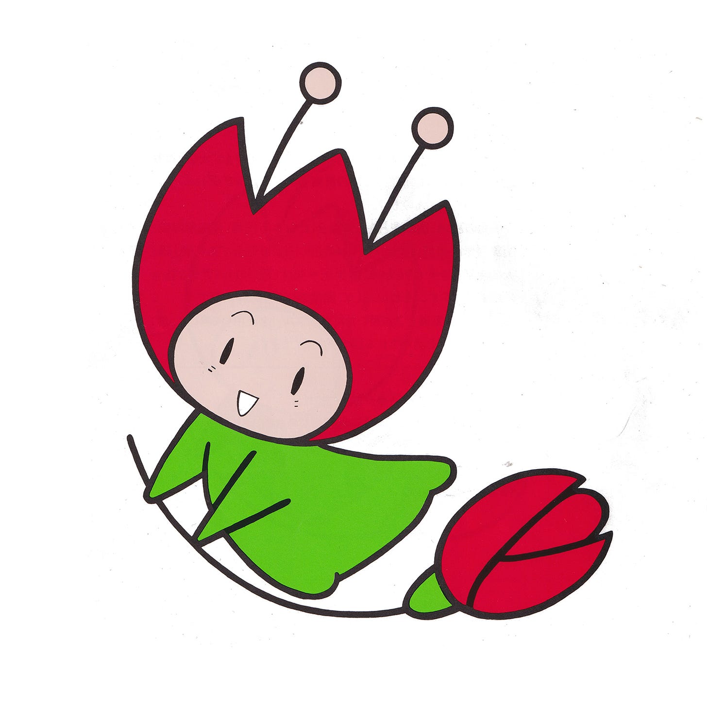
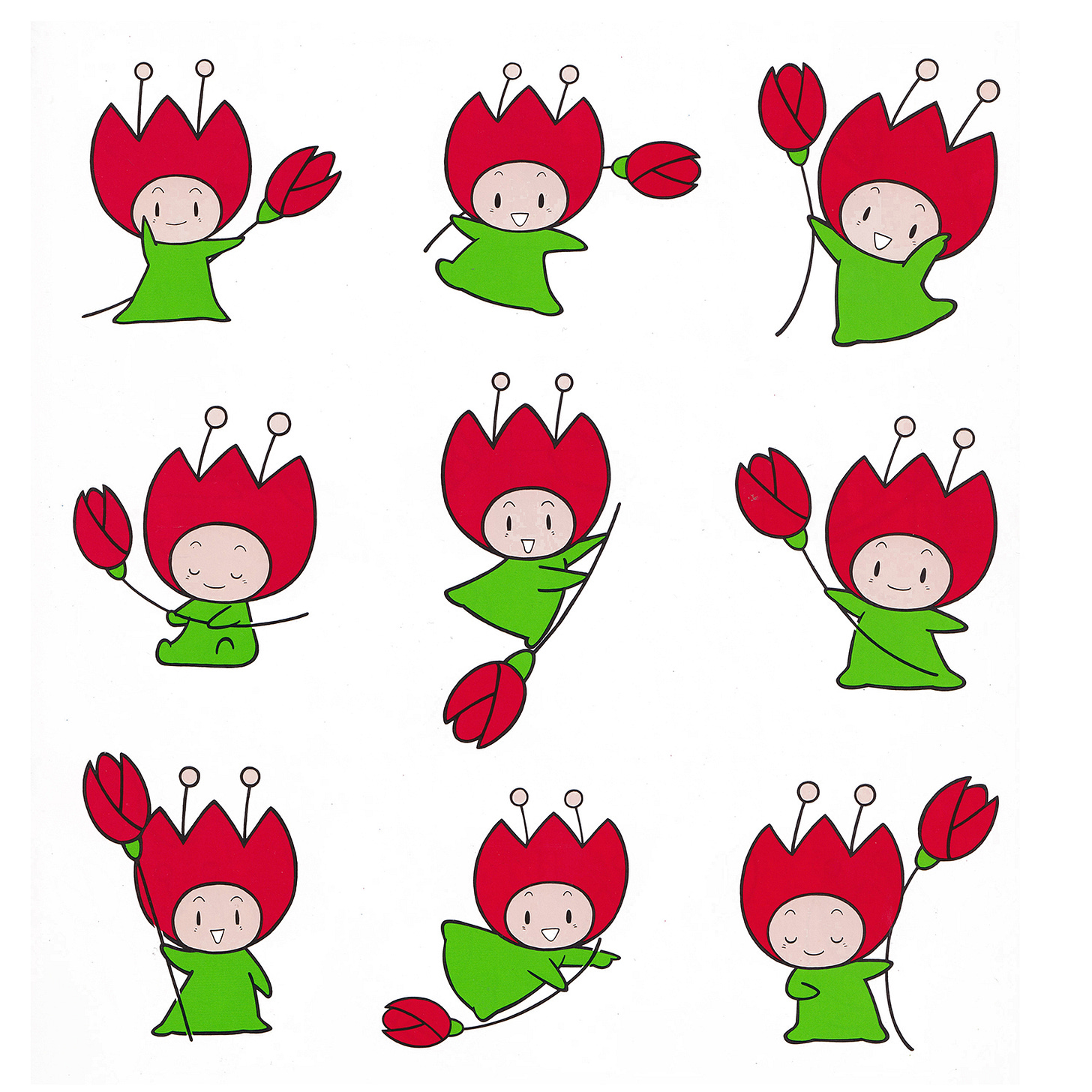
Accompanying the symbol was the mascot ‘Hanazukin-chan’. This was based on a flower fairy playing in the forest. As with Expos and Olympics of the past, Hanazukin-chan was drawn in a number of posses to create an active and involving character. This was used for PR, not only in Japan, but also around the world in the build up to the Expo. The mascot was produced as stuffed toys and animations, and appeared in various public institutions and throughout public phone booths.
Following the exhibition, the Expo’90 Foundation was established to promote its thematic legacy of humanity and the environment. The symbol continues to be used today by the Foundation.
Thank you for subscribing to Logo Histories. If you enjoy reading this you may also enjoy these resources from the same team:
Brand Archive – Research tool for brand designers.
LogoArchive Website – Searchable modernist logo archive & research tool.
LogoArchive Shop – Vintage design books & LogoArchive Zines.
BP&O – Contemporary design editorial.


