A complex architecture
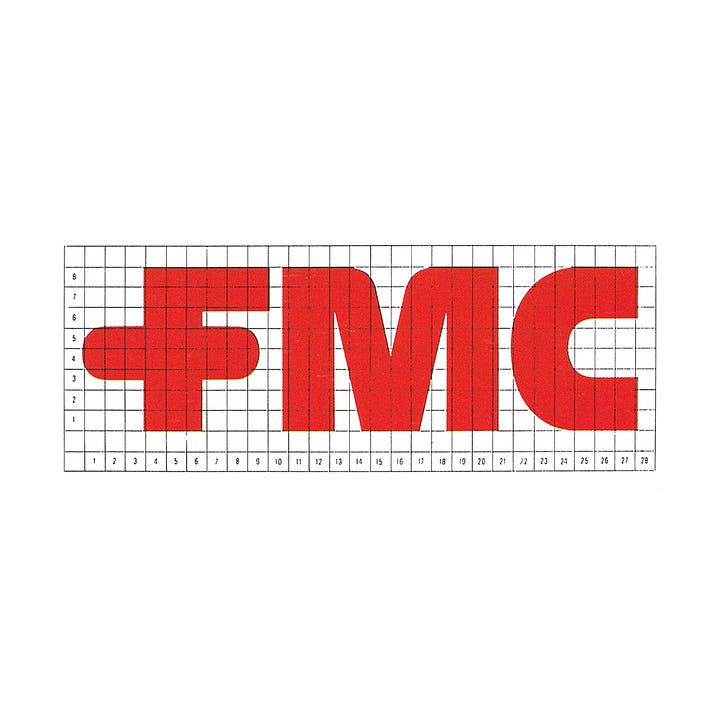
Lippincott & Margulies' 1972 logotype and CI for FMC.
This post is supported by LogoArchive – The home of historical logos. Discover over 4000 of history’s greatest designs from the world’s finest designers. Always find the logo inspiration you need for your next project. Start here.
FMC Corporation (FMC) was founded in 1884 as the Bean Spray Pump Company and manufactured pressure pumps for irrigation. By the 1960s it had diversified and was a major international producer of chemicals and machinery for industry and agriculture.
The rapid post-war growth of American corporations–through mergers and acquisitions–had given rise to an ‘identity crisis’. This catalysed many of the modernisation programmes that took place during the 1960s and 1970s.
Despite being one of the nation's biggest industrial advertisers, FMC was not recognised as the giant it was by its customers, financial institutions or the general public. As the newly elected President and Chief Executive Officer Robert H. Malott described it, they were likely the least-known $1.5 billion-a-year company in the country.
A growing architecture of thousands of products, hundreds of brand names and tens of divisions had led to a complexity and dissonance, and under-utilised FMC’s vast scale. This would change in 1972. Under the direction of Malott, New York-based consultancy Lippincott & Margulies would devise a new nomenclature and design policy for FMC that would bring a much needed systematic and visual coherence to the corporation.
Lippincott & Margulies (L&M), working closely with FMC management, was brought in to address the complexity that had grown from FMC’s acquisitions and what was described as the ‘elusiveness’ of the brand. Not only would they develop a new design policy, but also devise a ‘generic’ nomenclature for marketing groups and operating divisions that would redefine what an FMC company does by clearly classifying its business areas and fields of activity.
L&M defined the company's principal areas of ‘marketing competence’, and regrouped them into ‘principal divisions’. These division names would clarify and express their ‘business content’.
A ‘corporate endorsement program’ would then link each of these to FMC and guided the new design policy. By coordinating the corporate image across all divisions, products and services, FMC would be able to increase the awareness of the corporate brand, improve its image and provide a more systematised and evident presentation of its diverse business activities. Put simply, the sheer scale of FMC would be brought to the fore.
Further, FMC would then benefit from being able to transfer to other divisions some of the good will built up around its most successful affiliated companies and business units.
Standardising the basic elements of logo, colour and type, and formalising the arrangement of FMC and division names across packaging, stationery and signage etc. would not only save FMC in print and fabrication costs, but the consistency would significantly improve the overall visibility of the brand in the public and corporate spheres.
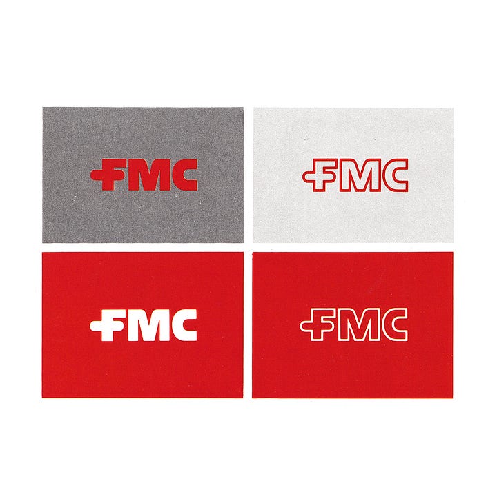
At the heart of the new design policy was the FMC logotype. The custom drawn bold uppercase letterforms had a graphic immediacy that was absent from previous versions, and made sure that each division became more visually integrated with the corporate body. Further, the style of this logotype was intended to give the overall impression of technological precision, a notion that connected all of FMC’s activities, despite their diversity. This technical precision was developed further through a colour palette of bright red and grey, and the unwavering consistency of the logotype’s application.
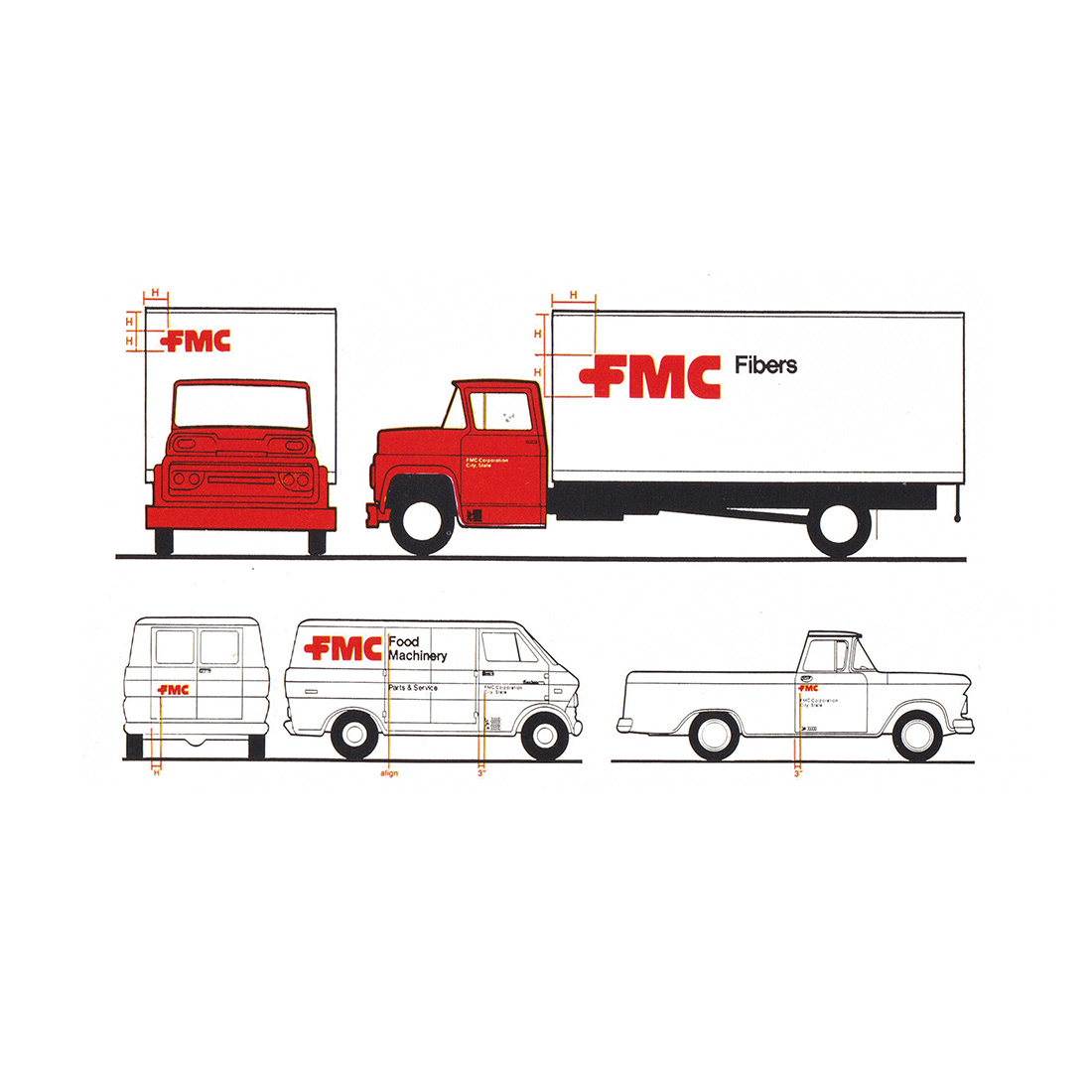
Solid and outline versions of the new logotype afforded FMC more flexibility throughout a diverse product landscape, be it printed on stationery, applied to vehicles, repeated to form a security pattern, fabricated as signage and used as a decorative element on packaging or cast into metal.
A system was devised to arrange the FMC logotype and brand names. For those brands to be discontinued, the name would be placed further away from the logotype as they were phased out.
Standardisation of corporate documents and the fabrication of signage at scale allowed FMC to achieve an economy of scale and save money. This also extended to the choice of typeface. The international reach of a company such as FMC required one that was readily available in many different countries and would bring the various devisions and products into a visual coherence alongside the new logotype. Helvetica’s full range of styles were used, from Extra Bold Extended to Bold Condensed.
The overall effect of the new nomenclature and design policy, reaching across the whole corporation, was significant. It brought into coherence and put to work the sheer scale of the corporation. It gave more significance and visual weight to the logotype through consistent use, that increased over time, so much so, it remains in use today.
Thank you for subscribing to Logo Histories. If you enjoy reading this you may also enjoy these resources from the same team:
Brand Archive – Research tool for brand designers.
LogoArchive Website – Searchable modernist logo archive & research tool.
LogoArchive Shop – Vintage design books & LogoArchive Zines.
BP&O – Contemporary design editorial.


