The Kenwood triangle
PAOS' 1982 logo for Kenwood Japan
This post is supported by LogoArchive – The home of historical logos. Discover over 4000 of history’s greatest designs from the world’s finest designers. Always find the logo inspiration you need for your next project. Start here.
For many, and especially those in Great Britain, hearing the name ‘Kenwood’ will call to mind the counter mixers and kitchen appliances of Kenwood Manufacturing Company, founded by British engineer Kenneth Wood in 1947. In Japan, this is a different story.
The other Kenwood was founded in 1946 as ‘Kasuga Radio Co. Ltd.’ Located in Japan’s Nagano Prefecture the electronics company would later be renamed ‘Trio Corporation’ in 1960 – in recognition of its three founders. As part of an international expansion programme and following extensive research the name "Kenwood" was introduced into the American market in 1964 whilst retaining Trio throughout Japan and Great Britain.
It has been said, although we can’t confirm this, that the name was derived from the two words ‘ken’ and ‘wood.’ The former, a name familiar to both Japanese and Americans, and the latter referring to the durable wood casing of the company’s electronic products. It was also suggested that this would call to mind ‘Hollywood’. Somewhat poetic but a more a myth.
By the 1980s, Trio had earned itself a reputation as a worldwide leader in the manufacturing of high quality audio equipment, in addition to wireless communication devices and testing instruments. What held the company back, however, was its neglect of the consumer electronics market. By prioritising professional ‘tastes’ and requirements, Trio (now Kenwood in the US) was surpassed in sales by a growing number of competitors.
To address this, and move towards their goal of becoming “an exceptional electronics manufacturer”, a new corporate identity program was proposed in 1981. This involved dissolving the ‘Trio’ namesake (merging two brands into one) and developing a corporate image that would speak to a global market.
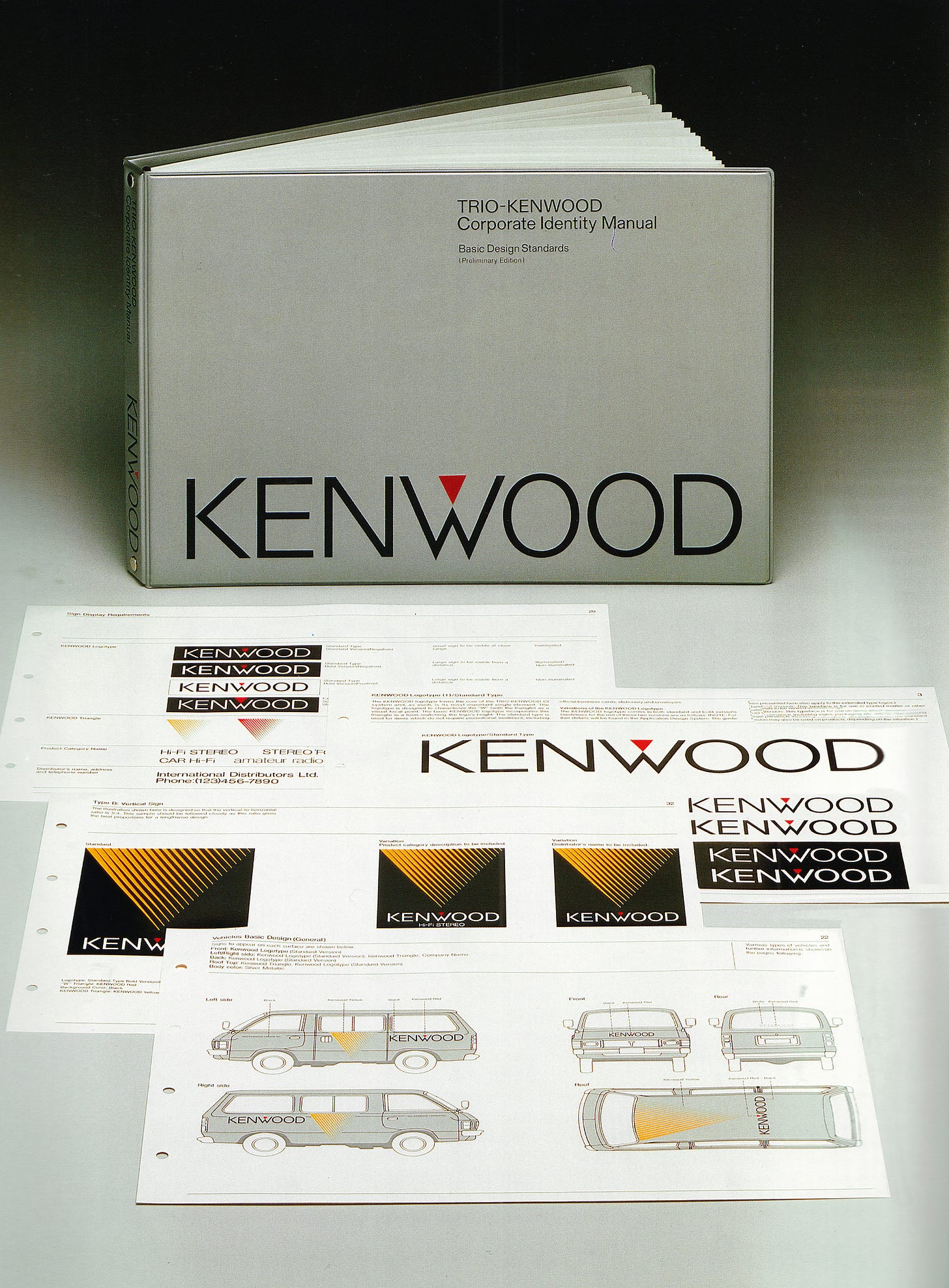
Corporate identity consultants PAOS were commissioned to create this new unifying identity system that would extend from signage to packaging to vehicle liveries. As the new focal point of the brand strategy, these new visual elements were required to convey a sense of ‘high quality’, ‘progressiveness’ and ‘smartness’.
After extensive research and surveys, PAOS developed four proposals from which the favoured design, a logotype and triangle device was selected as an expression of ‘quality’, ‘progressiveness’ and ingenuity’. The design was simple yet striking, displaying the brand name in an all-caps, geometric sans serif. In white text, it was unmissable and highly legible on a black background. For added visual impact and recognition, an inverted red triangle was added as a focal point – the angle of which was derived from the ‘W’ of the logotype.
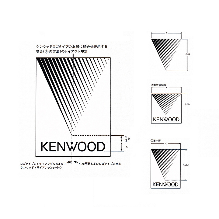
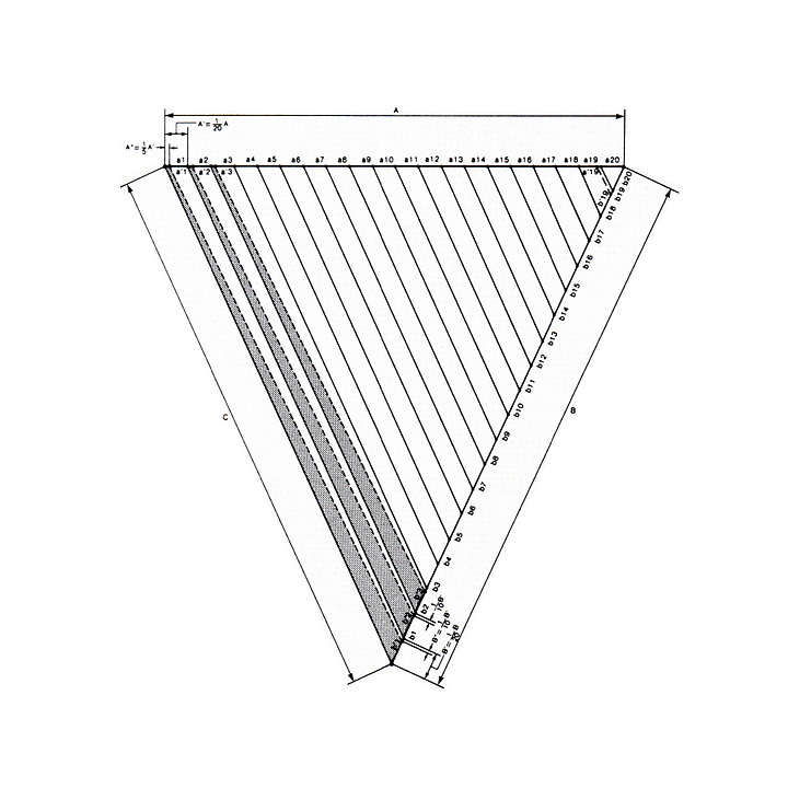

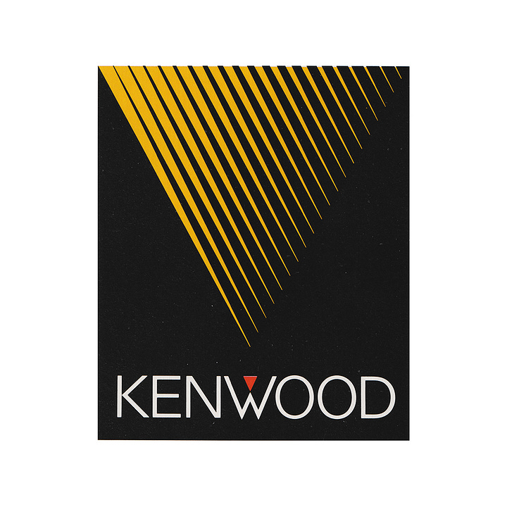
Thanks to the simple geometry, the logo contained within it plenty of potential for a broad range of applications; either used alone or scaled to cover surfaces. In larger sizes, it could be created from tapering diagonal lines – optically resembling a gradient and creating a sense of ‘progress’. It was a device that could be used to not only intrigue but also differentiate a growing number of products. Helping to facilitate this was a small and vibrant secondary colour palette. Alongside white and black backgrounds and the use of shape this provided a flexible solution without the need for additional elements.
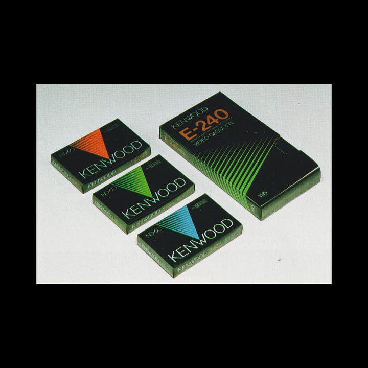

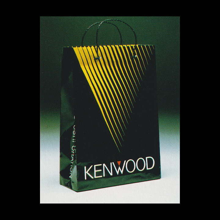
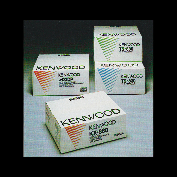
The new system was officially introduced in 1982. A few short years later, in 1986, the corporation made Kenwood its official name, achieving the initial goal of distancing it from the ‘Trio’ brand. The logotype and triangle both remain in use to this day, demonstrating not only the timeless nature of the design, but its ability to anchor the brand throughout Kenwood’s evolution.
Thank you for subscribing to Logo Histories. If you enjoy reading this you may also enjoy these resources from the same team:
Brand Archive – Research tool for brand designers.
LogoArchive Website – Searchable modernist logo archive & research tool.
LogoArchive Shop – Vintage design books & LogoArchive Zines.
BP&O – Contemporary design editorial.




It was a treat to find those early concepts. The dots is interesting, certainly an element of progression.