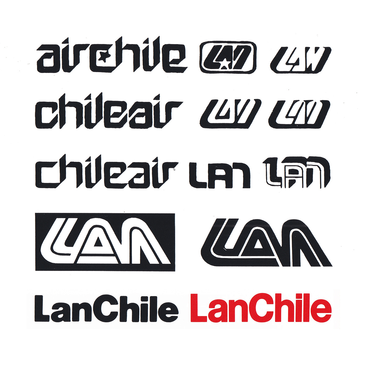
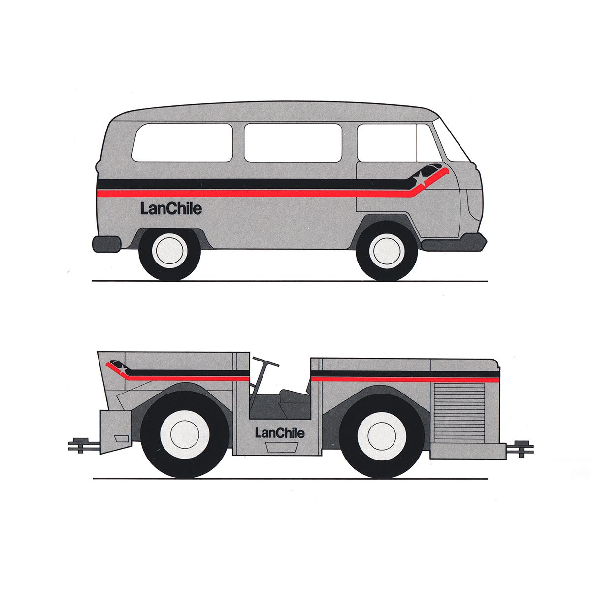
LanChile Logo, 1975
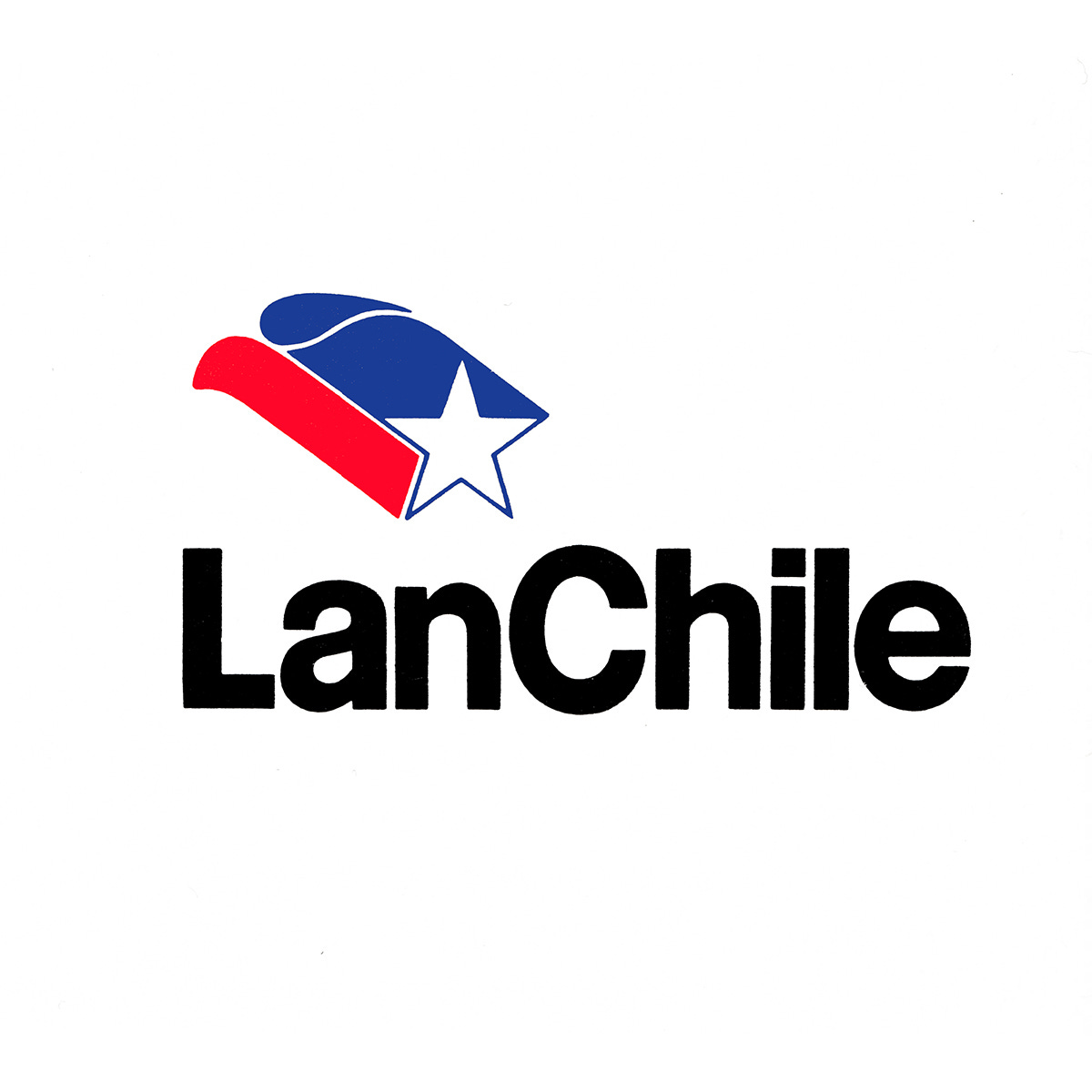
Olaf Leu's 1975 logo and visual identity for LanChile.
This post is supported by LogoArchive – The home of historical logos. Discover over 4500 of history’s best designs from the world’s finest designers. Always find the logo inspiration you need for your next project here.
Lan-Chile, now LATAM Airlines Chile, is the oldest airline in South America, founded in 1929. It began as a postal service but by 1934 started carrying passengers on domestic routes, expanding internationally in 1944 with flights to Buenos Aires and Montevideo. As wide-bodied craft were introduced and demands for commercial aviation increased new destinations were added. These included flights to Bolivia, Peru, Panama and the USA. Chile was then connected to Europe in 1965 as the jet-age took off.
To support the airline’s continued growth in 1975 a working group consisting of graphic designers, design students, industrial designers, architects and sociologists was established to develop a new image for the airline, with Olaf Leu being commissioned to develop a fresh Lan-Chile logo and identity.
Unlike the big commercial airline identity programmes that had come before it (KLM, Swissair, & American Airlines) it was an unusual task as there was no marketing data and or research from which to give shape to such a logo, only what could be seen, the aircraft.
Chile, as it would later be described by Leu, was the ‘embodiment’ of a 'European' country. Unlike its neighbours it was said to have ‘no Indio-folklore’ or ‘motley gods’ and the ‘connection and yearning for Europe was great’. Further, as Leu wrote for Wolfgang Schmittel's book Process Visual, published in 1979 ‘Chile would like to embody a piece of European thinking which the airline, as an ambassador, would be part of’. With this in mind, Leu would say the design task was, in the broadest sense, making the aircraft part of a 'European Chile’.
Prior to beginning, great effort was made to understand the shortcomings of the existing logo and wordmark. The white star, the national emblem of Chile, was considered too militaristic and the aircraft of the American Air Force had the same symbol. Further, the star could also be associated with other nations such as Russia and China. The colours of red and blue didn’t help lower either association.
With these considerations in mind, it was felt that if a star was to be used, that it should be more ‘peaceful’ in nature, and further, the name Lan-Chile should remain but its lettering updated. Alongside this, other ideas should be developed that expressed notions of dynamism, flight, direction, wings and engine-power.
At the time, Leu was a temporary professor of Visual Communication in the Faculty of Art and Technology at the National University of Chile. To generate early stage directions, Leu engaged the 7th and 8th semester students. They were given a free hand.
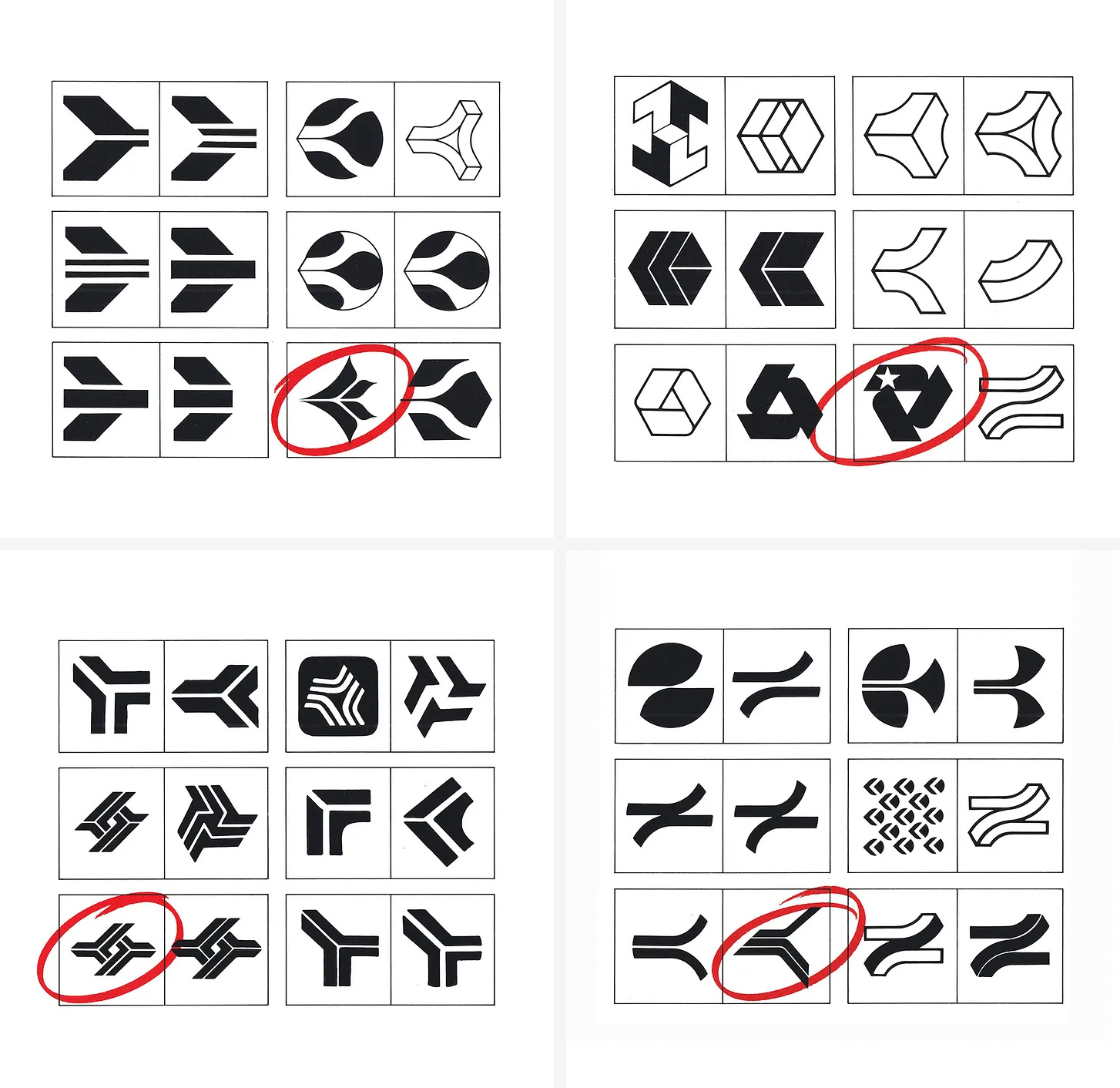
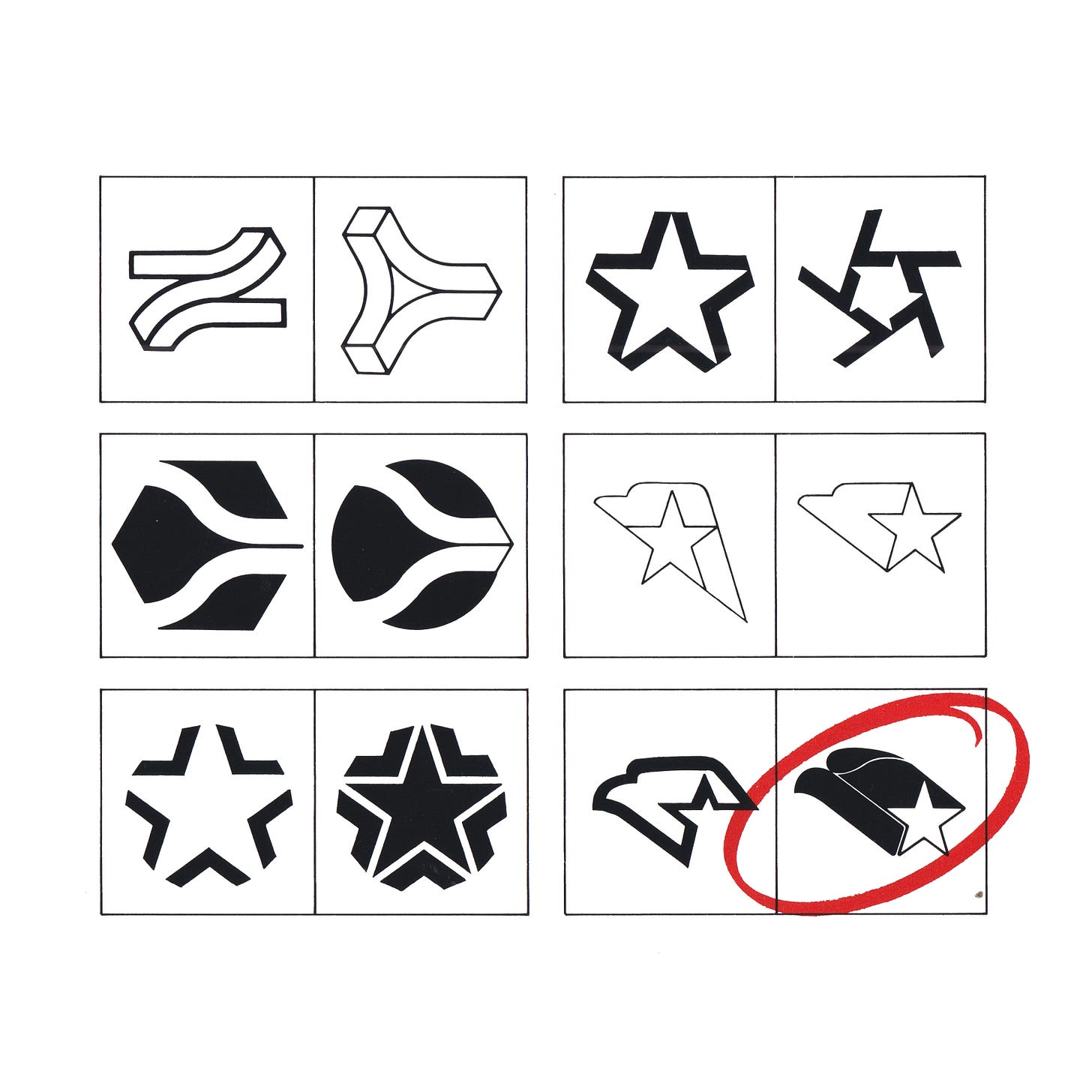
While the initial results were described as ‘lacking’, a number of possible directions did emerge from these. This included a ‘copihue’ – the national flower of Chile (top left); an abstract ‘L’; an upwards symbol; ‘traffic’ symbol (directional arrows, bottom); and a turbine.
Concerns were raised around an abstract ‘L’ also being the logo of another airline operating in Chile, and that the more abstract the letter became or the more embellishment it was given, the more indistinct it became. Attempts were made to generate a graphic representation of the ‘aircraft drive’, making the turbine a symbol (top right). This was considered too neutral of a solution, one which could represent any airline and, in addition, felt too heavy and lacked elegance for the jet age.
More successful was the ‘upwards symbols’ that registered a feeling of striving upwards, intensified in the application on the aircraft. It clearly suggested air-traffic and was closely connected with ‘transport’. The concept of ‘traffic’ (upwards-downwards) produced a symbol recalling a bird, however, this symbol was felt that it could belong to any airline, including freight airlines.
The attempt to make a star more attractive and less nationalist, while lowering the association with other countries, was unsuccessful, it was felt that incorporating a second form would alleviate these issues.
The condor, Chile’s national emblem, seemed fitting appropriate. With this combination, and the addition of red and blue, and the dynamic upwards momentum of the overall composition, the design became a contemporary version of the country’s coat of arms. The condor was well-suited to being ‘carried away’ on the aircraft and a proud flying symbol.
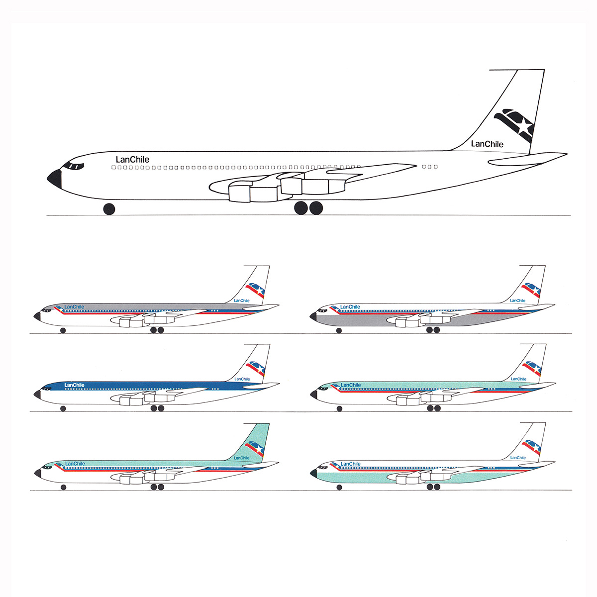
Different versions of the star-condor were created to enhance its usability. These included a version that would run off the edge of surfaces, a self-contained version and a variation that would connect with horizontal lines that would run the length of ground vehicles and aircraft, creating what would be called a cheat line. As Saul Bass would later describe it, a tool in which to make the wide-bodied aircraft have some of the elegance of the smaller jet engined craft.
Although wordmarks were explored, the priority was the design of a symbol. The lettering should be more neutral in keeping with changes in the industry at the time. The two words "Lan" and "Chile" were to be combined with no gap (surly spurred on by Vignelli’s bold combination of AmericanAirlines), leaving the first letter of each word in capitals, producing the optical impression that the logo contained two verbal conceptions despite being one word.
At first, this logotype was set in Univers Extra Bold but later, was adapter into a custom typeface called Chile sans-serif. This had a thicker stroke than the airport sans-serifs (such as Helvetica) that were increasingly being used in Europe, but kept some of that European character.
Each of the favoured concepts were applied to figures of ground equipment and airplane liveries, and presented to the public at a dedicated exhibition. They reacted ‘spontaneously and with interest’ considering the condor-star as being a proud, representative and national solution. In second place came the "copihue" and the modern ‘upwards’ bird-like solution. None of the turbine concepts or the ‘traffic’ proposals were accepted.
Despite this support, the logo would not go into use. Only the introduction of Chile Sans-serif as part of a new wordmark made it. There was, for a short period, the addition of a double line device that was reminiscent of the tail of the condor-star. This was used occasionally across timetables and poster. Aside from the documentation of Olaf Leu, and the publication of the book by Wolfgang Schmittel, there is little evidence that this project ever happened, despite it being a pioneering project for the University and the Faculty.
Thank you for subscribing to Logo Histories. If you enjoy reading this you may also enjoy these resources from the same team:
New! Wittl – Job posting and applicant tracking tool.
LogoArchive Website – Searchable modernist logo archive & research tool.
LogoArchive Shop – Vintage design books & LogoArchive Zines.
BP&O – Contemporary design editorial.
Brand Archive – Research tool for brand designers.


