
‘M’ for Montreal
Georges Huel’s 1972 symbol for the Games of the XXI Olympiad.

The first ever Summer Olympics to take place in Canada, the Games of the XXI Olympiad, was held from July 17 to August 1, 1976 in Montreal. As a historic event for the Quebecois city, many people sent designs for the games’ emblem to mayor Jean Drapeau from across the world. Rather than hold an open competition, in 1972 Drapeau awarded the job to long-time friend and designer Georges Huel. The French Canadian designer – then 43 at the time – was a graduate of the Graphic Art School in Montreal and had spent most of his working life in Montreal.


Following the successful design of the symbol in 1972, in April the following year, Huel left his job as Vice-president and art director for printer Therien & Frepes to become Director General of Graphics and Design. He would go on to create a team that would develop the graphics program for Montreal ‘76. He appointed Pierre-Yves Pelletier as Deputy Director General and Fritz Gottschalk as head of the Design Quality Control Office. This was on the basis of their shared enthusiasm for ‘Swiss design’. Joining them were eight permanent designers and over 100 freelancers, handpicked by Huel.

The visual identity continued in the same spirit of Munich 1972, a pioneering identity programme by Otl Aicher and Dept. XI, whilst incorporating a Canadian sensibility and ethos in harmony with the geographic, social and political idiosyncrasies of Montreal. From the outset, the team agreed that the visual identity would consist of a ‘basic yet well-coordinated system that would allow breathing space for variation and individual expression’.

The visual language for Montreal 1976 is composed of a solid red, typographic choices of Univers 55 & 75, and George Huel’s symbol. Huel’s primary goal was to keep things ‘clean and neat’. Creating effective work through symmetry, simplicity, and economy was at the heart of his practice, and this is reflected in the work undertaken for Montreal 1976. Following the two variations of the Munich symbol, and the intricacy of Mexico 1968, Huel intended to work with just one simple yet multifaceted design. At the time, Huel himself admitted that he found it amusing that nobody else thought of the design whilst designing symbols for Mexico or Munich.


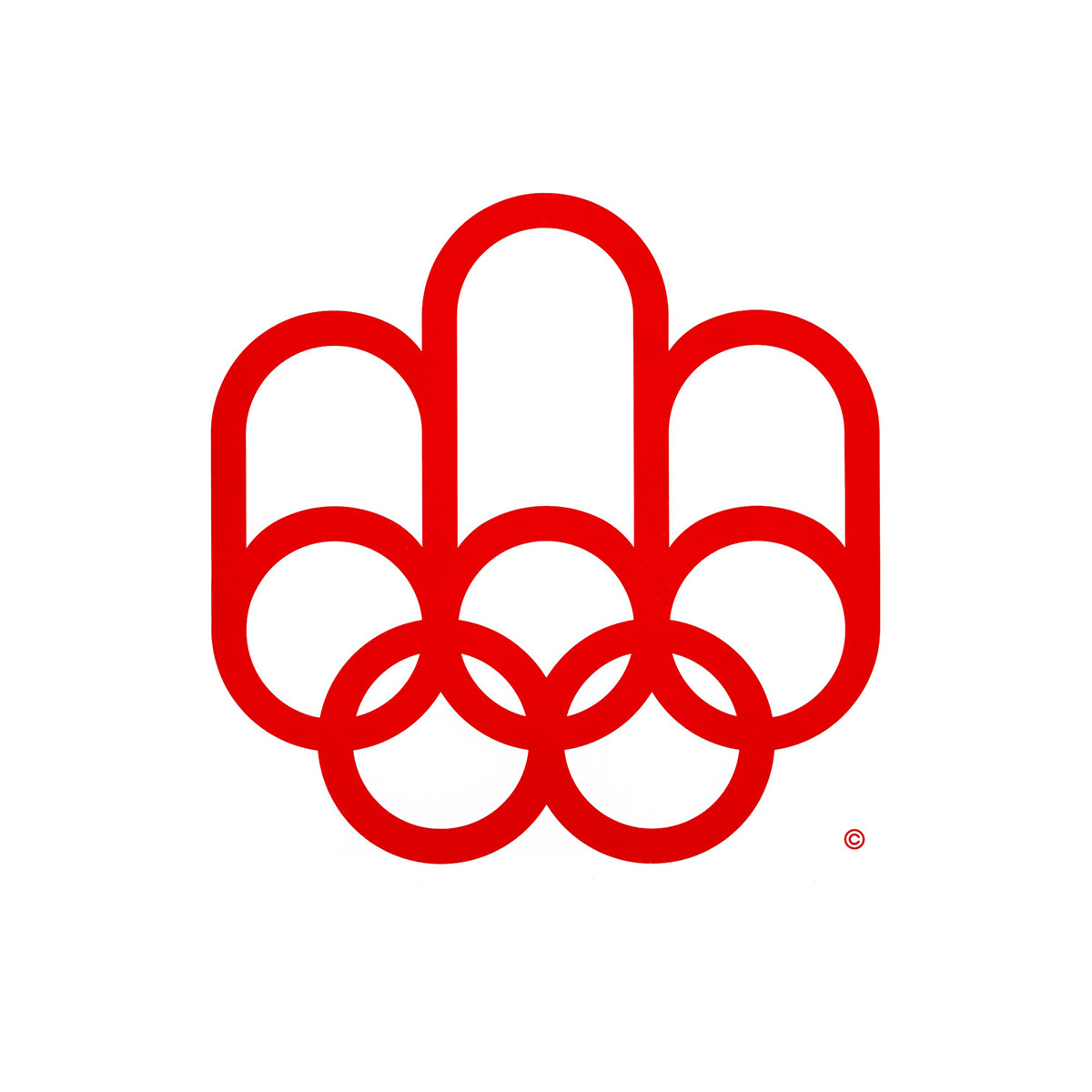
The symbol designed by Huel, is a creative confluence of three key motifs. The most striking part of the design – presented in the red of the national flag – is the Montreal ‘M’ which extends out from the five Olympic rings. The five Olympic rings themselves also have meaning, denoting the ‘universal brotherhood’ the Games seeks to promote. The superstructure above the rings also represents the medal podium associated with the Games. Finally, the stadium track, the focal point of the Summer Olympics, is visible in the centre of the logo, and links the middle curve of the M with the Olympic rings.

The intention of Georges Huel was to prove that, with good planning, design can significantly contribute to the visual image of sporting events such as the Olympic Games. Looking back, there is little doubt that Huel and his team succeeded in using precise and carefully orchestrated elements to shift the perceptions of what the image of the Olympic Games could be, and furthering the work of Lance Wyman (Mexico 68) and Otl Aicher (Munich 74).
Discover more Montreal 1976 brand assets and assets from hundreds other historical and contemporary brands at Brand Archive.
This post is based on the article ‘Five Ringed Circus’ by Pamela Ferguson, first published in the magazine ‘Design’, January, 1975, Issue 131.
Thank you for subscribing to Logo Histories. If you enjoy reading this you may also enjoy these resources from the same team:
Brand Archive – Research tool for brand designers.
LogoArchive Website – Searchable modernist logo archive & research tool.
LogoArchive Shop – Vintage design books & LogoArchive Zines.
BP&O – Contemporary design editorial.