This post is supported by LogoArchive – The home of historical logos. Discover over 4000 of history’s best designs from the world’s finest designers. Always find the logo inspiration you need for your next project here.
Linea Uno (Line 1) was the first underground rapid transport network to be built in Milan, Italy. It was first part of the Milan Metro, operated by ATM, that would eventually expand over the course of the following decades to include five lines connecting all parts of the city.
Work began on Linea Uno in 1957, with the initial section linking Sesto Marelli to Lotto, opening on November 1st 1964. Ahead of this, in 1962, the Società Metropolitana Milanese commissioned renowned architects Franco Albini and Franca Helg (Franco Albini-Franca Helg architecture studio) to develop station designs and pioneering designer Bob Noorda (Unimark International) to work on wayfinding and symbol.
Albini and Helg devised was a modular system based on prefabricated panels and the standardisation of key elements such as entrances, lighting and handrails. These gave the stations a clear identifiable visual language above ground. A key part of supporting the architectural visual language would be the design of a recognisable symbol, one that would catch the eye, with hand rails and signage then leading people underground.
Many of Noorda’s logos and symbols emerged from an ‘essential’ and ‘didactic’ appraoch. For Noorda, a successful logo was simple and immediate, and as ‘easy to read as a child's picture book’. These were the guiding principles for the design of the Milan Metro symbol.
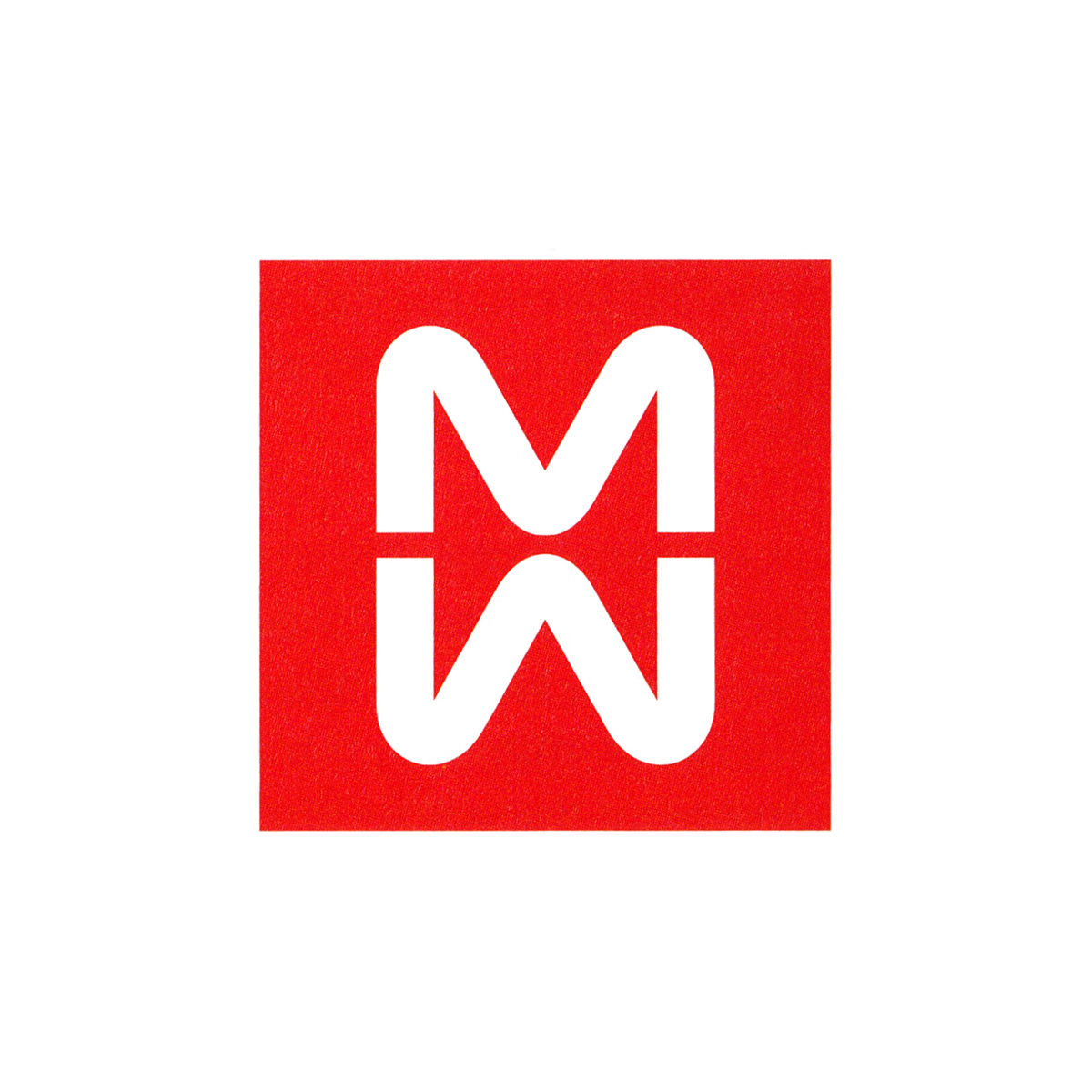
The symbol that Noorda would put forward to the president in charge of the Milan Metro project, had two readings.
On the surface it was a mirrored double ‘M’, one below the other, and the initials of Milan Metro. Secondly, it was a graphic expression to be read as two Milans, existing above and below ground.
The alphabetic mirrored forms were derived from the architecture of Franco Albini and Franca Helg, and specifically the handrails down to the interior spaces of the metro. These were referenced and turned into ‘clean-cut’ and ‘balanced’ typographic characters.
Finally, the red, part of the overall system, would be derived from the Milanese coat of arms. This would also run throughout wayfinding, and would give Linea Uno the supporting visual identification of Linea Rossa (Red Line).
Alongside the symbol, Noorda developed a custom typeface. In this, he avoided characters that were too tall, which would have reduced their legibility. He modelled the typeface on the ‘grotesque’ style, however, it was felt thatm while these were often clear and bold, they appeared too ‘sharp or dark’ when enlarged to meet the needs of the signage. So the alphabet was redesigned to create an ‘in between ‘version.
Noorda varied the weights, enlarged the counters and shortened the descenders and ascenders, improving the typeface’s practical performance, which included situations were there would be restricted vertical height, improving legibility. Set spacing between letters was established in order to ‘control and render uniform’ all the written information provided in the stations.
Architectural cues and wayfinding, which also included a set of pictograms, directional arrows and clock (also designed by Noorda), would inform passengers where they were and at what time, which line their destination was on and the direction of the train. This would then be supported by track-side information.
This coordinated architecture and the organisation of signage won Albini, Helg and Noorda a Golden Compass, and was commended for the effort given to researching and applying the system of signs, their hierarchical relationships and positioning, and the technical organisation, scale and material language of the interior spaces.
On the symbol, however, despite it being liked by many, the president who had then taken it to the board of directors for a vote, found that his dislike swayed the directors, who voted with him and against the symbol.
The system went ahead, without the mirrored ‘M’. This was replaced with a regular ‘M’ in a red square, which remains in place today. Aspects of Noorda’s work can still be seen at the stations, including the clock-face.
The logo was so well-received in the design industry, it found itself in many design books and magazines, leading many, including this writer, to wonder where it was when visiting the city!
Thank you for subscribing to Logo Histories. If you enjoy reading this you may also enjoy these resources from the same team:
Brand Archive – Research tool for brand designers.
LogoArchive Website – Searchable modernist logo archive & research tool.
LogoArchive Shop – Vintage design books & LogoArchive Zines.
BP&O – Contemporary design editorial.