


The following is an article published in Trade Marks & Symbols Volume 2: Symbolical Designs, 1973. In it, Yasaburo Kuwayama writes about the similarities that arise among trademarks.

Problems of similarity of trademarks used by different companies arise fairly often. When a new trademark is announced to the public and is then found to resemble an existing one used by a different company the public and the company which may suspect that its own design has been copied - react immediately. Similarities between the Osaka EXPO '72 mark and a design published in an American book were brought to the public eye in 1966 (Asahi newspaper, September 29) and suspicion that the snowflake motif in the Sapporo Olympics mark was taken from a family crest named "First snow" was similarly published in the Japanese press (Asahi newspaper. October 10, 1966). This is one manifestation of the high public interest in marks.
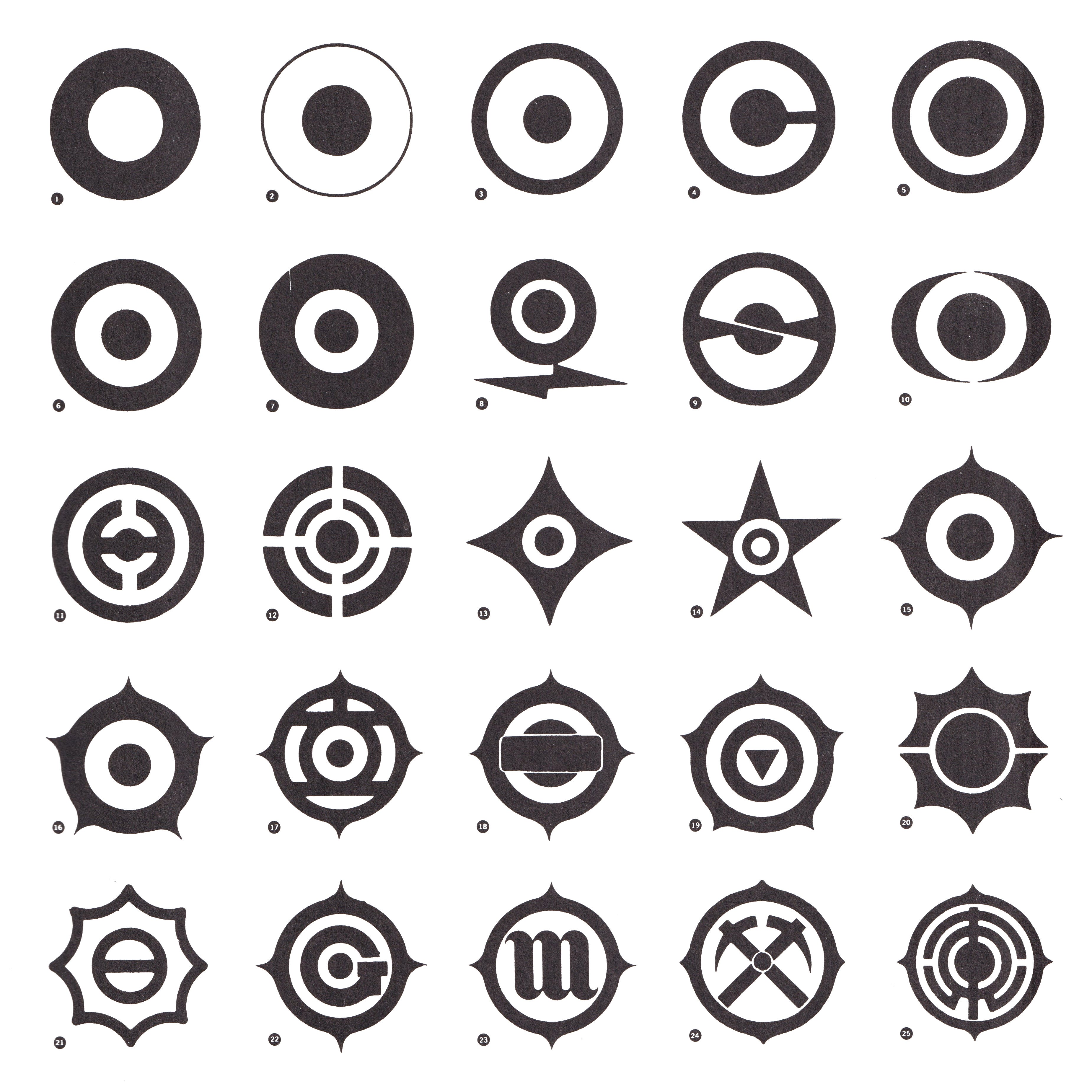
There are many instances when similarity arises from the need to keep marks simple. especially when letters of the alphabet are used as the basic motif. If a design which resembles an existing one is placed in use and the designer is accused of plagiarism, it may not be his fault at all, but he may be unable to fully clear his name. If all marks made in all countries were registered at one central place this, of course, would not happen. Large companies, active in foreign countries, must take special pains to ensure that a new trademark which they plan to use does not resemble one in use abroad.
Go behind the logos. Explore 200+ in-depth and meticulously researched logo histories revealing the designers, design decisions and ideas behind the world’s most iconic logos and important brand identities.
Similarities in trademarks are looked upon as either of three types, according to Japanese law: those which have a similar appearance, those which have a similar arrangement of letters (including a similar pronunciation of those letters) and those which are similar in concept. In the latter case, one example would be a trademark consisting of the word ‘Oriental’ and a trademark which said, but in Sino-Japanese characters, the equivalent translation of ‘Oriental’.
Judging whether a trademark is too similar to a previously existing one is extremely difficult, and the practices for legal review of the issue vary from country to country. Here, I would like to present my standards for de-terming whether two marks are too similar.
First, similarity of over-all form even though the concept and motif are different. Second, although the forms are dissimilar, the images presented appear the same, so that confusion is likely to occur when the two are seen separately. Third, when the trademarks appear the same if one is turned upside down, reversed or rotated 45 degrees - because trademarks are not always used or seen directly from the front. If any of these conditions are met, the designs are too similar.
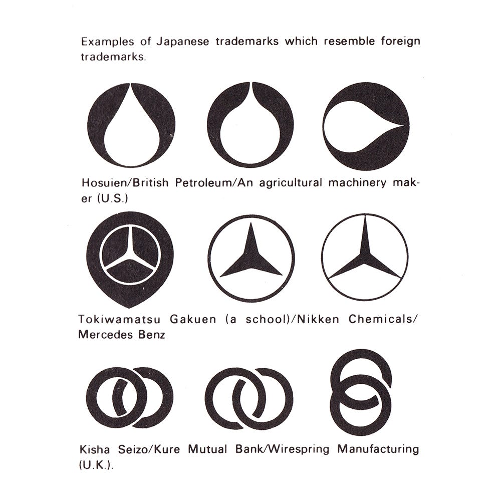
Even though a designer has labored long and hard to create a trademark, if he finds that it resembles another trademark already in use, he should feel obliged as a matter of professional ethics to revise or re-do his design.
Want more in-depth articles? Check out LogoHistories’ other articles on logos by Yasaburo Kuwayama →


Thank you for subscribing to Logo Histories. If you enjoy reading this short you may also enjoy these resources from the same team:
Brand Archive – Research tool for brand designers.
LogoArchive Website – Searchable modernist logo archive & research tool.
LogoArchive Shop – Vintage design books & LogoArchive Zines.
BP&O – Contemporary design editorial.