


Before supermarkets, food shopping commonly involved visits to several businesses: a butcher, baker, greengrocer and grocery shop, alongside market stalls. Inside the grocer’s, customers usually waited at a counter while an assistant retrieved their purchases or meats and cheese were cut and weighed to order.
The shopkeeper’s knowledge, recommendations and relationship with the customer formed part of the transaction. Goods were presented through a person as well as through their packaging.
Supermarkets changed who did the selling. As customers freely browsed and chose goods directly from shelves, packaging took on more of the sales work. Naming, colour palettes and logos had to identify a product, communicate its qualities and distinguish it from the products that surrounded and competed with it.
Branded products already existed within this system. Coca-Cola’s familiar script dates to 1886. During the late nineteenth century, expanding rail networks, canning and increasingly elaborate printed labels helped manufacturers distinguish goods sold far from their place of production. Brands could establish a reputation that travelled with the product.
This changed the demands placed on packaging. A label needed to attract attention among alternatives and make the product easy to recognise on a subsequent visit. Advertising could create familiarity before a shopping trip; the package had to make that familiarity useful in the aisle.
Go behind the logos. Explore 200+ in-depth and meticulously researched logo histories that reveal the design decisions and ideas behind corporate identities from past and around the world. Become a paid member and support our research.
→ free previews
→ join here

As supermarkets brought an expanding range of products together in one place, brands helped make that choice manageable. Familiar names, colours and symbols became shortcuts, allowing shoppers to draw on previous experience and find products quickly. Coordinated identities extended this advantage across whole ranges: an unfamiliar product could immediately be recognised as belonging to a trusted manufacturer. As the number of alternatives increased, these visual connections could reduce the effort of choosing, making a much larger store easier to navigate.
Coordinated packaging could also strengthen shelf presence. Repeated colours, recognisable symbols and related layouts could allow neighbouring packs to form a larger visual block. Each product contributed to the visibility of the range. Designers also had to preserve distinctions between flavours, sizes and uses, allowing customers to recognise the family and find the particular product they wanted.


Lawry’s, 1959
Discover the Lawry’s identity →
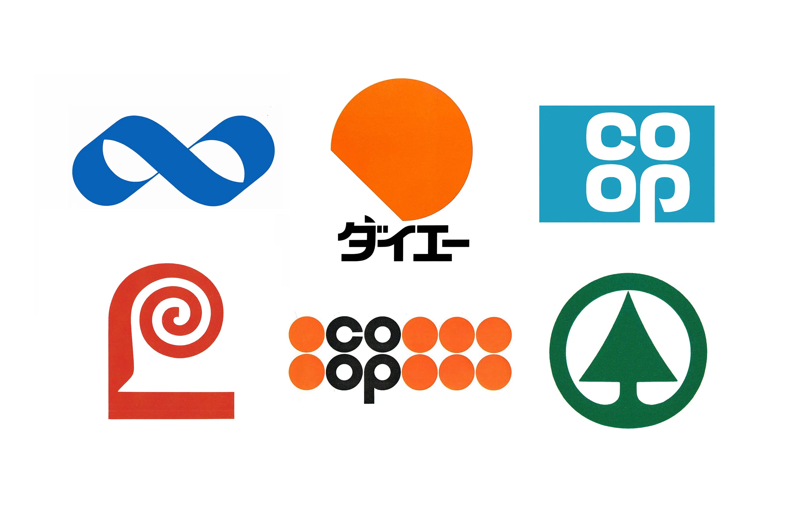
Lawry’s illustrates how deliberately this opportunity was pursued. Having developed a retail business from its restaurant seasoning, the company needed an identity capable of competing with larger food manufacturers. Saul Bass & Associates’ 1959 programme retained its established red-orange and dark brown colours and introduced a distinctive spiral-topped ‘L’. Designs were tested in simulated shopping aisles, while different configurations accommodated containers ranging from seasoning cylinders to dressing bottles. A rollout encompassing 45 products gave the identity a substantial collective presence.
The commercial logic extended beyond products standing together. A shopper familiar with Lawry’s seasoning could encounter a dressing elsewhere in the supermarket and recognise its maker. The shared identity offered a reason to consider an unfamiliar line through experience of an established one. This was a way to transfer accumulated recognition and expectations of quality across a growing range, particularly valuable when individual products had little advertising support.

Coop, 1967
For retailers, coordination could connect the products on the shelf with the business operating the store. In Britain, the Co-op’s modernisation programme addressed declining sales and an increasingly competitive retail environment. Lippincott & Margulies’ cloverleaf identity, announced in 1967 alongside the campaign ‘It’s All at the Co-op!’, provided a compact identifier suited to a diversified offer. Repetition across packaging and communications could reinforce the connection between individual purchases and the wider organisation.

Kooperativa Förbundet, 1968
A similar requirement shaped the identity of Sweden’s Kooperativa Förbundet. By the mid-1960s, KF combined extensive retail operations with manufacturing and an expanding product range. Its brief explicitly called for an identity that would unite these activities, distinguish its merchandise from competing brands and connect the goods with the cooperative movement. Paul Persson and David Westman’s 1968 infinity symbol gave that complex organisation a shared visual expression.
Seen in the supermarket, this kind of common identifier could connect goods separated by function and location. Food and household products might occupy different aisles, yet a familiar mark could make their relationship apparent. The retailer’s reputation could accompany each purchase, while encounters with different products reinforced awareness of the same organisation.

Coca-cola, 1969
Discover the Coca-cola identity →
Established manufacturers faced a related problem: extensive distribution could produce inconsistent presentation. Coca-Cola’s 1969 identity programme by Lippincott & Margulies coordinated its script, Coke name, red colour and distinctive bottle imagery. The introduction of the white ribbon, derived from the bottle’s contour, helped connect different packaging and signage formats. A system of standards made these assets work together more consistently, giving repeated appearances a stronger combined effect.

Spar, 1970
SPAR demonstrates how the same principle operated across a network of independent businesses. Founded in the Netherlands in 1932 through cooperation between retailers and wholesalers, it expanded internationally in the post-war decades. A corporate identity programme begun with Raymond Loewy’s studio in 1966, leading to the 1970 logo, sought to bring its activities under a common organisational image. Recognition could extend across locations as well as across products, making separate encounters contribute to a shared impression.

Daiei, 1975
As supermarkets grew, their identities also needed greater flexibility. Japan’s Daiei, which opened in Osaka in 1957, developed into a major national retailer. Its 1975 identity by Rei Yoshimura and PAOS used a simple, incomplete circle as the basis of an extensive system. Solid, striped and outlined versions, supported by colour and application guidelines, accommodated products, signs and in-store displays. A recognisable core could remain consistent while its presentation adapted to different purposes.
The value of this coordination could grow with every shopping trip. A successful purchase gave the familiar mark more meaning when it appeared on another pack in another aisle. In a store organised around different product categories, visual identity could make the connection between them immediate.
LogoHistories is an independent publication documenting logo and corporate identity design history. Each of these has a fascinating story, some are familiar, others forgotten. LogoHistories exists to uncover these and then bring them to life. There’s so much more to uncover. A paid subscription helps us to continue to do this, it also gives you access to a growing archive of articles.