The 'Arden Square'
Lippincott & Marguiles' 1969 corporate identity for Coca-cola.
This post is supported by LogoArchive – The home of historical logos. Discover over 4000 of history’s best designs from the world’s finest designers. Always find the logo inspiration you need for your next project here.
By 1969, American soft drinks company Coca-Cola had been around for more than 80 years. It had endured a period of intense competition engaging in huge marketing efforts to establish itself. It also had had a history of ongoing legal disputes with companies using similar trademarks. The Coca-Cola name and script, which was used from 1886 and registered in 1893, was unique at the time. However, as the product became popular, rivals began to imitate the trademark and use misleading product names to confuse consumers.
With this in mind, the initiation of a new corporate identity programme in 1969 would seek to prevent infringement of Coca-cola’s trademark rights. It would do this by reinforcing the Coca-cola and Coke brand names by more effectively coordinating core visual assets, rejuvenating these without changing them too much. Further, the programme would also resolve discontinuities across its products and signage, which had become multiplicitous, undermining the combined effect expected of a large brand.
By formalising the attributes of these core assets, their use and coordination across all products and touch points throughout the world, Lippincott & Margulies intended to increase the overall impact and impression of the Coca-cola brand.
Continue scrolling to understand the 1969 Coca-cola corporate identity, read about the introduction of the ‘ribbon’ and see aspects of the brand’s ‘Basic Standards’.
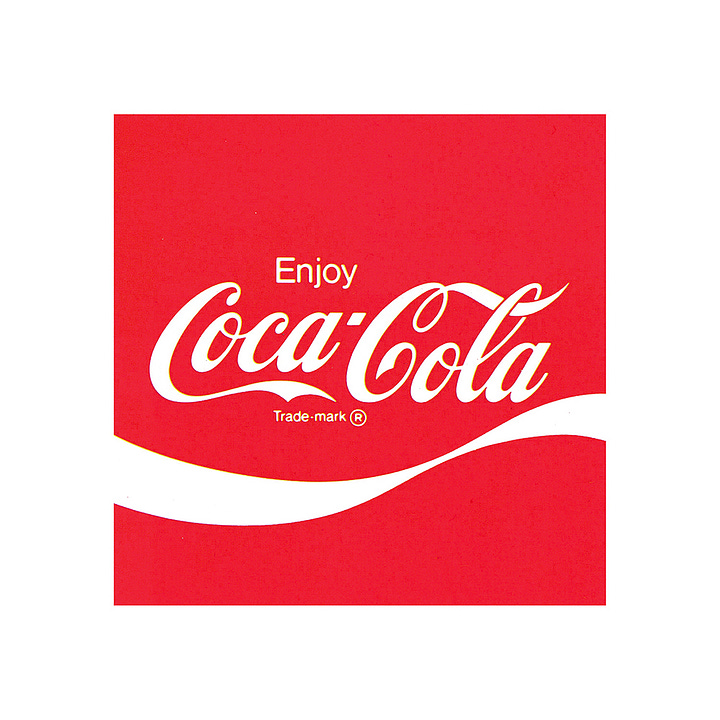
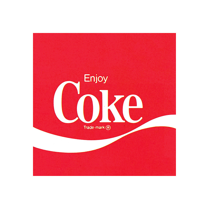

In 1969, the Coca-Cola brand was made up four elements, all of which where in use since its earliest days. These were the Coca-Cola script, the Coke logo, ‘Standard Red’ and the shape of the bottle. However, the way these were presented had become inconsistent. And because there were many Coke signs, ‘sometimes ten or twenty within the space of a few yards’ they had become almost invisible. Further, research had shown this had had also led to consumer confusion.
The new program devised by Lippincott & Margulies focused on organising and clarifying the relationship between these elements with a set of ‘Basic Standards’. This was the first attempt to codify and bring into coherence the brand’s visual identity.
Coca-Cola's logotype, designed by Frank M Robinson, remained the same. ‘Coke’ was only slightly modified (reduced to a couple of variations) and Standard Red and the design of the bottle was left unchanged.
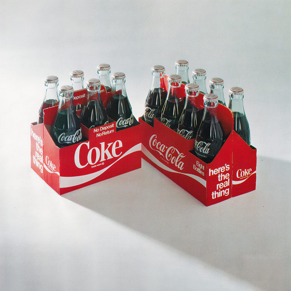
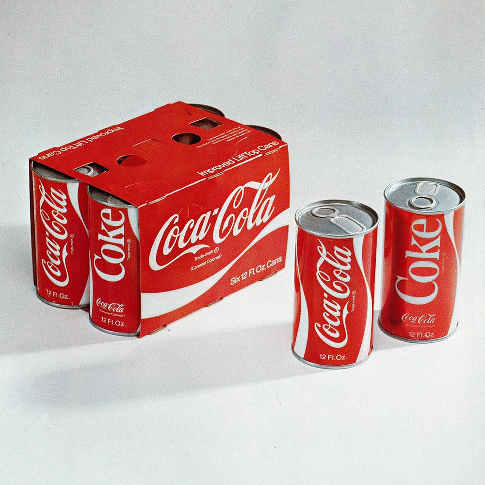
The biggest iteration came with introduction of an additional brand element. The ‘Bottle Contour Curve’, later known as the ‘ribbon’ was a fluid graphic device derived from the shape of Coke’s iconic bottle. This better connected all the graphic components to the other key brand asset, the glass bottle silhouette.
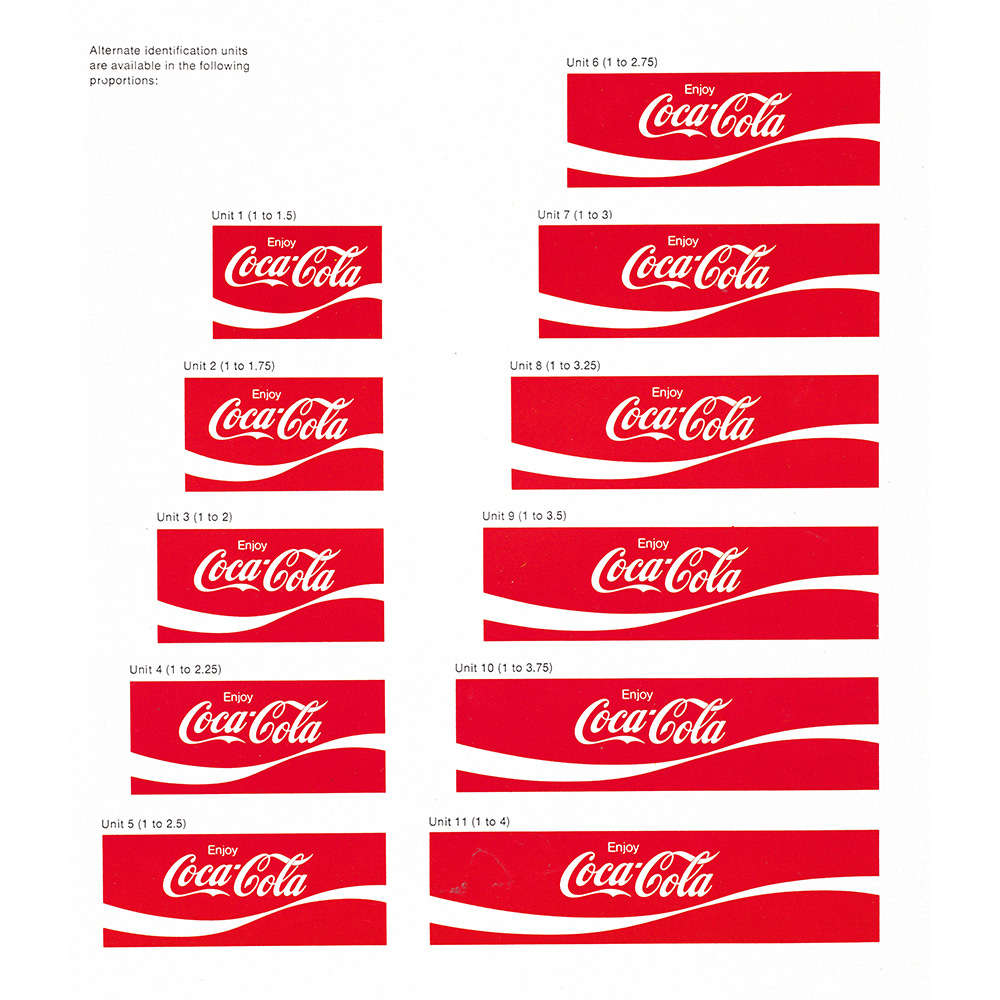
This fluid line broke away from the geometric elements of the square and the circle which had existed up to that point’, lending each a dynamic quality. This was placed within a frame, often square, but also rectangular, expanding to run the length of the surface of signage and packaging, and used with the Coca-cola or Coke script. This arrangement of elements became known as the ‘Arden Square’.
Like this? Also check out these great Logo Histories:
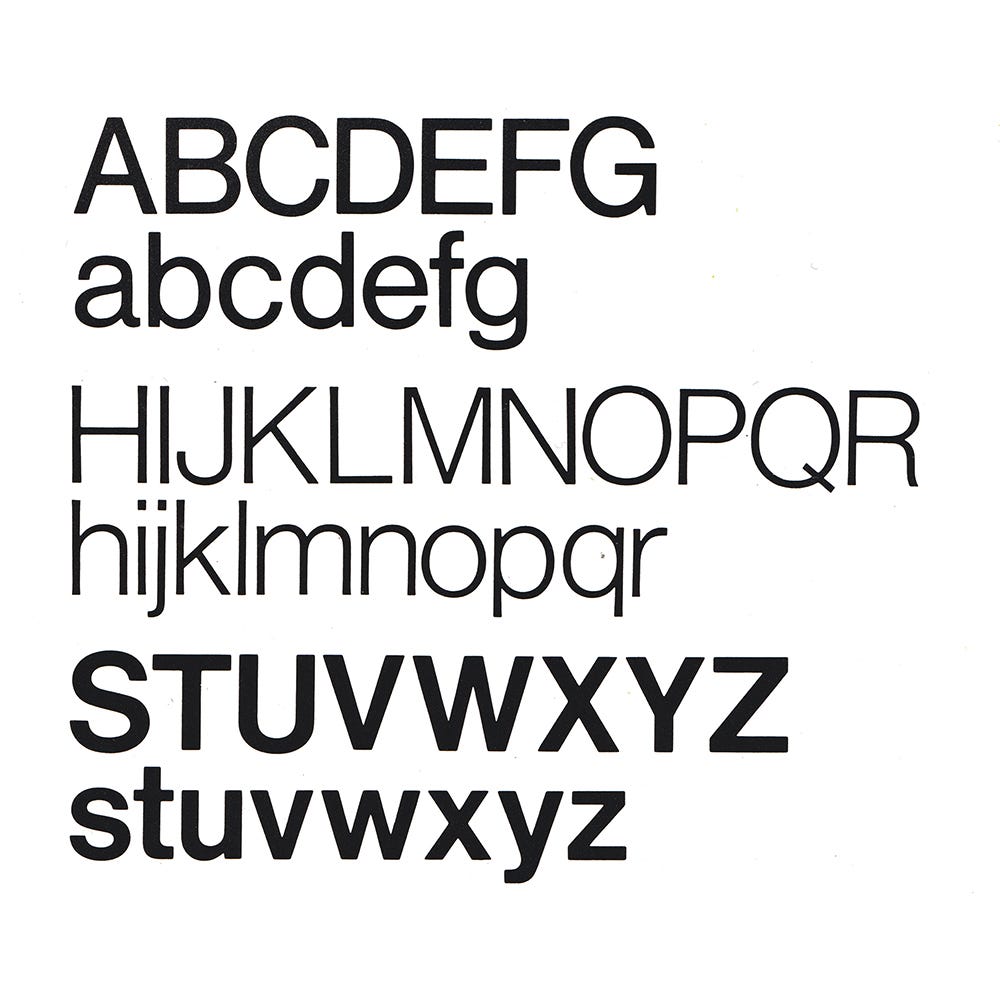
Helvetica, a widely available typeface was introduced to formalise marketing and corporate communications. This availability was important as Coca-cola was an international brand using many different agencies and printers for packaging and advertising. It wasn’t uncommon for typesetting companies to substitute fonts when one wasn’t readily available to them. Helvetica Regular was used preferentially with Light being selected when a particular message was needed to be conveyed ’softly’, with Medium used when special emphasis was required.
As well as solidifying its visual identity, Coca-cola also started to enforce its trademarks, raising the possibility of being sued to store owners serving any other brand when ‘Coke’ was requested by a customer. The overall effect of this formalised programme was continued growth, with much of the brand identity remaining in use today and the ribbon providing designers and advertising companies with powerful creative asset to work with.
If you enjoy reading this you may also enjoy these from the same team:
Brand Archive – Research tool for brand designers.
LogoArchive Website – Searchable modernist logo archive & research tool.
LogoArchive Shop – Vintage design books & LogoArchive Zines.
BP&O – Contemporary design editorial.


