
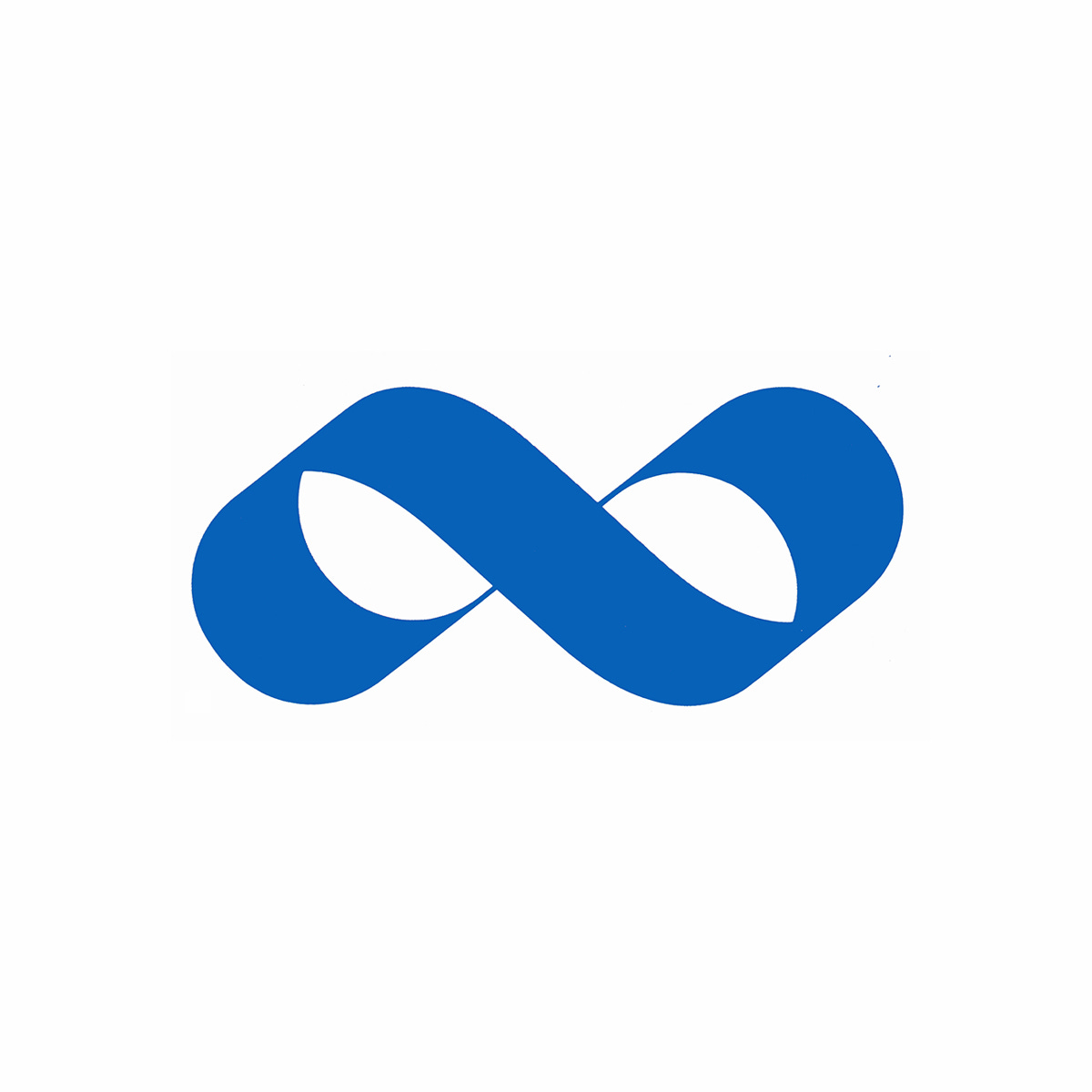
A reclining eight
Paul Persson & David Westman's 1968 logo for Kooperativa Förbundet

This post is supported by LogoArchive – The home of historical logos. Discover over 4000 of history’s greatest designs from the world’s finest designers. Always find the logo inspiration you need for your next project. Start here.
Kooperativa Förbundet (KF) in English: The Swedish Cooperative Union & Wholesale Society, was founded in 1899 by 40 local consumer co-operatives with the intention of providing support and education for retail managers and investors, and later procuring and manufacturing goods.
In the 1930s KF expanded rapidly under the management of Albin Johansson, setting up in various industries. Just like the co-operatives of Great Britain, Germany and France, KF grew from the Rochdale principle; the pursuit of member profit through democratic operations.
Two years prior to KF’s foundation, advertising agency SVEA was set-up by Gustav Adolf Nilssonas and produced advertising for goods and the housing brokerage market within the Norrkцping region. It later changed hands, and under the ownership of Johan Erhrnfrid Rydberg was responsible for the formation of the Tariff Centralen in 1915, the first attempt to bring order to the competitive situation in newspaper advertising.
SVEA and KF are extricably linked as early as 1923 when SVEA became a Limited company and KF became a shareholder, giving it control and insight into the advertising business as it moved its headquarters to Stockholm. Between the years 1926-1930, KF accounted for half of SVEA’s turnover.


By the mid-1960s KF was at the forefront of Swedish retail developing new and bigger store formats, dominating many manufacturing plants and accounting for 20% of national retail sales. Alongside national sales and developing new products, it also exported many of these into international markets. This dominance had created intense competition between the public-orientated KF and private manufacturers. To solidify and further grow KF’s reputation it embarked on the developmet of a new corporate image.

This new corporate image had to work in two ways. Firstly, it needed to systematically consolidate a growing range of products, services and activities (nationally and internationally) and secondly, clearly identify the cooperative movement.
SVEA had become Swedish institution. It was a pioneer of poster advertising and responsible for much of KF’s communications. Working with KF it devised the following extended criteria:
to identify and express the idea of co-operation;
to connect the idea of the cooperative movement with KF merchandise;
to clearly distinguish KF merchandise from other brand merchandise;
to visually unify a complex mix of products and manufacturing activities;
to be adaptable for supermarkets, department stores and corporate activities;
to ensure simplicity of maintenance and to reflect a high standard of design.
Designer Paul Person generated hundreds of logo sketches for the project, however, one idea stood out.
The origins of the KF logo, an infinity symbol (∞), dates back to 1957. It was used first used as a marque for an exhibition on the theme of "Without boundaries”, and was later used to represent various fund-raising activities for developing countries. Paul Persson, together with David Westman, was responsible for developing the infinity symbol; a mobius strip drawn as if with a pen, colloquially called "the reclining eight”. When it was presented as a concept, it was agreed upon that it best represented all aspects of KF such as cooperation and unity.


The concepts were presented by SVEA to a Marketing Council composed of representatives of the Swedish consumer cooperative societies as well as KF’s central administration office. The Marketing Council found a consensus around the identity program based on the infinity symbol, and ordered its development. A ‘Specialist Group’ consisting of Mats Erik Molander, head of KF's Architectural Office, Björn Peterson, creative director of SVEA, and David Westman, exhibition designer of the SVEA subsidiary EXPO, was assigned to develop and execute the visual identity program.

This would be one of Sweden’s biggest corporate identity design projects, making a significant visible impression on the Swedish people, and costing 12 million kroner, an unheard of sum for the time. Although KF continues to trade today, and under the infinity symbol, it exists in a modified form.
Thank you for subscribing to Logo Histories. If you enjoy reading this you may also enjoy these resources from the same team:
Brand Archive – Research tool for brand designers.
LogoArchive Website – Searchable modernist logo archive & research tool.
LogoArchive Shop – Vintage design books & LogoArchive Zines.
BP&O – Contemporary design editorial.
I worked closely with KF in the mid 1990s whilst working for Landor. We worked on the now not so new modified symbol, part of a restructuring of the organisation. Franco Bonadio, Hide Matsunaga and myself (Ian Haughton) worked on the new identity system. What I remember most was the willingness of KF to push creative ideas. It was a real pleasure to be involved.