Tokyo '64 Logo
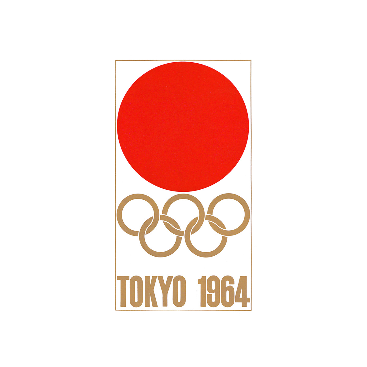
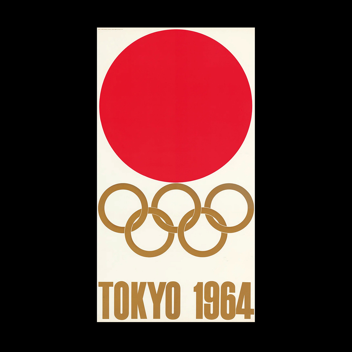
Yusaku Kamekura's logo for the Tokyo Summer Olympics of 1964
This post is supported by LogoArchive – The home of historical logos. Discover over 4500 of history’s greatest designs from the world’s finest designers. Always find the logo inspiration you need for your next project here.
The Games of the XVIII Olympiad, abbreviated to and branded as Tokyo 1964, was not only a state-sponsored event involving the whole nation but one of the first great opportunities for post-war Japan to showcase it rich cultural heritage to the world in a positive light and in an inclusive way. Designing a symbol that captured and conveyed this was critical in the promotion of the event. Work began on this four years earlier, in 1960, with an invitiation sent out by the Tokyo Olympics Organising Committee to critics, art directors, and designers inviting them to form ‘A Design Round Table Committee’. Their initial task would be to arrange a competition to generate options and the final design of an appropriate symbol.
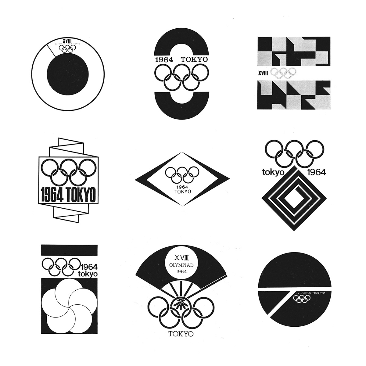
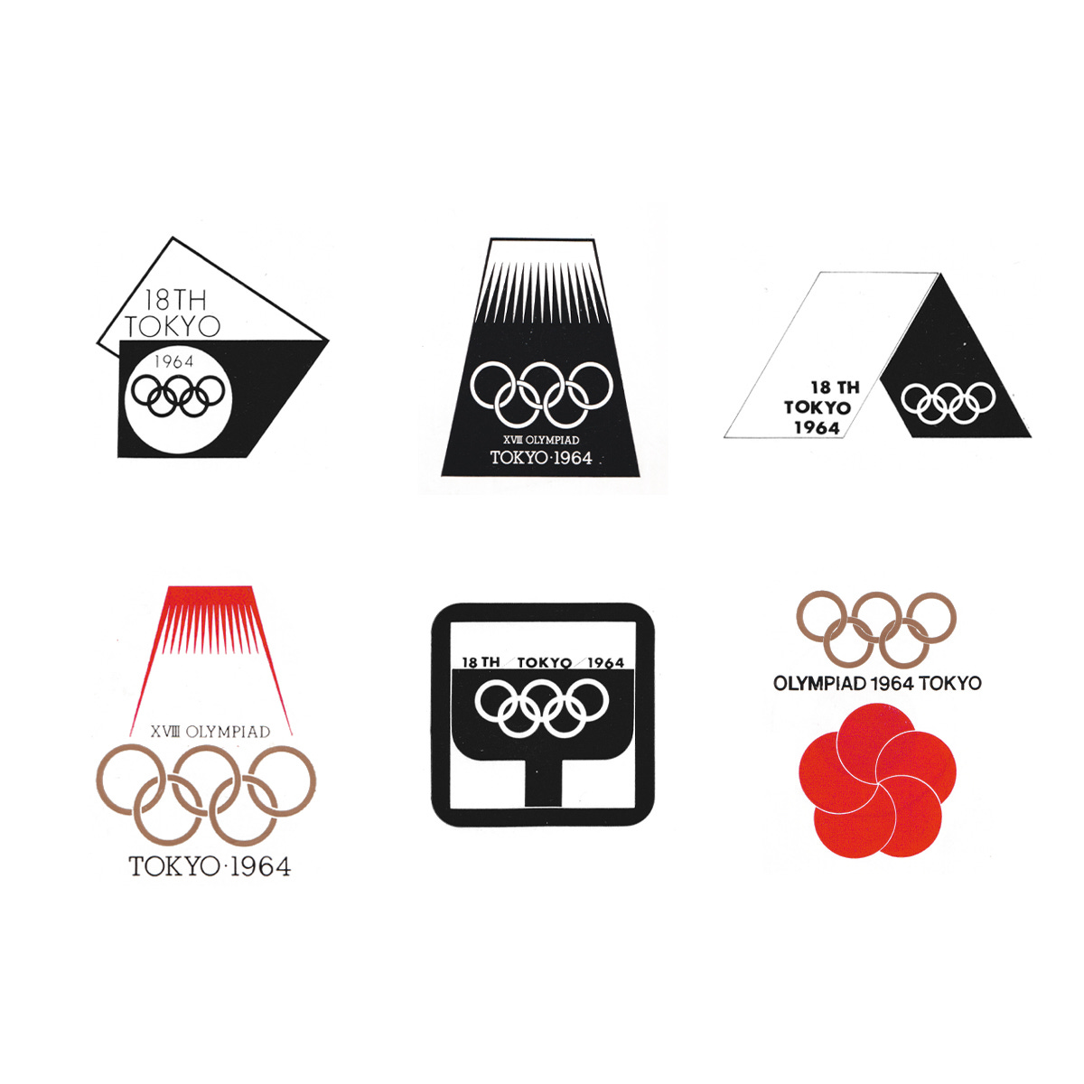
This would take the form of ‘semi-open’ design competition (rather than an open competition that would include members of the public). Six nominees, put forward by the Design Committee, would submit ideas and compete. These designers were Kazumasa Nagai, Ikko Tanaka, Yusaku Kamekura, Takashi Kono, Koichiro Inagaki and Kohei Sugiura.
The guidance these designers were given was that the symbol should; function throughout the Olympic Games, in all of the many diversified contexts; feature the five Olympic colours; and use ‘unified’ lettering.
The proposals put forward by the six designers used–in conjunction with the Olympic Rings–various culturally relevant motifs. These included Mount Fuji, Sensu (a folding fan), cherry blossom, running track and ribbons. All of these shunned the illustrative approach of what had came before and showed how Japanese designers were embracing European and American modernist ideals yet fusing these with their own history of ‘mon’, in particular, Ikko Tanaka’s proposal (bottom left).
Kamekura’s submission seems obvious now, but was daring for the time. A bold red circle (the Hinomaru of the Japanese national flag, representing the rising sun) was set above the Olympic rings. Not only was it progressive in form, it also pushed the limits of what had previously had been expected, and outlined in the brief. The use of the Olympic colours had been forgotten by the designer in his haste to generate his design proposal. In Kamekura’s design, the Olympic Rings were presented in a solid gold, complementing and not competing with the volume of the red above. Kamekura described the red as less of a nationalistic expression and more of a symbol of passion and excitement for the Games.
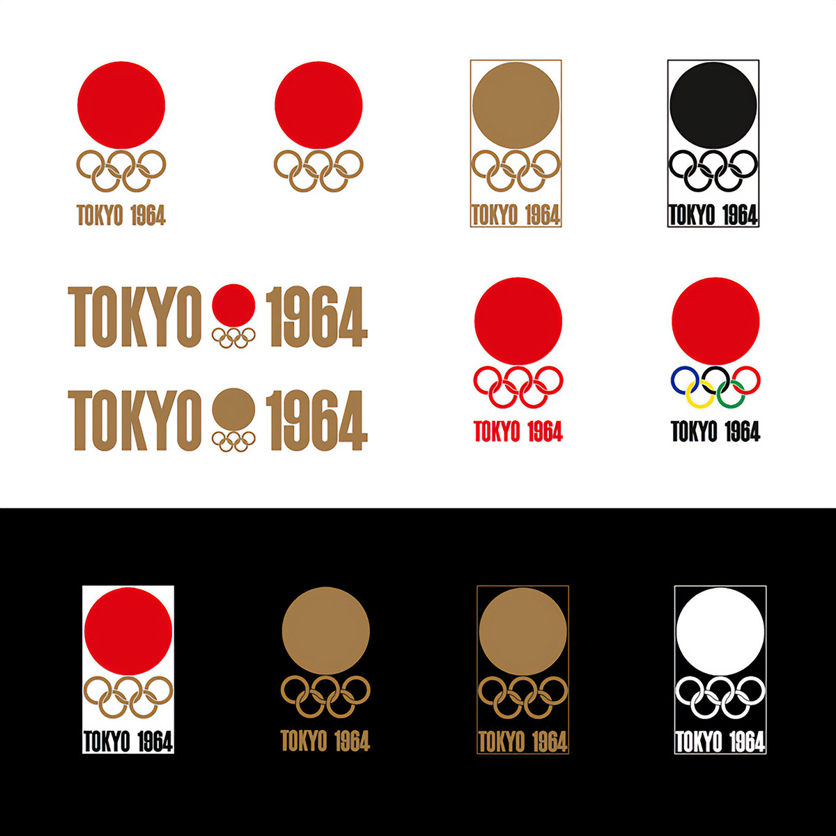
In order to expand the flexibility of the symbol, a variety of compositions were created. These included a primary stacked version, with circle, rings and the consistent lettering; a version that split Tokyo and 1964 with the symbol at the centre; as well as those that covered use cases that required a single colour or simplified options for contexts that were smaller and had restricted space.
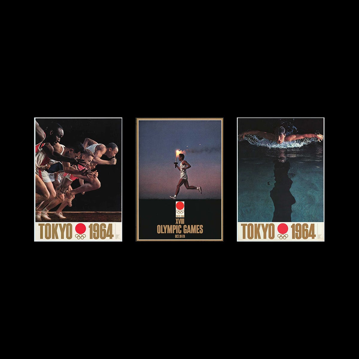
Kamekura’s design was unanimously selected as the winner, and as a result, he was also commissioned to produce the first official poster. This used the Tokyo Olympic symbol ‘without modification’ – as a proud expression that required no further embellishment. He would also go on to design a series of event posters.
Following the symbol competition, it was decided that the experience of the other competition participants be utilised, contributing to other aspects of the design programme. Takashi Kono would be invited to advise the Tokyo Olympics Organizing Committee on the use of colours, Hiromu Hara would advise on printing (the first set of posters highlighted Japan’s advanced printing technologies) and Masaru Katzumie would be Executive Chairman, co-ordinating all the above.
The final symbol was made public during the Olympic Games in Rome in the summer of 1960, and a guideline booklet was prepared to assure its consistent application. The guidelines prescribed how the symbol should be used on all Olympic-related athletic facilities, and on all kinds of printed materials under the supervision of the Design Committee.
What followed would be an intense period of design preparation, culminating in an extensive guideline document of loose sheets. The emphasis was placed on ‘decoration in conformity with function’, with attempts to make the design programme ‘necessary and adequate’. The priority of visual communication was stressed ‘every time and everywhere’ as a response to the tendency in the past to lean towards ‘over-decoration’.
Not only was the symbol of Tokyo 1964 used consistently, but an attempt was made to develop a ‘visual language’ for the first time. This included applying the five colours (which were absent from the primary symbol) in a functional manner to help identify areas within the grounds of the Olympics. Alongside this, uniform pictograms for the various games and facilities were created, furthering the visual language. This ushered in a new era for the Olympics, which was tuned to the international nature of visitors, many who would be visiting the country for the first time. This set the approach for the Games that followed.
An idea was suggested at the time that the pictograms created for Tokyo 1964 could form an important foundation, and be continually refined each new Games, eventually reaching a total universal communicative efficiency. Despite this suggestion, and later attempts to standardise these across Games, they would become tied up in the look at feel of each individual Olympics. This notion was partially realised when the pictograms were used for Expo 70 and later refined for Sapporo 1972.
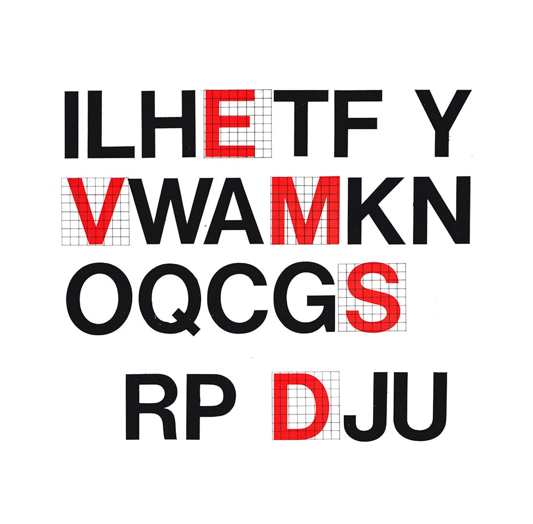
Neue Haas Grotesk (renamed Helvetica in 1960) would be the basis for all typographic expressions. This was an early example of the widespread use of such a typeface, well-ahead of corporate identity programmes such as Massimo Vignelli’s work for American Airlines in 1967. Just like the bold red circle, the uniformity of the pictograms and the functional application of colour, the typeface symbolised the future, universality and inclusion, just like the Games itself.
Discover more Tokyo 1964 brand assets and assets from hundreds of other historical and contemporary brands at Brand Archive.
Thank you for subscribing to Logo Histories. If you enjoy reading this you may also enjoy these resources from the same team:
New! Wittl – Job posting and applicant tracking tool.
LogoArchive Website – Searchable modernist logo archive & research tool.
LogoArchive Shop – Vintage design books & LogoArchive Zines.
BP&O – Contemporary design editorial.
Brand Archive – Research tool for brand designers.


