Yokogawa Logo, 1986
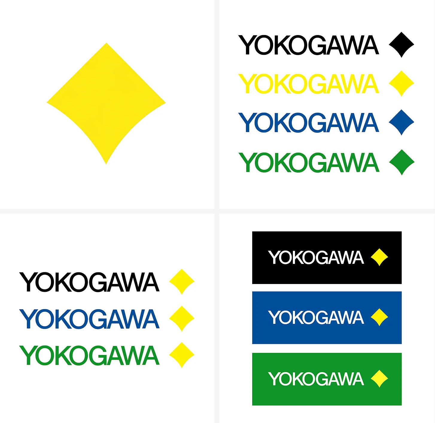
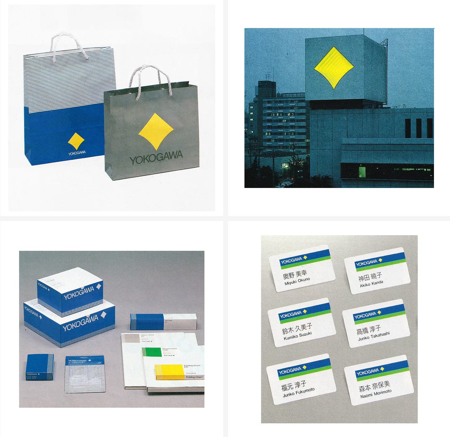
Rei Yoshimura's 1986 logo for Yokogawa.
This post is supported by LogoArchive – The home of historical logos. Discover over 5000 of history’s greatest designs from the world’s finest designers. Updated every single day. Always find the logo inspiration you need for your next logo or branding project. Start here.
Yokogawa, founded in 1915 by Dr. Tamisuke Yokogawa as an electric meter research institute in Tokyo, evolved into Yokogawa Electric Works in 1920. It ventured into aircraft instruments and controllers in 1933 and, after World War II, expanded globally with its first overseas office in New York.
In the 1960s the corporation entered the industrial analyser market and launched the development, manufacturing and sales of vortex flowmeters. Later, in the 1970s, Yokogawa established its first manufacturing plant outside Japan in Singapore, opened a sales office in Europe, and became one of the first corporations to bring a distributed process control system to market.
In 1983 Yokogawa merged with Hokushin Electric Works and entered the high-frequency measuring instrument business. This merger–part of the corporation’s continued drive towards expansion of its areas of business interests and in response to the increasing number of group companies–created the need for a unified corporate image.
The new corporate image intended to support Yokogawa’s expanded business operations and an increase in affiliates and subsidiaries through a total image and standardisation of marketing materials. Further, it would ‘better symbolise’ its ambition and leverage its sized and global reach to further its presence in international markets.
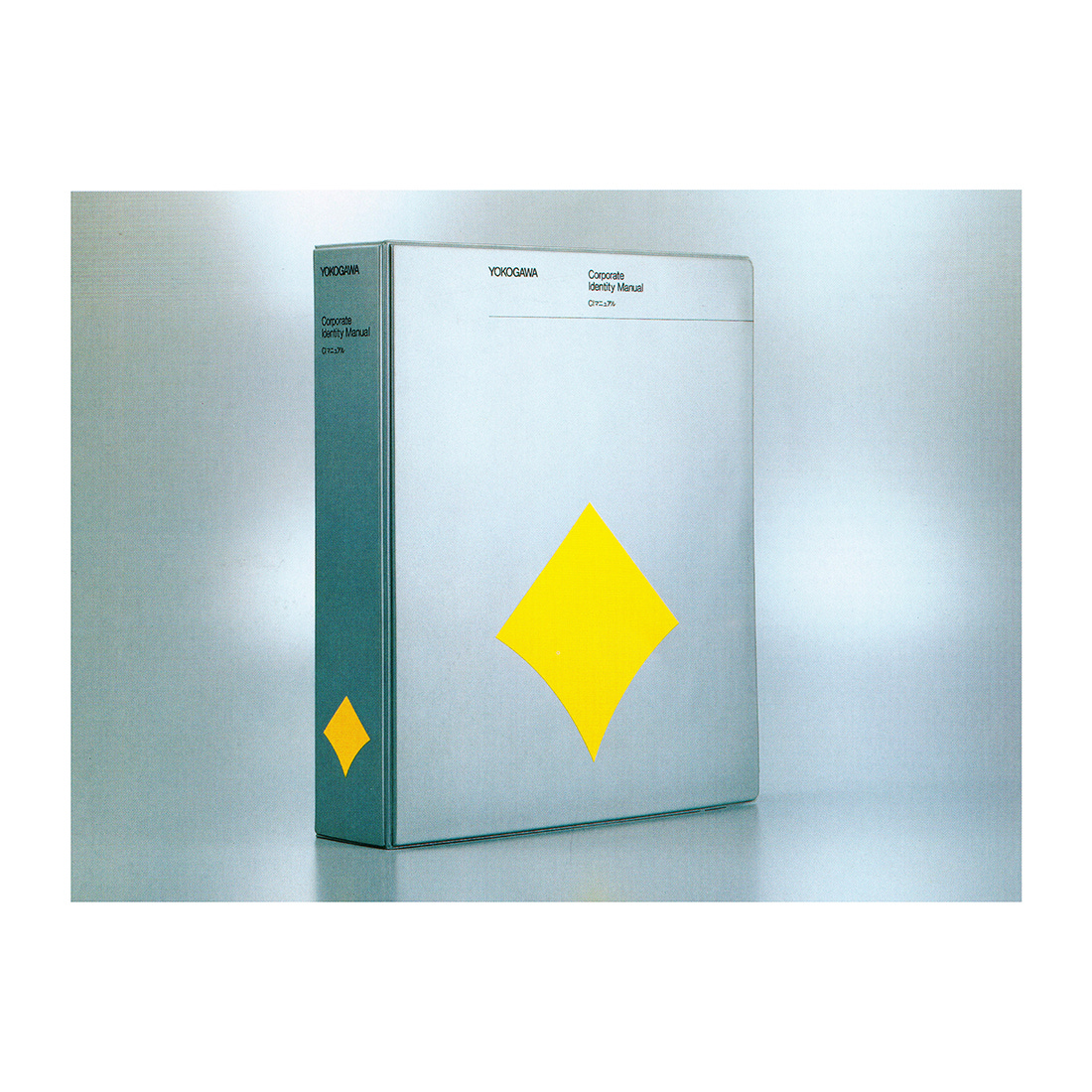
Under the leadership of Japanese art director Rei Yoshimura (Daiei, Tokyo Metropolitan Government), who oversaw a team of designers (XICO and Fuki Ito) and typographer Taro Yamashita, a new corporate image for Yokogawa would be developed. This would culminate in the publication of a formalised Yokogawa corporate identity manual in 1986
Unlike manufacturers of consumer equipment, it had been difficult for the industrial equipment makers in Japan to develop strong corporate images. This presented a new leadership opportunity for Yokogawa and the design team.
The new corporate identity devised by Yoshimura grew from a new logo, described as a ‘flag-like image’ that intended to reflect Yokogawa’s values and ideals, and be a ‘powerful emblem’ for Yokogawa’s employees to rally around. ‘Like a lodestar that points where one should go' the logo should represent the corporation’s obligation to society and reason for existing.
The logo was inspired by the sun as a constant provider of energy to all living things on earth. The sharp straight lines of the logo intended to call to mind the precision, accuracy and sophistication of Yokogawa’s products and solutions. The soft curves, in contrast and giving the diamond its distinctive character, would be an indication of ‘kindness’ ‘heart’ and warmth’ and convey the forward development of the corporation–working in partnership with its customers–and ‘unswerving’ course.
As a whole, the diamond shape is described in the brand manual as exhibiting ‘balance’ and ‘stability’ as an expression of Yokogawa’s determination and confidence, its aim of working towards a sustainable society and, just like the sun, benefiting of all humankind through the development of the industrial sector.
The colour of the logo also references the bright yellow of sun. This was known as ‘Yokogawa Yellow’ and represented energy and benevolence. Yellow was used alongside a sky blue, an earthy green and industrial grey as further articulations of conscientiousness and industriousness. The logo was combined with a ‘light’ logotype set in all uppercase Helvetica, which then served as the corporate typeface throughout.
Together, logo and colour sought to appeal to both the eyes and minds of those inside and outside of the corporation, and convey the mission of corporate and social responsibility Yokogawa were committed to fulfilling. The mission continues today under the tag line ‘Co-innovating tomorrow’, which was introduced on the 100th anniversary of the company in 2015. This is used alongside the unaltered version of the logo designed by Rei Yoshimura in 1986.
You can find all the Yokogawa assets and thousands other brand assets on Brand Archive.
Thank you for subscribing to Logo Histories. If you enjoy reading this short you may also enjoy these resources from the same team:
Brand Archive – Research tool for brand designers.
LogoArchive Website – Searchable modernist logo archive & research tool.
LogoArchive Shop – Vintage design books & LogoArchive Zines.
BP&O – Contemporary design editorial.


That very logo is a symbol of hard work and determination. That's exactly what I'm getting here. Its designers must've been so proud to make it.
Whoa...should be selected for worst logo EVAH award...now yes, when you light it up with lots of fancy electronics it looks pretty good...but on it's own? Total DUD....