


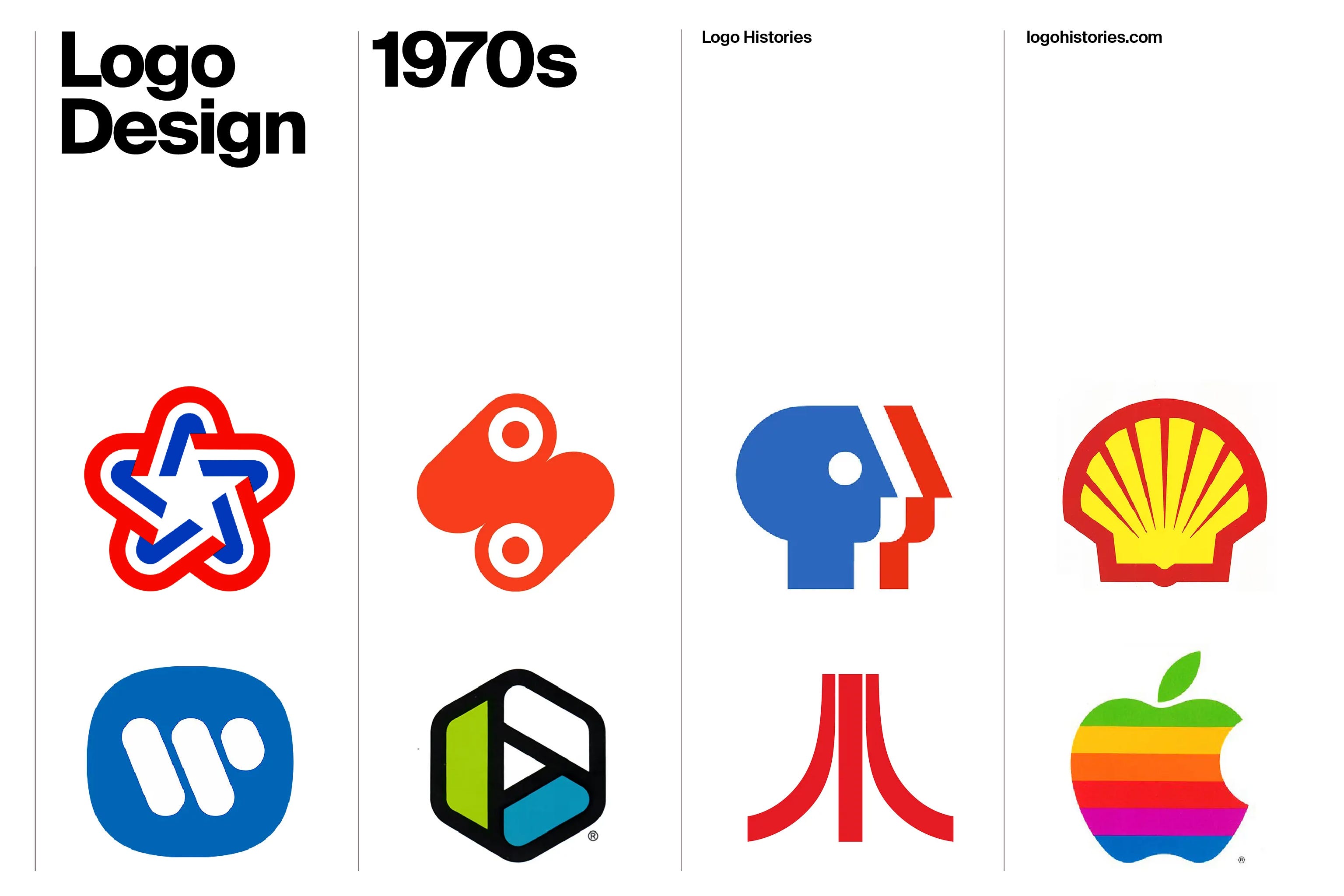
Designers in the 1970s continued to build on the learnings and commercial experience of the post-war decades. As businesses continued to expand internationally, as they reached into new markets and grew into increasingly complex organisations, coherent and cohesive visual identities gained importance. A logo needed to work harder, to do more than identify a company. It had to hold together businesses operating across different products, places and people.
Globalisation was accelerating. Multinational corporations were growing in scale and reach, while mergers and acquisitions brought disparate businesses under single corporate names. Airlines connected expanding international networks, manufacturers sold the same products in multiple markets, and public services and broadcasters were addressing increasingly large and diverse audiences. A clear and consistent visual identity offered a way to make these organisations understandable.
Many of the ideas that had emerged during the previous two decades now reached maturity. The principles of the International Typographic Style, the growth of corporate identity programmes and a belief in design as a rational, systematic discipline encouraged designers to reduce identities to their most essential forms.
The result was a particularly rich period of logo design.
Geometric symbols, monograms and carefully crafted wordmarks could be reproduced cheaply and consistently, recognised quickly and understood without necessarily relying on language. A successful logo could appear on the side of an aircraft in New York, a business card in Tokyo or a television screen in Munich and remain unmistakably the same.
This practical requirement helped produce some extraordinarily economical pieces of graphic design. Designers including Otl Aicher, Walter Landor and Lance Wyman developed corporate identities and logos in which simple forms and precise colour palettes and typography carried complex ideas.
At the same time, technological changes was creating new contexts for logos. Television demanded marks that remained legible on low-resolution screens. Improved printing and reproduction processes expanded what was possible in packaging and advertising. Large-scale signage and transport systems required identities that could be recognised rapidly and at a distance.
Logos were also increasingly understood as only one component of a much larger system. Colour, typography, grids, signage, packaging, uniforms, vehicles and architecture could all be coordinated to present an organisation as a coherent whole.
This is what makes the logo design of the 1970s particularly interesting. Popular nostalgia often remembers the decade through expressive lettering, warm colours and the visual language of popular culture. Corporate identity tells another story: one of reduction, systems, geometry and remarkable graphic discipline.
Many of the symbols created during this period survived for decades. Some remain in use today. Others have disappeared, but continue to demonstrate how much information can be compressed into a handful of lines, shapes and letters.
Logo Histories brings together 100s of the concepts and contexts that gave shape to logos of the 1970s. Through this, designers can situate themselves within a canon, make sense of many of the principles that were established in the past, yet remain relevant and powerful understandings in the present.
Explore all 1970s logos in the Logo Histories archive →

Olivetti, 1971
Walter Ballmer
Walter Ballmer’s 1971 logotype for Olivetti condensed the Italian company’s name into a sequence of distinctive rounded forms. Its apparent simplicity was the product of careful construction and formed part of Olivetti’s unusually sophisticated relationship with graphic design, architecture and art.
Read the history of the Olivetti logo →

Expo ’74, 1972
Lloyd L. Carson
Created for Expo ’74 in Spokane, Washington, Lloyd L. Carson’s symbol translated the exposition’s environmental theme into a compact graphic logo, designed to work across many of the applications required by a major international event.
Read the history of the Expo ’74 logo →

ZDF, 1973
Otl Aicher
Otl Aicher’s work for German broadcaster ZDF demonstrates the increasingly systematic approach to identity during the decade. Rather than treating the logo as an isolated object, Aicher developed a visual language capable of giving a varied television service a consistent identity.
Read the story of Otl Aicher’s ZDF identity →

Bicentennial Council, 1973
Lance Wyman and Bill Cannan
Designed for the Bicentennial Council of the Thirteen Original States, Lance Wyman and Bill Cannan’s symbol is a characteristically economical combination of geometry, symbolism and visual immediacy.
Discover the Bicentennial Council Logo →

San Francisco Municipal Railway, 1974
Walter Landor
Walter Landor’s identity for San Francisco Municipal Railway transformed the abbreviated name Muni into an ingenious piece of interlocking lettering. Introduced in 1974, the symbol became affectionately known as the Muni “worm” and remains one of the most distinctive pieces of American civic graphic design.
Read the history of the Muni logo →
A decade of systems
Taken together, these identities reveal something more interesting than a recognisable 1970s aesthetic. There is no single visual style connecting them.
Instead, what many share is an attitude towards design: the belief that a small number of carefully controlled visual elements could give clarity and personality to organisations becoming larger, more complicated and more international.
The logo sat at the centre of that system.
And perhaps that explains why so many logos from the period still feel striking today. They were designed for a world of expansion and complexity, but their answer to that complexity was often radical simplicity.