Uniformity within diversity
Otl Aicher's 1973 logo and corporate identity for ZDF.
This post is supported by LogoArchive – The home of historical logos. Discover over 4000 of history’s greatest designs from the world’s finest designers. Updated every single day. Always find the logo inspiration you need for your next logo or branding project. Start here.
The German television station ZDF (Zweites Deutsches Fernsehen, Second German Television in English) was launched on April 1st, 1963. This would give the Federal Republic of Germany its second channel and was funded through a license fee and advertising, and controlled by public organisations. It was created to ‘compete’ with ARD, the first channel, which was considered ‘too critical of the government’. ZDF intended to be independent of federal and local government, and rebalance political discourse.
By the 1970s, it was felt that the fixed logo of the station was incompatible with the heterogeneous nature of its programming, which was fundamentally time and event sensitive, and manifold in its content. With this in mind, in 1973 Otl Aicher was commissioned to develop a corporate image ‘appropriate for a television channel’, one that could resolve the conflict between heterogeneous programming (in content, journalistic style and artistic expression) and a requirement to make each appearance of the ZDF enterprise identifiable and consistent, both on screen and throughout its print materials.
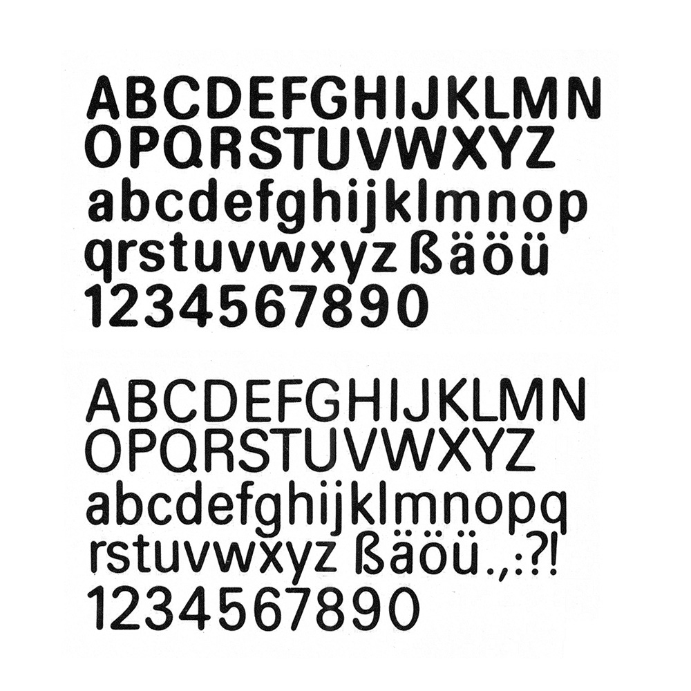
Aicher's proposal would avoid artificial decoration and ‘company heraldics’ and instead, focus on devising a ‘relatively simple’ number of graphic elements; a custom typeface and colour palette.
The requirements for the ZDF typeface was that it be a functional carrier of information with the fastest possible means of comprehension whilst also establishing a coherent identity across diverse programming.
Preliminary tests had shown that Univers, designed by Adrian Frutiger, best met these conditions. However, these had also shown that the sharp-edged nature of the typeface was lost on the screen, and in particular when used at smaller sizes. The brightness and resolution of the screen (a constraint) thus defined the evolution of the typeface, with Aicher adapting this into a custom rounded version that maintained the contrast and legibility of the thicker vertical and thinner horizontal strokes (also see Gerstner’s Shell). Further variations were created to increase readability and establish hierarchy in a variety of contexts. This included three different weights and a condensed version. Univers 55 was used (unmodified) as body copy for printed materials and subtitles.
The common abbreviation ‘ZDF’, set in the new custom typeface, became the basis of a new logo. This abbreviation offered flexibility in application, with it being much shorter than the full name and limited the possible negative connotations related to ZDF being the ‘number 2’ station.
The precisely defined relationship between letters, and the new aesthetic qualities of Univers, shaped by its on screen appearance and retaining its legibility, established the unique character of the logo. As this was meant to be used primarily on screen–a place where movement and change was a constant–it was developed into a number of variations. It changed size and colour, and was repeated at different scales, turning it into something playful, increasing the ‘attention value’ and suggesting the diversity of the television programs that were broadcast.


