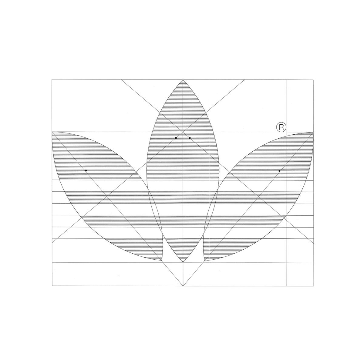
Triple stripes and a Trefoil
Hans Fick's Trefoil and Adolf Dassler's logotype for German sports brand Adidas.
The West German sportsman and inventor Adolf Dassler was ahead of his time. Long before the creation of leisure wear and sports science, Dassler was endeavouring to perfect footwear for sports people.
Dassler set out first by making simple plimsolls in 1920, registering ‘Gebrüder Dassler Schuhfabrik’ in 1924. Later, in 1949, he would start over again and founded ‘Adi Dassler addas Sportschuhfabrik’. With a team of 47, he designed and registered the first sports shoe that featured three stripes.
A problem arose when Dassler went to register the company and the name 'addas'–a combination of his first and last name–was similar to an existing children's shoe business. Dassler then changed the company name to 'adidas', but not before printing his business cards.
The company, at this time, used a logo created by Dassler (who also came up with the 3-Stripe motif). This featured a composition of a simple illustrated spiked boot with the three stripes and a geometric all-lowercase logotype with pronounced ascenders emerging from the ‘d’s. Around this was ‘Adi Dassler Sportschuhfabrik’ set in an all-uppercase.
By 1950, this composition was reduced to just Adidas, and the lettering was refined, tightening the spacing and reducing the height of the ascenders to create a more useable and compact logotype. The ‘a’ then acquired points. This simplification and geometry reflected the functional aspects of Adidas products and was considered ‘highly-modern’ for the time. This was used with K+E Novaboard Blue.
The logo was further revised in 1967, becoming even more compact and with improved balance. It featured shorter d's lined up with a square tittle over the ‘i’, further tightening of the letter spacing, and the letter ‘a’ returned to a squared-off at the top.
What would later be known as the ‘Trefoil’ was the product of a unique intersectional moment in time. Ahead of the 1972 Summer Olympics in Munich, and as Adidas expanded into the apparel sector, an opportunity emerged to create a symbol that could be launched on the world stage. Emblazoned on a new generation of running shoes, the symbol intended to be associated with the highest level of achievement which would then be transferred to new lines Adidas would launch. This symbol would then accompany the logotype and 3-Stripes, broadening the brand’s palette of visual assets and support the planned diversification of products.
The new symbol needed to reflect the spirit of the Olympics and performance, the diversity of the brand (from performance sportswear to leisurewear). Further, it was felt that the three stripes had become limiting, and somewhat ill-suited to diversified fashion lines. For examples, on tracksuits they visually dominated and left the designers with little room to play with. Dassler realised that occasional sports such as jogging, aerobics and fitness would provide sufficient space for brand growth. That also meant more diverse lines and styles. Having all these dominated by the 3-Stripes would not support this vision.
The Trefoil was devised by Freelance Nuremberg-based designer Hans Fick. It was inspired by the 3-Stripes and selected from more than 100 proposals. It depicted three outstretched leaves, calling to mind the laurel leaves that crowned victors of athletic competitions of the ancient Olympic games. This was rendered in an abstract and formalised manner to create a flexible and scaleable symbol. Running through this would be the 3-Stripes, this time, within the negative space of the leaves and appearing less dominant. This was then paired with the revised version of Dassler’s logotype.
The Trefoil, even when scaled down, would be distinctive and interesting enough to catch the eye on the back of sports shoes, on the strings of a tennis rackets and on the surface of a ball, and act as ‘leitmotif’ across a diverse range of equipment and garments, for sports professionals and those taking up leisure activities. The three stripes that run through the leaf would be enough to connect the symbol with the sportswear manufacturer. Further versions of the logotype and symbol would be added between 1971 and 1989. These included a halftone and outline variations, increasing usability.


Despite the creativity of the logo, it was not meant to put across a ‘creative and audacious image’ - one that would detract from the ‘solidity of the product’. Rather, it was a symbol of products that could be relied on. It also afforded the designers more room for a range of stylistic expressions across the coming decades (see above).
The Trefoil would continue to be used right up until present day, but repurposed firstly as a representative for performance apparel and later for ‘Adidas Classics’, the company’s lifestyle label, now ‘Adidas Originals’. This was used alongside the logotype that remained unchanged.
In 1989 Creative Director Peter Moore would formalise the Adidas brand, delivering a comprehensive Housestyle Manual (from which many of the images in this article are drawn. A year later, he also would design the '3 bars' logo for performance products. This was inspired by the 3-Stripes, reconfigured into sloping bars and composed in a way that suggested a mountain, representing the ‘challenges to be faced’.
Discover more Adidas brand assets and assets from hundreds other historical and contemporary brands at Brand Archive.
Thank you for subscribing to Logo Histories. If you enjoy reading this short you may also enjoy these resources from the same team:
Brand Archive – Research tool for brand designers.
LogoArchive Website – Searchable modernist logo archive & research tool.
LogoArchive Shop – Vintage design books & LogoArchive Zines.
BP&O – Contemporary design editorial.


Ive always been curious as to what the trefoil might mean! Turns out its also derived from an old greek tradition of laurel leaves and a crown to symbolise victory.
Amazing research!