This post is supported by LogoArchive – The home of historical logos. Discover over 4000 of history’s greatest designs from the world’s finest designers. Updated every single day. Always find the logo inspiration you need for your next logo or branding project. Start here.
By the mid-1960s the British Oxygen Company was manufacturing many other products aside from oxygen. These included gases for industry and medicine, welding, cutting and surgical equipment, metals and alloys, chemicals and cryogenics, amongst many other things. As well as expanding into new industries the company was well-established in countries other than Great Britain, so much so that 'British', just as 'Oxygen', were considered to not be in support of future growth. As part of a broader public relations push, to keep up with its expansion and acquisition, a number of alternative names were discussed, with the initials BOC finally being settled on.
BOC commissioned British design studio Wolff Olins to design a corporate identity (CI) that would provide 'a vigorous projection of the company’ which was capable of being applied on an ‘international basis’ and bring into coherence the different names of the companies that were part of the BOC group. Seeking to better understand the existing image of BOC, Wolf Olins interviewed various stakeholders, from the chairman to the chief executives, from middle management to truck drivers. One revelation unearthed was the time it took for the company to act.
One of the managing directors told the research team that, in his opinion, BOC had the' nervous system of a dinosaur: if it decided to do something in its brain, by the time the information got down to its big toe a lot of time had elapsed.' A major part of the programme then would be to address this time-lag by studying its current communication system and offering solutions.
This included a look at the different types of stationery and literature in use, with a view to rationalisation and leveraging economies of scale to speed up production. Further, Wolff Olins looked at the types and numbers of vehicles owned by the company, as well as their renewal rate and frequency of painting. Further, the studio delved into the control of budgets for producing literature, painting vehicles and painting premises, etc. and finally the routines followed to action the co-ordination, production and application of changes. Following this research stage, work began on the BOC corporate image.
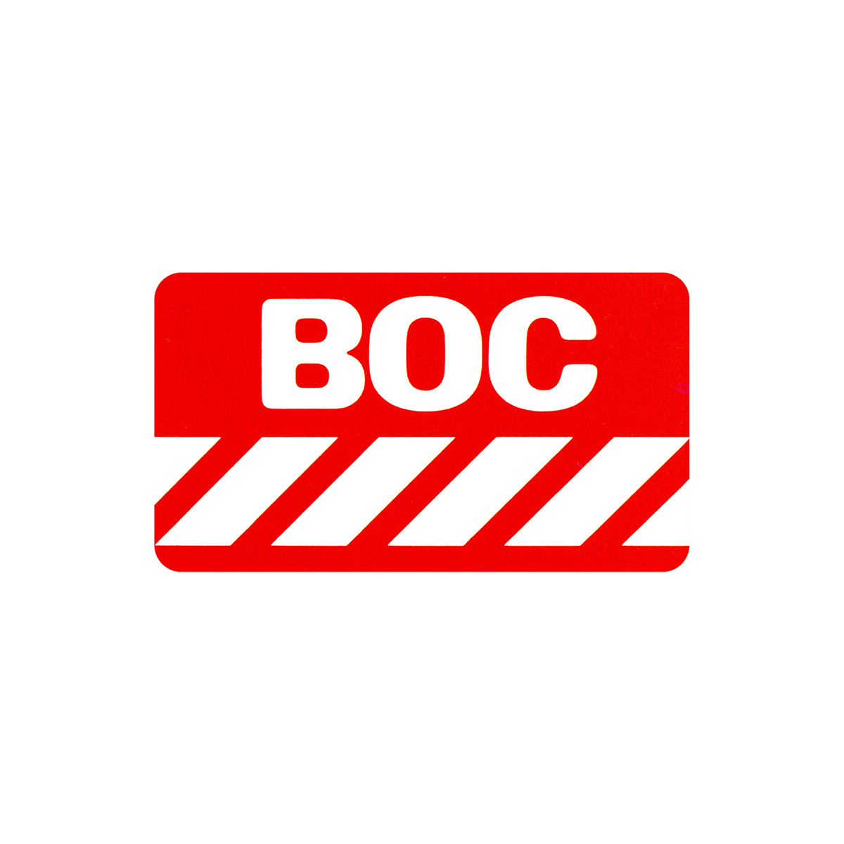
Red and white stripes were decided on at an early stage. It was felt that these would not only be clearly recognisable from a distance and easily applied to a multitude of items; from industrial equipment and transport, to packaging and stationery, but would also ‘counteract’ the ‘institutional’ and dated image that had been created by BOC's existing image and house colours of maroon and gold lettering. The company’s new initials were then drawn up in various typefaces.
A custom hand drawn rounded typeface was selected as it formed a strong and memorable contrast to the sharp diagonal stripes that would be used below. Rounded corners were added to the container to match the rounded lettering. As a basic rule, the overseas group companies were presented in the uppercase rounded letterforms while the subsidiaries and associated company names appeared in sentence case Univers. Univers and Univers Bold was also used as the typeface for signs, vehicles and stationery.
With this basic logo drawn up, the design team created a presentation with several hundred variations of its use across stationery, signage and vehicle liveries to showcase its flexibility. These included the ways in which the symbol could be used with overseas companies' names like Canox (Canadian Oxygen); Zamox (Zambian Oxygen); IOL (India) and CIG.
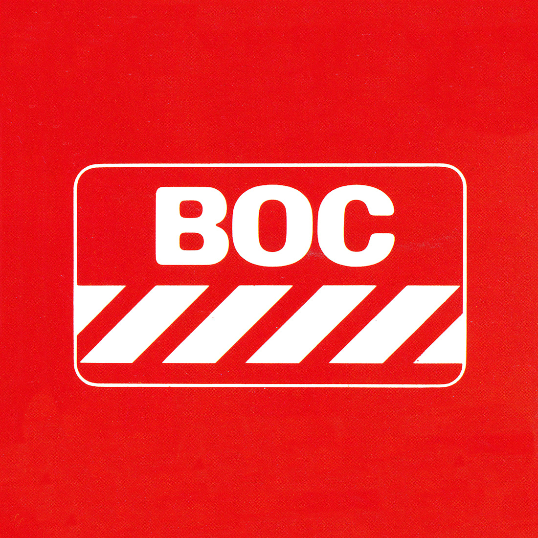
The logo could either be used as an ‘overall treatment’ or could be contained; the letters could be used on their own; and the company logo could be dominant or subordinate to a subsidiary or brand name.
This was then put before the BOC Management Advisory Board for their approval. Nine months after the designers had first been commissioned, the approval was given and the various aspects of the programme were developed for application. At their simplest, the instructions given were no more than 'these are the colours and the proportions: put stripes on things’.


A version of the presentation was made in the form of slides and a taped commentary. This was sent to all BOC companies overseas and was all the persuasion used to get these companies to adopt the scheme. Many did so quickly and enthusiastically. Care was taken at this early stage to avoid dampening enthusiasm by being too fussy about the details of application, and quite different to many of the modernist CI’s of the time. A manual was eventually produced, three years later to help maintain the CI and to instruct new executive staff.
The scheme was considered by BOC to have achieved all its objectives. A measure of its success was the ease and rapidity with which it had been adopted overseas. Isolated subsidiaries were made to feel part of a world-wide entity, and internal morale was enhanced, with drivers taking pride in their newly painted vehicles.
Thank you for subscribing to Logo Histories. If you enjoy reading this you may also enjoy these resources from the same team:
New! Wittl – Job posting and applicant tracking tool.
LogoArchive Website – Searchable modernist logo archive & research tool.
LogoArchive Shop – Vintage design books & LogoArchive Zines.
BP&O – Contemporary design editorial.
Brand Archive – Research tool for brand designers.
Thank you for talking about another logo that you've so thoroughly researched.
So not boards of Canada then? 😉