A mobile medium
The coordinated rollout and the role of vehicle liveries in rebrands

‘Insights’ is a new series from Logo Histories, and draws together learnings from across the archive. In this article, we take a look at vehicle liveries and coordinated rollouts.
When a corporation reached a certain size or expanded into international markets, the deployment of a new corporate identity could take years due to their scale and/or complexity. In certain industries, such as aviation, where economic conditions demanded fleets be on the ground for as little time as possible, a coordinated rollout simply wasn’t an option. For KLM in the 1960s, grounding and repainting aircraft had to be done incrementally over many years.

Where a corporation had the resources and opportunity to execute a massive coordinated push, it could use an ‘overnight’ change (usually within a few months) to maximise the exposure and combined effect of a rebrand to generate interest and impress upon customers a change in vision and a new direction.

For a corporation such as Japanese telecoms company NTT, which had many of public-facing buildings in 1984, the effort to change signage quickly across the country was seen by PAOS, the design studio in charge, as being of strategic importance, so much so, it commandeered thousands of fabricators to make this happen. Another part of this programme was its liveries. NTT’s fleet of over 40,000 service vehicles was a valuable tool, a ‘mobile medium’ to project NTT's new image. This projection was vital as the company entered a new era of free market competition in the Japanese telecoms industry. This coordinated rollout wan’t something that the emerging competition could do, so provided NTT with an high visibility advantage.

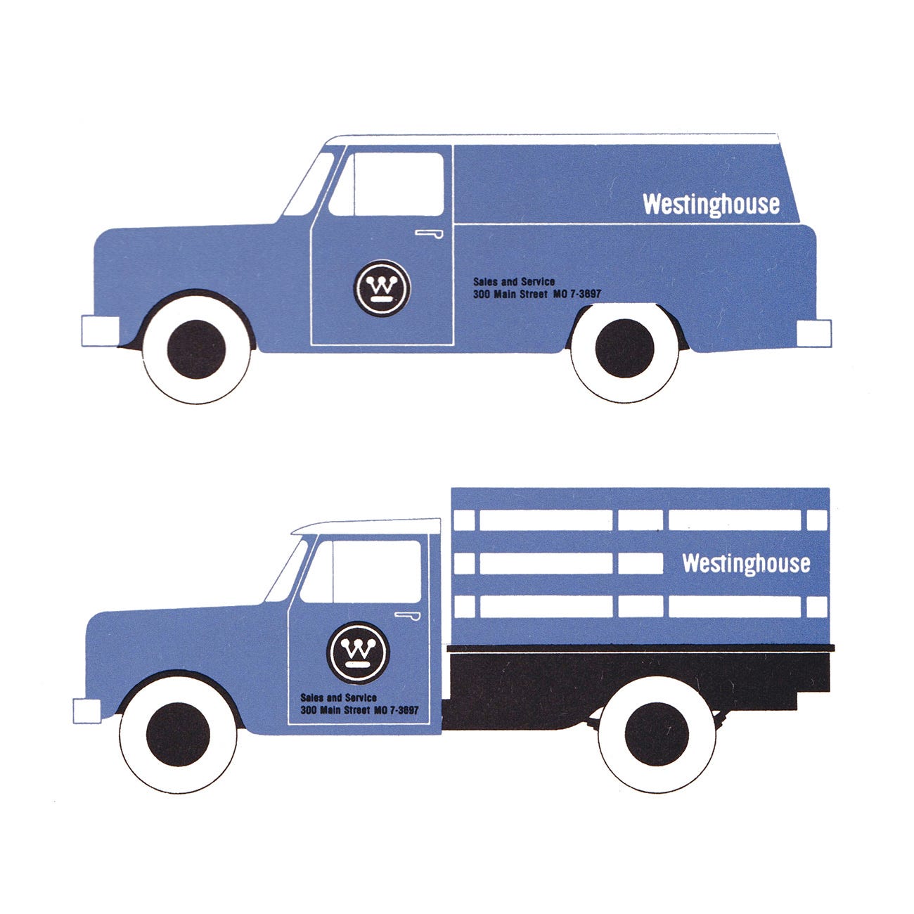
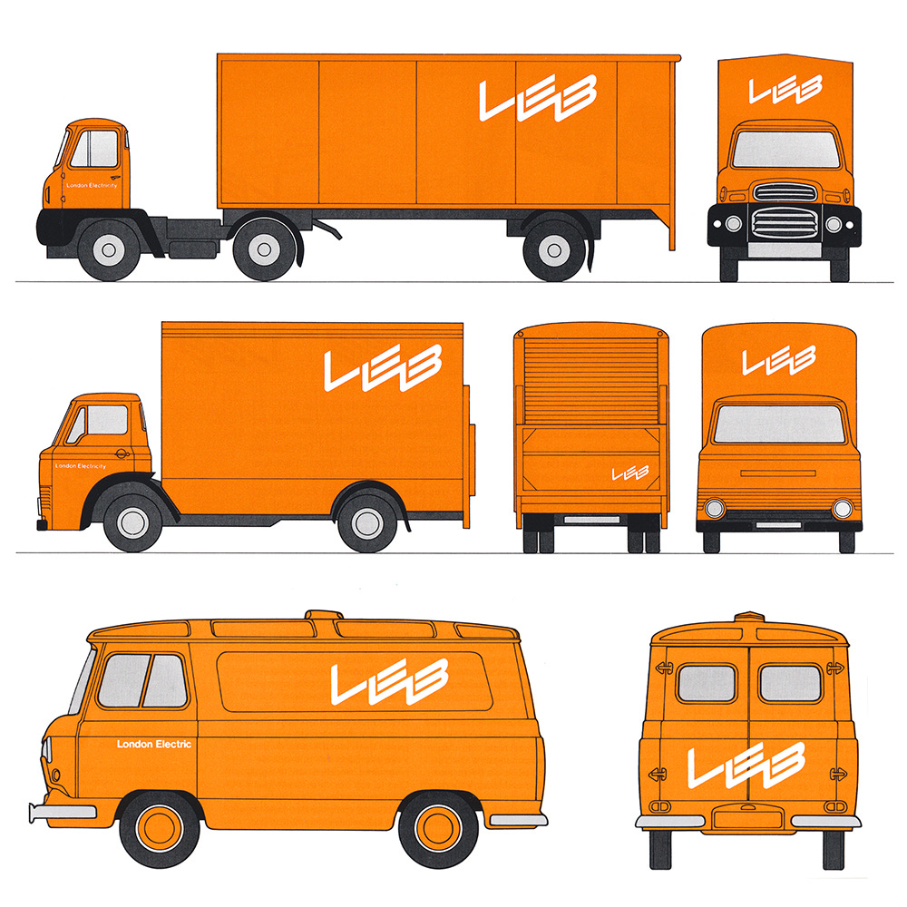
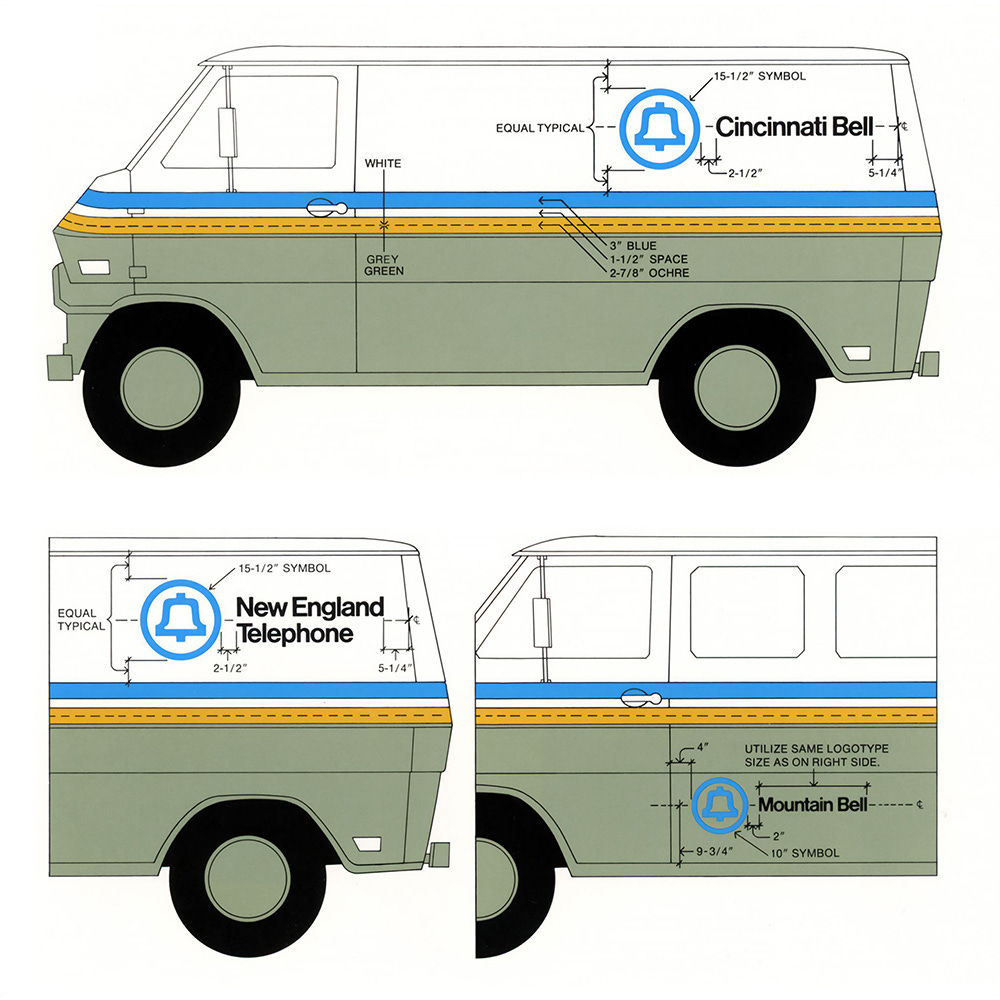
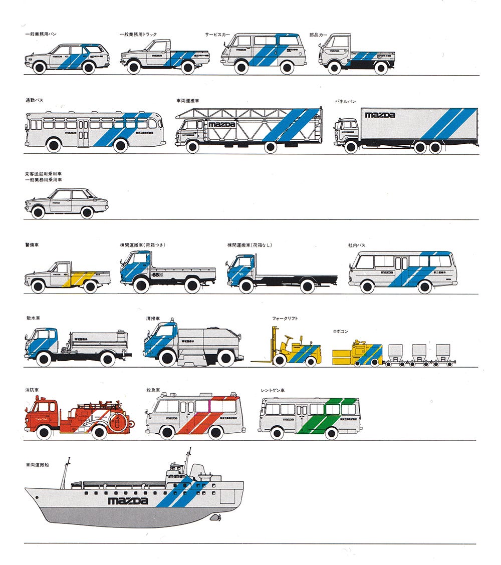
With the ‘mobile medium’ of the vehicle livery in mind, this issue of the Logo Histories’ newsletter is illustrated with a selection of examples from the archive. Above, you can see how colour, dynamic bands and stripes were used to clearly connect different vehicles type, differentiate these brands from others and make sure that they were clearly identifiable as they were on the move.
Next on Logo Histories: Claude Neon
Last week on Logo Histories, I shared the story of Mitsuo Katsui's 1972 logo Kawasaki Shinkin Bank. Next week, I’ll cover Gottschalk & Ash’s work for outdoor advertising company Claude Neon. Don’t miss out on this and a unique archive of over 100 other Logo Histories by subscribing here.
Subscribe today and receive new histories straight into your inbox each week. Subscribers to our paid newsletter also receive 10% discount from LogoArchive Shop.
If you enjoyed reading Logo Histories also check out these projects:
Brand Archive (Beta) – Research tool for brand designers.
LogoArchive Website – Searchable modernist logo archive & research tool.
LogoArchive Shop – Vintage design books & LogoArchive Zines.
BP&O – Contemporary design editorial.
Extra Issue – Unlocking opinion and insights from the past.


