Channel 5 & you
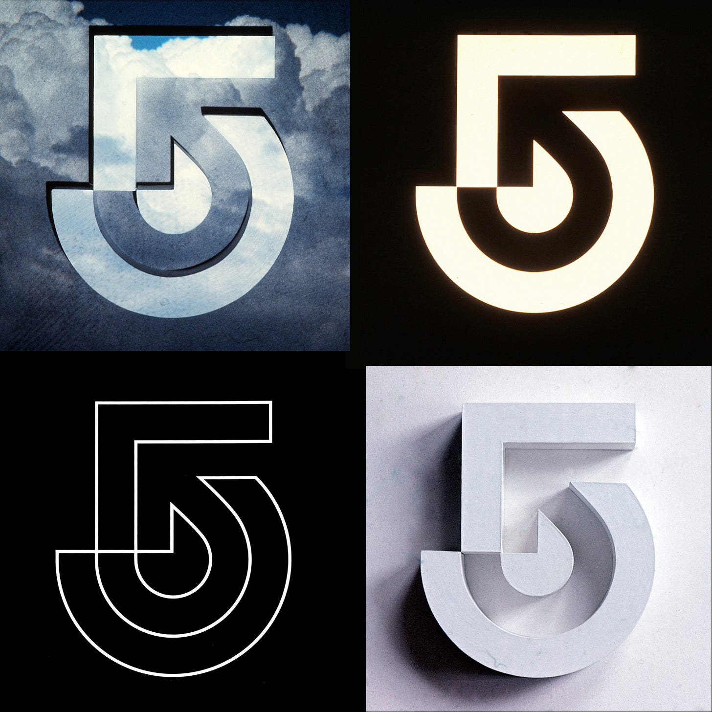
Wyman & Cannan’s 1972 logo for Channel 5 (Boston Broadcasters).
This post is supported by LogoArchive – The home of historical logos. Discover over 5000 of history’s greatest designs from the world’s finest designers. Updated every single day. Always find the logo inspiration you need for your next logo or branding project. Start here.
In 1969, Boston Broadcasters promised that they would air more local programs than any other station in the United States. This bold claim led to them winning a construction permit to build a new television station on channel 5, in the city of Boston Massachusetts. They would become the city's new ABC affiliate, WCVB-TV - Channel 5, and replace the previous channel 5 occupants who were being investigated for allegations of impropriety.
To design the new logo and corporate identity, Boston Broadcasters approached graphic design firm Wyman & Cannan. The firm, founded by designers and former colleagues Bill Cannan and Lance Wyman, was formed following Wyman’s return to New York in 1970. The pair had previously worked together at George Nelson & Company, before Wyman departed to spend several successful years designing many well-known logos in Mexico, including the Mexico ’68 Olympic symbol.
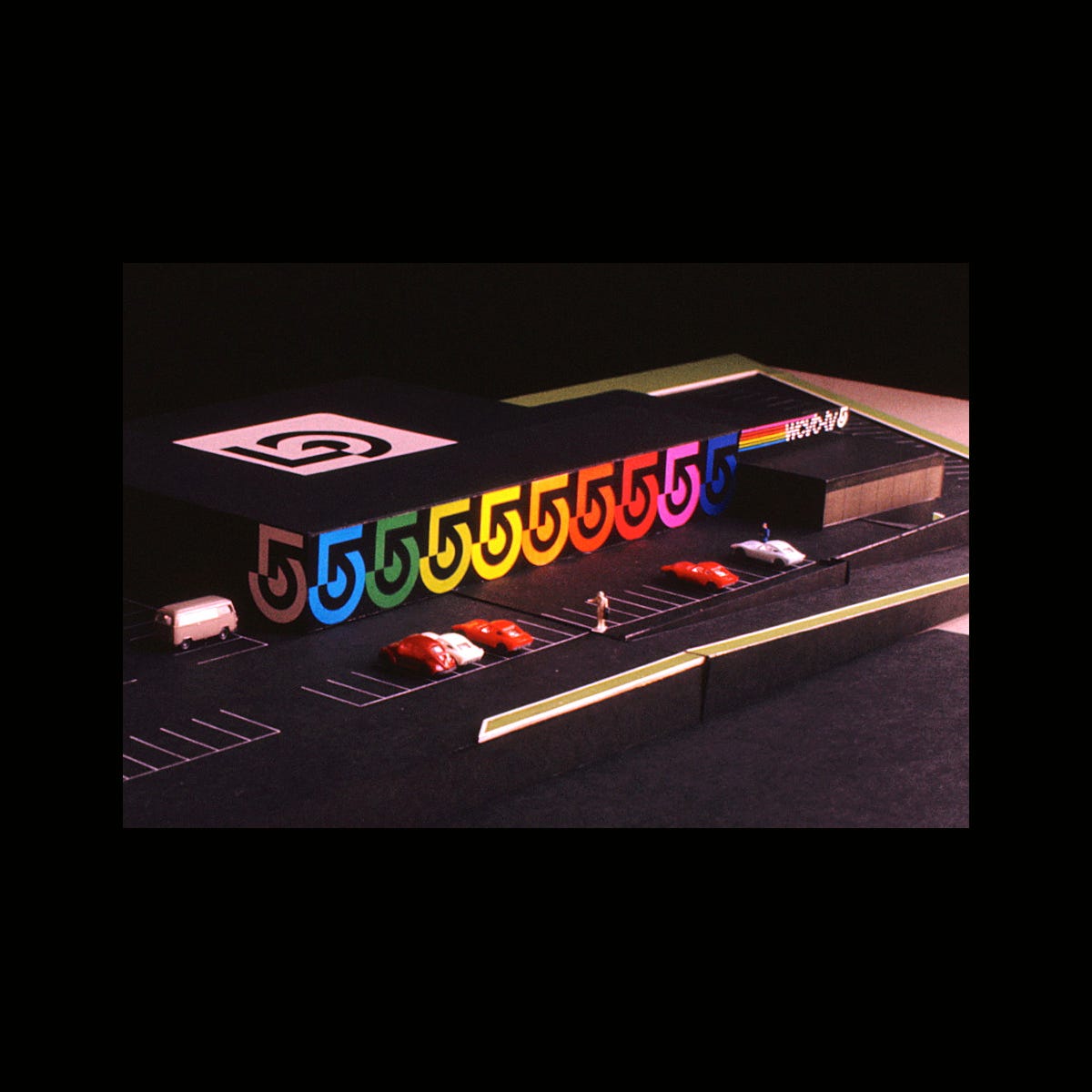
As a new design studio, the Channel 5 project was their first major client. Cannan and Wyman were assisted by designer Herb Hong in creating a dynamic logo and visual identity. Whilst the logo would need to be a unique identifier of the new channel, it was required that the logo be applied to many elements to strengthen attribution. The logo’s development would therefore have to consider scale and be versatile for a high number of both common and more unusual creative applications.
Continue reading to discover how the Channel 5 logo was constructed, see some of its creative applications and how colour was introduced.
Following several stages of development – involving experimentations of form, colour and line – a cohesive and contemporary corporate identity was achieved. The designers utilised concentric circles and a directional arrow to form a stylised ‘5’ logo. These two geometric elements were superimposed at a 45 degree angle within the ‘5’ and slightly altered to generate a curved arrow within the negative space.
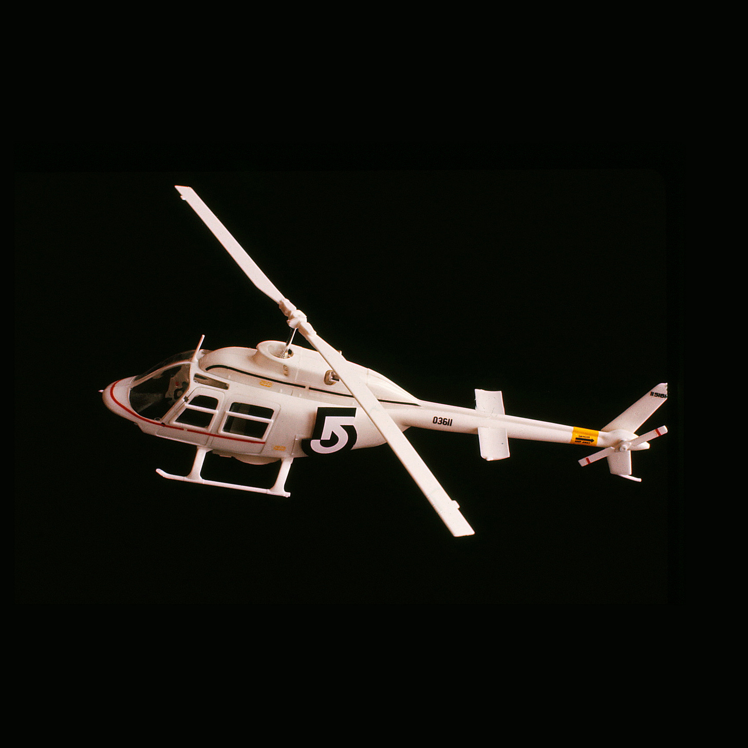
Thanks to the geometric, linear and abstract construction the logo was highly adaptable. Development saw various creative ideas realised, from mobile broadcasting vans to stationery – the designers developed many potential placements of the logo varying in scale and colour. Whilst the logo would frequently appear in single-colour, a multi-colour band was used to promote the all-colour broadcasting capabilities of the new station.
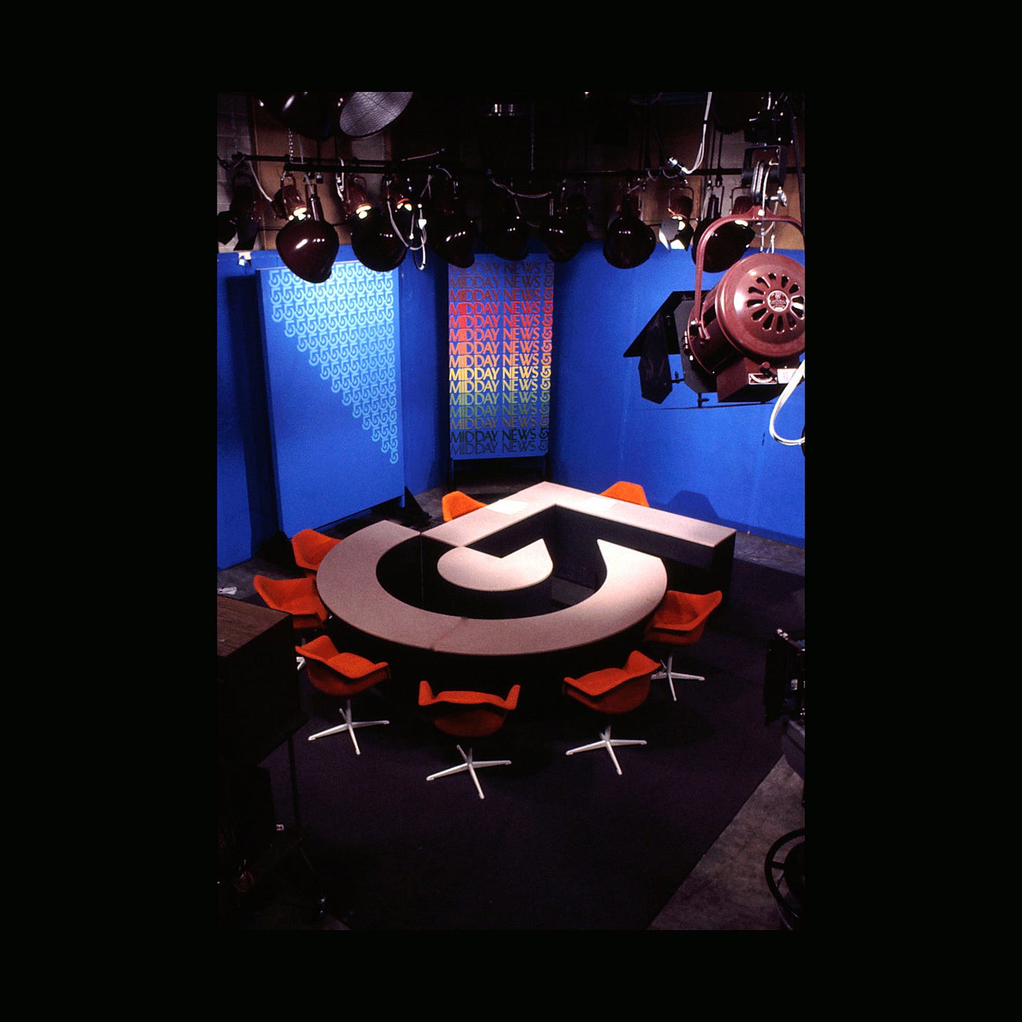
In 1972, the logo made its debut, with the commencement of WCVB’s operations. The logo succeeded within its many use-cases, both for broadcast and in print. This notably included the station’s first News Set, with a desk configuration mirroring that of the logo’s structure, allowing for communication between the co-anchors and the broadcast guests.
Simple yet memorable, the iconic logo has remained a key asset to the Boston channel’s identity and remains in use to this day.
Discover more Channel 5 brand assets and assets from hundreds other historical and contemporary brands at Brand Archive.
Thank you for subscribing to Logo Histories. If you enjoy reading this short you may also enjoy these resources from the same team:
New! Portal – Design-driven jobs board and applicant management.
Brand Archive – Research tool for brand designers.
LogoArchive Website – Searchable modernist logo archive & research tool.
LogoArchive Shop – Vintage design books & LogoArchive Zines.
BP&O – Contemporary design editorial.


What do you think of Bill Cannan and Lance Wyman's work for Channel 5? Share you thoughts below. Also, what logo history should we share next?