This post is supported by LogoArchive – The home of historical logos. Discover over 4000 of history’s greatest designs from the world’s finest designers. Always find the logo inspiration you need for your next project. Start here.
Greater Manchester Passenger Transport Executive (abbreviated to GMPTE) was a British public service originally formed in 1969 as ‘South East Lancashire North East Cheshire’, more commonly referred to as SELNEC.
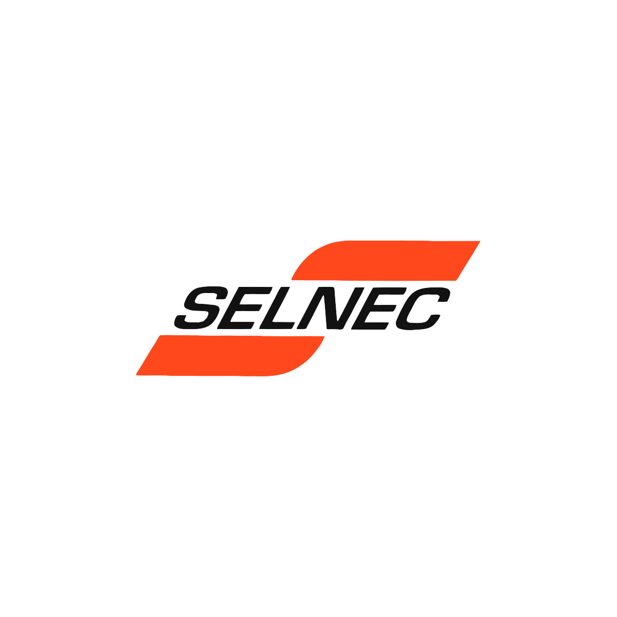
SELNEC had branded its transport network and vehicles with a ‘dynamic S’ and an italic wordmark set through the centre, and employed an orange and white colour palette.
To differentiate each of the divisions that made up SELNEC the ’S’ was given a unique colour: magenta for Northern, blue for Central and green for Southern. For corporate operations, the parcel operations and coaching fleet, the 'S' remained orange.
In 1974, when the metropolitan county of Greater Manchester was formed, SELNEC was replaced by GMPTE, with the Greater Manchester County Council taking over the joint transport authority.
With the intention of continuing to expand it services by acquiring other operators (later this would include the Wigan Corporation which had a fleet of over 130 vehicles), a new visual identity was sought out to help unify the growing fleet and geographical extent.
To support this, the name Greater Manchester Passenger Transport Executive would be simplified to Greater Manchester Transport.
The goal of Greater Manchester Transport was to make journeys as easy, comfortable and attractive as possible and ensure recognition across places and for all people.
Establishing a unified design standard, applied across ‘common decor’ of bus stations, staff uniforms and vehicle liveries, would be essential in fulfilling these objectives. Part of this would include the design of a new logo.
The new Greater Manchester Transport (GMT) logo would need to be highly flexible; able to be etched into glass on the side of bus shelters; applied to railway station name boards; be used across rolling stock and bus liveries; and have the ability to be scaled up and down without diminishing its recognition.
With expansion and acquisition, there would also be the need to establish a symbol that staff–be that those already working at GMT or newly inducted–could get behind and would raise morale. Further, the new logo and identity would show them that they are part of an ‘efficient and caring organisation which had its sights set on achieving the highest possible standards’. As outlined in the guidelines, the ‘first-line salesman’ would be the drivers and their vehicles.


Overseeing the development of the new logo and visual identity would be renowned British designer Kenneth Hollick, he would develop a solution based around a distinctive ‘M’.
The logo was designed to represent, in a simple, modern and distinctive way, the organisation and the service provided, and function as a recognisable and unifying symbol for staff and travellers.
Through its parallel tracks, the design suggested a ‘two-way road pattern’, and the connecting of two points, from A to B (also see: CN). This then formed a distinctive double ‘M’ shape that would associate the transport network with the Metropolitan County of Greater Manchester. This would be used inside a square with rounded corners, inside an orange rectangle, or on a white background, increasing its flexibility and applicability to a variety of contexts.
The logo could be used in isolation from the logotype but the logotype, it was stipulated, could not be used on its own. The logotype, using the shorter name Greater Manchester Transport, displayed in upper and lower case Helvetica, was aligned to the right of the new logo.


Orange was brought forward from the previous SELNEC visual identity and formalised, then uniformly applied to the entire network, differentiating itself from private networks, and in its extent and consistency throughout emphasised its scale, increased its visibility across the region and provided a eye-catching colour recognition in an urban context (also see: LEB & Itau). This simplification of logo, colour and type also afforded the publicly-funded operation an economy of scale, saving money.
Alongside these elements, basic wayfinding and signage standards were arrived at, further utilising the distinctive brightly coloured ‘M’ alongside Helvetica.


Despite the uniformity of the design standards created by Hollick, there were often a number of creative approaches to printed items such as timetables as the responsibility of governing these was handed over to others. This would see the logo recoloured and alongside more expressive type choices.
The logo can still be seen in use today on bus stops and transport information literature but is gradually being replaced across Greater Manchester by a new logo. This takes its inspiration from Hollick’s design, however, replaces the square shoulders in favour of a softer and more rounded appearance.
Thank you for subscribing to Logo Histories. If you enjoy reading this you may also enjoy these resources from the same team:
Brand Archive – Research tool for brand designers.
LogoArchive Website – Searchable modernist logo archive & research tool.
LogoArchive Shop – Vintage design books & LogoArchive Zines.
BP&O – Contemporary design editorial.