ICI Logo, 1969
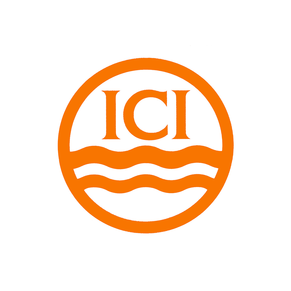
Design Research Unit’s 1969 corporate identity for ICI.
This post is supported by LogoArchive – The home of historical logos. Discover over 5000 of history’s greatest designs from the world’s finest designers. Always find the logo inspiration you need for your next project here.
By the mid 1960s, the activities and reach of Imperial Chemical Industries (ICI) was substantial, with over 100 factories, laboratories and administrative buildings throughout Great Britain, a further 57 in Europe and 300 others spread across the rest of the world. ICI was composed of eight divisions and also ICI Fibres Ltd. These were focused on manufacturing over 12,000 different chemical-related products and employed approximately 200,000 people to do so.
In 1965, ICI asked an outside agency to report on the state of its public relations and to submit recommendations for its improvement. The report’s findings highlighted that ICI did have a recognition problem, and in particular around aspects of its visual identity. A recommendation was made to hire a design consultancy to develop a comprehensive identity program. This would cover: the correct usage of the existing ICI roundel or develop a new one; establish nomenclature; define corporate colours; select a typeface for signage; standardised stationery–leveraging economies of scale to reduce costs–and to publish a corporate identity manual formalising all the changes and establishing a consistent global image.
Design Research Unit (DRU), a design consultancy well-known for their work with British Rail, was selected from a shortlist of agencies. DRU collaborated with ICI to establish a working party responsible for research, design and implementation.
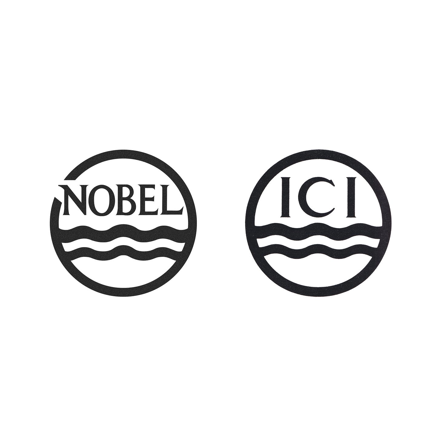
ICI was formed from a merger of four companies in 1925, and took over the logo of Nobel Industries (designed in 1923) which depicted shockwaves from an explosion. When the wording of Nobel was replaced with the initials ICI following the merger, the waves remained. Despite the increased areas of business, it was felt that the waves also worked well to represent liquids and chemicals.
By the time DRU got involved, the logo was a registered as a trademark in nearly every country around the world. Changing it and incurring legal fees would be prohibitively expensive and, in certain countries, registration of an entirely new logo would not have been possible.
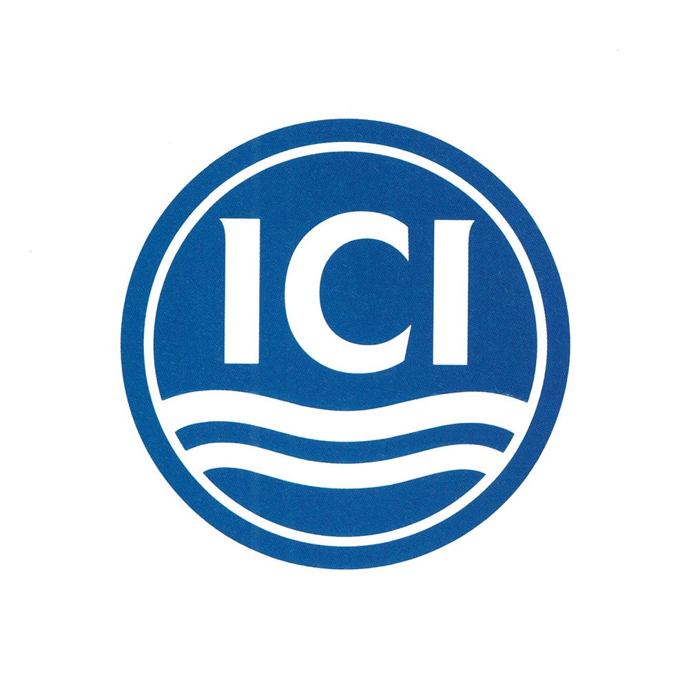
DRU felt that nothing would be gained by ICI going to the great expense of altering the logo, and research had indicated that it had accumulated value. After a consultation with the ICI’s legal advisers, it was agreed that, with minor alterations they could improve the overall composition, balance and legibility of the logo without invalidating the globally registered trademark.
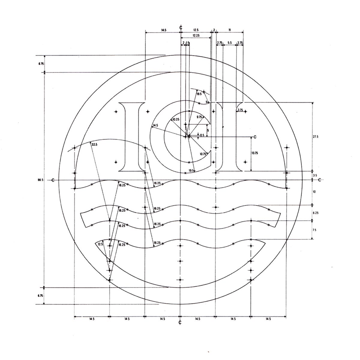
These minor changes included developing the contrast of the serifs and formalising the overall proportions and line weights of the total form. This would also improve the quality of the logo’s application across the 12,000 different chemical-related products, and better accommodate printing techniques such as embossing, engraving and casting in metal (such as pin badges).
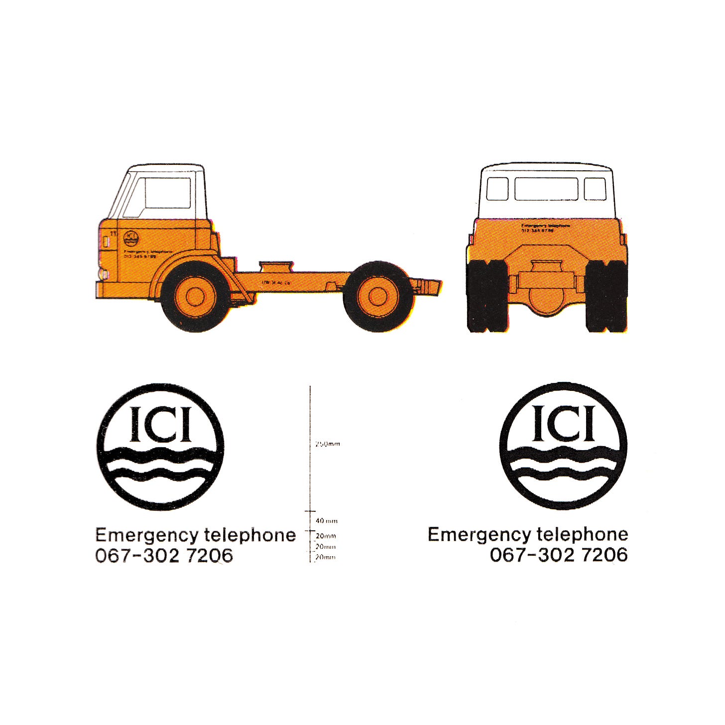
Alongside the updated logo, DRU recommended that a bright ‘chrome orange’ be used as an accent colour. This was selected for its ‘warmth’ and ability to deliver an immediate impact and a lasting impression. Further, the designers rejected the use of Monastral Blue or any other dark blue as the ICI house colour on the grounds that: it was the most common livery colour for vehicles in use at that time; dark blue, ‘although dignified’ was ‘unobtrusive’, ‘conservative’ and ‘institutional’ and did not project a 'modern’, ‘dynamic’ and ‘human' image. Further, dark blue showed up the khaki of mud and traffic staining more quickly than other colours. When used on signs the dark blue, it was felt, might cause confusion with motorway signs.
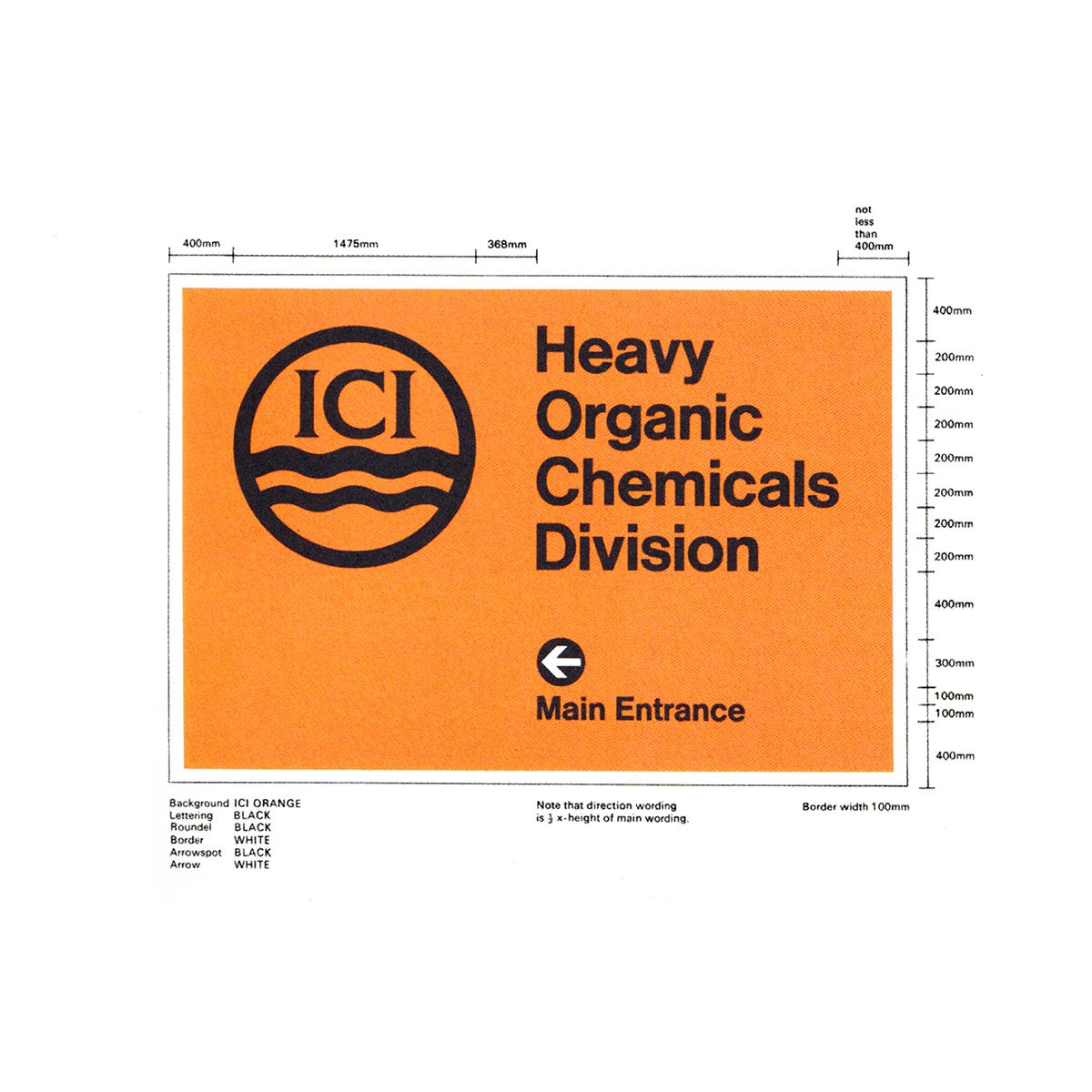
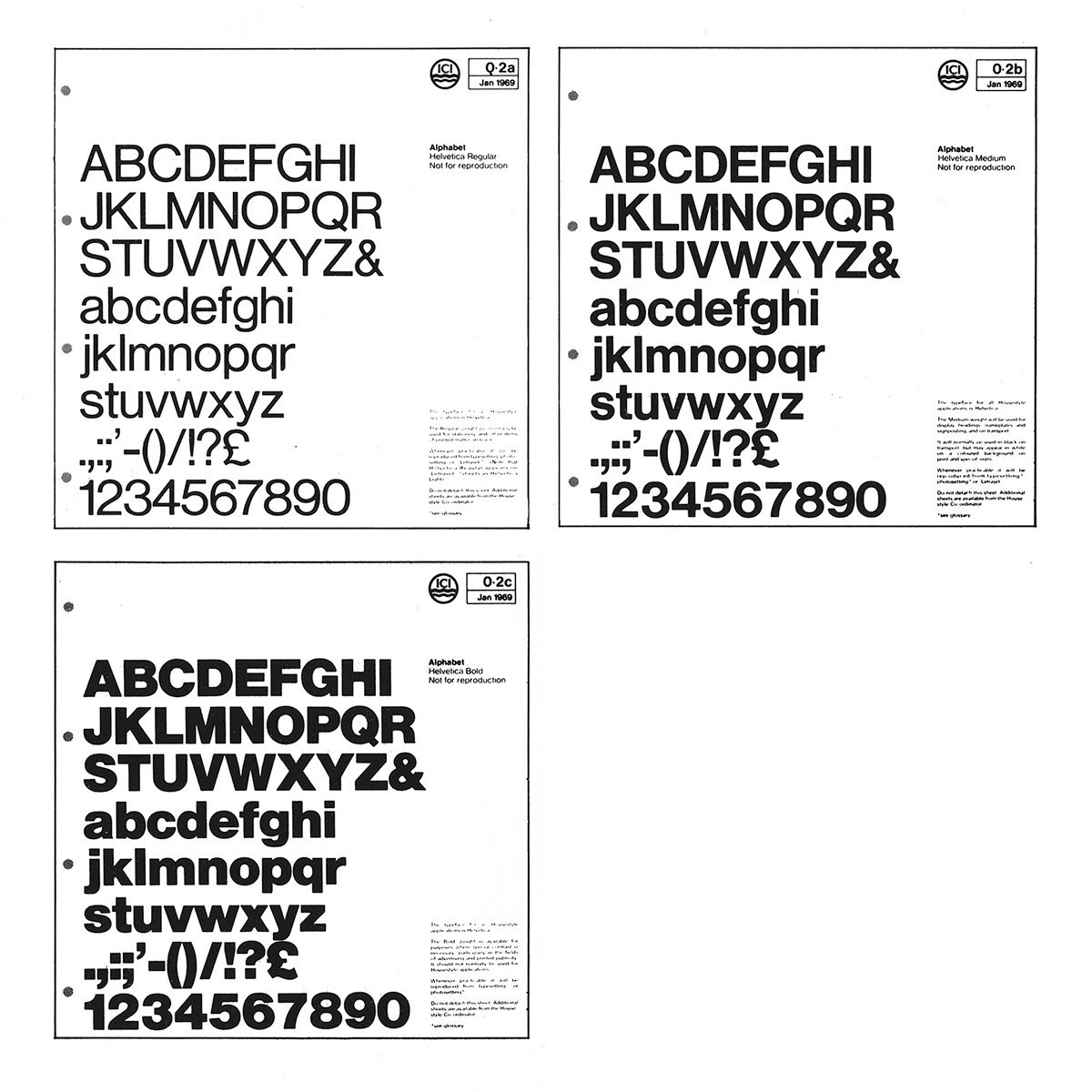
DRU put forward Helvetica as the corporate typeface. At the time, it was a readily distributed and internationally available typeface. In some ways, this would have the same simplicity as the revised logo lettering, just without the serif, and was said to give identifiable ‘character’ to stationery, signs and vehicles. Layouts were prepared on grids to control the printing of a wide range of stationery and to ensure a consistent relationship between the names of divisions and the main company, and between the division and company names and the logo.
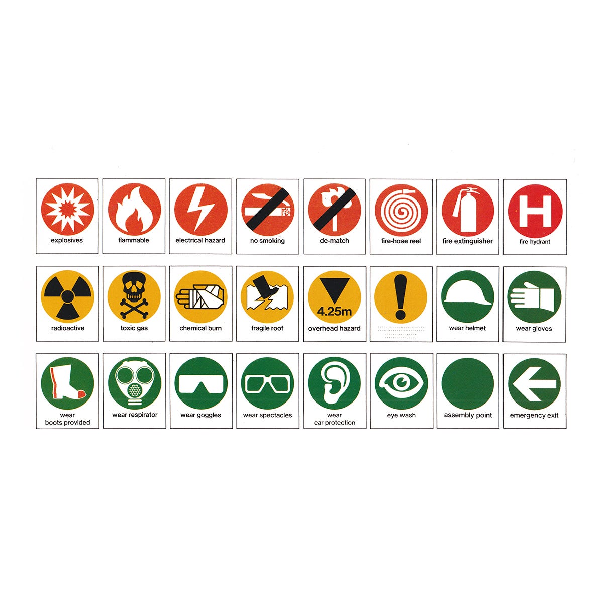
A standardised signage system with custom-designed pictograms was also introduced as a way to improve the speed of comprehension. This included colour-coded hazard signs - red for fire, yellow for danger and green for protection.
Th implementation of the corporate identity was planned over two years, and was aligned with the vehicle repaint cycle to minimise disruption (also see BEA). A house-style coordinator was appointed within ICI to oversee this, and was aided by a committee representing various departments. The brand manual was divided into four volumes covering print, signs, transport, and uniforms, ensuring a consistent understanding of the brand elements across the huge global corporation.
By 1986 ICI had become a leader in the chemical manufacturing industry. Despite this, ICI was viewed as a successful but old-fashioned British institution. The London-based design studio of Wolff Olins (BOC) were commissioned to develop the corporate identity in a way that would project to the world the company's ‘true personality’, as it existed at the time, whilst retaining a sense of continuity.
After extensive research, Wolff Olins' first recommendation was to drop the outdated and formal title (Imperial Chemical Industries) and to formalise the adoption of the familiar acronym, ICI. The studio then developed a ‘fresh’ and ‘modern’ interpretation of the logo, making this more ‘powerful’. This included simplifying the waves and letterforms further. It is this version that remains in use today.
Thank you for subscribing to Logo Histories. If you enjoy reading this short you may also enjoy these resources from the same team:
Brand Archive – Research tool for brand designers.
LogoArchive Website – Searchable modernist logo archive & research tool.
LogoArchive Shop – Vintage design books & LogoArchive Zines.
BP&O – Contemporary design editorial.




A logo such as this is certainly ahead of its time despite the decade that it comes from. I enjoy it very, very much.