Vision, strength & beauty
The story of Saul Bass, Herb Yager & Associates' 1980 logo for Minolta.
This post is supported by LogoArchive – The home of historical logos. Discover over 5000 of history’s greatest designs from the world’s finest designers. Updated every single day. Always find the logo inspiration you need for your next logo or branding project. Start here.
Minolta was founded in Osaka, Japan, in 1928 as Nichi-Doku Shashinki Shōten (the Japanese-German camera shop) and changed its name in 1931 to Minolta, an acronym for Mechanism, Instruments, Optics and Lenses by Tashima. The company made the first integrated autofocus camera system and, for the early part of the 20th century, was mainly concerned with mechanical technologies for image capture.
As the company began to move from mechanical technology to advanced optics and electronics in the late 1970s, it engaged American consultancy Saul Bass (ALCOA, United Airlines, AT&T), Herb Yager & Associates to develop a new logo that would help the company outwardly reflect its new focus.
The general criteria laid out for the development of the logo was that it should be unique, memorable, flexible, strong and enduring. More specifically, the design should reflect aspects of ‘high technology’ with customer perception being that Minolta products were the very latest and most advanced on the market. Finally, the new design should give the impression that all Minolta products were well-made, long-lasting and reliable.
A secondary criteria was also created and broken down into the following key considerations:
Vision: the new logo and identification system signals the quality of light, which is the basis of all vision. Strength: that the company has strong management. Beauty: the new identification system should be perceived as beautiful and express the grace and precision of all Minolta products. Global: the new identification should be effective in any country, and transcend language.
Through the use of linear elements, focusing at the centre as if passing through a lens, the logo conveyed the high-tech optical and electronic basis of Minolta and graphically represented a company that dealt with light. The use of fine lines also intended to suggest that Minolta products were precision instruments.
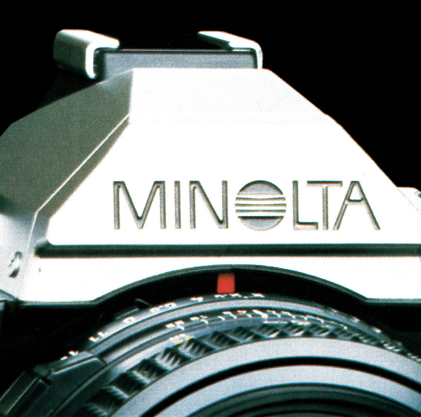
In order to maximise the flexibility of the logo, two configurations were created; a logo placed above the logotype, and a logotype with the logo standing in for the ‘O’. This maximised the use-cases of the logo in both vertical or horizontal contexts.
Three different logo variations were produced that had differing amounts of counter space. The larger the logo the finer the counters would be. From large building signage to small embossed product markings the logo always maintained a sense of precision, at any size.
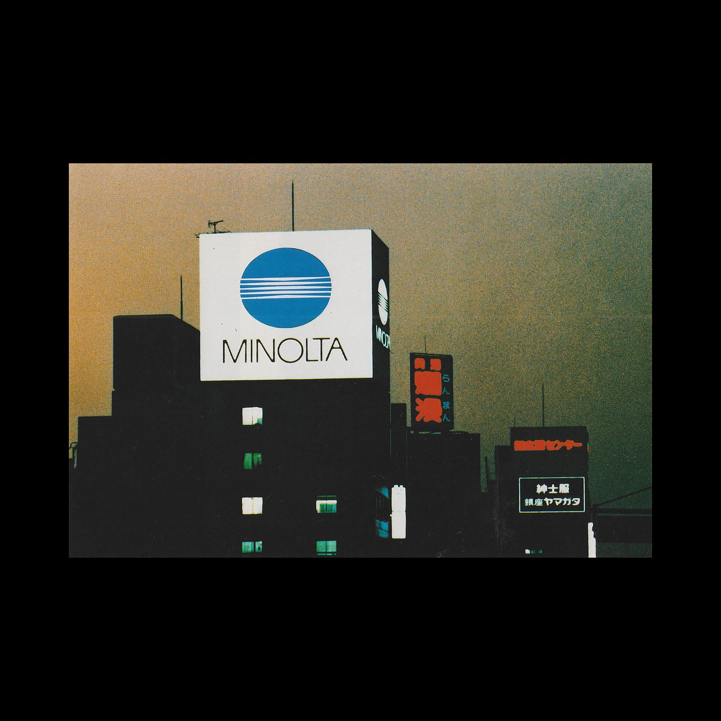
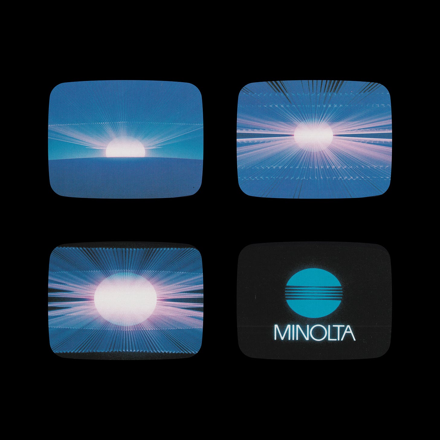
The logo was deployed across large format building signage, cast into camera bodies and printed throughout Minolta’s marketing materials. To emphasise the notion of managing and manipulating light, a broadcast advert depicted the sun’s light being focused and turned it into the Minolta logo.
In 2003, Minolta merged with Konica to form Konica Minolta. Even though Konica Minolta would announce their exit from the camera market, selling portions of its business to Sony and Dai Nippon Printing, it still retains the logo with the addition of a gradient to give the logo a three dimensional impression.
Key Takeaways
As as a technology business, Minolta would have to continually innovate throughout the decades. The identification system needed to be able to convey this innovation, without itself dating. An abstract and figurative logo served this requirement for over forty years.
As a company with a growing global presence, the need for a universal visual language was required, one that would work without words. A simple use of a lines and tightening counter space functions as a universal expression of focus. On white, this focus appeared as light.
In order to maintain the notion of precision across all of the logo’s applications, three versions were created to maintain a fine and precise counter-space. Whether large or small, cast in metal or printed that central idea remained a constant throughout.
Thank you for subscribing to Logo Histories. If you enjoy reading this short you may also enjoy these resources from the same team:
New! Portal – Design-driven jobs board and applicant management.
Brand Archive – Research tool for brand designers.
LogoArchive Website – Searchable modernist logo archive & research tool.
LogoArchive Shop – Vintage design books & LogoArchive Zines.
BP&O – Contemporary design editorial.


