First in aluminium
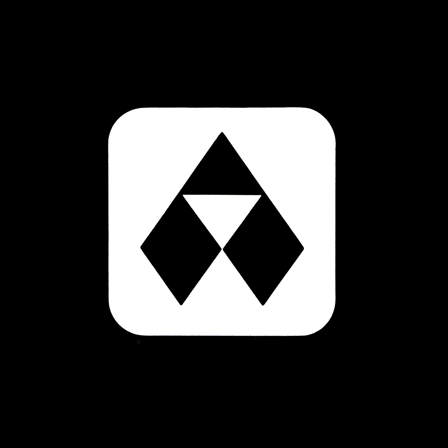
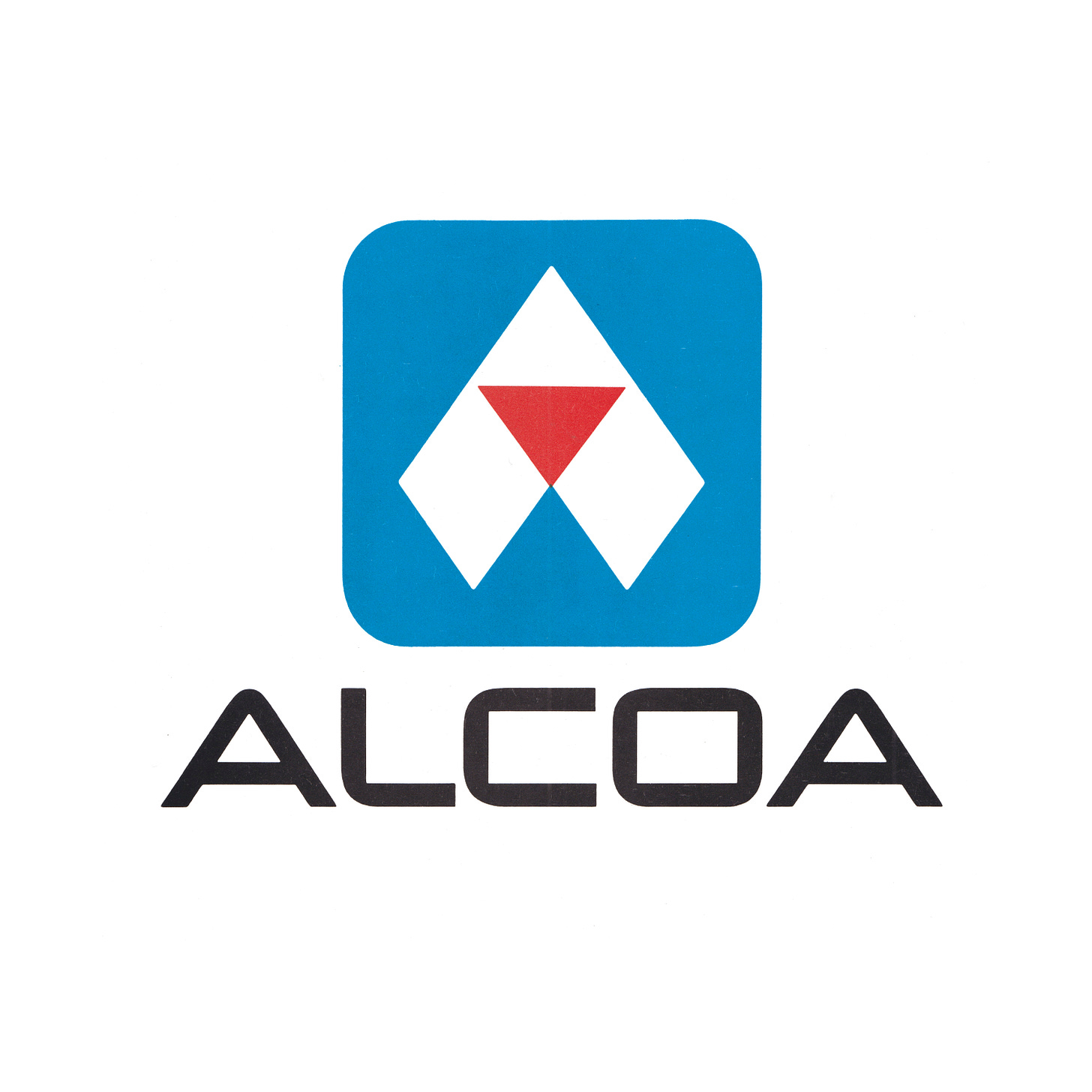
Saul Bass & Associates 1962 logo for The Aluminum Company of America.
The Aluminum Company of America (ALCOA) had a design problem. It had extended the use of its trademark–two triangles in red and blue inverted above another–to manufacturers using the ALCOA ‘base’ material. These products came with the exclamation "made with ALCOA Aluminum”. However, the ALCOA brand was being eroded by the many manufacturers using high quality ALCOA aluminium to construct poorly designed products. The association was damaging. If a consumer had a bad experience with a non-ALCOA manufactured product, they still held ALCOA responsible. To address this problem, the corporation hired renowned American designer Saul Bass, Saul Bass & Associates (Minolta, United Airlines, AT&T) to develop a design policy and build visual equity around a new logo without entirely losing the recognition of the previous design and discarding the association with poorly made products.
As well as addressing this key concern, the new design policy would also be required to communicate ALCOA’s position as a leader and as a progressive, pioneering and growing corporation. Further, the new design policy would need to unify a broad range of packaging, and take into account low-quality surfaces such as steel barrels and corrugated boards and a wide variety of applications.
Continue reading to understand how Saul Bass addressed the issue of continuity and a clean break. See how the industrial context shaped the logo and accompanying custom typeface, and see how the logo was applied to structures and stationery.
By the early 1960s, it had been agreed that the existing ALCOA logo of two triangles was too simple and by extension, difficult to own, and that the problem of an association with poor non-ALCOA products had tarnished the image. Any new logo would need to clearly carry forward elements of the old logo without becoming a dominant element. Further, the logo must be able to undergo extreme scaling, and be recognisable when printing on materials that were industrial in nature.
With these considerations in mind, Saul Bass & Associates devised a new logo based around the letter “A”. In its geometric and angular form, it was intended to reflect some of the qualities of structural aluminium as well as the crispness and precision of the material itself. The new logo incorporated a red triangular motif at the centre, with the counter of the A forming a second triangle and making a subtle connection with the previous logo. In its simplicity, it could be applied at scale, and remained legible, even when printed in a single colour across low-cost massed produced industrial packaging such as sacks, boxes and steel drums.
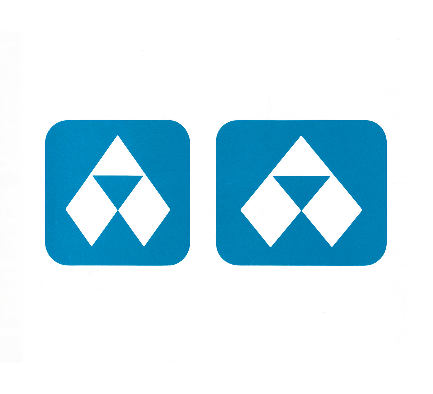
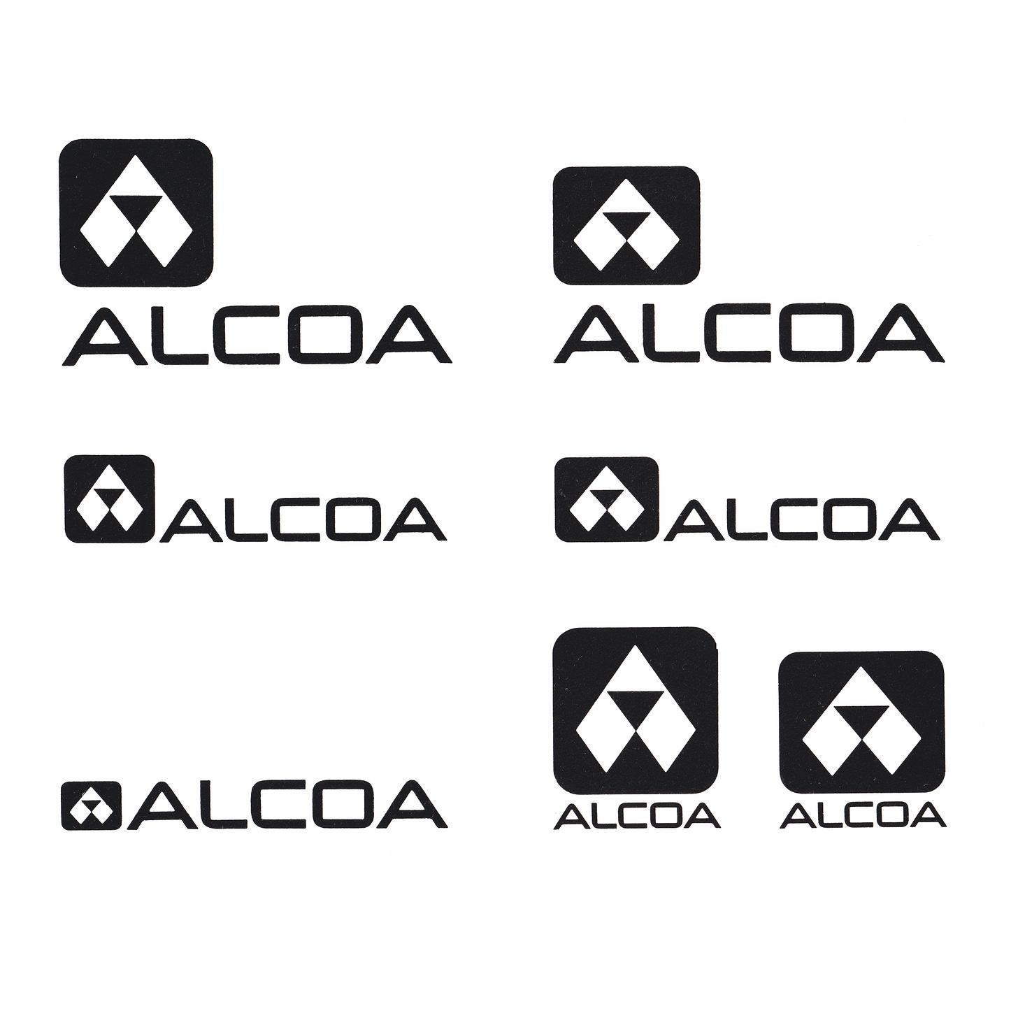
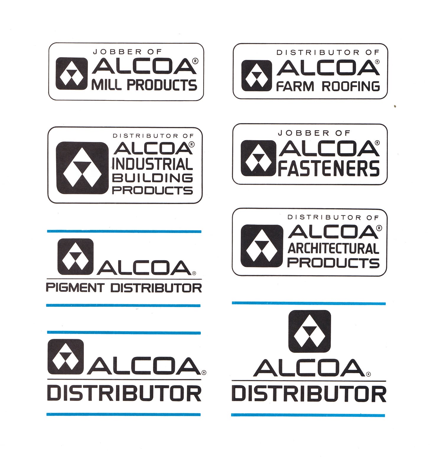
Two versions of the logo were created to account for the optical distortion that happened when logos are applied to curved surfaces. A wider version would appear as the regular version when applied to the cylindrical surfaces of water towers, silos and barrels. These two versions would also allow for flexibility when printed space was restricted, and was supported by a variety of lock-ups.
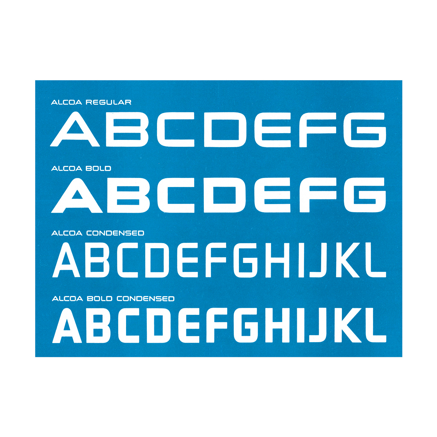
The flexibility created by the two version of the logo also was extended to the custom corporate typeface, with two versions being created, ALCOA Regular and ALCOA Extended. In places where names were long, and surface area limited, ALCOA could switch to a condensed version of both its typeface and its logo.
The custom typeface, aside from affording the corporation a flexibility and the opportunity to convey its visual character through words, also improved identification and warehousing coding. In conjunction with colour the overall system was simplified, with symbols and letters from Alcoa's new typeface applied to raw aluminium bars, making it possible to reorder by lot number quickly and easily.
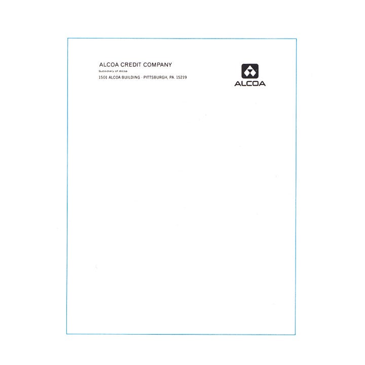
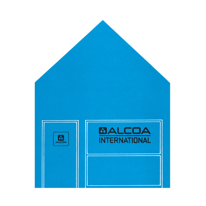
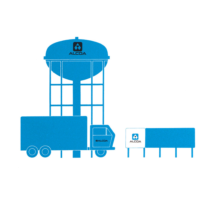
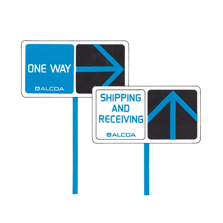
The redesign took three years and extended across the whole corporation, from matchbooks to water towers, from film commercials to press releases. Trucks, trains and shipping cartons became moving billboards when they carried Alcoa's mark, and every item was seen as an opportunity to reinforce the ALCOA message of "first in aluminium”. Only through the flexibility of two logos and two display typefaces, were these all able to work coherently and economically introduce the new design policy at scale.
The solution conveyed a modern, timeless feeling, and was used by all ALCOA divisions. It clearly separated the company from others, and distanced the corporation from the previous logo which was used exclusively for identifying products which contained ALCOA aluminium but was not manufactured by ALCOA.
If you enjoyed reading Logo Histories also check out these projects:
LogoArchive Website – Searchable modernist logo archive & research tool.
LogoArchive Shop – Vintage design books & LogoArchive Zines.
BP&O – Contemporary design editorial.
Perspectives – Unlocking opinion and insights from the past.


