Flying into the future
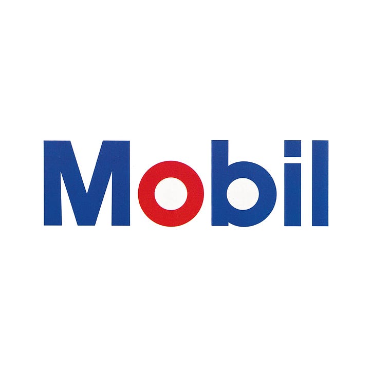
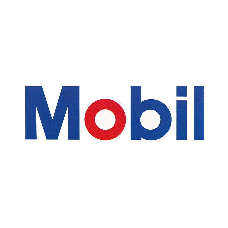
Chermayeff & Geismar's 1966 logo for Mobil
This post is supported by LogoArchive – The home of historical logos. Discover over 4000 of history’s best designs from the world’s finest designers. Always find the logo inspiration you need for your next project here.
By the mid 1950s, Socony Mobil Oil Company had become one of the world's largest industrial corporations, selling oil and thousands of oil-based products all over the world. Despite this growth, studies had shown that the American company had one of the weakest corporate images of all the international oil giants. And there were questions raised about society’s dependancy on this finite resource. What new forms of energy would be used in the future? And how could a big oil company keep on finding, processing, and selling oil at a profit while preparing it for the future?
These were the underlying issues. However they were going to be resolved, Socony Mobil Oil Company understood that it needed a ‘strong’, ‘positive’, ‘attractive’ and ‘progressive’ image to better ready it for an unknown future.
In 1956 a design program delivered by Peter Schladermundt Inc. had produced a new logo with a smaller version of the corporation’s flying Red Horse and a distinctive blue and white colour scheme for its stations. However, it wouldn’t be until 1966 that Mobil would begin to standardise its visual image, devised and coordinated by Eliot Noyes and Chermayeff & Geismar.
In 1965, Rawleigh Warner Jr. was elected President. He was a seen as young and dynamic character and oversaw the corporate name change to Mobil Oil Corporation, severing its links with the past, and presenting a new name for the future.
Prior to his Presidency, Warner Jr. had headed the international division and observed, at close hand, the design of many overseas affiliates. Some of these, having less company history to contend with, had shown innovative thinking when it came to design within the Mobil framework. While individually creative, these had produced inconsistencies.
This experience had led Warner Jr. to being open to new ideas when it came to corporate image. While competitors had seen the value of clean and neat service stations, Warner Jr. and Chairman of the Board, Albert L. Nickerson, had decided to look harder at a more basic factor - the design of the service stations.


Eliot Noyes, architectural and industrial design consultant to IBM and Westinghouse, was invited to study the design of Mobil's 26,000 service stations throughout the United States. From his studies Noyes designed a new basic service station unit. And brought in Chermayeff & Geismar Associates (C&G) to handle the graphic elements.
C&G worked over six months, talking with Mobil marketing and advertising people about the problems, specifically, the need for greater legibility in its signs. Beyond that, Mobil was willing to let C&G have a voice in defining the objectives of the program as well as offering solutions. Nothing was pre-established. As C&G worked on the problems and began to produce designs, the scope of the project grew. Finally, they had a presentation ready that established criteria for the graphics program and included design suggestions for service station signs, packaging, and a variety of other graphic applications. A crucial point raised was what to do with the Flying Horse?
The idea of getting down to the word 'Mobil,' rather than 'Mobil' plus the horse symbol, was central. There was great equity in the Flying Red Horse, having been established over many years. C&G didn't want to take it away, rather, redefine its usefulness as an independent graphic element.
Alongside improvements to the drawing of the horse, the studio developed a new simplified 'Mobil' sans-serif logotype, derived from Helvetica and Futura, and freed this from the horse, improving the immediacy of the new shorter name. This would then be developed into a corporate typeface that could be used to unify a vast array of products, solving a key issue of inconsistency. The blue and red first introduced by Peter Schladermundt Inc. were brought together with the speculation being that the red 'o' would help a global audience pronounce 'Mobil' correctly, placing emphasis on the right syllable.
The new logotype underwent a variety of visual tests, using mock-ups and prototypes. At the suggestion of C&G, Mobil commissioned Alfred Politz to do outside research on the comparative legibility of the old and new emblems. Color slides of the signs, set up in open fields, were taken from various distances. Films of the signs under actual highway conditions were then made. The new signs proved to be legible at distances almost twice as great as the previous deign.
C&G provided Mobil with basic graphics guidelines applicable to all the problems that would arise, beginning with the service station graphics, then on to packaging, stationery, forms, and the Mobil Travel Guide - the largest-selling travel guide in the world. This would help establish the new logo in the minds of customers.
Standardisation and economies of scale across printed materials and packaging led to clarity, uniformity and a clearer identity for communication as well as reducing overall production costs. The studio also pressed for a stronger, bolder, simpler design solution to every package and graphic application, using the new corporate typeface to address inconsistencies.
Even though there were high initial costs of sign conversion across stations, the new sign proved to be considerably less expensive to produce than the old one. Mobil saved hundreds of thousands of dollars each year over what it would have been paying for a comparable number of the old design. This approach proved so successful, with the logo remaining in use today.
If you enjoy reading this you may also enjoy these resources from the same team:
Brand Archive – Research tool for brand designers.
LogoArchive Website – Searchable modernist logo archive & research tool.
LogoArchive Shop – Vintage design books & LogoArchive Zines.
BP&O – Contemporary design editorial.


