Excellence in all things
Paul Rand's 1961 logo for Westinghouse.
This post is supported by LogoArchive – The home of historical logos. Discover over 4000 of history’s greatest designs from the world’s finest designers. Always find the logo inspiration you need for your next project. Start here.
At the beginning of the 1960s, the Westinghouse Electric Corporation was the fourteenth largest industrial corporation in America producing a wide range of electronics for nuclear power stations, public transportation and the home. The growing global presence and extensive catalogue which amounted to over 300,000 product lines across sixty divisions, meant that a new and more ‘conscious’ design policy be introduced to maintain a consistent image throughout the corporation and across all the industries it operated within.
In 1960, the architect and industrial designer Eliot Noyes was hired as consultant director of design at Westinghouse. His duty was to help shape the philosophy of the corporation through a new and ‘long-range’ design program. Titled ‘Image by Design’, this was to be an ongoing study of the Westinghouse image during an era of continuous development and growth, and sought to convey ‘excellence in all things’.
Further, the design program would need deliver an authentic expression of the company as a whole; demonstrative of quality and performance; and give it a contemporary appearance to give the impression of an ‘advanced’ corporation. Noyes commissioned renowned graphic designer Paul Rand (IBM) (with whom he previously had worked with to develop IBM’s logo and design policy) to coordinate Westinghouse’s visual identity.



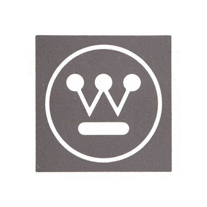
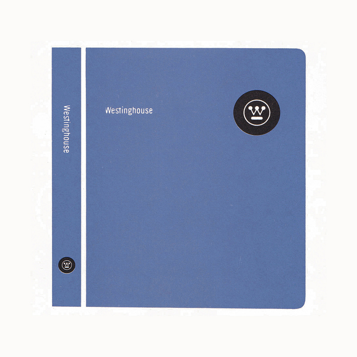
A ‘Graphics Identification Manual’ was created to ensure a high standard of design material throughout the company, and develop a unified look that would lead to a positive perception by the public. As established in this manual, the visual language created by Rand consisted of five key elements; the logotype; the ‘statement’; the standard colour Westinghouse Blue; the Westinghouse Gothic typeface; and a logo, the ‘Circled W.’
While there was the feeling that small adjustments could have been made to improve the reproducibility of the previous logo, it was felt that it did not imply the ‘nature’ of the business. Further, it was said to have lacked style, was ungraceful and impersonal, and lacked flexibility and possibility for greater variety. To really drive home the shortcomings of this logo, it was also said to be absent pictorial interest and a decorative quality, this had made it appear somewhat ‘tiresome’.
Rand’s task was to reimagine the old logo, giving it a contemporary new look that embodied Westinghouse in its entirety. He would also need to address the concerns of the previous logo whilst also carrying over some of the symbolic value it had accumulated. Iterating rather reimagining what had come before would also save time and money.
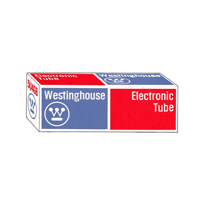
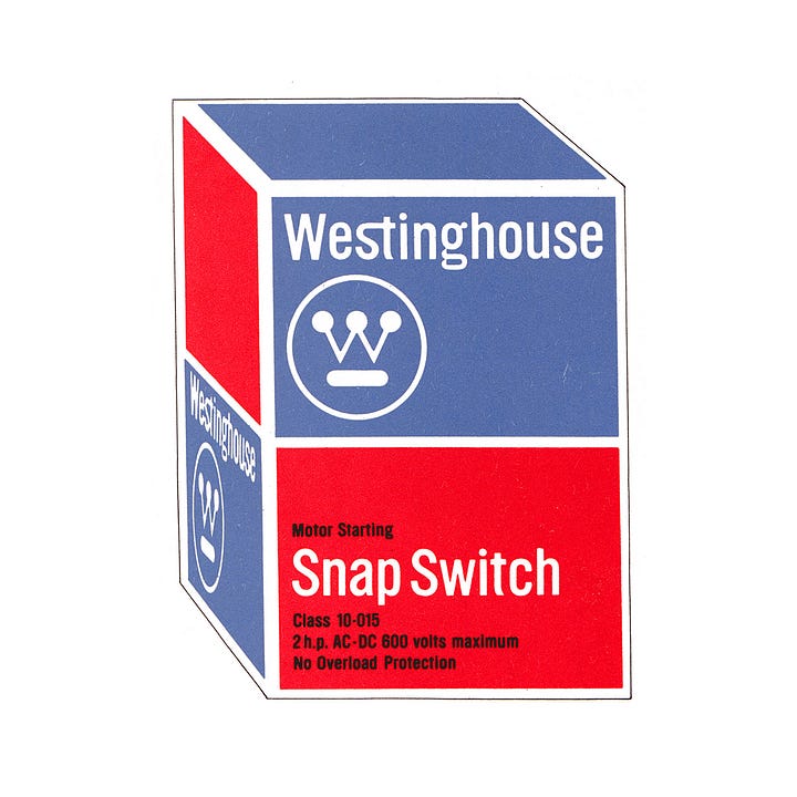

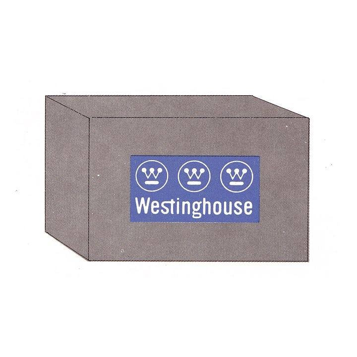
With a stylised ‘W’ at the centre, Rand’s design solution echoes the basic compositional qualities and components of what came before, however, through simple adjustments, which included reducing the line weight of the diagonal strokes, it took on the appearance of a circuit board, with circles representing lights. During development of the logo, and in one meeting, it was pointed out to Rand that the logo resembled a mask. Although not intentional, it was Rand’s feeling that it was this anthropomorphic observation that gave the logo its memorable quality, with masks being a central part of many cultures.
As part of the ‘Image by Design’ program, it was outlined that the new logo should appear in every single printed and TV advertisement. In each of these applications, the ‘Circled W’ would need to be prominent, bold, and clear — putting the brand image and communications front and centre. Also, the program would make the most of the vast number of surfaces Westinghouse had available, from product packaging to advertising to liveries and signage. This logo was supported with a distinctive and eye-catching colour palette and Westinghouse Gothic, a custom corporate typeface.
Following the launch of the logo, Rand continued to guide the graphic design program and contribute to the Westinghouse’s Corporate Design Centre which was formed in 1968 to ‘stimulate and maintain’ a high design standard for graphic material throughout the corporation and into the future. All of the graphic designers at the Corporate Design Centre were welcomed into the AIGA and won recognition from the Art Directors Club and the Type Directors Club of New York.
The logo continues to be used today, with Pentagram updating the brand for the digital era, introducing a new website and digital typeface based on that originally proposed by Rand.
Thank you for subscribing to Logo Histories. If you enjoy reading this you may also enjoy these resources from the same team:
Brand Archive – Research tool for brand designers.
LogoArchive Website – Searchable modernist logo archive & research tool.
LogoArchive Shop – Vintage design books & LogoArchive Zines.
BP&O – Contemporary design editorial.


