The look of the future
Danne & Blackburn's 1974 logo and identity for NASA.
NASA was founded in 1958 as an amalgamation of different and independently operating technological ‘centres’. A year later, in 1959, administrator T. Keith Glennan would ask designer James Modarelli to develop an ‘insignia’ that would unite these and symbolise a shared space-bound vision for America.
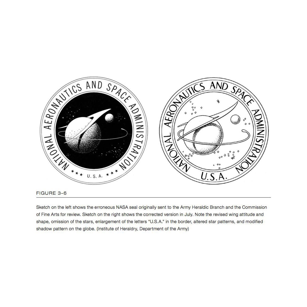
What would later be affectionately known as the ‘meatball’, Modarelli’s design was a detailed composition of a blue sphere representing a planet, a red sweeping chevron symbolising aeronautics, and a spacecraft orbiting a cluster of white stars. While beloved, by the 1970s this was seen as a relic of the past, a cumbersome design that didn’t fit the sleek and modern image that NASA wanted to project.
In an effort to review and improve the visual identities and communications of Federal agencies in the United States a Federal Design Improvement Program was initiated through grants held by the National Endowment for The Arts (NEA). This was started by President Lyndon B. Johnson in 1965 with Nancy Hanks directing the NEA from 1969-1977. This would produce iconic design for the EPA, American Bicentennial, National Zoo, Federal Energy Administration and by 1974 would reach NASA.
The programme intended to improve the agency’s ability to communicate internally and externally; provide uniformity for all NASA graphics; save both time and money; enhance and symbolise a progressive path; and achieve ‘maximum communication’ of NASA’s programme objectives across stationery, technical and management publications, vehicles and aircraft, buildings, signage and press releases. Danne & Blackburn, a small New York design studio of five at the time, got the job of bringing NASA's image right up to date.
The ‘meatball’ was complicated, hard to reproduce and was undermined by sci-fi tropes and associations that were, in the words of Danne, ‘born out of the classic "airman syndrome" where hype and fantasy dominated over logic and reality.
The studio would be responsible for addressing, through a new design, the issues of reproducing the colours and finer details of ‘the meatball’. These would often get lost in print production, or lose recognition in tough viewing conditions. The logo would need to survive what was described as the mediocre printing of the Government Publishing Office (GPO) and stand up to extreme scaling, all the way up to rocket livery, and down to embroidered patches.
Danne and Blackburn began their work with a singular focus on simplicity and clarity, creating one asset that couldn’t be messed with. Their intention was to create a logo that was not only modern but would also be instantly recognisable. After going back and forth, simplifying symbols and logotypes– trying to make them work in two and three dimensional applications–they landed on a design that was radical for its time: a sleek, red typographic treatment of the word ‘NASA’ which expressed the spirit of aeronautics and space exploration.
The letters were crafted from a consistent line weight and curvilinear forms that gave the impression of a seamless flow that earned it the nickname ‘the worm’, and symbolised the journey into the future, a forward trajectory into the unknown. The absence of crossbars on the A’s, a controversial element, alluded to the nose cones of two rockets pointing upward, imparting a vertical thrust to the logotype. The N and S followed with similar forms and equally weighted lines. The design was more than just a typographic choice; it was a bold graphic statement.
The new logotype was the opposite of ‘the meatball’. It was ‘clean’ and ‘progressive’. The absence of any extra graphical elements, such as stars or orbiting craft was a deliberate move to strip away the clutter, improve usability, recognition and reduce the cost of its application. It could be read small and clear from a mile away, and could easily be applied to all mediums.
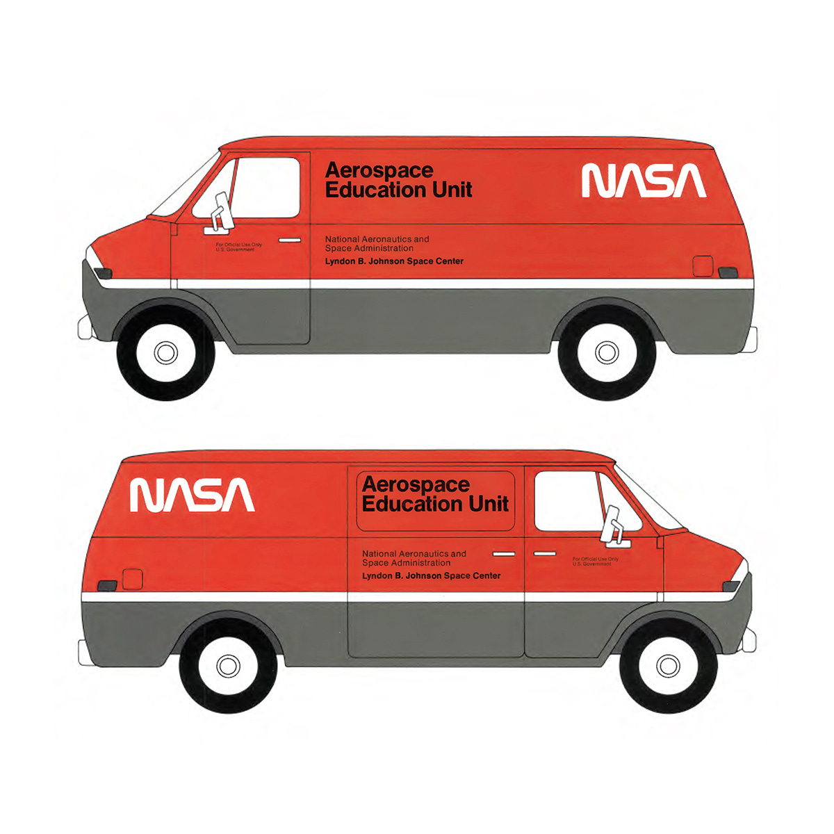
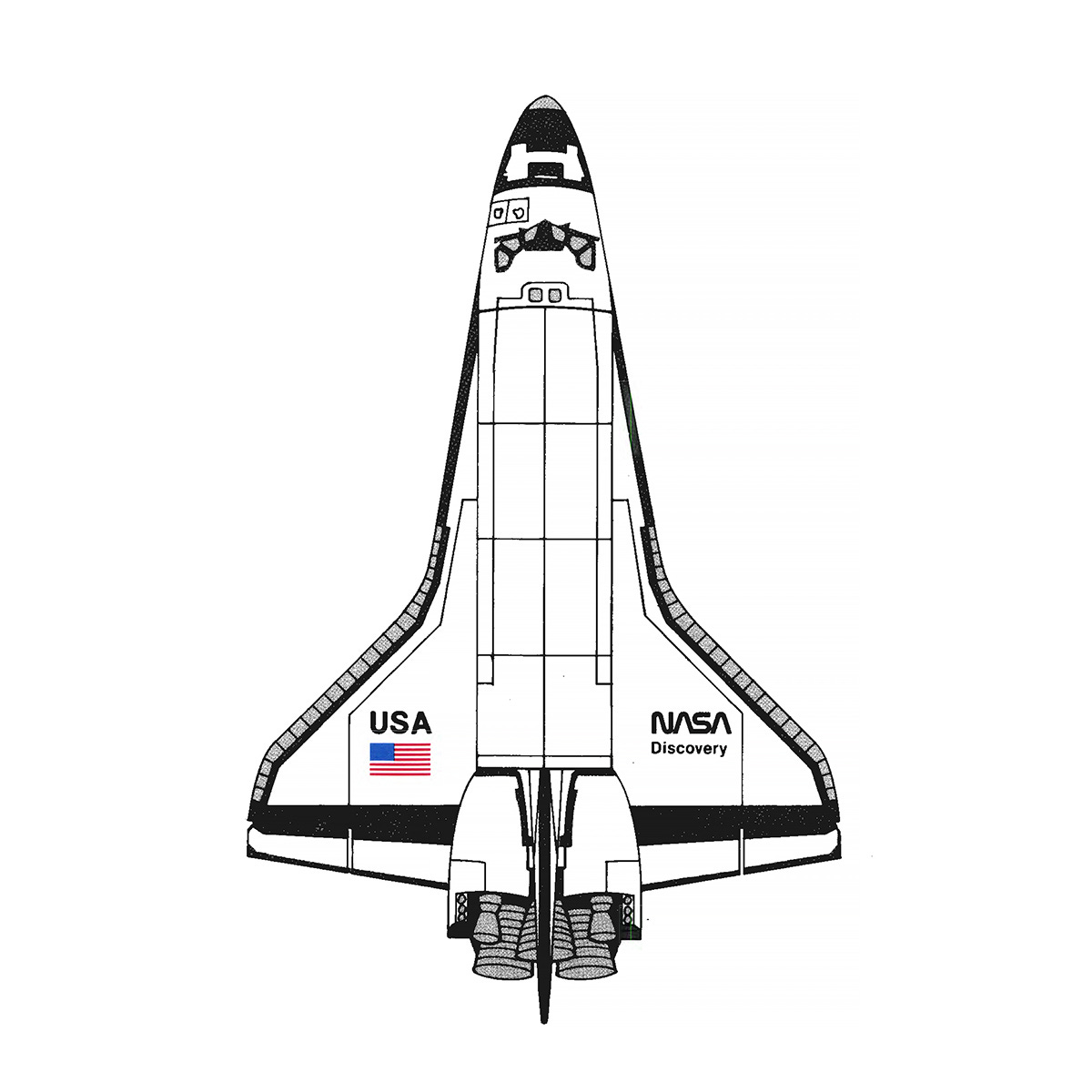
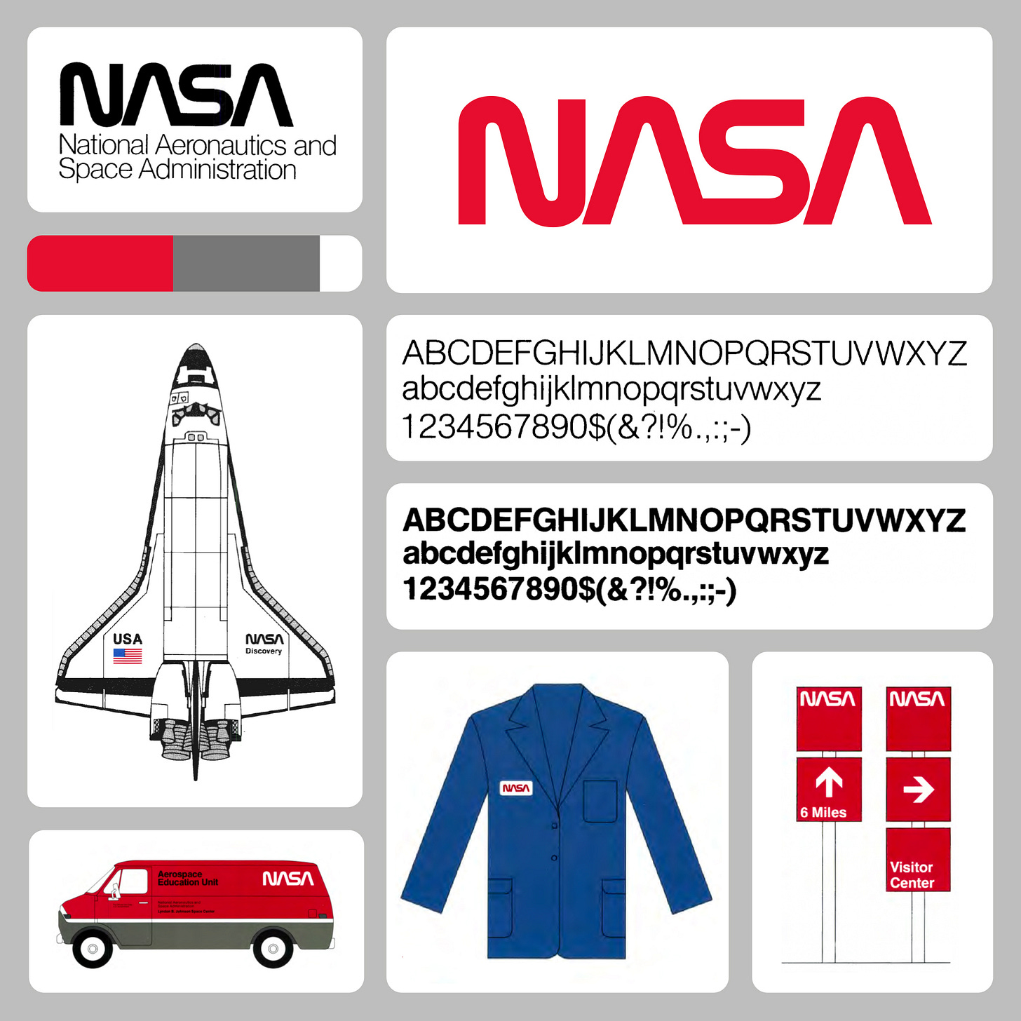
The studio decided early on to present only one solution but back it up with a plethora of examples of its use to drive home its utility. Illustrations showed the logo being applied to a diverse range of use cases. The idea was to show that it was more than just a logotype but a coordinated and comprehensive design programme that was fit for purpose and addressed the short-comings of the previous design.
NASA Administrator James Fletcher wrote in the introduction to the design manual that the result was pleasing to the eye and had a feeling of ‘unity, technological precision, thrust and orientation toward the future. Unity, technology, pioneering achievement–that’s what NASA is all about’.
Danne paired the ‘worm’ with Helvetica because the two ‘blended well together’. And, just like the logo, Helvetica had a modern sensibility. Its consistent use and availability would also address the issues of cost when producing printed materials.
The legibility of the logotype’s simplified letterforms was further enhanced by the use of Pantone 179. This was a more orange-red than the red used in the ‘meatball’, clearly standing out on the white of rockets and shuttles. Further the use of a single colour would further reduce cost and limit reproduction problems at the GPO.
Following the creation of the ‘worm’, Danne & Blackburn designed the graphic standards manual. This covered the logo, colour palette and fonts. Bob Schulman was given the role of internal graphics coordinator who oversaw the roll-out of the identity.
Tensions between internal and external perceptions of NASA, as well as poor communication of the new design lead to resistance to its adoption. NASA was made up of independently operating ‘centres’. The first that many of them heard of the change was when they received newly printed stationery from head office. Danne & Blackburn would later say that the casual introduction of the new logotype was not their way and would have preferred a more strategic telling of the project in order to bring everyone on board. This would later happen in the form of a tour across the US, complete with a public relations representative from NASA giving a presentation to each centre.
The ‘worm’ served NASA for nearly two decades, becoming an integral part of the agency’s identity during some of its most historic moments, including the Space Shuttle program. However, in 1992, the logo was retired in favour of a return to the ‘meatball,’ a decision that was met with both nostalgia and disappointment. Many saw this as a step back, a return to a more traditional and less daring identity.
Despite its retirement, the ‘worm’ never faded from public memory. Its progressive design continued to inspire designers and space enthusiasts. In 2020, NASA announced the logo’s return to limited use, recognising its enduring appeal and iconic status. The logo was reintroduced on the SpaceX Falcon 9 rocket, which symbolised a new era of private-public partnership in space exploration.
Discover more NASA brand assets and assets from hundreds other historical and contemporary brands at Brand Archive.
Want to share this article? Here’s a social asset Logo History’s has created and that you can use. Please share and link back to this article.
Thank you for subscribing to Logo Histories. If you enjoy reading this you may also enjoy these resources from the same team:
Brand Basics – Automated Brand Guidelines maker.
Brand Archive – Research tool for brand designers.
LogoArchive Website – Searchable modernist logo archive & research tool.
LogoArchive Shop – Vintage design books & LogoArchive Zines.
BP&O – Contemporary design editorial.


