
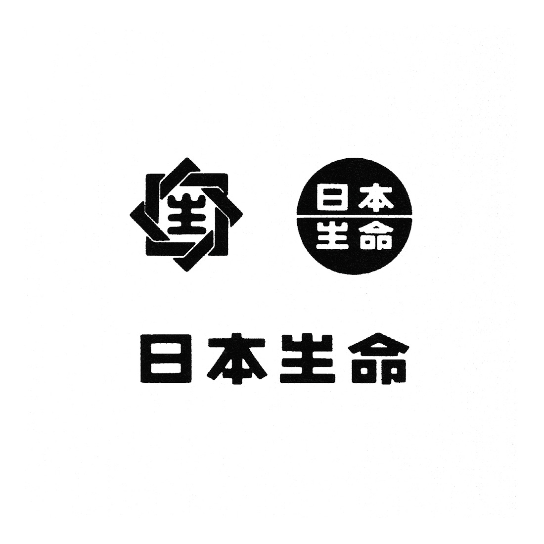
Nissay Logo, 1988
Ivan Chermayeff’s 1988 logo and PAOS’ corporate identity for Japanese insurance company Nissay.


This post is supported by LogoArchive – The home of historical logos. Discover thousands of history’s finest logo designs from the world’s greatest designers. Bookmark and collate logo inspiration for your next logo project here.
Nippon Life Insurance Company was founded in 1889 and by the mid-1980s had become the world's largest life insurance company in terms of total assets and ‘premium income’. It had consistently been a leader in the life insurance industry, was the first company in Japan to pay policy-holder dividends, was one of the first to hire women as sales staff and was an employer of over 70,000 people. Together, these had secured it a venerable position in Japanese society. However, studies undertaken in 1985 indicated that despite Nippon Life being considered a large, reliable and friendly corporation there was some confusion around the extent of its services. Put simply, there were still many people who did not know what the company did.
With this revelation in mind, Nissay Life would embark on the development of a new communications strategy. This would include the design of a new logo and corporate identity. This intended to better express the services and values of the corporation and give a boost to employees with a strong image to be proud of. PAOS and DENTSU would collaborate in 1985, and work through to 1988 to help Nippon Life Insurance achieve this ahead of its 100th anniversary in 1989.
Just like their approach to other projects, PAOS would draw on the outside support of specialists. In this case, PAOS invited American designer Ivan Chermayeff of Chermayeff & Geismar (Mobil, EPA & NBC) to create the logo.
The goal was to develop something that would express a revised corporate vision built around the notions of ‘newness’ and ‘communicating and proposing’. Further, the design should better set the company up for international expansion. This would mean designing and organising visual assets in a way that could be easily fabricated as signage, lower costs in the production of corporate communications and standardise colours and typefaces for introduction into other parts of the world.

Before beginning, Chermayeff came to Japan and studied the Japanese life insurance industry as well as the ‘corporate atmosphere’ of Nissay (he would return a year later to design the logo for Japanese insurance company Tokio Marine). From this experience he submitted four proposals. The design selected by PAOS would be dubbed the ‘Century Crystal’ in honour of the corporation’s coming centenary.
Chermayeff’s design took inspiration from the shapes inherent in the old logo (forming a link to the tradition of Japanese heraldic symbols and calligraphy). He simplified the reference into a diamond shape and introduced, within the negative space of the diamond, a faceted ‘N’. This placed emphasis on a Latin character as a expression of foresight, the corporation’s new international scope and welcoming attitude.


Chermayeff would also design the accompanying logotype. This was set in Futura, with the bar removed from the ‘A’ (also read: NASA). This ‘A’ and the sharp terminals and geometric forms of Futura developed a perceptible relationship between the logo and logotype. Futura would then be used as the corporate typeface and used in conjunction with Pantone 485 (Red) and Pantone 431 (Grey), which were selected as the corporate colours.
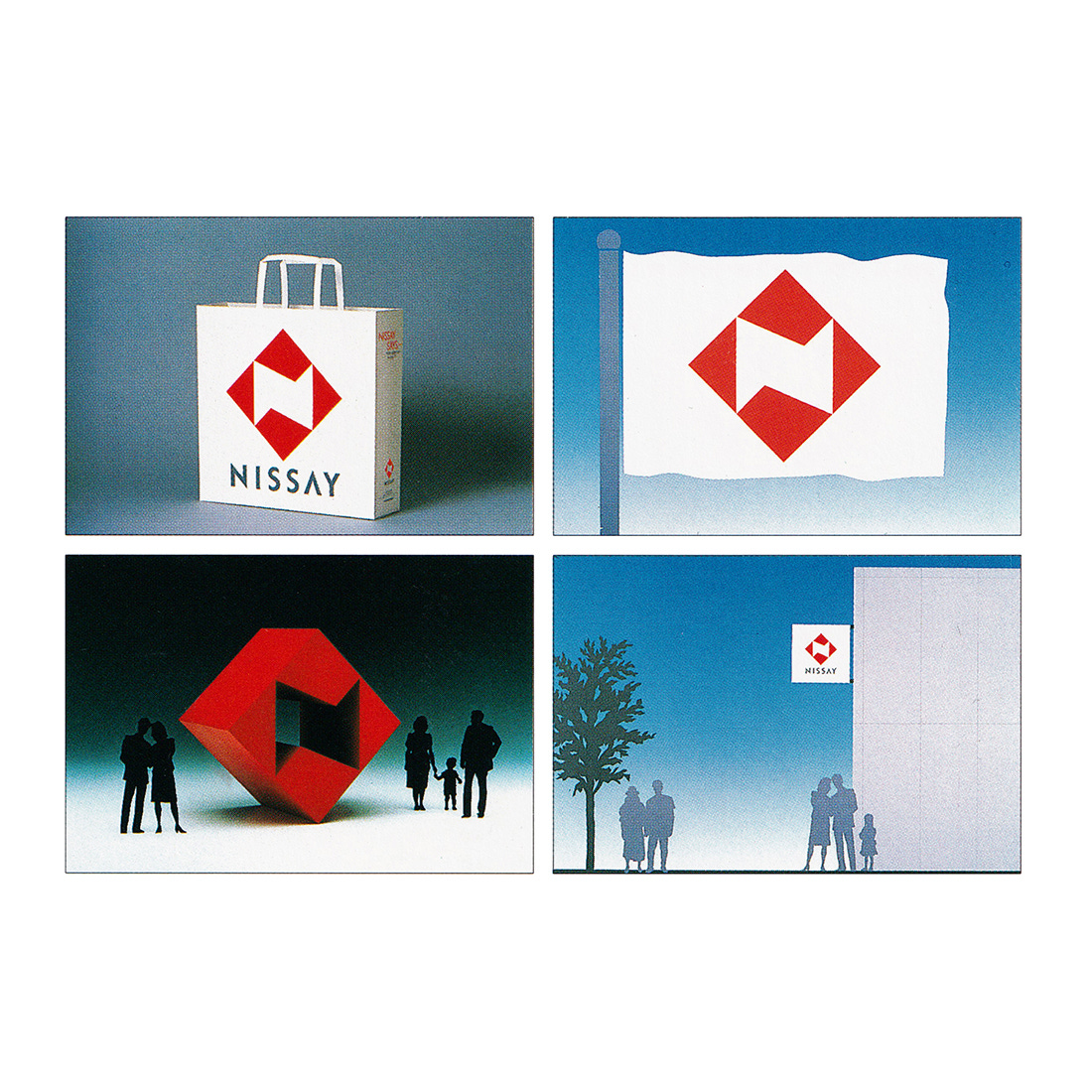
PAOS coordinated the overall design effort. They were responsible for the creation of the Japanese version of the logotype and developing the design system. Items such as company pins, business cards, stationery, policy certificates, and pamphlets were said to be fundamental at the time for creating the public image of an insurance company and carried a large weight when it came to the success of such an enterprise. So, a ‘consistent’ and ‘appealing’ design format was developed for all these items. The system also included an extensive signage programme.
Local branches of Nissay were considered by its customers to be ‘staff headquarters’ and not places they could go to themselves. To address this, new ‘eye-catching’ signs and shutters that would ‘harmonise with their environment’ were introduced. These also intended to have an effect on staff moral as the visibility of the Nissay brand would be more clearly projected and generate more pride.

As part of the corporate strategy a new name would also be introduced. Prior to the launch in 1988, the corporation was known as Nis-sei (short for Nippon Seimei or Nihon Life Insurance). This was changed to just Nissay. Adjusting the ‘sei’ to ‘say’ intended to emphasise the idea of ‘speaking out’ and ‘proposing ideas’, and had an internationalised quality.
The phrase ‘Nissay Says’ was used in advertisements to express the concept of a company that speaks out and sharing new ideas. It would give a voice to the corporation, its executives and employees with phrases such as ‘Nissay's President Says’ and ‘Nissay Says’. This was instrumental in getting the new name across to the public and presenting the corporation as friendly and multifaceted. Further it was used as an effective means of expressing individual messages to better help the public understand Nissay’s values and services.


In the words of PAOS, ‘an important function of any corporate identity program is the stimulation and enlivening of the corporation itself; how a company is seen from the outside influences its employees’. Less than a month after the introduction of the program almost 90% of Nissay’s local branches had the new look. This significantly increased the visibility of the corporation and gave a boost to its 70,000 employees.
The new image, and the effect of the ‘Nissay Says’ campaign functioned so well as a powerful new vision for the future direction of the company, the logo, typeface and colour palette remain in place and in use today.
Discover more Nissay brand assets and assets from hundreds of other historical and contemporary brands at Brand Archive.
Thank you for subscribing to Logo Histories. If you enjoy reading this you may also enjoy these resources from the same team:
New! Wittl – Job posting and applicant tracking tool.
LogoArchive Website – Searchable modernist logo archive & research tool.
LogoArchive Shop – Vintage design books & LogoArchive Zines.
BP&O – Contemporary design editorial.
Brand Archive – Research tool for brand designers.