In 'Living Color'
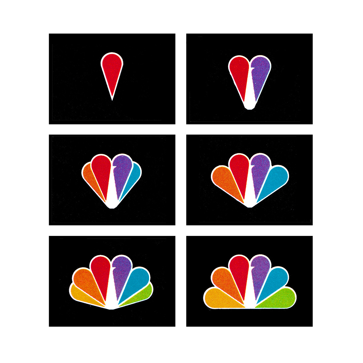
Chermayeff & Geismar's 1986 logo for NBC.
This post is supported by LogoArchive – The home of historical logos. Discover over 4000 of history’s greatest designs from the world’s finest designers. Updated every single day. Always find the logo inspiration you need for your next logo or branding project. Start here.
Since its launch in 1926 as the National Broadcasting Company and America’s first radio network, NBC has been at the forefront of the media landscape. Over the decades, it evolved to meet the demands of an ever-changing viewership through technology and programming.
One of the most recognisable elements of NBC’s visual identity is the NBC Peacock, which has stood as a ‘symbol of innovation and excellence’ since its introduction in 1956. The first version was created by Herb Lubalin (ASCIS) at Sudler & Hennessey and NBC Design Director and John J. Graham, and was used as a promotional device, announcing the arrival of colour television but not as an official trademark. The design’s multi-coloured plumage was an effort to tie the broadcaster to the future and make the most of new colour technology.
Between 1959 and 1979, three logos were used in succession. A single line monogram that connected the letters NBC and a Diamond ‘N’ designed by Lippincott & Margulies. In 1979, the ‘frankensteining’ of the Peacock and Diamond ’N’ was created by the NBC in-house design department. Despite the awkwardness of this combination, this did move the Peacock forward through its simplification.
Later in 1979, NBC decided to take a fresh look at their visual identity and evaluate its effectiveness in an increasingly competitive marketplace. Improved performance and the company's 60th Anniversary gave the corporation the impetus, means and reason to introduce a new design, one that would better resonate with its viewership.
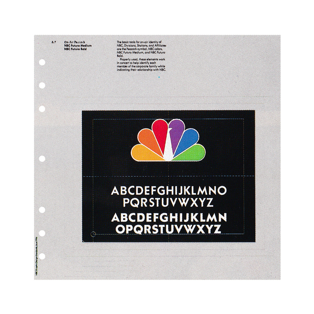
The corporation worked with Chermayeff & Geismar (C&G), led by Partners Ivan Chermayeff and Steff Geissbuhler (EPA), to develop a new logo, formalise its use, settle on corporate typeface, and codify these within a corporate identity manual. The main objectives were to simplify the existing design, improve its fidelity and usability and at the same time minimise the noticeability of its change.
The design team explored the abstraction and geometric rationalisation of the Peacock, establishing a continuity without a drastic change, and improve its function as an on-screen corporate trademark.
By simplifying the plumage and colours from 11 to 6, and employing negative space to form the peacock, C&G improved the overall flexibility, impact and immediacy of the logo, whilst better reflecting the full tonal spectrum of colour television and symbolising the ‘collective contributions’ of NBC's corporate family. This simplified form then afforded the corporation a means to create distinct identities for its various divisions using single solid colours for NBC Sports, NBC TV Stations, BC News, NBC Entertainment and NBC Enterprises.
In the final design emphasis was placed on the importance of simplicity, strength, and appropriateness, and incorporated a return to the full use of NBC's initials alongside the iconic Peacock symbol. This integration intended to ‘streamline the application of the corporate identity while reaffirming NBC's legacy as a pioneer in broadcasting’.
As part of the identification program the design team redrew the letters NBC, News, Sports, etc. and three weights of Futura to create a custom corporate typeface and establish a sense of hierarchy across corporate stationery and communications. And the standards manual eliminated the disparities within the previous design styles and ensured a consistent level of quality across NBC’s advertising, design and promotion departments.
The final design, it was said, was embraced because it simplified the peacock - initially a symbol for "living color" and later associated with the slogan "NBC - Proud as a Peacock" - and included a return to the full use of our corporate initials. Focus groups confirmed the validity of the new design, with over 90% of respondents to a survey correctly identifying it as NBC without noticing the changes.
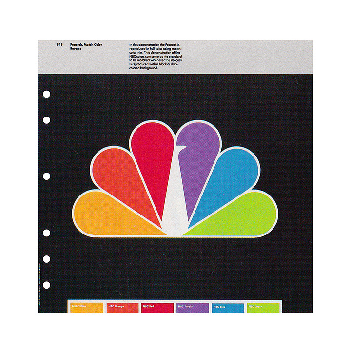
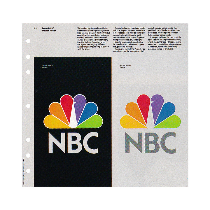
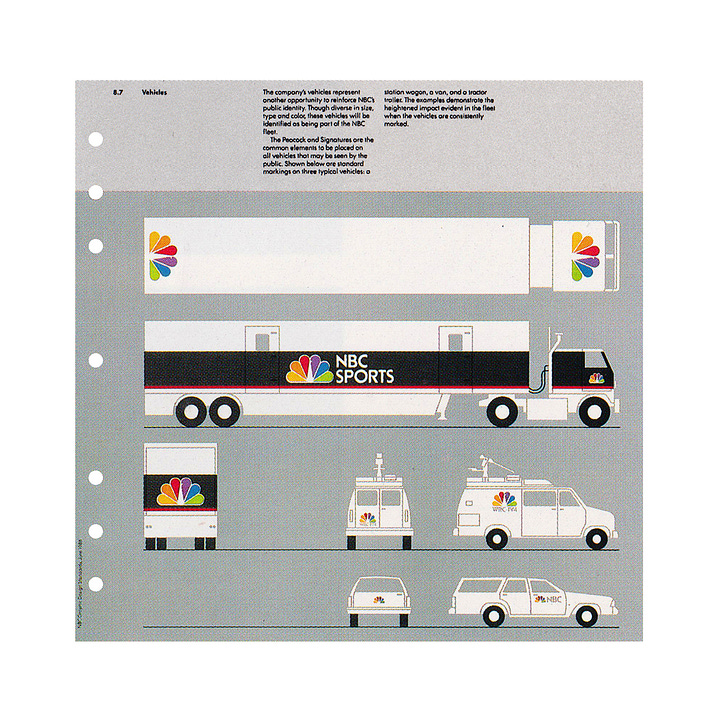

Despite the completion of the project in 1980, NBC hesitated to adopt it. The expense of changing its signs, trucks, promotions would be significant. At the time, it was third in ratings, behind behind ABC and CBS. It was felt that there would be a strategic advantage of executing the new corporate image once it had regained its position as number one.
This would come six years later in 1986, and lead to the official release of the new Peacock emblem. Reflecting on this process, Geissbuhler acknowledged the complexities involved in redesigning such a prominent logo. However, he emphasised the importance of patience and strategic timing in ensuring the successful rollout of the new identity.
Thank you for subscribing to Logo Histories. If you enjoy reading this you may also enjoy these resources from the same team:
Brand Archive – Research tool for brand designers.
LogoArchive Website – Searchable modernist logo archive & research tool.
LogoArchive Shop – Vintage design books & LogoArchive Zines.
BP&O – Contemporary design editorial.


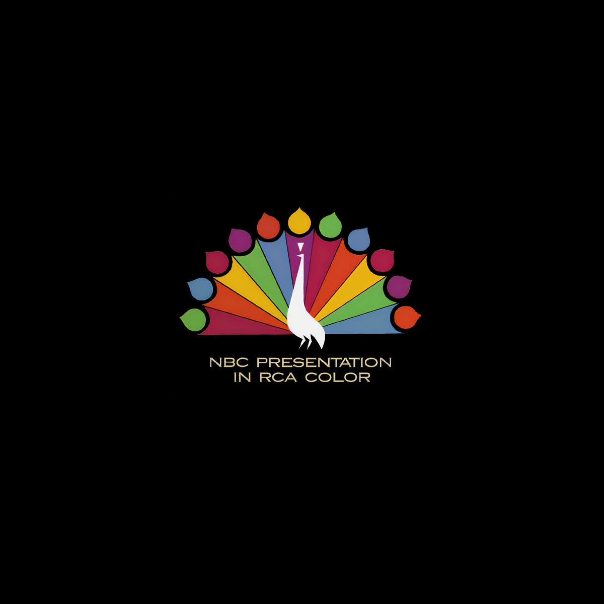




I can still hear the music that played when the 60s peacock unfurled its tail feathers. I also remember changes made and it took my young mind a bit to adapt, and I always wondered "why they had to do that". Great nostalgia for me - thank you!
NBC's peacock logo, despite its many changes, remains the network's most fascinating thing to ever exist.