Pan Am's World
The Pan Am logos of Charles Forberg, Edward Barnes & Ivan Chermayeff
This post is supported by LogoArchive – The home of historical logos. Discover over 4000 of history’s best designs from the world’s finest designers. Always find the logo inspiration you need for your next project here.
In 1955 architect Edward Barnes was hired as a design consultant for Pan American Airways just as the company began to introduce commercial jets to the America airline market.
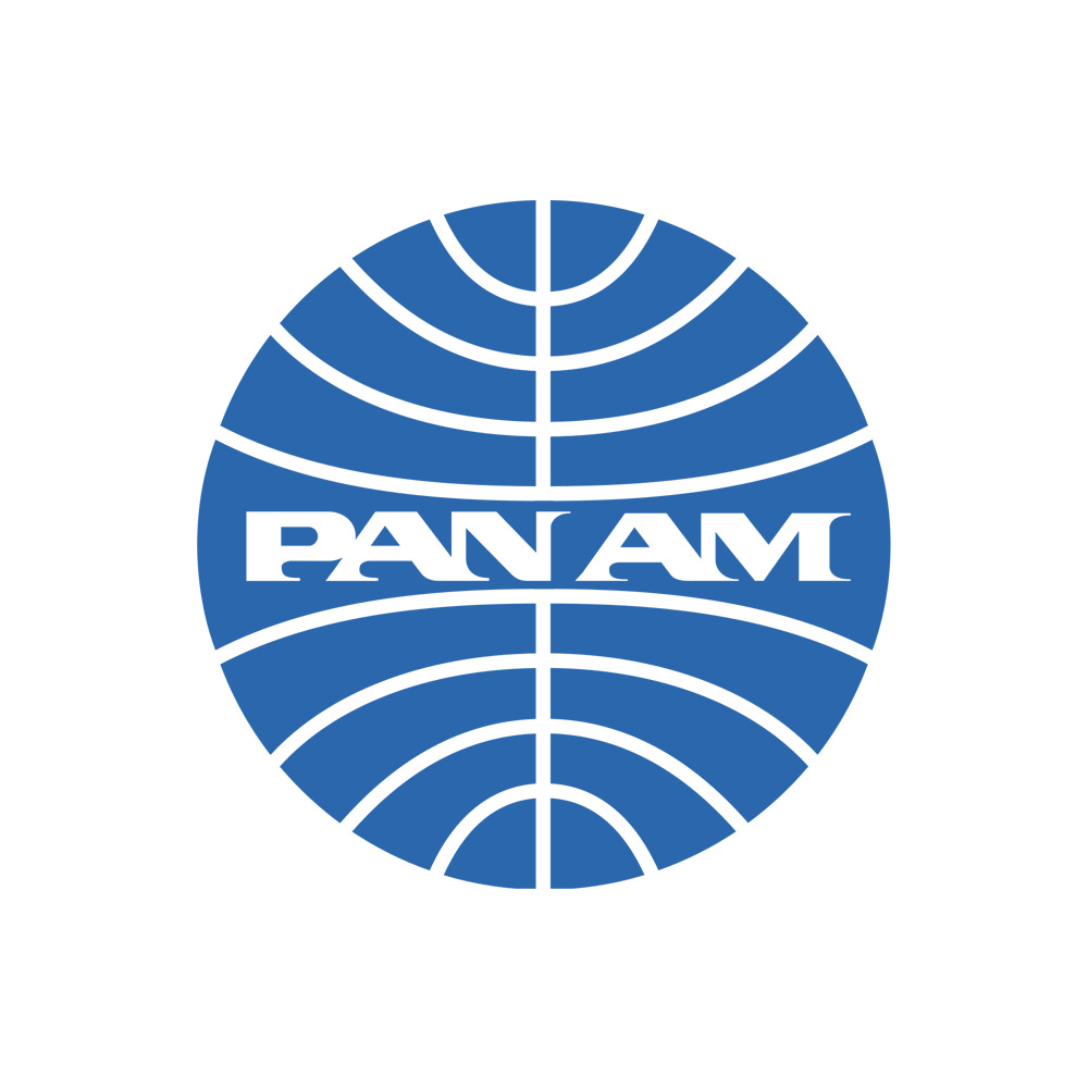
The half wing symbol, a motif that had become increasing common in aviation and used since 1928, was replaced with a globe with fine curved lines of negative space intersecting it. This was colloquially known as the ‘blue ball’ and was a bold and modernist expression, well ahead of its time that avoided specific geographic representation, instead, favouring an abstract vision of a world without borders, fitting for the dawning of a new age of commercial aviation.
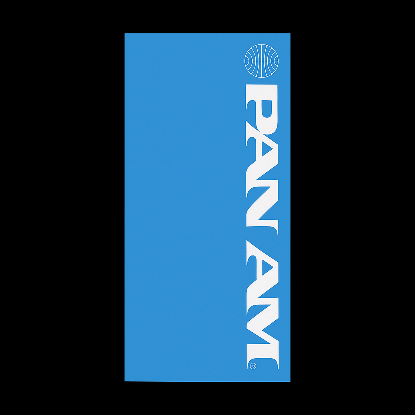
An extended wordmark with dynamic serifs, alluding to speed and distance, was used alongside the logo. In 1957, the wordmark and globe were integrated into a single symbol.
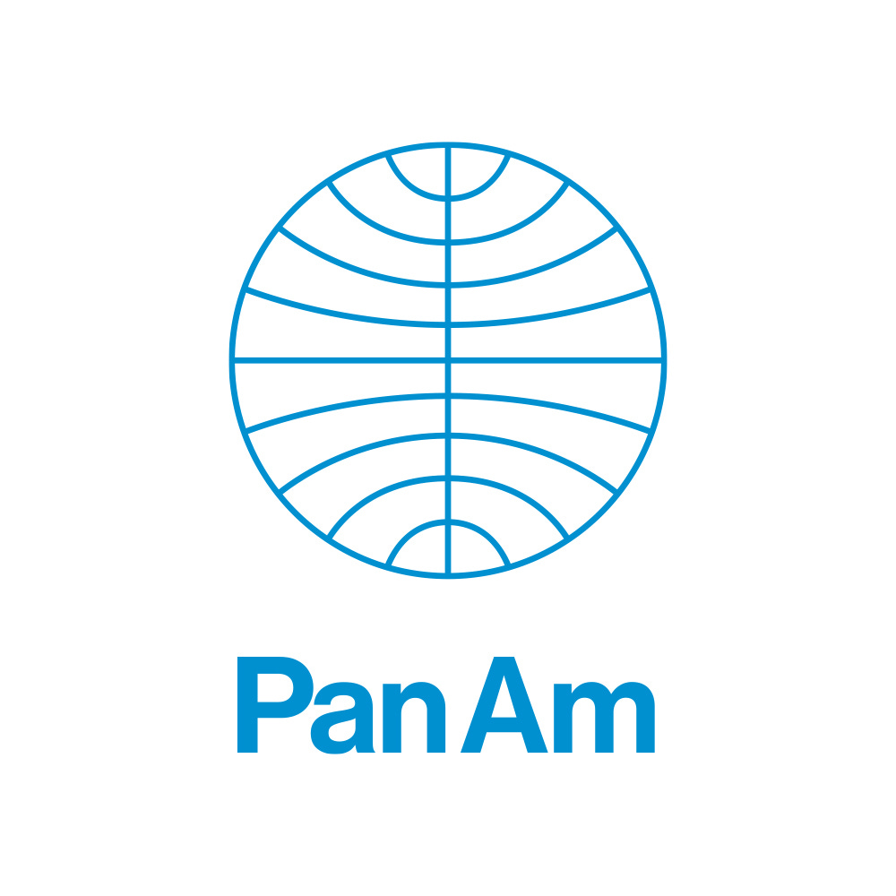
Coinciding with the appointment of a new chairman in 1970, and the delivery on a large purchase of Boing 747’s, ordered in 1966, Pan Am embarked on a programme of further modernisation, appointing Ivan Chermayeff to review Pan Am’s corporate identity. This programme included a revision to the globe logo based on the 1955 version, but which was converted to outlines, set vertically or horizontally aligned with a new wordmark set in Helvetica. Other versions included a solid version which could be used on its own as a decorative element in conjunction with a bold use of type.
As part of a massive marketing drive, under the direction of Pan Am’s head of sales and promotion, Chermayeff & Geismar produced promotional works as well as campaign materials that included travel agent posters. These used stock rather than commissioned photographs, however, as single images, made a striking and “simple statement about some part of the world” and this was then used as a straightforward message alongside the Pan Am logo and corporate typeface in different configurations. The strapline “Pan Am’s World” united the campaign of diverse global images, driving it away from the corporate and towards conveying a sense of adventure. Although stock images, the idea and execution, delivered a powerful and pioneering campaign for the time.
The new corporate identity didn’t last long. Pan Am’s Patrick Friesner, Head of Sales and Promotion, described the new work as being an imposition by senior staff rather than as a liberating vision for the future that would help Pan Am through a tough financial period. Ultimately, in 1973 as the pressure of a global oil crisis took hold, Pam Am returned to a previous iteration of its corporate identity, reintroducing the dynamic wordmark, and continued to use this until its bankruptcy in 1991.
Discover more Pan Am brand assets and assets from hundreds of other historical and contemporary brands at Brand Archive.
If you enjoy reading this you may also enjoy these resources from the same team:
Brand Archive – Research tool for brand designers.
LogoArchive Website – Searchable modernist logo archive & research tool.
LogoArchive Shop – Vintage design books & LogoArchive Zines.
BP&O – Contemporary design editorial.


