On the September 22nd 1955 advertising-supported television was launched in Great Britain. This reflected the increasing home television viewing figures which had arisen from the lowering cost of technology and an increase in household incomes. However, and as a consequence, British cinema chains started to see a down turn in audiences and were being forced to develop new initiatives to retain them. One such initiative was the setting up of television stations.
The Associated-British Picture Corporation (ABPC) was approached by the Independent Television Authority (ITA) with an invitation to start their own station. Despite initial reluctance, they agreed and signed a contract. This had initially been a larger seven day Midlands contract, however, by the time of agreement, the new offer from the ITA was a much smaller deal for a weekend slot in the Midlands and the North of England.
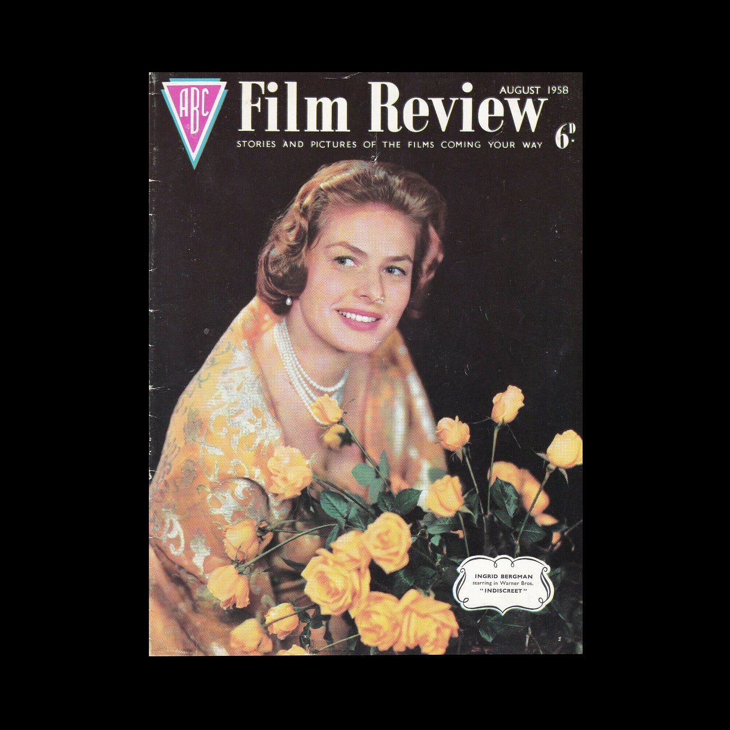
When the newly formed ABC Television launched in 1956, it used a derivative of the ABC cinema logo, the parent company. Following criticism from the ITA in 1958, who had suggested it was too similar, ABC Television sought out a new logo.
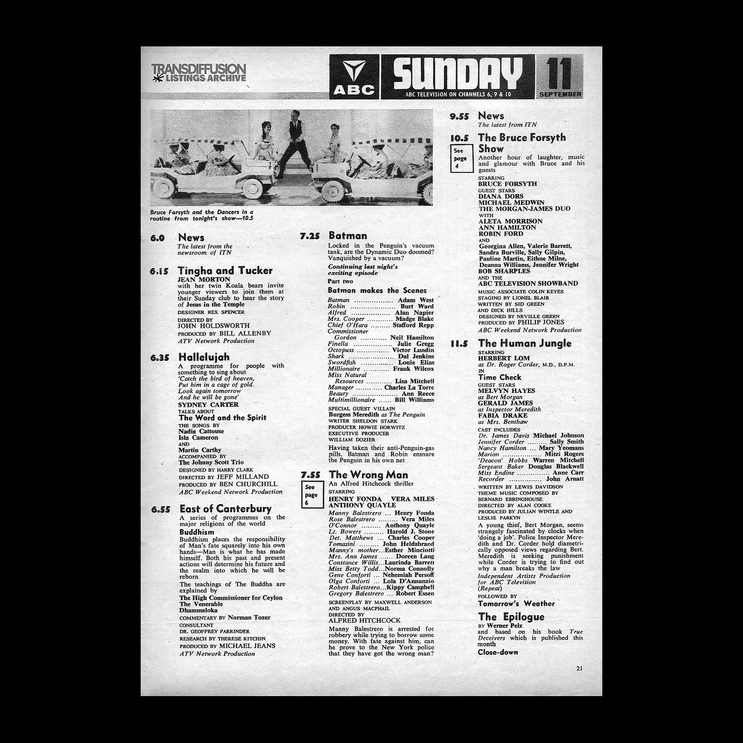
The responsibility for designing ABC’s new logo was handed to June Fraser at Design Research Unit. Fraser, a pioneering graphic designer, had joined the design agency in 1957 - not long after completing her education at the RCA. The following year, Fraser’s logo design for ABC Television began appearing in motion on-screen.
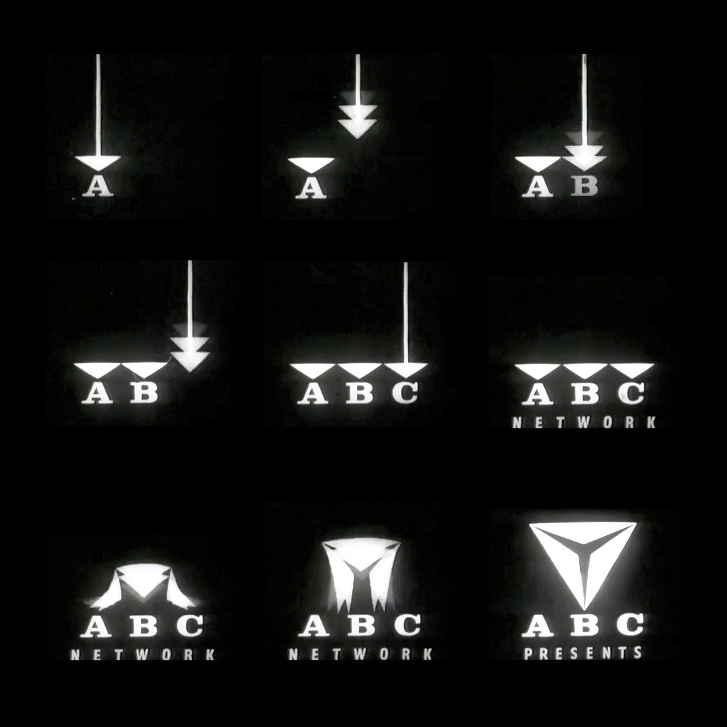
The on-screen identity featured three arrows falling to the bottom of the screen, pointing to A, B, and C respectively as corresponding notes are played on a vibraphone. The arrows then merge to form the ABC’s new triangular logo.
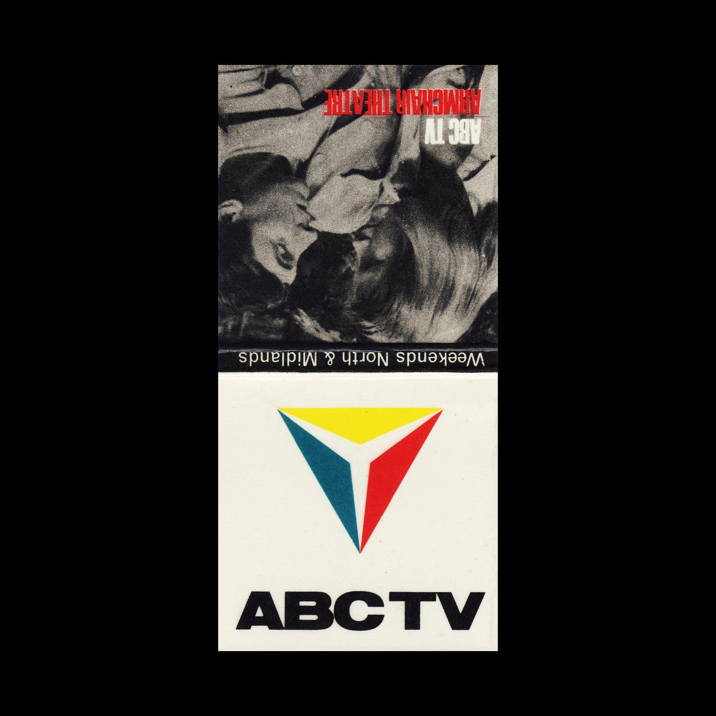
The design concept follows the principles of the original ABC logo – a downward pointing triangle. Continuing the theme of three, the logo itself is also made up of three identical triangles.
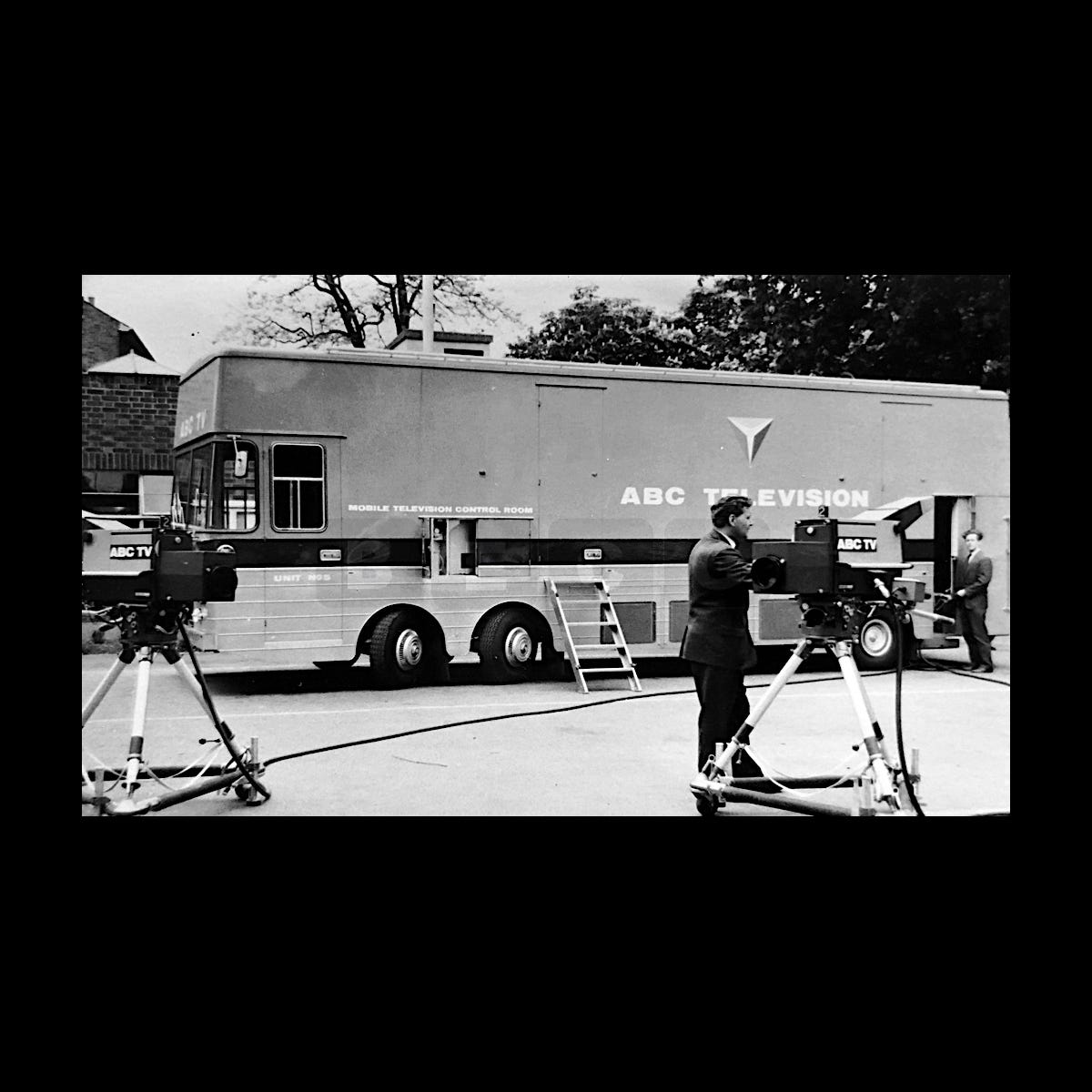
The new design iterated on the original ABC logo, following a brief which specified that a definitive link be formed with the parent company but also convey a recognisable difference. Its simplicity and abstract shape is also an expression of its specific and diverse use-cases. The logo had to work within the growing requirements of broadcast motion graphics which needed a strong use of form and motion as televisions were, at the time, black and white. It also had to function as a corporate house mark to be applied to many different surfaces, quite different in scale, from building signage to vehicles, from TV cameras to outside broadcast trucks, from matchbooks to pens and pencils.
The logo was used until 1964, with a revised version introducing a heavier ABC typeface, which improved legibility at smaller sizes. This then lasted until the demise of the company in 1968, following a merger with Rediffusion to become Thames Television.
Thank you for subscribing to Logo Histories. If you enjoy reading this short you may also enjoy these resources from the same team:
Brand Archive – Research tool for brand designers.
LogoArchive Website – Searchable modernist logo archive & research tool.
LogoArchive Shop – Vintage design books & LogoArchive Zines.
BP&O – Contemporary design editorial.


