This post is supported by LogoArchive – The home of historical logos. Discover over 4000 of history’s greatest designs from the world’s finest designers. Updated every single day. Always find the logo inspiration you need for your next logo or branding project. Start here.
The American Cellulose & Chemical company was founded in Delaware, USA in 1918, changing its name to Celanese Corporation of America in 1927, and again in 1966 to Celanese.
By the middle of the 1960s Celanese had evolved from a domestic company that specialised in the manufacturing of acetate fibres to a diversified billion-dollar and world-wide producer of man-made fibres, chemicals and cosmetics, lubricants, pesticides, pharmaceuticals, plastics and paints.
Despite a global strategy for ‘integrating forward into consumer fields and backward into raw materials’ the corporation’s growth and diversification had produced an incoherent corporate image. Further, the old ‘free-script’ signatures used since the 1920s were seen as no longer relevant. These lacked strong recognition, did not reflect the ‘characteristics of a large company’. and were considered inappropriate as unifying symbols for the wide variety of companies, affiliates, subsidiaries and brands that made up the Celanese corporation.
The growth of Celanese had been achieved through a strong sense of unity fostered across all subsidiaries. To ‘dramatise’ this unity, Celanese sought a new corporate identity that would ‘correct’ the image of the corporation, bringing it up to date, and graphically unify its divisions and affiliates, which were spread across five continents. This project, substantial in size and complexity, would be led by Saul Bass and Associates who had previously completed work with large corporate entities such as Lawry’s and ALCOA.
The decision had to be made as to whether or not to use a logo or some other unifying graphic device. In developing either, the solution must be right for all of the diverse enterprises within the corporation, from heavy industry to high fashion. It was felt that it was imperative that the design also reflect the diversity, harmony, scale and flexibility of Celanese.
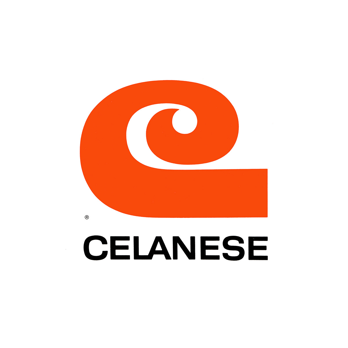
The ‘C’ logo devised by Bass intended to offer an ‘intersectional’ solution to a company with a diversified product portfolio, functioning well in a fashion context as it sold materials to clothing manufacturers, as well as appearing appropriate when related to more industrial products which included paint brand Davoe. The ‘C’ was described as stylish and fashionable but also have the stability of a large chemical company, living comfortably within either of these contexts and functioning as an umbrella for many things.
In its simplicity, the logo would also provide the corporation with a much needed adaptability, unlike its previous logotypes, able to be reproduced across all kinds of media, from large signage and storage tanks to smaller applications such as labels and letterheads. Further, it would also lend itself well to animation for TV spots.
The ‘C’ would be used as the primary housemark, and used by affiliated companies that also began with the letter ‘C’. A special set of letters, in a similar style, were also developed for brands and products whose names did not begin with ‘C’. These included Fartrel, Nylon, Acetate, Arnel and Devoe. This was described as the ‘most difficult criterion’ to satisfy in development of the corporate identity but would best reflect the diversity, harmony, scale and flexibility of Celanese.
A custom sans-serif typeface, a more austere expression of uniformity, industrial activity and stability was also devised for use with the stylised letters. The benefits afforded by this was the ability to establish a more unified Celanese style; and developing a typographical harmony and consistency within Celanese's corporate messaging. This was also supported by a more formalised colour palette of a warm and striking reddish orange.


A vertically stacked lock-up would be used to deliver more impact and was suitable for viewing from a distance, like signage. The horizontal lock-up was created for ‘close viewing media’ such as brochures, advertisements and corporate stationery. The overall effect was the creation of a more powerful, legible and flexible solution that was better-suited to the increasing scale and complexities of a modern industrial giant.
The ‘C’, the stylised lettering and the corporate typeface replaced numerous symbols and logotypes that were in use by different divisions, subsidiaries and brands, and formed the basis of Celanese’s new corporate image. The bold new ‘C’ and its ‘graphic offspring’ were seen as symbols of a ‘progressive corporation’, a reminder of a common desire to serve the various markets with distinction whilst also being an effective tool to speak clearly with a single voice across continents.
In 1987 Hoechst AG acquired Celanese and the logo was retired. This was replaced by a Helvetica-based logotype designed by New York design studio Siegel+Gale.
Discover these brand assets and more at Brand Archive.
Thank you for subscribing to Logo Histories. If you enjoy reading this short you may also enjoy these resources from the same team:
Brand Archive – Research tool for brand designers.
LogoArchive Website – Searchable modernist logo archive & research tool.
LogoArchive Shop – Vintage design books & LogoArchive Zines.
BP&O – Contemporary design editorial.