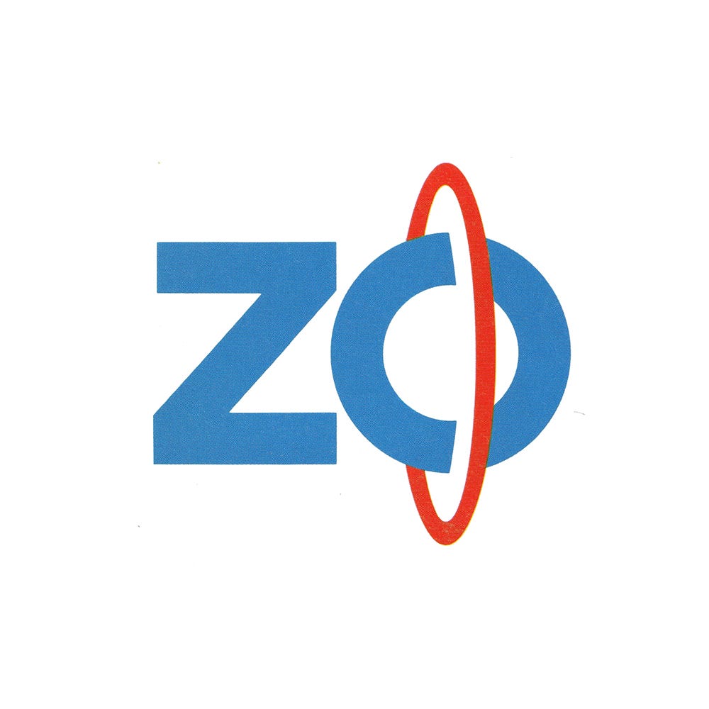
Zojirushi Logo, 1988
PAOS’ 1988 logo and corporate identity for Japanese appliances brand Zojirushi
This post is supported by LogoArchive – The home of historical logos. Discover over 4000 of history’s greatest designs from the world’s finest designers. Updated every single day. Always find the logo inspiration you need for your next logo or branding project. Start here.
Zojirushi was founded in 1918, and was one of a multitude of thermos makers that popped in Japan’s Osaka region. By 1964 it had succeeded in becoming the industry leader. Between 1960 and 1980 it made efforts to sustain this position by focusing on innovation (it was the first to offer an electric thermos) and by expanding the scope of its operations. This included moving into the manufacturing of general household electrical appliances.
In 1984, PAOS and DENTSU began working on the development of a new corporate identity program for Zojirushi with the intention of ‘revamping’ its image for the the ‘post-thermos’ era and stressing its efforts to expand its industrial role.
The romanised form of the company's name ‘Zojirushi’ was selected as the basis for the design of a new corporate symbol. This would become a visual distillation of Zojirushi's four corporate ideals: innovation, technical strength, ‘contemporary stylishness’ and international acceptance. Alongside this, the wide corporate identity (CI) program had two primary goals: to make a new symbol the core of a formalised visual identity system, and improve employee awareness of the corporation’s evolving vision.
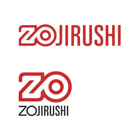


The basic strategy of PAOS's design effort was to stress the "ZO" in "Zojirushi," the wordmark for the company's new image. This clear differentiation with what came before would enable the "ZO" brand to take hold and become a easily recognisable shorthand for the brand. It would be easier to work with across a multitude of print, packaging and advertising contexts as the corporation expanded.
Out of the many designs produced by PAOS, three final candidates were felt to fully embody the key notions of: international acceptance, practicality and individuality. Each was presented as a wordmark with the shorthand symbol integrated, and the ‘ZO’ symbol on its own.

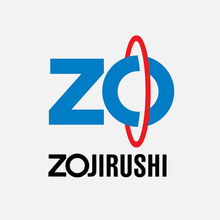
The final design was selected on the consensus that the red ring around the O better symbolised an advanced consumer services brand and most strongly suggested, alongside the primary values, the additional aspects of ‘diversity’ and ‘dynamism’. Alongside this, an effort was made to update the Zojirushi’s traditional symbol, the elephant mark. (Zo 象 means “elephant” and jirushi (shirushi) means “(trade) mark”. Thus, Zojirushi tramslates as “the Elephant mark”.
Despite wide recognition as the corporate symbol since Zojirushi's founding, the elephant mark was ill-suited to conveying a message of ‘innovation or technological prowess’. To strike a better affinity with the new corporate symbol, it was refined, simplifying its form and used in a few select instances to form a continuity. Updating this symbol would give the clearest impression that the corporation was firmly committed to improving and embarking on a new journey.



The red ring was developed into a design element to offering greater distinction and energy to the overall design system. This was formalised and given the name: the "Inter-link." This was then produced in three weights to accommodate different sized use-cases. Used in conjunction with colour, this new design element afforded the corporation the capacity to better delineate between growing product categories, with blue and red forming the brand’s core palette.
PAOS developed a suite of assets to improve the overall flexibility of the Zo visual identity. This included the basic logotype, a version combining this with the ‘ZO’ symbol, the ‘ZO’ symbol alone, the elephant, the inter-link and corporate pattern.
Enjoying this Logo History? Also check out these:
ZDF by Otl Aicher, 1973
Swissair by Karl Gerstner, 1978
AT&T by Saul Bass, 1969
The assets created by PAOS provided a flexibility that was previously absent. These better addressed space limitations and improved the creative opportunities for ‘special marketing undertakings’. As well as the practical considerations, the new CI would help to better express the Zojirushi’s ‘prestige’ and position as a market leader.
This flexibility, the suggestion of innovation and the traditional yet refined image of the elephant set Zo up for the next three decades and continues to be used today.
Thank you for subscribing to Logo Histories. If you enjoy reading this you may also enjoy these resources from the same team:
Brand Archive – Research tool for brand designers.
LogoArchive Website – Searchable modernist logo archive & research tool.
LogoArchive Shop – Vintage design books & LogoArchive Zines.
BP&O – Contemporary design editorial.


