Co-operatives emerged as smaller individual retailers sought to increase their collective bargaining power to the level of larger corporate retailers. Aside from improving wholesale negotiations, this also gave individual members a voice to shape the direction of the business rather than investors. The modern co-operative movement emerged in many countries, beginning in Great Britain in 1844 and quickly spreading into the European nations of Italy, Germany and France. Each share the same name but are not part of the same organisational group. And while they all began diversifying their services and products in the 1950s and 1960s, each developed quite different design policies.
Scroll down to learn Lippincott & Margulies' logo for the Co-op in Great Britain or click here to read about Raymond Loewy’s design for Co-op France.
In the 1950s the Co-op movement in Great Britain was suffering a decline. In response, a commission was set up in 1958 to investigate and address this. The result was "Operation Facelift", a concerted and strategic initiative aimed at reversing a decline in sales which was being attributed to a substantial rise in consumer choice, and part of the post-war economic boom. This operation included a significant internal managerial change that brought in leaders with more corporate experience. Reflecting this internal change externally, and representing a new outlook for the Co-op, was the introduction of a new visual identity and logo design.
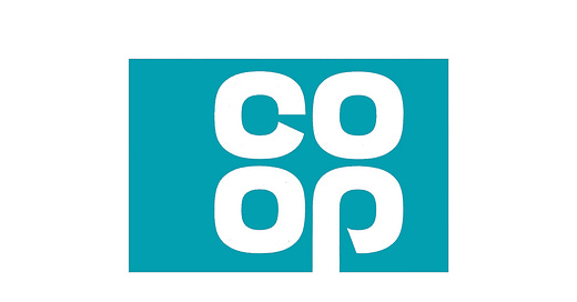
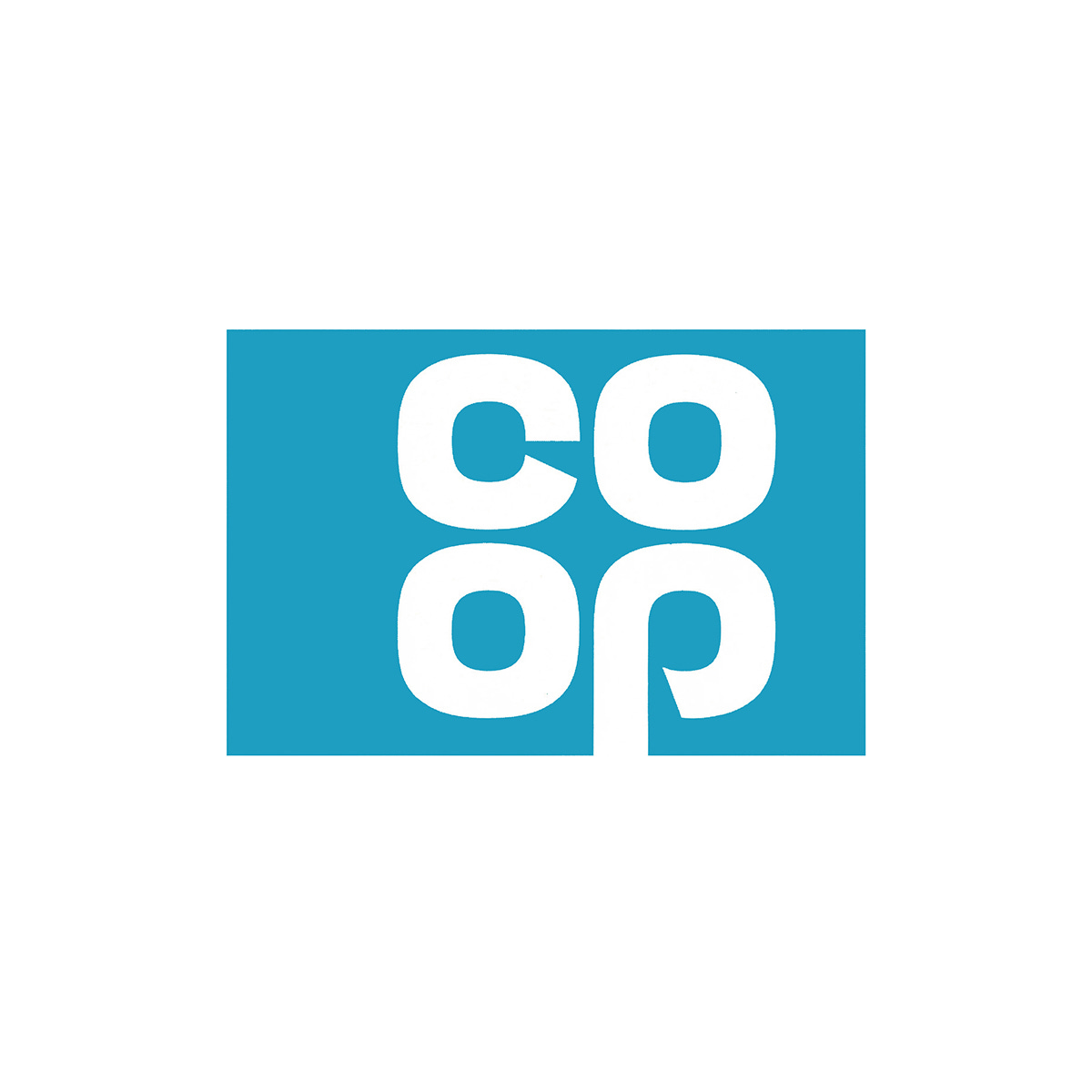
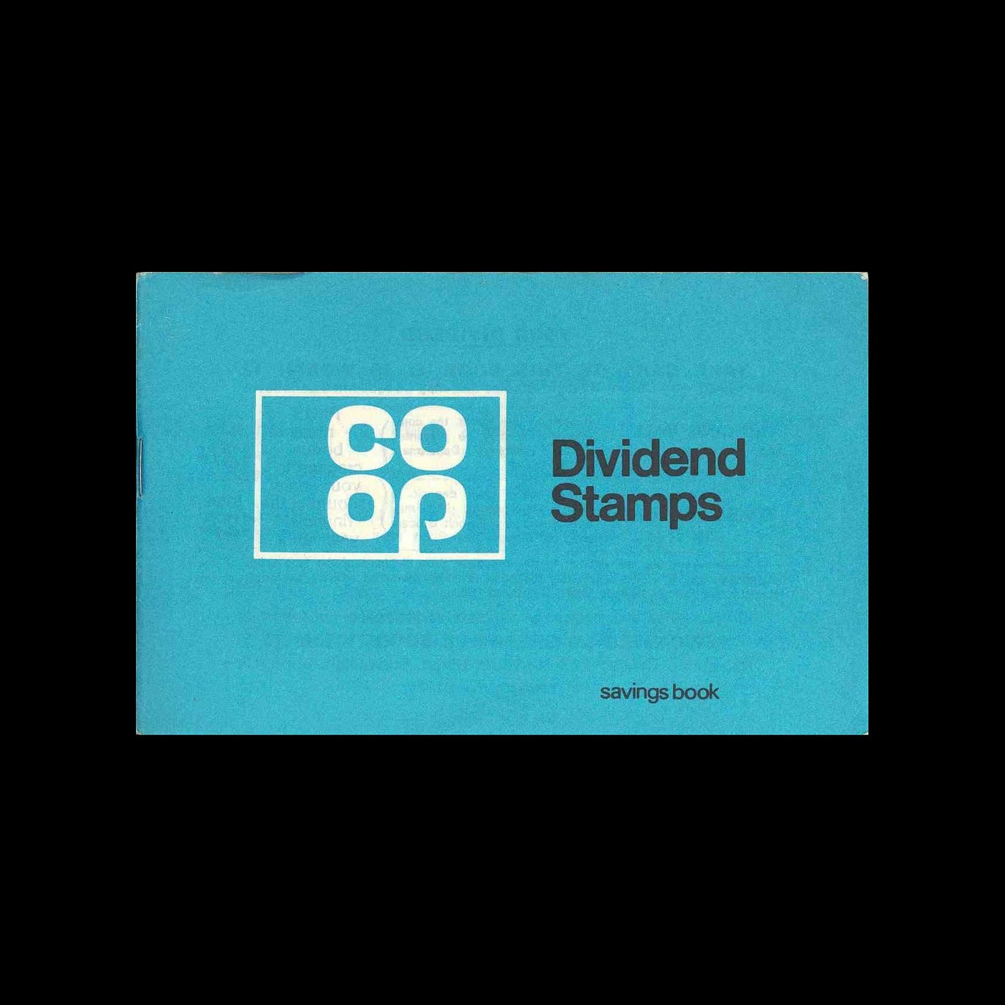
Working with the Co-op in-house team, American design studio Lippincott & Margulies' developed a logo that, through the arrangement of the letters and making the most of the recurring forms and the ‘stem’ of the ‘P’, created the ‘cloverleaf’ logo. This was placed within a rectangle outline or knocked out of a solid colour. The introduction of the new logo and visual identity was announced in 1967 with the campaign "It's All At The Co-op!"
Alongside the new logo and visual identity, was a strategic review of all communications, with the intention of helping modernise the way that Co-op talked to its members and customers, and shedding the old-fashioned perceptions across all of Co-op's stores.
This logo was in use until 1993 when it was revised slightly, making the letterforms circular, and extending the stem of the ‘P’ below a line and freeing it from the rectangular container. This was later abandoned in 2007 as part of an effort to resolve Co-op's diversified businesses portfolio under a single consistent brand, directed by London-based Pentagram. The Co-op became ‘The Co-operative’ and this was rendered as a long-form logotype.
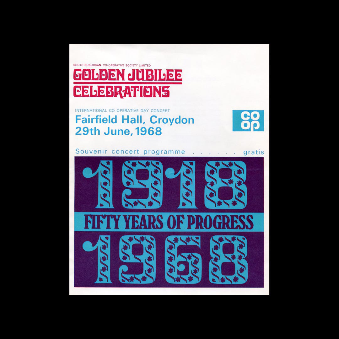
In 2016, Coop returned to the original 1968 cloverleaf logo. Reintroduced by design studio North, this applied a new grid-based structure to the logo where prior it had been hand drawn, formalising the letterforms. this was then developed a simple visual identity system that made the most of this logo. At the time of the logo’s reintroduction, and asked to speak about the logo, Sean Perkins, Founding Partner of North said that "it's never dated".
Missed the Co-op France Logo History? Click here to read about Raymond Loewy’s logo and visual identity for the French Co-op.
Key Takeaways
Intended to reverse a decline in sales ‘Operation Facelift’ saw significant internal managerial change. Reflecting this change externally was critical to presenting a new positive outlook for Coop, to both store owners and customers.
The logo was launched alongside the campaign ‘It’s all at the Co-op’, communicating a new diversified product offering. By launching logo and campaign together, the logo would be attributed the value of abundance and convenience.
The simplicity of the logo made it a useful and easy to use asset across more diversified product packaging and an intensified marketing programme. This saw it reinforced in the minds of consumers through repetition. The logo’s reintroduction in 2016 made the most of this residual impression.
Thank you for subscribing to Logo Histories. If you enjoy reading this you may also enjoy these resources from the same team:
Brand Archive – Research tool for brand designers.
LogoArchive Website – Searchable modernist logo archive & research tool.
LogoArchive Shop – Vintage design books & LogoArchive Zines.
BP&O – Contemporary design editorial.


