


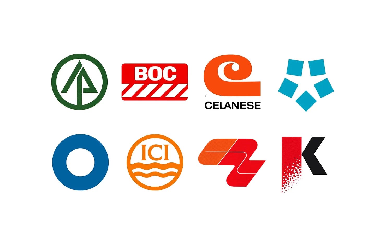
Steelworks, chemical plants, cement works and paper mills rarely sell directly to the public, yet some of the most rigorous corporate identity programmes of the 1950s, 60s and 70s were created for them.
Post-war mergers, acquisitions and diversification had left many industrial giants with fragmented names, trademarks and liveries. A new logo corporate identity had to unify subsidiaries across continents while working on storage tanks, trucks and cement bags as well as letterheads and sometimes down to pin badges.
Here are eight of corporate identities for industrial giants, from Lester Beall’s International Paper in 1958 to PAOS’ Kawasaki Steel in 1987, and the stories behind their design.
Key Takeaways
Unity after growth
Diversification had left companies such as Celanese, Blue Circle and Crown Zellerbach with fragmented trademarks, and a single logo brought their subsidiaries together under one image.
Built for industrial scale
These marks had to work on storage tanks, trucks, signage and packaging as well as stationery, from BOC’s red and white stripes to Blue Circle’s four size variations.
Keep what has value
Where a mark had built up recognition, designers refined rather than replaced it: Design Research Unit kept ICI’s waves, Blue Circle kept its circle and International Paper kept its spruce tree.
Go behind the logos. Explore 200+ in-depth and meticulously researched logo histories revealing the designers, design decisions and ideas behind the world’s most iconic logos and important brand identities.
Continue reading to discover how eight industrial companies turned steel, chemicals, gases, cement and paper into memorable marks →

International Paper, 1958
Ahead of this, IP undertook an extensive study of its paper users and paper merchants. Despite having become the world’s biggest manufacturer of printing papers, the study revealed that the corporation and its products were not well-known. Additional research suggested that the absence of a cohesive corporate image across packaging, signage, trucks, letterheads and business forms was a key cause of such poor recognition. Alongside this, it was felt that the current trademark had proven to be impractical and hard to use, and not well-suited to the diverse reproduction needs of the company, from severe enlargement (signage) to reduction (stationery). Further, it was not simple enough to support recognition and recall.
Beall devised a logo that creatively combined the spruce tree of an earlier trademark–the raw material for much of the corporation’s products–with the initials IP, and placed this within a circle. A single consistent line weight links each element to form a whole. The international reach of the company and its desire for continued growth can also be understood in the tree and circle also being read as an arrow and a globe. This new logo was applied at scale and consistently where it hadn’t before, due to its simplicity and scalability.
Read the full International Paper story →

Hoogovens, 1963
Dutch designer Jurriaan Schrofer began working with Hoogovens in the 1950s advising on its printed communications. In 1963 he was invited to design a new logo for the company.
The five squares represented the composite character of the Hoogovens steel manufacturing complex of five blast furnaces, and the five continents the company exported to at the time. In the arrangement of these squares they give space to the shape of a starfish, a symbolic representation of where the company was situated; the point at which land and sea meet. The negative space also became the sea between the continents.
Read the full Hoogovens story →


Celanese, 1965
Despite a global strategy for ‘integrating forward into consumer fields and backward into raw materials’ the corporation’s growth and diversification had produced an incoherent corporate image. Further, the old ‘free-script’ signatures used since the 1920s were seen as no longer relevant. These lacked strong recognition, did not reflect the ‘characteristics of a large company’ and were considered inappropriate as unifying symbols for the wide variety of companies, affiliates, subsidiaries and brands that made up the Celanese corporation.
The ‘C’ logo devised by Bass intended to offer an ‘intersectional’ solution to a company with a diversified product portfolio, functioning well in a fashion context as it sold materials to clothing manufacturers, as well as appearing appropriate when related to more industrial products which included paint brand Devoe. The ‘C’ was described as stylish and fashionable but also had the stability of a large chemical company, living comfortably within either of these contexts and functioning as an umbrella for many things.
Read the full Celanese story →

British Oxygen Company, 1967
By the mid-1960s the British Oxygen Company was manufacturing many other products aside from oxygen. These included gases for industry and medicine, welding, cutting and surgical equipment, metals and alloys, chemicals and cryogenics, amongst many other things. As well as expanding into new industries the company was well-established in countries other than Great Britain, so much so that ‘British’, just as ‘Oxygen’, were considered to not be in support of future growth. As part of a broader public relations push, to keep up with its expansion and acquisition, a number of alternative names were discussed, with the initials BOC finally being settled on.
Red and white stripes were decided on at an early stage. It was felt that these would not only be clearly recognisable from a distance and easily applied to a multitude of items; from industrial equipment and transport, to packaging and stationery, but would also ‘counteract’ the ‘institutional’ and dated image that had been created by BOC’s existing image and house colours of maroon and gold lettering. The company’s new initials were then drawn up in various typefaces.

Blue Circle, 1967
HDA International worked to unify the organisations that made up the group under the name Blue Circle Group, and develop a cohesive brand identity system. Blue Circle Cement was one of the primary expressions of this new work.
The principal design element of this system was simply a blue circle, drawing on the past but pioneering and progressive in its application. The dimensions of the circle, from its centre point to its outside diameter, was twice the distance as from the centre point to the inside diameter.
Read the full Blue Circle story →

ICI, 1969
ICI was formed from a merger of four companies in 1925, and took over the logo of Nobel Industries (designed in 1923) which depicted shockwaves from an explosion. When the wording of Nobel was replaced with the initials ICI following the merger, the waves remained. Despite the increased areas of business, it was felt that the waves also worked well to represent liquids and chemicals.
DRU felt that nothing would be gained by ICI going to the great expense of altering the logo, and research had indicated that it had accumulated value. After a consultation with the ICI’s legal advisers, it was agreed that, with minor alterations they could improve the overall composition, balance and legibility of the logo without invalidating the globally registered trademark.

Crown Zellerbach, 1970
As Crown Zellerbach, the corporation contributed significantly to the industrial growth of North America, diversifying significantly since its foundation. By the beginning of the 1970s, it was made up of a number of subsidiaries servicing different industries. Each of these traded under their own visual identities. The absence of a coherent design policy had created a ‘chaotic’ and fragmented image. Rather than appearing as a large conglomerate the company appeared far smaller.
The selected logo, designed by Gary Hinsche, was described as simple and unique in design with a sense of movement and boldness, power and dynamism. Although based on the company’s initials it also appeared abstract, to some it gave the impression of paper moving on rollers at high speed but was not intended to be limited to this one interpretation. This abstract quality allowed the corporation to convey modernity and innovativeness, no matter what industry it expanded into.
Read the full Crown Zellerbach story →

Kawasaki Steel (Kawatetsu), 1987
Kawatetsu worked with PAOS to develop a new corporate identity. This intended to support the restructuring of the business; accommodate its ambitious diversification plan; and solidify its identity as a potent industry leader into the 1990s.
The new Kawatetsu logo, an iconic ‘K’, drew its inspiration from the flowing molten steel Kawatetsu was known for. The ‘grain gradation’ of the letter ‘K’ was inspired by an image of gushing molten steel and also expressed the ‘passion and vitality of the company’ which was emphasised further with a bright red.
Read the full Kawatetsu story →
Read next
For more logos made for heavy industry, browse every industrial logo history in the archive, or see more of the best in the Top 10 logos of all time. Become a paid subscriber to read every story in full, richly illustrated.
Want more in-depth articles? Check out LogoHistories’ other articles on manufacturing logos →


Thank you for subscribing to Logo Histories. If you enjoy reading this short you may also enjoy these resources from the same team:
Brand Archive – Research tool for brand designers.
LogoArchive Website – Searchable modernist logo archive & research tool.
LogoArchive Shop – Vintage design books & LogoArchive Zines.
BP&O – Contemporary design editorial.