


The following is an article first published in Graphis 140, 1968. In it, Willy Rotzler talks about the importance of a good symbol and the Mexico 1968 visual identity.

International events such as world exhibitions and Olympic Games need a memorable symbol which can be used to identify them wherever they stake their claims. One of the main preliminary tasks of the organizers of such events-and one that is often tackled years ahead-is therefore to find an emblem that has a high identity value and can be put to many uses not always foreseeable in advance. It is often no easy matter to find a mark that meets these requirements and is at the same time graphically satisfying and adapted to its purpose. In the case of Olympic games the issue is complicated by the fact that the existing symbol of the five interlocking rings has to be connected in some way with the location or year of the games concerned.
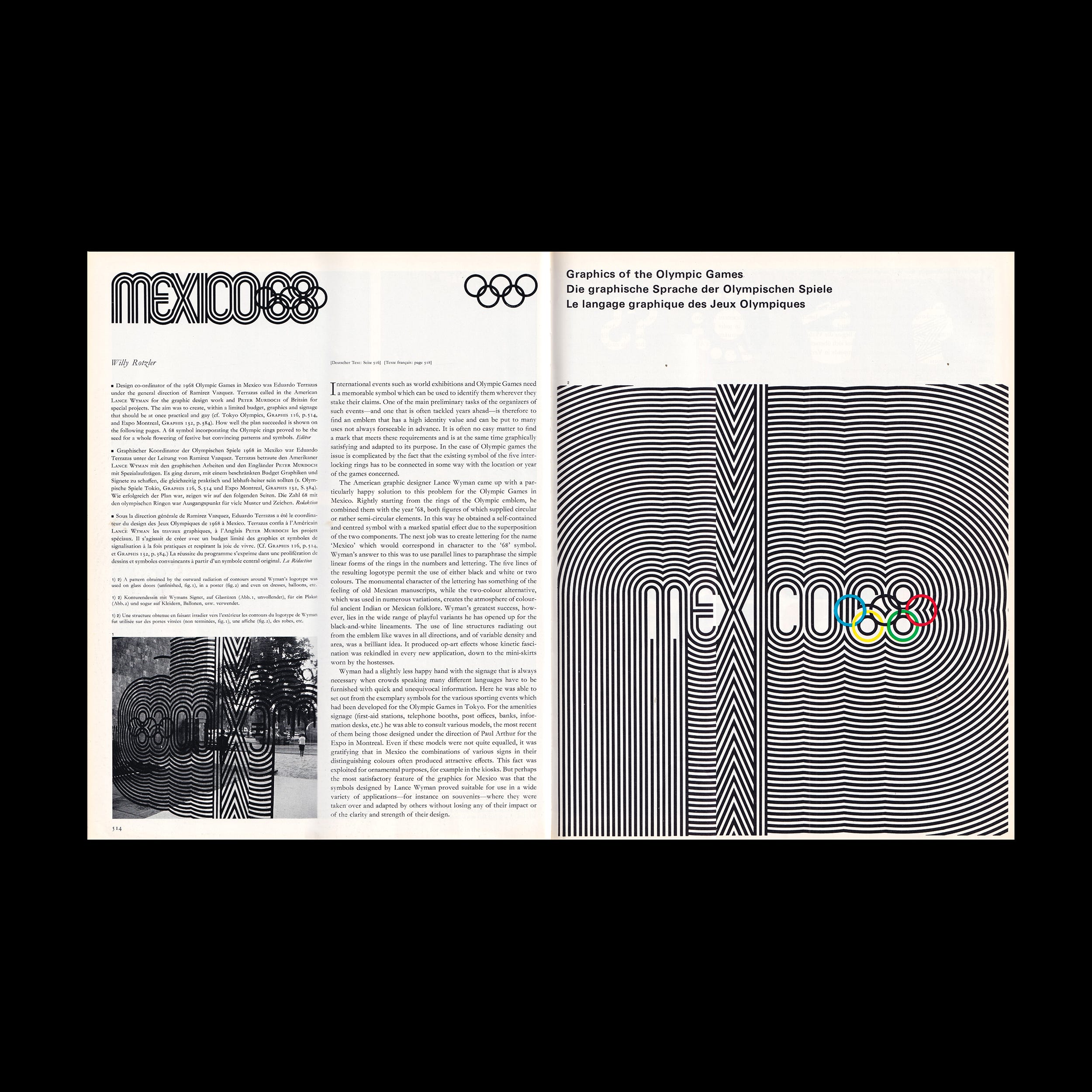
The American graphic designer Lance Wyman came up with a particularly happy solution to this problem for the Olympic Games in Mexico. Rightly starting from the rings of the Olympic emblem, he combined them with the year '68, both figures of which supplied circular or rather semi-circular elements. In this way he obtained a self-contained and centred symbol with a marked spatial effect due to the superposition of the two components. The next job was to create lettering for the name ‘Mexico' which would correspond in character to the '68' symbol. Wyman's answer to this was to use parallel lines to paraphrase the simple linear forms of the rings in the numbers and lettering. The five lines of the resulting logotype permit the use of either black and white or two colours. The monumental character of the lettering has something of the feeling of old Mexican manuscripts, while the two-colour alternative, which was used in numerous variations, creates the atmosphere of colourful ancient Indian or Mexican folklore. Wyman's greatest success, however, lies in the wide range of playful variants he has opened up for the black-and-white lineaments. The use of line structures radiating out from the emblem like waves in all directions, and of variable density and area, was a brilliant idea. It produced op-art effects whose kinetic fascination was rekindled in every new application, down to the mini-skirts worn by the hostesses.
Go behind the logos. Explore 200+ in-depth and meticulously researched logo histories revealing the designers, design decisions and ideas behind the world’s most iconic logos and important brand identities.
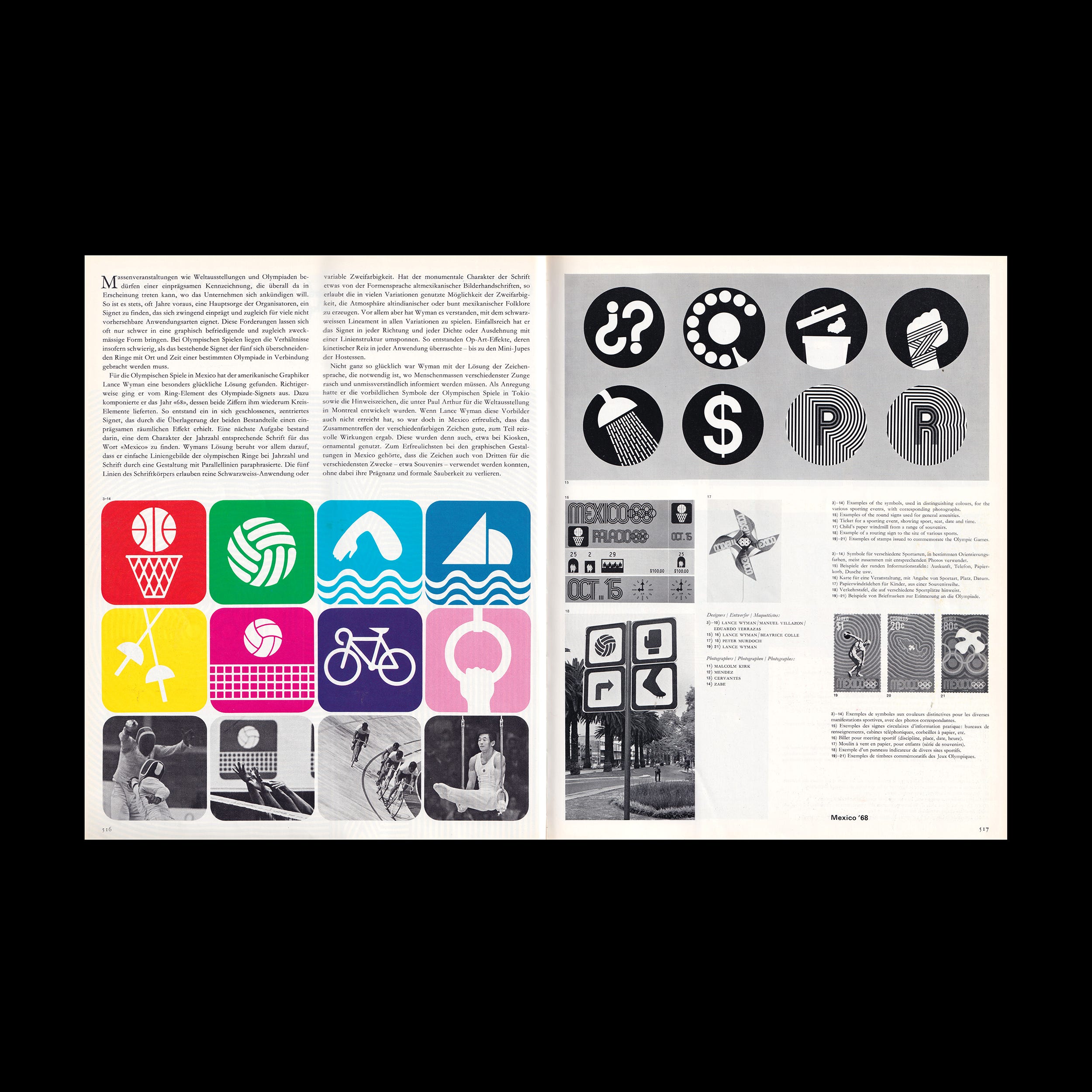
Wyman had a slightly less happy hand with the signage that is always necessary when crowds speaking many different languages have to be furnished with quick and unequivocal information. Here he was able to set out from the exemplary symbols for the various sporting events which had been developed for the Olympic Games in Tokyo. For the amenities signage (first-aid stations, telephone booths, post offices, banks, information desks, etc.) he was able to consult various models, the most recent of them being those designed under the direction of Paul Arthur for the Expo in Montreal. Even if these models were not quite equalled, it was gratifying that in Mexico the combinations of various signs in their distinguishing colors often produced attractive effects. This fact was exploited for ornamental purposes, for example in the kiosks. But perhaps the most satisfactory feature of the graphics for Mexico was that the symbols designed by Lance Wyman proved suitable for use in a wide variety of applications--for instance on souvenirs--where they were taken over and adapted by others without losing any of their impact or of the clarity and strength of their design.
Want more in-depth articles? Check out LogoHistories’ other articles on Lance Wyman and Olympic logos →


Thank you for subscribing to Logo Histories. If you enjoy reading this short you may also enjoy these resources from the same team:
Brand Archive – Research tool for brand designers.
LogoArchive Website – Searchable modernist logo archive & research tool.
LogoArchive Shop – Vintage design books & LogoArchive Zines.
BP&O – Contemporary design editorial.