


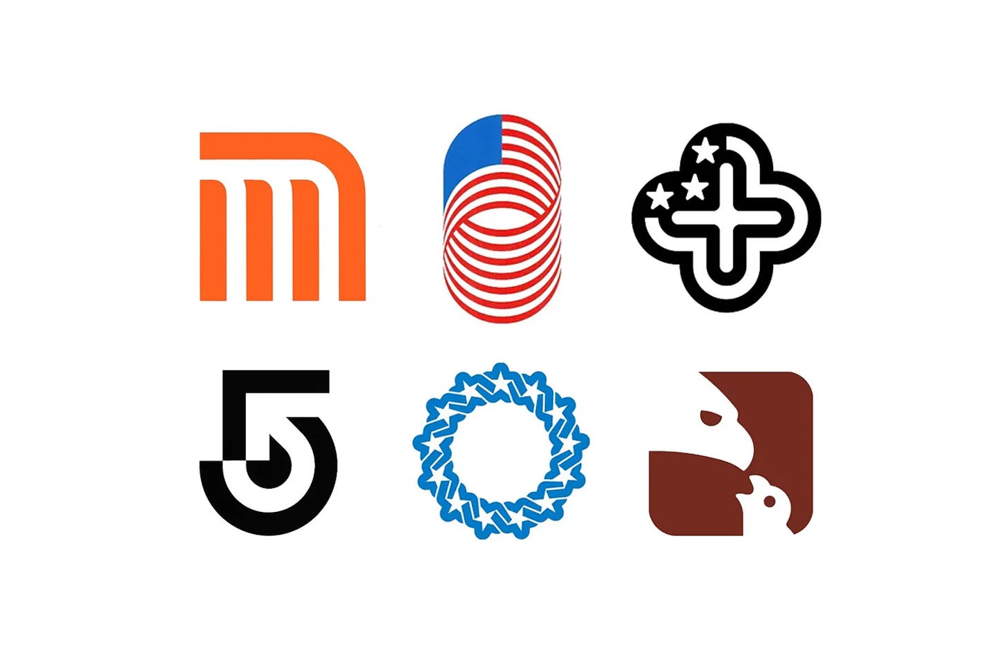
Mexico ’68 made Lance Wyman one of the most celebrated designers in Olympic history, but it was only the beginning. In Mexico, and later at Wyman & Cannan in New York, he created logos, pictograms and wayfinding systems for transport networks, broadcasters, exhibitions and federal institutions, often building a whole visual language from a single mark.
In this collection, discover seven Lance Wyman designs, from Mexico ’68 to the National Zoo in 1975, and the stories behind them.
Key Takeaways
Logos as systems
Wyman’s marks often became the basis of whole systems, from the Mexico ’68 typeface to the Mexico City Metro’s station icons and the National Zoo’s pictograms.
Designed to be understood by all
With a third of Mexico City’s population unable to read or write when the Metro opened in 1969, its symbols and icons prioritised recognition over reading.
National symbols, reworked
For the USIA exhibitions and the Bicentennial Council, he reworked the stars and stripes and Revolutionary War motifs into modern, flexible marks.
Go behind the logos. Explore 200+ in-depth and meticulously researched logo histories revealing the designers, design decisions and ideas behind the world’s most iconic logos and important brand identities.
Continue reading to discover the stories behind seven of Lance Wyman’s most influential designs →

Mexico ’68
An international competition was held two years prior to find an identity that would convey the city as an exciting, cosmopolitan place to be. It would need to be a unifying image of the games, the city, and the spirit of ‘Mexico.’ One of the entrants, Lance Wyman, a young 29 year old designer, flew over with creative partner Peter Murdoch with a one-day ticket. The pair had travelled for a trial period, planning to design something that would represent Mexico, despite this being their first time in the country.
Following a suggestion by Ramirez Vázquez , the design would blend the five Olympic rings with the year ’68. With geometric flair, the five Olympic rings ‘expanded’ and created the numbers in concentric circles. With simple, yet mesmerising use of line and repetition, the final design suggests Mexican folk art through a contemporary OP-art lens – fitting for the hippy psychedelia fashion of the time.
Read the full Mexico ’68 story →

Mexico City Metro, 1969
The project began with the design of a basic symbol for the metro network. Wyman explored various track and ‘M’-based compositions. What was eventually arrived at, a simple ‘M’ for Metro, is unique in its ideation and distinct in its visual expression.
The symbol conveyed the three lines of the new network cutting through the centre of the city. The square was used because the ancient symbolic centre of Mexico City was arranged around the ‘Zocalo’, the city square or ancient meeting place. The rounded top right-hand corner enhanced the form of the ‘M’ and gave the lines the sense of being part of an integrated network.
Read the full Mexico City Metro story →


USIA Ecology Exhibition, 1971
Lance Wyman developed a logo to support the story, distil the concept and promote the exhibition. Taking the equation concept, Lance created a logo that focused on positivity, employing a bold yet soft and inviting plus motif.
By introducing the Stars and Stripes the plus motif took on a new, distinct and national aspect. This latter detail was important as the exhibition travelled throughout the members of the Soviet Block. The stars of the States were reduced to just three, representing land, sea and air.
Read the full USIA Ecology Exhibition story →

Industrial Design USA
Lance Wyman worked to bring George Nelson’s brochure text to life with images, and develop a symbol for the exhibition, generating many ideas. However, in the words of Wyman, none of the concepts seemed to do the trick.
The USIA officer in charge of the exhibition suggested designing something clever like a slinky, a toy that was industrial in nature, and would continue to move once given sufficient energy.With this in mind Wyman combined a moving spiral, inspired by a slinky, with the form and colours of the American flag. This gave the flag an endless energy, like a slinky and a mobius strip, which was perfect for the theme of the exhibition.
Read the full Industrial Design USA story →

Channel 5, 1972
To design the new logo and corporate identity, Boston Broadcasters approached graphic design firm Wyman & Cannan. The firm, founded by designers and former colleagues Bill Cannan and Lance Wyman, was formed following Wyman’s return to New York in 1970. The pair had previously worked together at George Nelson & Company, before Wyman departed to spend several successful years designing many well-known logos in Mexico, including the Mexico ’68 Olympic symbol.
Following several stages of development – involving experimentations of form, colour and line – a cohesive and contemporary corporate identity was achieved. The designers utilised concentric circles and a directional arrow to form a stylised ‘5’ logo. These two geometric elements were superimposed at a 45 degree angle within the ‘5’ and slightly altered to generate a curved arrow within the negative space.
Read the full Channel 5 story →

Bicentennial Council of the 13 Original States, 1973
The creation of the symbol for BCTOS was placed in the hands of Wyman & Cannan Company of New York City, which was run by the renowned designer Lance Wyman (Mexico 68, National Zoo) and partner Bill Cannan (Channel 5 – Boston Broadcasters)
The design put forward by Wyman and Cannan, and selected by the council was composed of 13 interlinked stars that formed an unbroken ring. This was based on two designs from the Revolutionary War period. The first, a circle of 13 links from the Second New Hampshire Regimental flag, was brought to attention by Dr. J. Duane Squires of New Hampshire, and chairman of the Council. The second, was the constellation field from the flag of the original 13 states; the first version of the stars and stripes.
Read the full Bicentennial Council story →

National Zoo, 1975
The National Endowment for the Arts–and as part of the Federal Design Improvement Programme (FDIP), an initiative to improve all forms of Federal communications through design–hired Robert E. Mulcahy as art director for the Zoo. Working with the New York-based design firm of Wyman and Cannan, Mulcahy set in motion the creation of a new graphics system and visual identity for the Zoo.
As well as the wayfinding system, Wyman and Cannan also devised a new logo for the National Zoo. Designed by Lance Wyman (USIA, American Bicentennial, Mexico ‘68), the logo depicted an eagle feeding a chick. This was set within the same ‘soft square’ of the pictograms, and that made up the ‘O’s of the Zoo’s new logotype. This was created in three different variations to accommodate different use-cases such as simple scaled-down icons, vinyl cut graphics, badges and metal stamped merchandise that included key chains.
Read the full National Zoo story →
Read next
For more on the designer behind these marks, browse every Lance Wyman logo history in the archive, or see more of the best in the Top 10 logos of all time. Become a paid subscriber to read every story in full, richly illustrated.
Want more in-depth articles? Check out LogoHistories’ other articles on Olympic logos →


Thank you for subscribing to Logo Histories. If you enjoy reading this short you may also enjoy these resources from the same team:
Brand Archive – Research tool for brand designers.
LogoArchive Website – Searchable modernist logo archive & research tool.
LogoArchive Shop – Vintage design books & LogoArchive Zines.
BP&O – Contemporary design editorial.