


Few industries have played as significant a role in the evolution of modern visual identity as railways.
By the middle of the twentieth century, growing competition from private car ownership and commercial aviation created a catalysing force throughout the rail networks of Europe, triggering programmes of nationalisation, modernisation, technological advancement.
These changes placed new demands on railway identities. They needed to function across increasingly vast and integrated physical networks that encompassed trains, stations, signage, tickets, timetables and advertising. Their purpose extended far beyond corporate recognition. They had to be identifiable at speed, legible from a distance and consistent across thousands of applications.
The challenge was no longer to simply identify a railway company, but to establish a coherent visual system through which an entire network could be recognised, understood and navigated.
Go behind the logos. Explore 200+ in-depth and meticulously researched logo histories that reveal the design decisions and ideas behind corporate identities from past and around the world. Become a paid member and support our research.
→ free previews
→ join here

From emblems to modern symbols
Early railway identities often employed heraldic devices, elaborate monograms and regional imagery to communicate authority and geographical identity as well as more abstract notions of freedom and worldly knowledge.
During the post-war period, the consolidation and modernisation of railway networks encouraged a different approach. Modernist principles of reduction, geometry and standardisation offered designers a means of creating identities that were distinctive, practical and could scale. The striking new logos quickly conveyed externally, the massive internal changes that were happening.
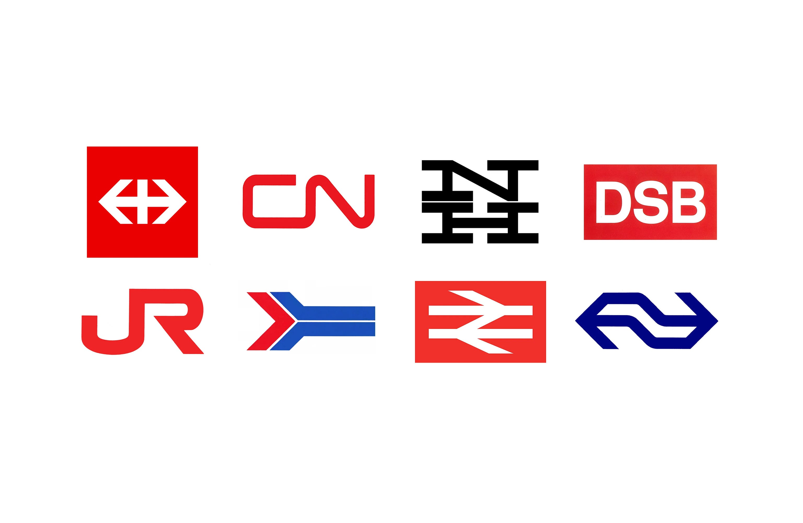
In 1960, Allan Fleming’s identity for Canadian National demonstrated this shift. Replacing a traditional emblem incorporating a maple leaf and the initials CNR, Fleming developed a continuous line forming the letters CN. The symbol suggested movement, connection and the uninterrupted journey of a train without depicting railway machinery.
Its simplicity made it highly adaptable, working across trains, signage and printed communications. More significantly, it demonstrated how an abstract symbol could communicate something fundamental about an organisation’s purpose.

Identity as infrastructure
The introduction of British Rail’s corporate identity in 1965 represented a further shift. Following nationalisation in 1948, the organisation had inherited an extensive network with differing visual traditions. Design Research Unit was commissioned to establish a coordinated identity as part of a wider programme of modernisation.
At its centre was Gerald Barney’s double-arrow symbol, a geometric representation of movement in opposing directions along railway tracks. However, the significance of the programme extended beyond the logo. A coordinated system of typography, colour, signage and graphic standards established consistency across trains, stations and passenger communications.
Rail Alphabet, developed by Jock Kinneir and Margaret Calvert, was particularly important in creating a clear and recognisable system of railway signage.
Stations presented complex information environments. Passengers needed to identify entrances, platforms, departures and connections, often while moving through unfamiliar spaces. Typography, directional symbols and consistent information hierarchies therefore became essential to the experience of rail travel.
British Rail demonstrated that corporate identity could serve a practical function. Rather than simply communicating the character of an organisation, design could help people navigate and understand it.
The ease of navigation and positive experience would stick to the logo, which could then be transferred as the network expanded.

A recognisable environment
A similarly comprehensive approach emerged in the Netherlands. Developed by Gert Dumbar and Tel Design in the late 1960s, the Nederlandse Spoorwegen identity combined a geometric symbol suggesting movement and connection with a distinctive yellow and blue colour scheme.
Bold colour became an important means of recognition across trains, stations and passenger information.
The identity demonstrated how a railway could establish a consistent presence through the combined use of symbols, typography and colour, rather than relying on the repeated application of a logo.
Together, the British and Dutch programmes illustrated how corporate identity was becoming inseparable from the design of the transport environment.

Continuity through change
The privatisation and division of Japanese National Railways in 1987 presented almost the opposite challenge. The creation of the Japan Railways Group (JR) required several newly independent companies to establish their own identities while retaining a recognisable connection to the national network.
Designed by Yoji Yamamoto of Nippon Design Center, the compact JR logo, just like Flemming’s CN, used interconnected letterforms to suggest movement and progress from point A to B.
Individual corporate colours distinguished the different operators, while the shared symbol maintained continuity across the group. Unlike the unified systems of British Rail and Nederlandse Spoorwegen, the JR identity demonstrated how a common visual language could accommodate organisational independence.

From logo to visual system
These identities reveal how the changing requirements of railway transportation helped advance modern corporate design.
The move towards geometric symbols was not simply an expression of Modernist aesthetics. Railway logos needed to remain recognisable on moving vehicles, function across different scales and integrate with increasingly sophisticated systems of passenger information.
Equally important was the relationship between identity and wayfinding. A passenger might encounter a railway’s symbol on a station exterior, follow directional signage to a platform and identify a service through a consistent system of typography and colour.
Each interaction contributed to a coherent and positive experience of the organisation which could generate value around a logo. Railways demonstrated that corporate identity could extend beyond commercial recognition to become an essential part of public infrastructure, and would play out on a smaller scale, within city bus and tram networks (see: Greater Manchester Transport and HT).
The enduring success of symbols such as Canadian National’s continuous-line logo, British Rail’s double arrow and Nederlandse Spoorwegen’s geometric mark reflects the strength of this approach.
The railway logo was no longer simply a symbol carried by a train. It became part of the visual language through which an entire network could be recognised, understood and navigated.
LogoHistories is an independent publication documenting logo and corporate identity design history. Each of these has a fascinating story, some are familiar, others forgotten. LogoHistories exists to uncover these and then bring them to life. There’s so much more to uncover. A paid subscription helps us to continue to do this, it also gives you access to a growing archive of articles.