


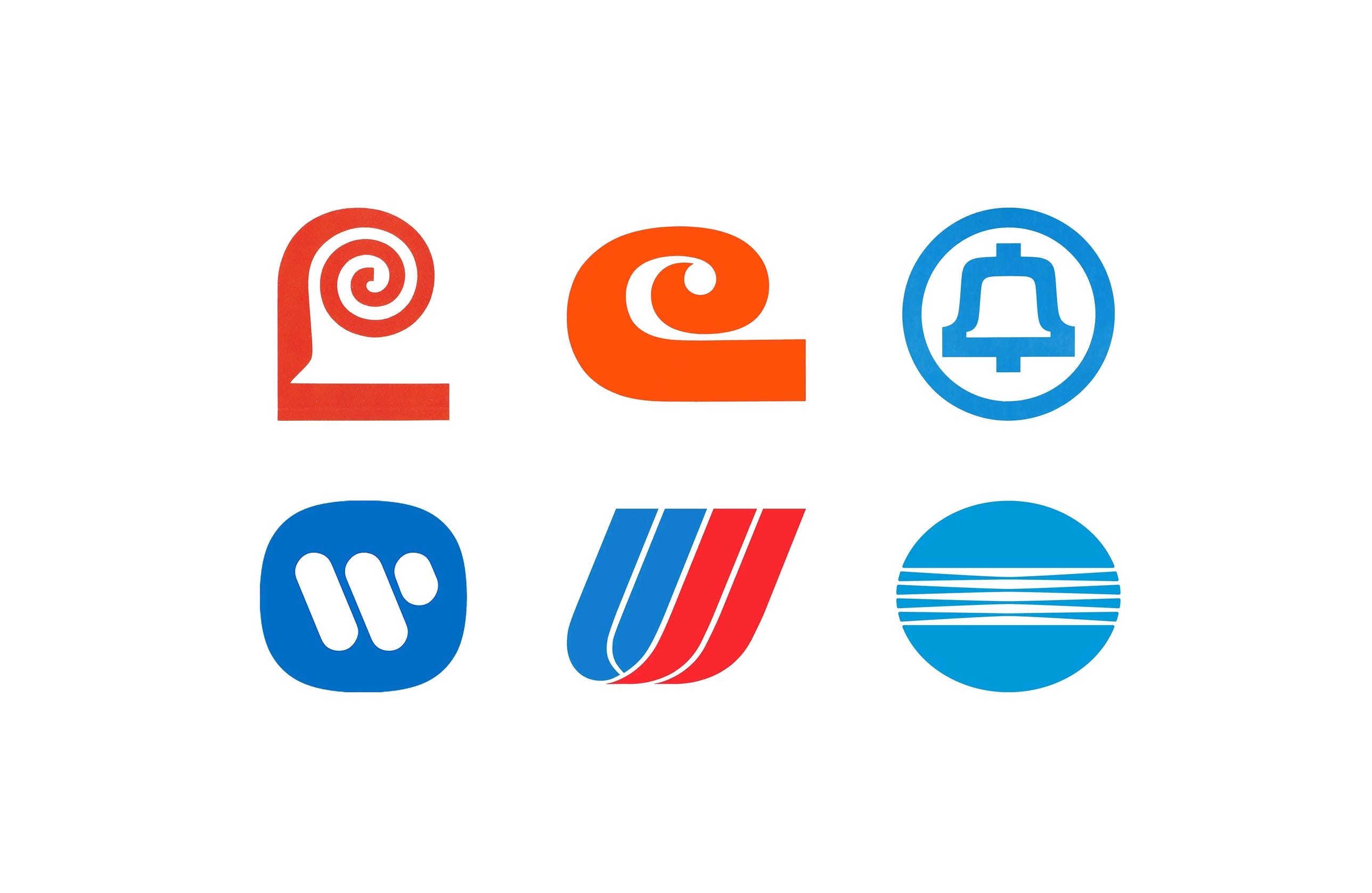
Saul Bass is perhaps most-widely remembered for his film titles and posters, but his studio also produced some of the most enduring corporate logos of the 20th century. Working first as Saul Bass & Associates and later with partner Herb Yager, Bass reduced complex companies to simple, memorable symbols, many of which stayed in use for decades.
In this collection, discover seven of the best Saul Bass logos, from Lawry’s in 1959 to Minolta in 1980, and the stories behind their design.
Go behind the logos. Explore 200+ more in-depth and meticulously researched logo histories revealing the design decisions and ideas behind the world’s most iconic logos and important brand identities.
→ free previews
→ join here

Lawry’s, 1959
By the late 1950s, Lawry’s had found success with its proprietary blend of salt, herbs and spices, and began to compete with the giants of the food industry on supermarket shelves. Saul Bass & Associates were initially invited to work on a new dressings bottle in 1958, but became an ‘influential factor’ in the decision to also develop a new logo. To compete against heavily advertised major brands, it would need ‘visual boldness’ and ‘singularity’, and convey quality on a ‘gourmet level’.
Hundreds of variations of an initial ‘L’ were explored, and tested in shop aisle mock-ups. What would later be called the ‘fanciful L’ retained the chisel-edge calligraphic qualities of the earlier logotype, while its spiral serif added an elegant gourmet flourish. The strategy worked: from $5 million in the late 1950s, Lawry’s grew to $30 million in the 1970s, and the logo can still be seen in use today.
Read the full Lawry’s 1959 story →


Alcoa, 1962
The Aluminum Company of America had a design problem. It had extended the use of its trademark, two triangles in red and blue, to manufacturers using its aluminium, and the brand was being eroded by poorly designed products made with it. Any new logo would need to clearly carry forward elements of the old one, undergo extreme scaling, and remain recognisable when printed on industrial materials.
Saul Bass & Associates devised a new logo based around the letter ‘A’. Its geometric, angular form was intended to reflect the qualities of structural aluminium, with a red triangular motif at the centre and the counter of the A forming a second triangle, a subtle connection with the previous logo. A wider version was drawn to correct the optical distortion on the curved surfaces of water towers, silos and barrels. The redesign took three years and extended across the whole corporation, from matchbooks to water towers.
Read the full Alcoa 1962 story →

Celanese, 1965
By the middle of the 1960s, Celanese had evolved from a domestic maker of acetate fibres into a diversified, billion-dollar producer of fibres, chemicals, cosmetics, plastics and paints. Its growth had produced an incoherent corporate image, and the old ‘free-script’ signatures used since the 1920s did not reflect the ‘characteristics of a large company’. Any solution had to be right for every enterprise within the corporation, from heavy industry to high fashion.
The ‘C’ devised by Bass offered an ‘intersectional’ solution: stylish enough for a fashion context, with the stability of a large chemical company. A special set of letters in a similar style was developed for brands whose names did not begin with ‘C’, described as the ‘most difficult criterion’ to satisfy. The ‘C’ served until 1987, when Hoechst AG acquired Celanese and the logo was retired.
Read the full Celanese 1965 story →

Bell System (AT&T), 1969
By the 1960s, versions of the bell logo had been in use for over 50 years and had become a recognisable and key graphic element. There was, however, little uniformity across the regional companies, which had adopted wildly different typographic directions. Saul Bass was invited to work on the project and, within a year, had created one of the most simple and iconic logos: the bell reduced to its most essential elements, a silhouette and circle rendered with a uniform line weight.
The new logo, the sixth since the first bell was adopted in 1889, made it easier to unify the 23 AT&T subsidiaries. Appearing on over a million phone booths, it would be the largest corporate rebranding programme in US history, and took years to roll out. It paid off: by 1972, 91.7% of adults surveyed associated the logo with the telephone industry. After the 1982 ruling that broke up the Bell System, Bass was approached again, and his striped globe replaced the bell in 1983.
Read the full Bell System 1969 story →

Warner Communications, 1972
Warner Communications was formed in 1972 with broad interests in music, film and television, publishing and cable television. Due to the widespread recognition of the Warner Bros. shield, it was perceived primarily as a film company, despite its many subsidiaries. A new identity was needed, one that could unify varied operations without being impeded by pre-established associations with film.
Taking the initial ‘W’ as a starting point, various iterations and degrees of abstraction were explored. The final design was described as ‘somewhat electronic in character’, with a twisting, cable-like form that conveyed the shared effort of the corporation’s divisions. By the mid-1970s it was ‘almost impossible for a consumer not to see it each day’. The ‘Big W’ lasted until 1990, when Warner merged with Time Inc. to form Time Warner.
Read the full Warner Communications 1972 story →

United Airlines, 1974
By the early 1970s, United Airlines had grown to become the largest domestic airline in the USA, and was keen to move away from its ‘conservative and stodgy’ image. Bass’s Los Angeles studio worked with the airline for two years, testing and analysing ‘hundreds’ of logos, typographic styles and colourways. A key change was moving away from the shield, the airline’s trademark since 1936 and by then a ubiquitous motif, in favour of something more original.
The new logo consisted of two overlapping U-shapes, slanted at a 68-degree angle and rendered in red, white and blue. The shape led to the nickname ‘the tulip’, while the tilted angle suggested dynamism and movement. The identity appeared across over 1,800 items, from ground equipment to ticket books, and for many became the defining image of the airline, until the Continental merger replaced it in 2012.
Read the full United Airlines 1974 story →

Minolta, 1980
As Minolta began to move from mechanical technology to advanced optics and electronics in the late 1970s, it engaged Saul Bass, Herb Yager & Associates to develop a new logo that would outwardly reflect its new focus. The criteria were summed up in four words: vision, strength, beauty and global, with an identity that would transcend language.
Through linear elements focusing at the centre, as if passing through a lens, the logo conveyed the high-tech optical basis of Minolta and graphically represented a company that dealt with light. Three variations were produced with differing amounts of counter space, so the logo kept its sense of precision at any size, from building signage to markings cast into camera bodies. It is still retained by Konica Minolta today.
Read the full Minolta 1980 story →
Read next
For more on the designer behind these marks, browse every Saul Bass logo history in the archive, or see more of the best in the Top 10 logos of all time. Become a paid subscriber to read every story in full, richly illustrated.
Fantastic!