


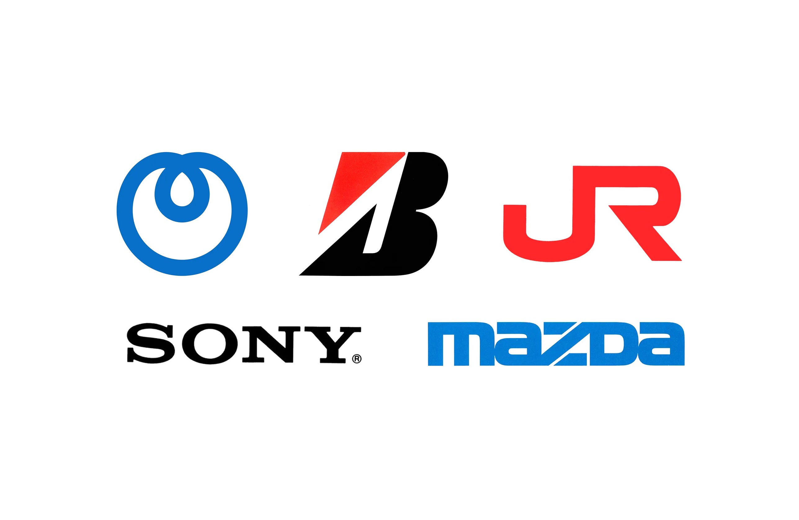
Japanese corporate identity at its peak
Japan produced some of the most disciplined corporate identities of the 20th century. Its companies rarely treated a logo as a one-off mark. Instead, in-house design teams and consultancies such as PAOS built complete systems around it: typefaces, colours, grids and rules that held a company together across products, signage and advertising.
Between the 1970s and the late 1980s, Japanese corporate identity design reached its peak. Much of it was led by PAOS, the studio founded by Motoo Nakanishi, which brought strategy, research and design together and drew in specialists such as Yusaku Kamekura and Ivan Chermayeff. Alongside agencies like Nippon Design Center, these teams gave Japanese companies corporate identities built for an international audience.
The five logos below trace that story, from Sony’s in-house refinement of 1973, through PAOS’s work for Mazda, Bridgestone and NTT, to the privatisation of Japan’s national railway in 1987.
Key Takeaways
Identity as a system
Japanese companies rarely treated a logo as a one-off mark, building complete systems of typefaces, colours, grids and rules around it.
The PAOS era
From the 1970s to the late 1980s, Motoo Nakanishi’s PAOS brought strategy, research and design together for Mazda, Bridgestone and NTT.
Built for the world
Teams including PAOS and Nippon Design Center gave Japanese companies identities designed for an international audience.
Go behind the logos. Explore 200+ in-depth and meticulously researched logo histories revealing the designers, design decisions and ideas behind the world’s most iconic logos and important brand identities.
→ free previews
→ join here
Continue reading to discover the stories behind the Sony, Mazda, Bridgestone, NTT and Japan Railways logos →

Sony, 1973
Yasuo Kuroki
Having switched from a hand-drawn script to a serif in 1957, various versions of the Sony logo had been used. Each was based around an uppercase serif; however, letter-spacing and weight had shifted regularly from 1957 to 1969. In order to bring the Sony corporate identity into coherence and establish standardised rules for its use, in-house designer Yasuo Kuroki, working under the direction of Akio Morita and Norio Ohga, refined the wordmark in 1973.
Kuroki modified Robert Besley’s Clarendon, added uniform spacing and weight, and then introduced Helvetica as a secondary corporate typeface. Two blues were then added, as well as formalised grid systems to bring continuity to advertising, vehicle liveries and promotional items. In 1981, Sony invited the international design community to reconsider the four letters. The contest drew 29,883 entries, but the judges found no clear winner, and the existing logotype would remain in use.
Read the full Sony 1973 story →

Mazda, 1975
Rei Yoshimura & PAOS
Toyo Kogyo Co., Ltd. was the first to develop the commercial application of rotary engines. Despite this technological achievement, it hadn’t been able to move its image away from being a manufacturer of three-wheeled service vehicles. PAOS found that the ‘circled M’ logo then in use was often misread as an ‘h’ and ‘n’. It was decided that the brand name Mazda would be prioritised and the old logo replaced with a new and unambiguous symbol.
The proposal selected, after a two-stage closed competition, was created by New York-based Japanese designer Rei Yoshimura. It placed emphasis on the letter at the centre of the logotype, with a diagonal stroke cut from the horizontal bars of the ‘Z’. This provided visual interest, dynamism and character. PAOS developed the diagonal stroke into a dynamic element across vehicle liveries, alongside a blue square intended to give the impression of a clear blue sky. In 1984, the firm officially changed its name to Mazda.
Read the full Mazda 1975 story →

Bridgestone, 1984
PAOS & Masanori Umeda
With its movement into new markets and product categories, Bridgestone’s brands multiplied and grew in complexity, leading to inconsistencies in design. Japanese design studio PAOS would lead the corporate identity project. Following extensive research, a new Bridgestone wordmark and symbol was devised. This focused on developing a strong and distinctive ‘B’ initial that incorporated the triangle, and introducing a red.
The angular component, which came to be known as the ‘hot triangle’, symbolised the ‘enthusiasm of Bridgestone employees’, as well as the company’s ambition and determination as it entered a new era. ‘Bridgestone Red’ formalised the colour used since the company’s founding in 1931. By early 1983 the new logo had been decided, but its introduction was put off until the firm’s name change to just Bridgestone a year later. This enabled the company to deploy most of the new designs the instant it changed its name, an occurrence unprecedented in CI design.
Read the full Bridgestone 1984 story →

NTT, 1985
Yūsaku Kamekura & PAOS
From 1952 to 1984, NTT used a logo created from two interconnected ‘T’s caught in a loop. In 1985, NTT was spun off into a private corporate entity, ending its 115-year run as Japan’s only telecommunications service. Rather than institute internal educational drives, NTT concentrated on replacing the ‘timeworn’ symbols of its monopolistic past with something ‘fresh’. Under the direction of Motoo Nakanishi (PAOS), Yūsaku Kamekura would be responsible for devising the new logo, required to have a ‘simple and impressive form’ with a ‘space-age quality’ suggesting ‘optical fibres’.
Kamekura produced over 150 initial ideas using paper and pencil. A concept seen as having promise was a simple circle and loop, which he varied by trial and error, changing the thickness of the lines and the size of the loops. Nakanishi saw what would later be called the ‘dynamic loop’ as the standout, and pressed NTT to adopt it. Supported by a ‘vivid blue’ and ‘appealing’ orange on silver, the new look would pop up almost overnight across 2,000 phone offices and over 40,000 service vehicles.
Read the full NTT 1985 story →

Japan Railways, 1987
Yoji Yamamoto, Nippon Design Center
Having accumulated a growing amount of debt, the national railway of Japan was privatised in 1987 and split into seven for-profit railway companies, collectively called the Japan Railways Group. Nippon Design Center was commissioned on the same day the privatisation bill was passed, giving designer Yoji Yamamoto less than 124 days to deliver. More than 100 concepts were submitted, including ‘JR’ and ‘NR’ monograms.
The final design combined the letters J and R to form a single continuous line, a ‘basic design that wasn’t a gimmick’. Yamamoto suggested that trains move in both directions, so he designed the letters so that it would not feel strange seeing them move to the right or left. The letters were made intentionally wider to improve legibility at high speed, and to give the impression of speed even when static. With only five hours between the last train on 31 March and the first on 1 April, JR Group employees personally placed the logo on the passenger trains just in time.
Read the full Japan Railways 1987 story →
Want more in-depth articles? Check out LogoHistories’ other articles on Japanese logos →


Japan's creativity really shines with these five logos. Three of them I instantly recognize: Sony, Bridgestone, and Mazda. You nailed it with this article on how all five of these logos came to be. Thank you.