


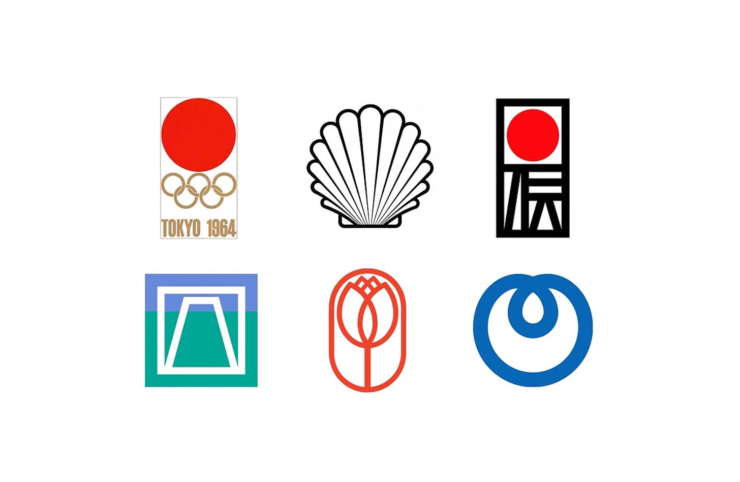
Yusaku Kamekura was one of the leading figures of post-war Japanese graphic design. Best known for the bold red sun of the Tokyo 1964 Olympic Games, he went on to create logos for banks, telecommunications companies, expositions and national institutions, combining modernist simplicity with Japanese motifs such as the rising sun and Mount Fuji.
In this collection, discover seven Yusaku Kamekura designs, from Tokyo 1964 to Surbank in 1985, and the stories behind them.
Key Takeaways
Japanese motifs, modern form
Kamekura drew on national symbols, from the rising sun of Tokyo 1964 and the Traditional Craft mark to Mount Fuji for Fuji Bank.
Won in competition
Several of his designs were chosen in competitions against designers such as Kazumasa Nagai and Ikko Tanaka, including Tokyo 1964 and the Traditional Craft Industry Promotion Association.
Refined through iteration
For NTT he produced over 150 sketches before submitting ten concepts, from which the ‘dynamic loop’ was chosen.
Go behind the logos. Explore 200+ in-depth and meticulously researched logo histories revealing the designers, design decisions and ideas behind the world’s most iconic logos and important brand identities.
Continue reading to discover the stories behind seven of Yusaku Kamekura’s most influential designs →

Tokyo 1964
The Games of the XVIII Olympiad, abbreviated to and branded as Tokyo 1964, was not only a state-sponsored event involving the whole nation but one of the first great opportunities for post-war Japan to showcase it rich cultural heritage to the world in a positive light and in an inclusive way. Designing a symbol that captured and conveyed this was critical in the promotion of the event. Work began on this four years earlier, in 1960, with an invitiation sent out by the Tokyo Olympics Organising Committee to critics, art directors, and designers inviting them to form ‘A Design Round Table Committee’. Their initial task would be to arrange a competition to generate options and the final design of an appropriate symbol.
Kamekura’s submission seems obvious now, but was daring for the time. A bold red circle (the Hinomaru of the Japanese national flag, representing the rising sun) was set above the Olympic rings. Not only was it progressive in form, it also pushed the limits of what had previously had been expected, and outlined in the brief. The use of the Olympic colours had been forgotten by the designer in his haste to generate his design proposal. In Kamekura’s design, the Olympic Rings were presented in a solid gold, complementing and not competing with the volume of the red above. Kamekura described the red as less of a nationalistic expression and more of a symbol of passion and excitement for the Games.
Read the full Tokyo 1964 story →

Shell, 1963 (Concept)
Shell’s red and yellow ‘Pecten’ symbol had been in use since 1900. This had been revised a number of times with subtle abstractions made along the way. Although this had become internationally recognised, and having just undergone a redesign in 1961, it was felt that the logo was perceived as dated and two versions, one for marketing and another for ‘institutional’ purposes, had added to the work required to maintain the corporate identity. Four designers were given the task of modernising Shell’s image, with the proposal put forward by French designer Raymond Loewy of C.E.I. being rolled out in 1972.
It was in 1963 or the year before that I received a letter from the main office of Shell Oil Co. in London. The letter said that Shell wished to adopt a new design policy looking ten years ahead. It asked me to participate in the international competition for the new design policy and said that designers had been selected from the United States (Raymond Lowey), Britain, Switzerland (Karl Gerstner) and Japan (Yusaku Kamekura). At that time, the British designer had not yet been selected.


Traditional Craft Industry Promotion Association, 1975
In 1974 the ‘Act on the Promotion of Traditional Craft Industries’ was set up in Japan. This intended to help preserve ancient techniques and promote domestic and international interest in authentic hand-made regional crafts.
Still, not entirely deterred, Kamekura reflected on how to embody the word ‘tradition’. He created a form that had a structure that was derived from the character 伝 (den, tradition) and used this alongside a red disc, representing the sun, linking to Japan’s title as the “Land of the Rising Sun” (Nihon). In this way, he balanced both national and international motifs.
Read the full Traditional Craft Industry Promotion Association story →

Expo ’75 mascot
Alongside the symbol, it was agreed upon that Kamekura’s dolphin would form a secondary mark and mascot. This would later help promote Kaiyohaku Park (later renamed Ocean Expo Park), where Expo ‘75 was held.
Kamekura also devised a system for the mascot’s use, and the ability for it to add a dynamic aspect to printed materials such as banners. The mascot could be rotated through a centre-point and used in a sequence to give the dolphin a sense of motion. Kamekura also created a broad and cheerful colour palette that would help promote a sense of fun throughout the Expo.
Read the full Expo ’75 story →

Fuji Bank, 1979
Fuji Bank’s logo, created by renowned Japanese designer Yūsaku Kamekura, is based on the form of Mt. Fuji. This was a requirement laid down by Art Director Tatsu Matsumoto and the director of Fuji Bank.
Kamekura noted in his book “The Works of Yūsaku Kamekura” that, at the time, he was initially overwhelmed by the design challenge as Mt. Fuji was difficult to shape because, when drawn, it becomes profane. However, Kamekura accepted the commission and created a simple logo depicting Mt. Fuji as an outline which was set within a square of equal line weight.
Read the full Fuji Bank story →

NTT, 1985
Under the direction of Motoo Nakanishi (PAOS), Yūsaku Kamekura would be responsible for devising the NTT logo. This new logo was required, as outlined by NTT president at the time, to have a ‘simple and impressive form’ with a ‘space-age quality’ suggesting ‘optical fibres’.
Kamekura submitted 10 concepts, however, Nakanishi saw what would be later be called the ‘dynamic loop’ as the standout. He pressed NTT to adopt it.

Surbank, 1985
The old name, Setashin, was discarded in favour of ‘Surbank Setagaya’, the ‘Sur’ being derived from ‘suburban’ and also the Latin sur, meaning ‘above’ or ‘over’, suggesting going beyond expectations.
For the new logo, Yusaku Kamekura, devised two tulips, set within a vertical lozenge shape, both with a single consistent line weight. The familiar image of flowered suburban parks and the geometric formalisation of a natural symbol gave the impression of a modern and friendly institution. The chosen logo was the simpler of the two, which in turn reflected a new architecture for the bank which had round columns and curved entrance doors. Colour amplified the sense of the natural and warm, and the new modern external cladding of the bank’s premises by combining warm red with a bright green and a cool grey. The system later devised by PAOS, was made flexible enough to allow for the addition of subsidiary colours as and when needed.
Read next
For more on the designer behind these marks, browse every Yusaku Kamekura logo history in the archive, or see more of the best in the Top 10 logos of all time. Become a paid subscriber to read every story in full, richly illustrated.
Want more in-depth articles? Check out LogoHistories’ other articles on Japanese logos →


Thank you for subscribing to Logo Histories. If you enjoy reading this short you may also enjoy these resources from the same team:
Brand Archive – Research tool for brand designers.
LogoArchive Website – Searchable modernist logo archive & research tool.
LogoArchive Shop – Vintage design books & LogoArchive Zines.
BP&O – Contemporary design editorial.