


Access extensive historical logo design research. Over 200 LogoHistories. Discover concepts and contexts. Improve your understanding and craft → join here
Having signed a temporary contract in 1953, Norio Ohga joined Sony formally in 1959 and would later go on to become President and then Chairman. In 1961, he declared that “Sony design must be standardized”. This was a concerted effort to bring Sony’s designers together in one place and develop a house style for all of its products under a ‘black and silver’ design language.
Having switched from a hand drawn script to a serif in 1957 various versions of the Sony logo had been used. Each was based around an uppercase serif, however, letter-space and weight had shifted regularly from 1957 to 1969. This created discontinuities between advertising, packaging and advertising, quite apart from the new standardised approach to industrial design.
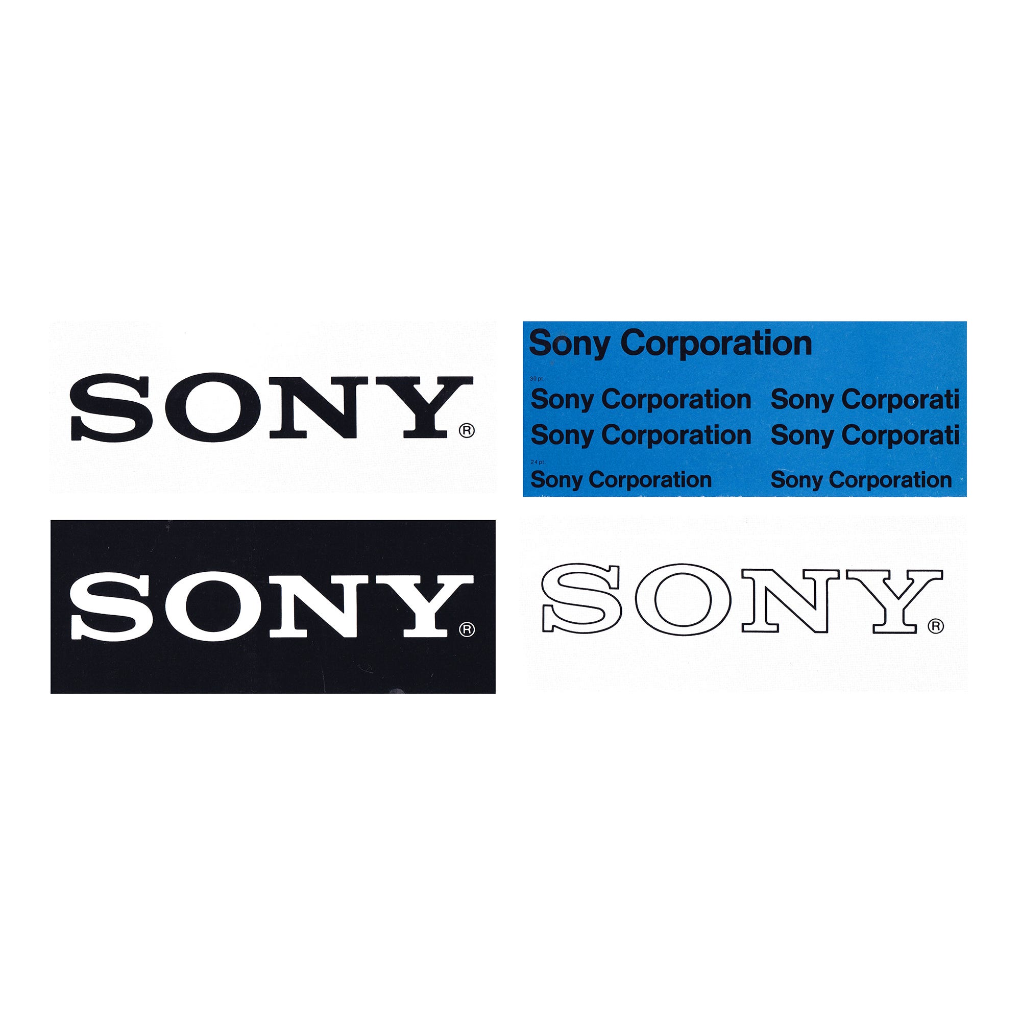
In order to bring the Sony corporate identity into coherence and establish standardised rules for its use, in house designer Yasuo Kuroki, working under the direction of Akio Morita and Norio Ohga, refined the wordmark in 1973.
Kuroki modified Robert Besley’s Clarendon, added uniform spacing and weight, and then introduced Helvetica as a secondary corporate typeface. Two blues were then added, as well as formalised grid systems to bring a continuity to advertising, vehicle liveries and other materials such as as bags and promotional items that included matchbooks.

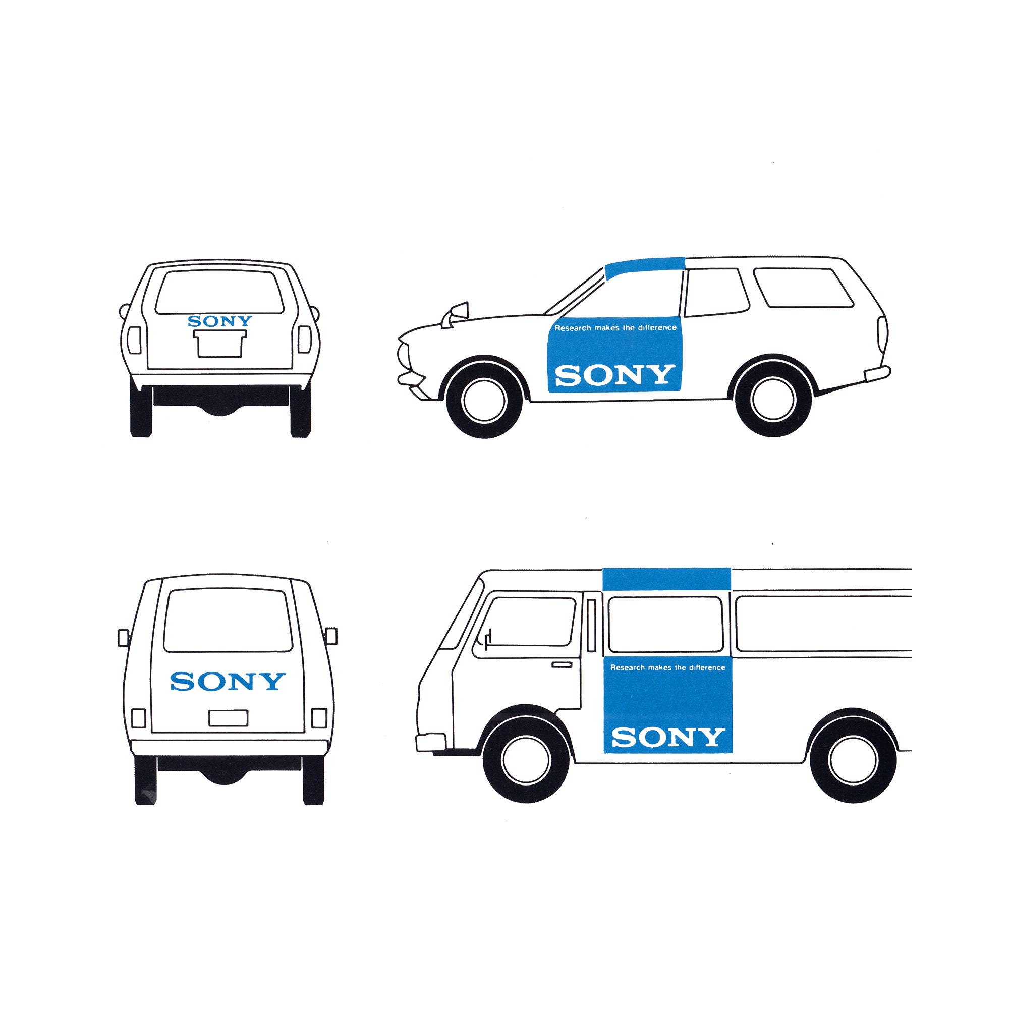
The result was a more coordinated system and stronger corporate impression that would support product and product messaging across a growing number of contexts.


Sony International Logotype Design Contest, 1981
In 1981, Sony marked its 35th anniversary by inviting the international design community to reconsider the four letters that identified its products. Through the Sony International Logotype Design Contest, the company looked beyond its own design office for a new expression of its name.
“We asked the world of designers to design our future,” Sony explained in its announcement of the results. The invitation drew 29,883 entries from across Europe, North and South America, Japan and Asia.
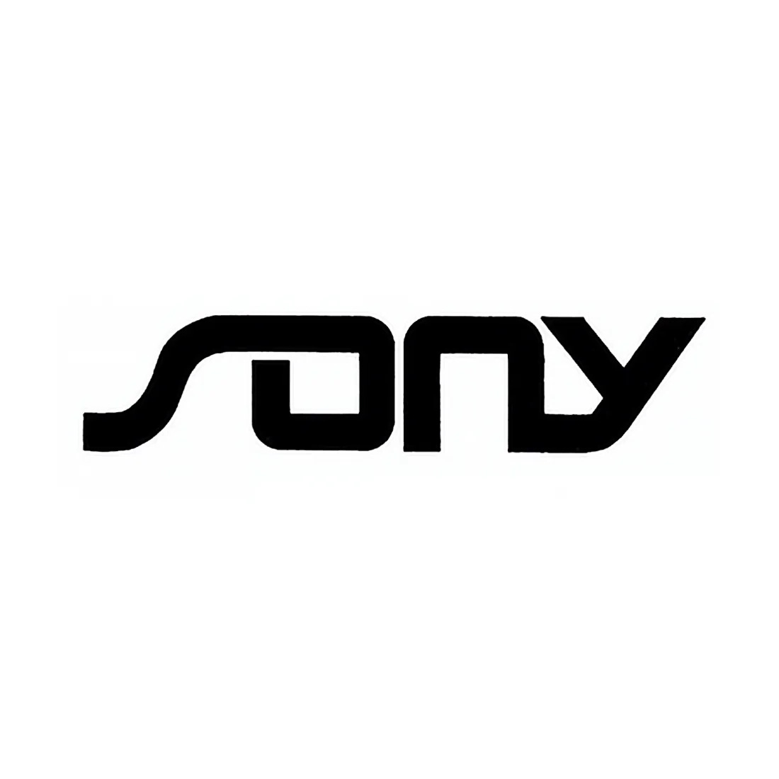
A special committee screened the submissions, assessing each on “originality, imagination, design concept and legibility.” These criteria suggest a balance between invention and practical use. The lettering could offer a fresh interpretation of Sony, but the company’s name still had to remain readable.
From the initial entries, the committee selected 59 designs. These were presented to Sony’s board of directors, senior management, designers and sales managers, together with chairman Akio Morita. The selection was reduced to nine entries for final judging, then to three finalists.
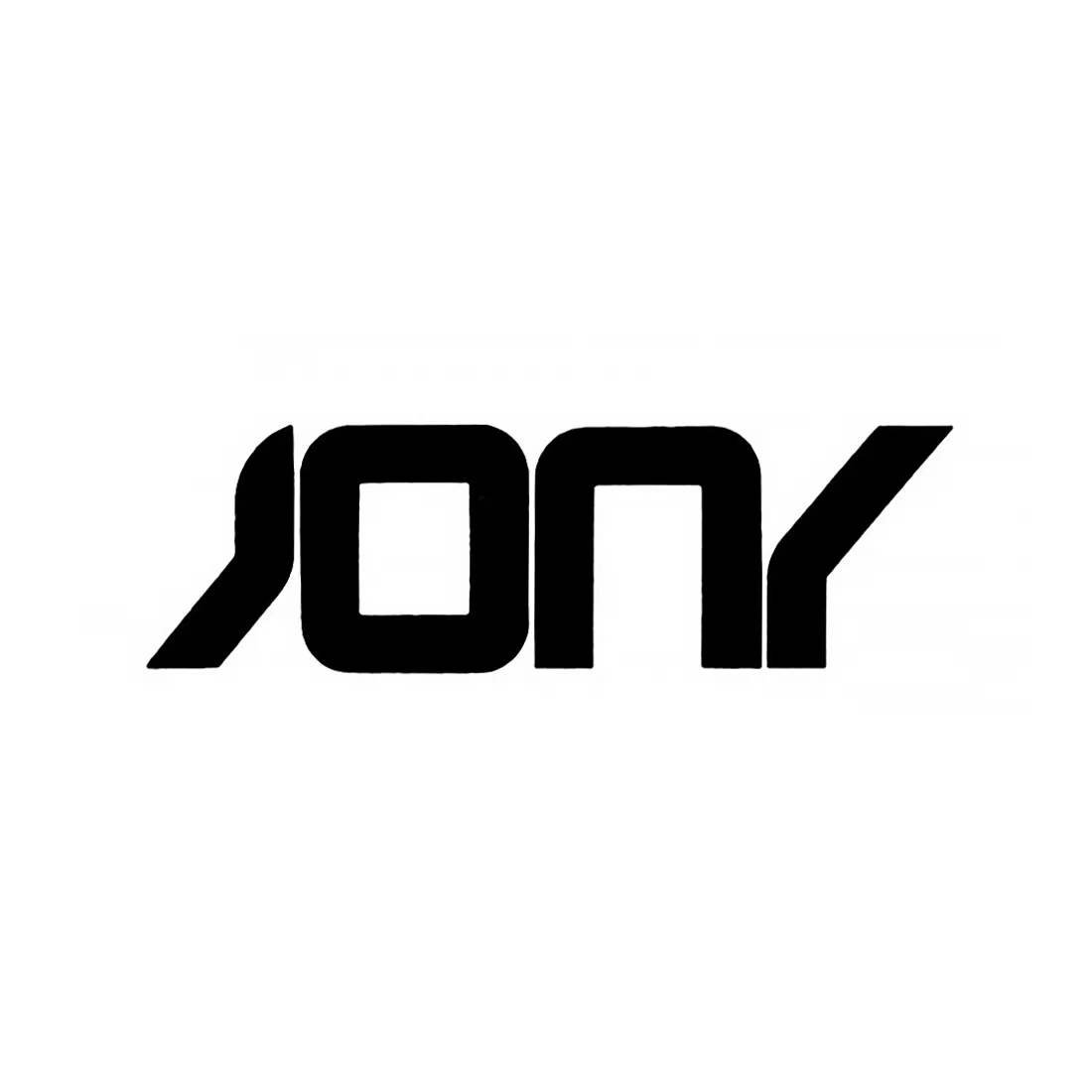
These came from Vilim Vasata of the Federal Republic of Germany, Bruno Grasswill of Australia and Fred Burton of the United States. Their proposals had emerged from an unusually large field, but reaching the final stage did not lead to the adoption of a new identity.
The judges concluded that there was “no clear first, second or third place winner.” Rather than rank the three finalists, Sony divided the prize money equally between them. The existing logotype would remain in use.
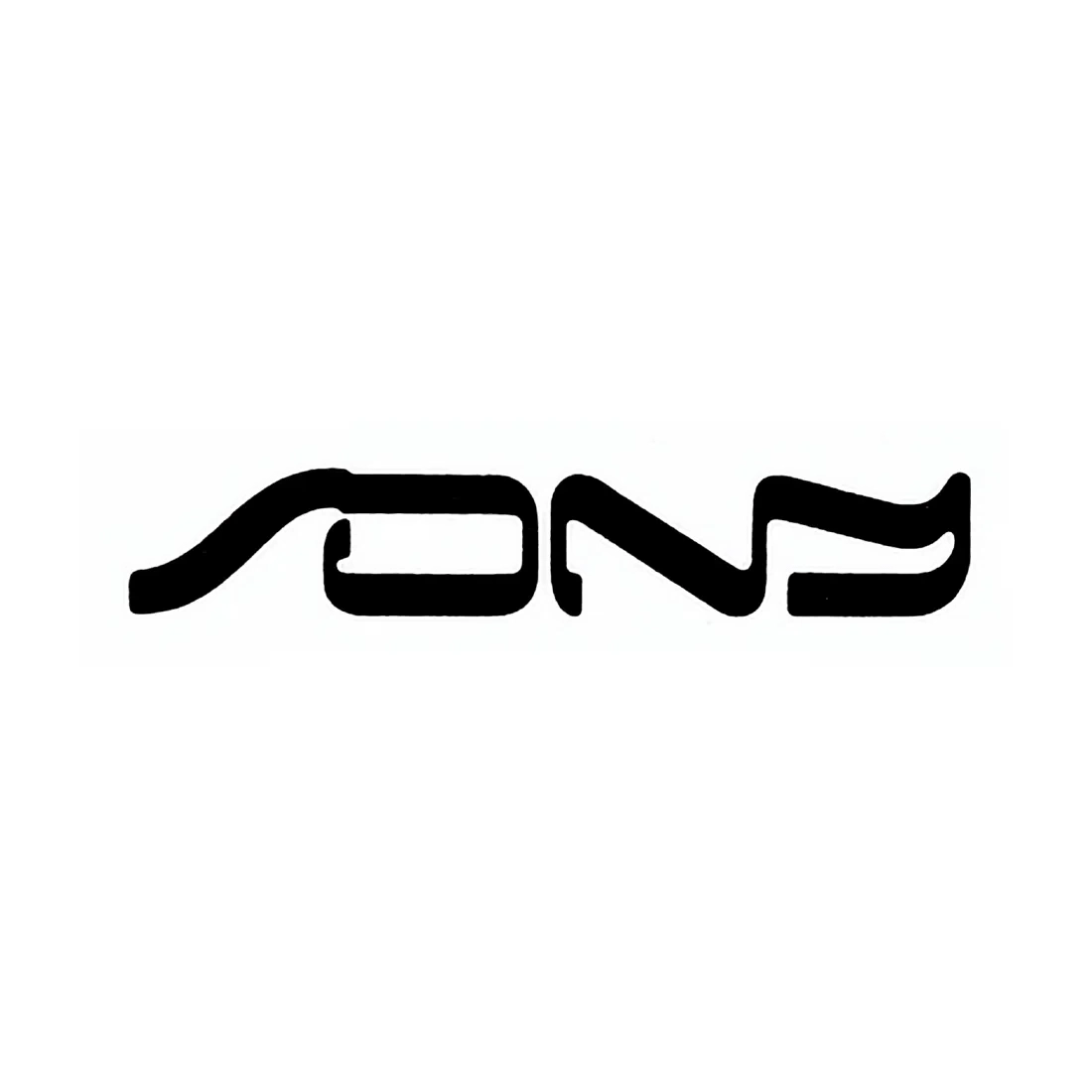
The company thanked the designers who had participated, describing their response as “most gratifying.” Its closing statement also left open the possibility of a later revision:
“And until the time comes in the future that we decide to make a change, the Sony logo will remain the same and continue to represent our commitment to innovative thinking and quality products.”
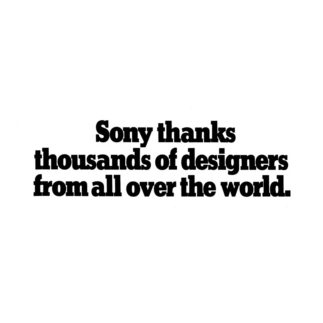
The competition had produced almost 30,000 proposals and three recognised finalists. For Sony, however, the anniversary passed with its familiar lettering still in place.
Thank you for subscribing to Logo Histories. If you enjoy reading this short you may also enjoy these resources from the same team:
Brand Archive – Research tool for brand designers.
LogoArchive Website – Searchable modernist logo archive & research tool.
LogoArchive Shop – Vintage design books & LogoArchive Zines.
BP&O – Contemporary design editorial.