


Access extensive historical logo design research. Over 200 LogoHistories. Discover concepts and contexts. Improve your understanding and craft → join here
Banks deal largely in things that cannot be seen. Trust, security, credit, growth and confidence are abstract ideas, yet each has to be communicated to their customers. For much of banking history, this was achieved through familiar symbols of authority: crests, seals, coats of arms, classical architecture and other imagery that suggested permanence and institutional weight.
During the second half of the twentieth century, that visual language began to change.
Banks were becoming larger and more complex. Mergers created new organisations, domestic banks expanded internationally and financial institutions introduced new products and services. At the same time, Modernism offered designers a different visual vocabulary: geometry, reduction, sans-serif typography and grid systems.
The challenge was no longer simply to make a bank look established. It was to make it look established and modern.
From authority to identity
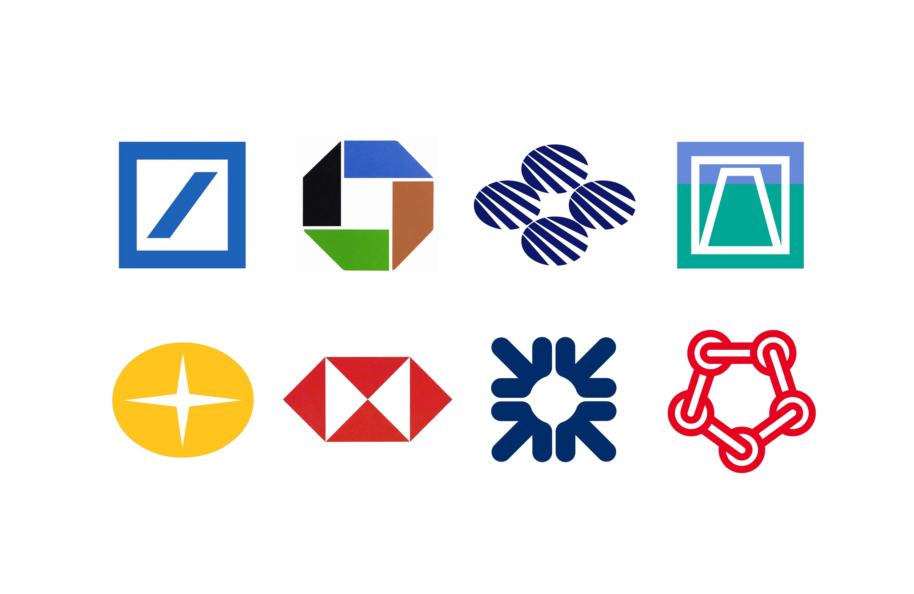
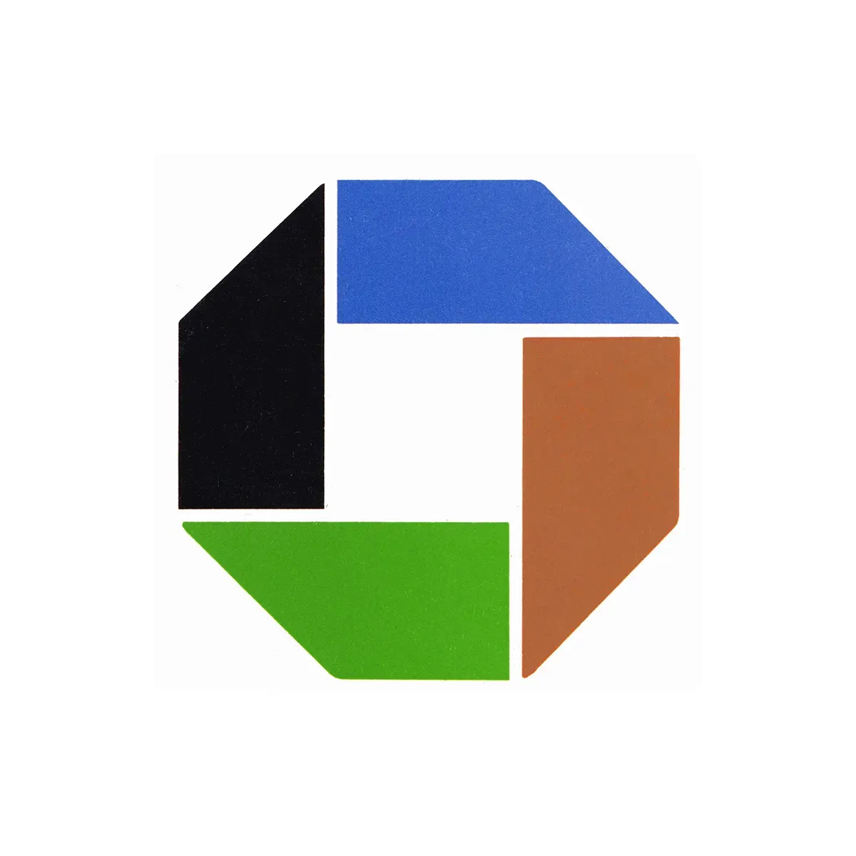
One of the clearest breaks with the past came with Chase Manhattan in 1960. Created by Brownjohn, Chermayeff & Geismar following the merger of Chase National Bank and the Bank of the Manhattan Company, the new identity needed to unite two organisations while reflecting the bank’s growing international ambitions.
Rather than drawing upon either bank’s existing visual heritage, the designers proposed something radical: an entirely abstract symbol.
Its four geometric elements formed an octagonal shape around a central square. The form suggested a bank vault and ideas of security and strength, while its angled outer edges introduced movement and dynamism. More important than any single interpretation, however, was its ability to acquire meaning through use.
This represented a significant change in thinking. A bank symbol no longer needed to depict history, money or authority. With sufficient consistency and exposure, an unfamiliar geometric form could itself become synonymous with the institution. Chase had turned abstraction into an asset.


A new visual language for banking
The approach reflected wider changes taking place within corporate identity.
As organisations grew, logos had to perform across increasingly complicated environments: branch signage, stationery, advertising, vehicles, credit cards, forms and architecture. International expansion added another requirement. A successful symbol needed to communicate across languages and cultures.
Simplicity became practical as much as aesthetic.
This can be seen in the identities that followed. Lippincott & Margulies’ 1962 identity for Royal Bank, FHK Henrion’s 1969 symbol for Giro, and Mitsuo Katsui’s 1972 identity for Kawasaki Shinkin Bank each approached banking differently, yet all belonged to a period in which financial institutions were reconsidering how they presented themselves to the public.
For Kawasaki Shinkin Bank, the brief was explicitly connected to the modernisation of banking. Katsui was asked to create something simple, strong and distinctive, but also approachable and capable of working everywhere from large signage to small forms and stationery.
That final requirement was increasingly important. The logo was becoming less an isolated emblem and more the organising element within a larger system.

Banking becomes global
By the 1970s, another pressure was becoming increasingly visible: scale. Banks were no longer necessarily single-purpose institutions operating under a single name in a limited territory. They were becoming diversified financial organisations with international networks and multiple areas of business.
The 1975 identity for Citibank, developed by Anspach Grossman Portugal, emerged directly from this complexity.
Citibank’s operations encompassed retail, international and merchant banking, while different names were being used in different markets. The new identity sought to bring these activities together under one global name.
Designer Dan Friedman took the bank’s established globe and compass-rose imagery and radically simplified it. The globe became a solid oval; the compass rose became a sharp negative-space form cut through its centre. The idea had not been abandoned. It had been compressed.
The result was more immediate, more contemporary and considerably easier to reproduce throughout an international organisation. A flexible colour system and Helvetica-based typography extended the logo into a broader corporate programme.
Here, simplification was not merely stylistic. It reflected the changing structure of the bank itself.

Trust without tradition
This presented designers with an interesting problem. Historically, banks had borrowed credibility from the past. Heraldry, architecture and ceremonial imagery suggested longevity. Modern corporate identity often did almost the opposite, removing historical detail in favour of simple forms that could communicate efficiency, progress and universality. Yet banks could not abandon trust.
Designers therefore began encoding familiar banking qualities in increasingly abstract ways: enclosed forms could suggest security; upward movement and concrete imagery such as trees could imply growth; repetition could suggest stability and wealth accumulation; interlocking elements could communicate connection; circles and globes could express international reach.
The visual vocabulary changed, but many of the messages remained remarkably consistent. The difference was that meaning was increasingly suggested rather than illustrated.

A more human bank
Modernisation did not always mean becoming more corporate. As banking expanded into everyday life, institutions also needed to appear accessible. Kawasaki Shinkin Bank’s identity was intended to communicate directly with customers. Young Jae Cho’s 1980 identity for Korea’s Citizens National Bank similarly sought to balance progress with friendliness.
Cho used a four-leaf clover, a familiar symbol of good fortune. Repeated lines gave the form movement, combining an approachable image with the sense of a bank adapting to changing financial services. This reveals another shift in banking identity. A logo could project strength without appearing cold or remote.
By the 1980s, banking brands increasingly had to reconcile apparently contradictory qualities: large but personal, international but familiar, technologically progressive but dependable.

From HongKongBank to HSBC
Henry Steiner’s identity for the HongKongBank, introduced in the early 1980s, addressed many of these pressures at once.
The previous identity incorporated a detailed colonial crest. Steiner instead developed a geometric symbol constructed from triangles around a central hourglass-like form. Its strong positive and negative space made it far easier to reproduce across everything from business cards to large building signage.
The older heraldic lion did not disappear entirely; it continued as an illustrative element. But it was no longer required to carry the full burden of identification.
A compact one-word logotype further improved the identity’s usefulness, while a corporate manual helped maintain consistency as the programme was introduced across different markets.
The contrast is telling. Where a crest communicated authority through history and detail, the new symbol communicated authority through consistency, recognition and scale.

The bank as a system
Taken together, these identities reveal something larger than a stylistic movement towards geometric logos. They document the emergence of the modern bank.
As financial institutions merged, diversified and expanded internationally, their identities had to do the same. The logo needed to survive reproduction at radically different scales, operate across languages, unite different divisions and remain recognisable wherever the organisation appeared. This encouraged a move away from highly specific imagery towards simpler and more adaptable forms.
It also changed the designer’s role. Designing a bank logo increasingly meant designing a system: typography, colour, signage, stationery, architecture, advertising and rules governing thousands of individual applications. Systems meant they could leverage economies of scale. Good design saved money.
The apparent simplicity of the resulting logos disguised the complexity they were designed to manage.

Designing trust
Look across twentieth-century banking logos and certain shapes appear repeatedly: squares, circles, arrows, intersecting lines and enclosed geometric forms. This is not accidental. Banking offered designers an unusually abstract design problem. There is no obvious picture for financial confidence. Instead, designers constructed visual metaphors for it.
And as banking changed, those metaphors changed with it. The crest offered heritage. The geometric symbol offered universality. The corporate identity programme offered consistency.
From Chase Manhattan’s pioneering abstraction to Citibank’s international system and HongKongBank’s transformation from heraldry to geometry, the history of bank logo design is therefore also a history of changing ideas about trust. Banks once demonstrated stability by looking old. Increasingly, they demonstrated it by looking unmistakably themselves.
If you enjoyed this article LogoHistories has over 200 stories of logos from the past available in the paid archive→


Thank you for subscribing to Logo Histories. If you enjoy reading this short you may also enjoy these resources from the same team:
Brand Archive – Research tool for brand designers.
LogoArchive Website – Searchable modernist logo archive & research tool.
LogoArchive Shop – Vintage design books & LogoArchive Zines.
BP&O – Contemporary design editorial.