


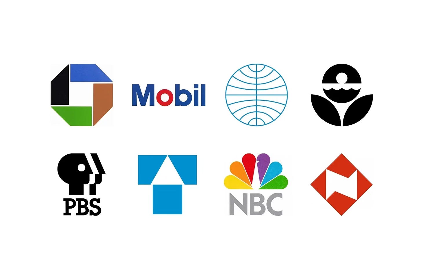
Ivan Chermayeff and Tom Geismar’s New York studio gave some of the 20th century’s largest organisations their most recognisable symbols, from the Chase Manhattan octagon to NBC’s peacock. Working for banks, broadcasters, oil companies, airlines and government agencies, the studio turned large and often unwieldy organisations into simple, memorable marks.
In this collection, discover eight Chermayeff & Geismar logos, from Chase Manhattan in 1960 to Nissay in 1988, and the stories behind their design.
Key Takeaways
A symbol in place of a name
From Chase Manhattan’s octagon to the three faces of PBS, the studio created abstract symbols that could stand in for long or unwieldy names.
Simplify, don’t start again
Where a mark had built up recognition, such as Mobil’s Flying Red Horse or NBC’s peacock, the studio refined it rather than replacing it.
Built as systems
Logos came with colour palettes, typefaces and guidelines, from Chase’s custom alphabet to the EPA’s nine programme colours.
Go behind the logos. Explore 200+ in-depth and meticulously researched logo histories revealing the designers, design decisions and ideas behind the world’s most iconic logos and important brand identities.
Continue reading to discover the stories behind eight of Chermayeff & Geismar’s most recognisable logos →

Chase Manhattan Bank, 1960
In 1955 the merger of Chase National Bank and the Bank of the Manhattan Company would form Chase Manhattan, the largest commercial bank in New York and the second largest in the United States.
The logo was inspired by a traditional Chinese coin, a circle with a square cut out of the centre. This was developed into the square enclosed in an octagon, suggesting a bank vault and, by extension, the notion of security and trust. As the designers would put it, the logo suggested how all activity (national or international) is centred around a square, implying growth from a central foundation. The addition of the 45-degree angles around the exterior edge was said to give the logo a sense of motion, dynamism and a hint of three-dimensionality, whilst remaining simple. The visual was said to be sleek, attractive and timeless, and the three-dimensionality would later play out in the form of signage.
Read the full Chase Manhattan story →

Mobil, 1966
By the mid 1950s, Socony Mobil Oil Company had become one of the world’s largest industrial corporations, selling oil and thousands of oil-based products all over the world. Despite this growth, studies had shown that the American company had one of the weakest corporate images of all the international oil giants. And there were questions raised about society’s dependency on this finite resource. What new forms of energy would be used in the future? And how could a big oil company keep on finding, processing, and selling oil at a profit while preparing it for the future?
Alongside improvements to the drawing of the horse, the studio developed a new simplified ‘Mobil’ sans-serif logotype, derived from Helvetica and Futura, and freed this from the horse, improving the immediacy of the new shorter name. This would then be developed into a corporate typeface that could be used to unify a vast array of products, solving a key issue of inconsistency. The blue and red first introduced by Peter Schladermundt Inc. were brought together with the speculation being that the red ‘o’ would help a global audience pronounce ‘Mobil’ correctly, placing emphasis on the right syllable.


Pan Am, 1970
Coinciding with the appointment of a new chairman in 1970, and the delivery on a large purchase of Boeing 747s, ordered in 1966, Pan Am embarked on a programme of further modernisation, appointing Ivan Chermayeff to review Pan Am’s corporate identity. This programme included a revision to the globe logo based on the 1955 version, but which was converted to outlines, set vertically or horizontally aligned with a new wordmark set in Helvetica. Other versions included a solid version which could be used on its own as a decorative element in conjunction with a bold use of type.
As part of a massive marketing drive, under the direction of Pan Am’s head of sales and promotion, Chermayeff & Geismar produced promotional works as well as campaign materials that included travel agent posters. These used stock rather than commissioned photographs, however, as single images, made a striking and “simple statement about some part of the world” and this was then used as a straightforward message alongside the Pan Am logo and corporate typeface in different configurations. The strapline “Pan Am’s World” united the campaign of diverse global images, driving it away from the corporate and towards conveying a sense of adventure. Although stock images, the idea and execution, delivered a powerful and pioneering campaign for the time.

EPA, 1977
An updated version of the logo was designed in 1977. This was created by Swiss designer Steff Geissbühler, also an enthusiastic environmentalist, who had joined the design studio Chermayeff & Geismar in 1975. The studio had been selected following Nancy Hanks and Jerome Perlmutter’s suggestion to the EPA to work with professional graphic designers on the project. This was part of a wider effort known as the Federal Design Improvement Program (FDIP). The FDIP was guided by Nancy Hanks and introduced a more design conscious thinking to many of the Federal departments. This was, up until that point, unheard of.
Whilst the team had developed several design proposals, they opted not to stray too far from the logo’s initial iteration. However, there were some notable and effective changes applied that made the logo simpler, more authoritative and adaptable - further providing a unifying element for all of the agency’s initiatives.

PBS, 1984
Lubalin’s design lasted over a decade, until 1984 when, to overcome what was described as a ‘serious problem with the prior identity’: its focus on the initials. With this concern in mind, a new PBS logo was commissioned.
The logo devised by Chermayeff & Geismar, which would replace Lubalin’s, depicted a stylised profile of a human face repeated three times using positive and negative space. This ‘playfully’ put the ‘public’ in public television, replacing one figure with many, and in so doing, did away with the ‘BS’, as ‘no one knew the meaning of it’.

Tokio Marine, 1986
It was the logo of American designer Ivan Chermayeff of studio Chermayeff & Geismar Associates that won. The logo created by Chermayeff developed the letter ‘T’ as its key motif. Through the use of negative space he introduced an arrow and the suggestion of a house with a pitched roof. Chermayeff described the logo as a ‘memorable and simple reminder of Tokio Marine’s continuing upward movement, its solidity and the protection of goods and people’. Further, the overall symmetry and proportions of the design added the suggestion of strength.
PAOS refined the logo and the colours of the original draft and worked this into a design system, introducing a logotype in Japanese and English. This preserved the unusual spelling ‘Tokio’ used since Tokio Marine and Fire’s founding. The logotype was changed to a more condensed version of Univers which was proposed by Chermayeff, improving usability in a variety of space-limited contexts that included tall building signage common to the country. The Japanese version was evolved to be set in one typeface, used horizontally and vertically stacked.
Read the full Tokio Marine story →

NBC, 1986
The corporation worked with Chermayeff & Geismar (C&G), led by Partners Ivan Chermayeff and Steff Geissbuhler (EPA), to develop a new logo, formalise its use, settle on corporate typeface, and codify these within a corporate identity manual. The main objectives were to simplify the existing design, improve its fidelity and usability and at the same time minimise the noticeability of its change.
By simplifying the plumage and colours from 11 to 6, and employing negative space to form the peacock, C&G improved the overall flexibility, impact and immediacy of the logo, whilst better reflecting the full tonal spectrum of colour television and symbolising the ‘collective contributions’ of NBC’s corporate family. This simplified form then afforded the corporation a means to create distinct identities for its various divisions using single solid colours for NBC Sports, NBC TV Stations, NBC News, NBC Entertainment and NBC Enterprises.

Nissay, 1988
Just like their approach to other projects, PAOS would draw on the outside support of specialists. In this case, PAOS invited American designer Ivan Chermayeff of Chermayeff & Geismar (Mobil, EPA & NBC) to create the logo.
Chermayeff’s design took inspiration from the shapes inherent in the old logo (forming a link to the tradition of Japanese heraldic symbols and calligraphy). He simplified the reference into a diamond shape and introduced, within the negative space of the diamond, a faceted ‘N’. This placed emphasis on a Latin character as a expression of foresight, the corporation’s new international scope and welcoming attitude.
Read next
For more on the studio behind these marks, browse every Chermayeff & Geismar logo history in the archive, or see more of the best in the Top 10 logos of all time. Become a paid subscriber to read every story in full, richly illustrated.
Want more in-depth articles? Check out LogoHistories’ other articles on mid-century American logos →


Thank you for subscribing to Logo Histories. If you enjoy reading this short you may also enjoy these resources from the same team:
Brand Archive – Research tool for brand designers.
LogoArchive Website – Searchable modernist logo archive & research tool.
LogoArchive Shop – Vintage design books & LogoArchive Zines.
BP&O – Contemporary design editorial.