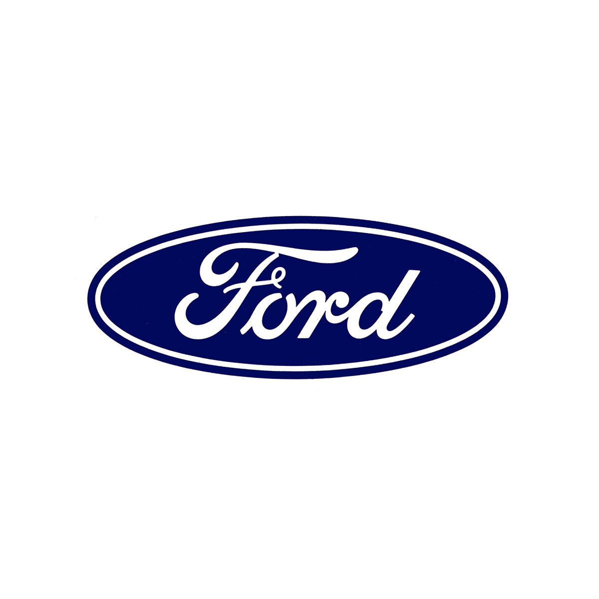
Ford Logo, 1965
Unimark's 1965 logo and corporate identity for Ford Motor Company.
This post is supported by LogoArchive – The home of historical logos. Discover over 5000 of history’s greatest designs from the world’s finest designers. Always find the logo inspiration you need for your next project here.
Increasing volatility in the markets of the 1960s, and the general mood in American and elsewhere was enough of a provocation for the leadership at Ford Motor Company (Ford) to look at ways of improving their position.
Post-war expansion and globalisation had seen many American companies extend their operations overseas as a way to sustain growth and market value. Ahead of Ford’s plan to invest in further global reach (it was already exporting to Europe and South America), it sought to review its corporate identity and seek a fresh direction that would better support and position it for this new era. Part of this would include formalising aspects that had increasingly become incoherent among factories, showrooms, and divisions overtime.
The process would also seek to deliver cost savings through economies of scale as well as improving overall visibility and impact. This would extend to reviewing the Ford logo, a copperplate script, based on the signature of its founder Henry Ford.
Three studios were invited to submit proposals. These included Sandgren and Murtha, Paul Rand (IBM & Westinghouse) and Unimark International (AGIP & American Airlines). Each studio approached the project differently. Sandgren and Murtha, who had extensive corporate experience, and could leveraged knowledge from their time at Lippincott & Margulies, explored an ‘exclusive and upscale’ route.


