


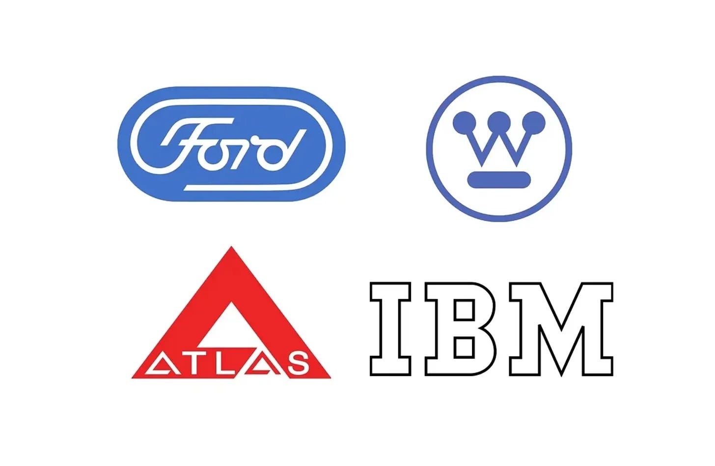
Paul Rand is perhaps most widely remembered for his IBM logo, but over a long career he created some of the most influential corporate identities of the 20th century. Often working alongside the architect and industrial designer Eliot Noyes, Rand helped shape the design programmes of companies such as IBM, Westinghouse and Cummins, reducing large and complex businesses to simple, memorable marks.
In this collection, discover four Paul Rand logos, from IBM in 1956 to his unused proposal for Ford in 1965, and the stories behind their design.
Key Takeaways
Designed not to date
Rand worked on the assumption that any theme or device would eventually become dated, so he kept his marks simple and grounded, from IBM’s square-countered 1956 logotype onwards.
Evolution over revolution
At IBM and Westinghouse, Rand refined what came before, carrying over the symbolic value a logo had accumulated while giving it a contemporary look.
Built for every application
His marks had to work in one colour, at any scale and in any medium, from service pins and calling cards to building signs and trucks, as with Atlas and Ford.
Go behind the logos. Explore 200+ in-depth and meticulously researched logo histories revealing the designers, design decisions and ideas behind the world’s most iconic logos and important brand identities.
→ free previews
→ join here
Continue reading to discover the stories behind four of Paul Rand’s most influential logos →

IBM, 1956
The logo and corporate identity design of International Business Machines (IBM) is perhaps most distinguished by its approach as much as it is by its results. Loose but profound and operating on the assumption that any theme or device is doomed to become “hackneyed” or “dated”, two constants were settled on, to reflect quality and “the contemporary”.
The second iteration of the IBM logo (1967) presents viewers with a cryptic visual language. Some have read the introduction of lines as being linked to the scan lines of a CRT screen. However, the truth lies in the idea of authority, and the notion that stripes appear like a security device to protect signatures from being counterfeited. These stripes were also meant to give the logotype the impression of speed, efficiency and dynamism.

Westinghouse, 1961
At the beginning of the 1960s, the Westinghouse Electric Corporation was the fourteenth largest industrial corporation in America producing a wide range of electronics for nuclear power stations, public transportation and the home. The growing global presence and extensive catalogue which amounted to over 300,000 product lines across sixty divisions, meant that a new and more ‘conscious’ design policy be introduced to maintain a consistent image throughout the corporation and across all the industries it operated within.
With a stylised ‘W’ at the centre, Rand’s design solution echoes the basic compositional qualities and components of what came before, however, through simple adjustments, which included reducing the line weight of the diagonal strokes, it took on the appearance of a circuit board, with circles representing lights. During development of the logo, and in one meeting, it was pointed out to Rand that the logo resembled a mask. Although not intentional, it was Rand’s feeling that it was this anthropomorphic observation that gave the logo its memorable quality, with masks being a central part of many cultures.
Read the full Westinghouse story →


Atlas, 1964
In 1964, Paul Rand designed a trademark for Atlas Crankshaft Corporation, an American manufacturer of engine components. Atlas had been acquired by Cummins Engine Company in 1958, and Rand had begun working on Cummins’ corporate identity programme in 1961. His proposal for Atlas was set out in a presentation booklet dated April 1964.
The resulting mark was dominated by a broad, triangular ‘A’, with Atlas incorporated into its base. The two As within the name repeated the larger symbol in miniature, linking the lettering to the surrounding form. This repetition gave the wordmark a distinctive rhythm and made the name part of the logo’s construction. The design could be recognised as a complete graphic unit and read as a group of letters. This wasn’t too dissimilar from his approach to the Cummins logo.

Ford, 1965 (Concept)
Rand, however, described Ford’s logo as ‘hopelessly outdated’, ‘tied to the company’s early twentieth century roots’ and ‘unsuitable for modern industry’. Driving the point further home in his proposal, said it was more ‘artistic embellishment than functional necessity’ and ‘not unique to any one time or period’.
Rand defined the key traits of Ford’s previous logo and developed a new one that translated these into ‘contemporary terms’; using evenly weighted letters instead of the Copperplate script; replacing a ‘common’ oval frame with a lozenge and creating a distinctive ‘F’ and ligatures. The effect, as described in the proposal document ‘conveys the impression of motion and moving lights’. It would also improve the logo’s usability, which was shown as an example on signs, trucks and when scaled down.
Read next
For more on the designer behind these marks, browse every Paul Rand logo history in the archive, or see more of the best in the Top 10 logos of all time. Become a paid subscriber to read every story in full, richly illustrated.
Want more in-depth articles? Check out LogoHistories’ other articles on mid-century American logos →


Thank you for subscribing to Logo Histories. If you enjoy reading this short you may also enjoy these resources from the same team:
Brand Archive – Research tool for brand designers.
LogoArchive Website – Searchable modernist logo archive & research tool.
LogoArchive Shop – Vintage design books & LogoArchive Zines.
BP&O – Contemporary design editorial.