


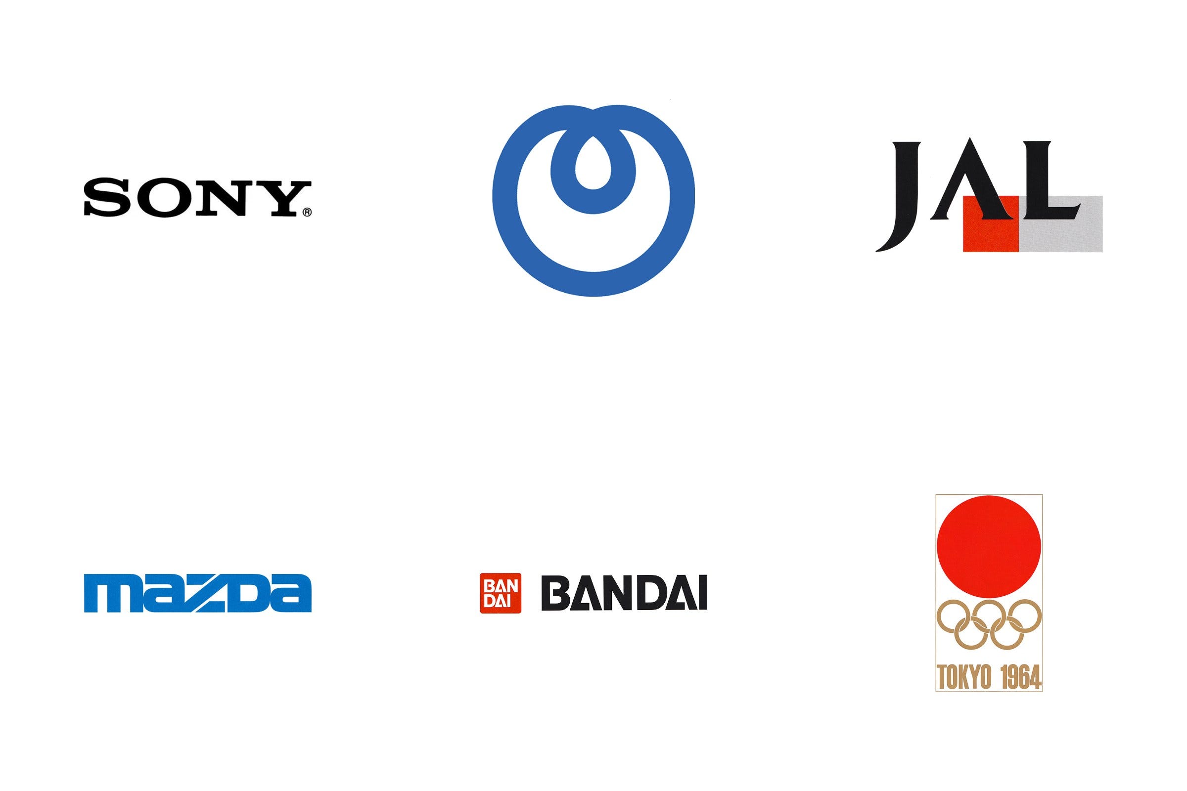
Between the 1960s and the early 1990s, Japan produced some of the most inventive logo design in the world. Designers such as Yusaku Kamekura, Ikko Tanaka, Kazumasa Nagai and Takenobu Igarashi, and consultancies such as PAOS, created identities for banks, carmakers, electronics companies, Olympic Games and world expos.
In this article you’ll find every Japanese logo history on LogoHistories, grouped by sector. Short on time? Start with five logos that defined Japanese design, or the work of Yusaku Kamekura.
Key Takeaways
Corporate identity as strategy
From the 1970s, PAOS used corporate identity programmes to help companies such as Mazda, Bridgestone and NTT reposition themselves, tying a new logo to a new direction for the business.
One strong idea
Many of these logos pair modernist geometry with a single, memorable idea, such as Yusaku Kamekura’s red sun for the Tokyo 1964 Olympics.
A world stage for design
The Tokyo Olympics, Expo ’70 in Osaka and the expos that followed gave Japanese designers an international stage, and a brief to show Japan to the world.
Go behind the logos. Explore 200+ in-depth and meticulously researched logo histories revealing the designers, design decisions and ideas behind the world’s most iconic logos and important brand identities.
Continue reading to discover all 43 Japanese logos and the stories behind them →
Olympic and world expo logos

Tokyo 1964 Olympics
The Games of the XVIII Olympiad, abbreviated to and branded as Tokyo 1964, was not only a state-sponsored event involving the whole nation but one of the first great opportunities for post-war Japan to showcase its rich cultural heritage to the world in a positive light and in an inclusive way. Designing a symbol that captured and conveyed this was critical in the promotion of the event. Work began on this four years earlier, in 1960, with an invitation sent out by the Tokyo Olympics Organising Committee to critics, art directors, and designers inviting them to form ‘A Design Round Table Committee’. Their initial task would be to arrange a competition to generate options and the final design of an appropriate symbol.
Read the full Tokyo 1964 Olympics logo story →

Sapporo 1972 Winter Olympics
Japan was asked to host the Sapporo Winter Olympic Games in 1972 due in large part to the high international praise that the Tokyo Olympic Games received, of which it’s breakthrough visual identity had played a significant role in impressing local and international visitors.
In order to deliver an equally impressive Winter Olympics, nine dedicated committees were set-up within the Organizing Committee. The Design Committee, a ten-member panel chaired by Masaru Katzumie, which would deliberate and shape the policy for all design-related activities, was established in 1966 and got quickly to work on sourcing concepts and deciding on a symbol.
Continue scrolling to see some of the concepts submitted. Understand the relationship between the symbol of Tokyo ‘64 and Sapporo ‘72. And learn about the considerations that shaped the final design and colour palette.
Read the full Sapporo 1972 Winter Olympics logo story →

Expo ’70 Osaka
In 1965 the committee of the Japan World Exposition Association began its work to select the theme for the Osaka Expo, due to take place between March 15 and September 13, 1970. Following a series of meetings, the theme of this 1960s Expo was selected to be "Progress and Harmony of Mankind”, and a competition was initiated to solicit designs for the official Expo symbol from graphic designers throughout the country.
Read the full Expo ’70 Osaka logo story →

Bureau International des Expositions, 1972
At the request of Japan, the Bureau International des Expositions (BIE)–the intergovernmental organisation in charge of overseeing and regulating World Expos since 1931–called on the governments of the 34 member countries to establish a ‘uniform logo’.
Each country was asked to submit three design proposals to the BIE Publicity Committee in Paris who would make the final decision. In Japan, an open competition was initiated and jointly sponsored by the Foreign Ministry, Ministry of International Trade and Industry and the Japan World Exposition Association.
Masaru Katzumie, who was working as a design adviser to the Association, was asked to serve as chairman of the selection committee. Katzumie had experience working with selection committees. He had overseen the design of symbols for Expo '70 and the Meiji Centenary, and would later go on to manage those of the Sapporo Winter Olympic Games and Expo ‘75.
Read the full Bureau International des Expositions logo story →

Expo ’75 Okinawa
Expo ‘75 was a World’s Fair held on the Japanese island of Okinawa, opening on July 20th, 1975 and running until January 1976. Like other Expos, the attractions and international pavilions revolved around a central theme, this time, it was the ocean, presenting to the public various oceanographic technologies and marine life. Expo ‘75 was also conceived of as a commemorative event, celebrating the handing over of Okinawa from the US to Japan in 1972, which was finally completed in 1975.
A closed competition was held between 11 designers to find a symbol for the Expo, and a selection committee was assembled to narrow down the many entries. The chairman of the committee was Masaru Katsumie. Katsumie was a strong choice, having had extensive experience working with selection committees overseeing the design of symbols for Expo '70, the Meiji Centenary, the BIE and Sapporo Winter Olympic Games. The rest of the committee was made up of designers Kenji Ito, Koya Ooshiro, Iwataro Koike, Ikko Tanaka (Expo ‘85), Hideo Mukai, Ryuichi Yamashiro, Seiji Kaya and Yasaburo Ikeda. Norio Ochi, the secretary-general of the Ocean Exposition Association, also joined the committee.
Read the full Expo ’75 Okinawa logo story →

Expo ’85 Tsukuba
The International Exhibition, Tsukuba Japan 1985 (国際科学技術博覧会, Kokusai Kagaku Gijutsu Hakurankai) shortened to Expo ‘85, was a world's fair held in Tsukuba Science City, north of Tokyo. The event ran from March 17 to September 16, 1985 with international exhibitors exploring the theme of “Dwellings and Surroundings - Science and Technology for Man at Home". Just like Expo '70, the process of procuring ideas and a final symbol came down to a competition and selection committee.
Kotani Shoichi, chairman of the publicity committee for the Expo, asked renowned Japanese designer Yusaku Kamekura (Shell, Fuji Bank) to serve as the chairman of the committee. Seven designers were selected to submit proposals, these included Ikko Tanaka, Takenobu Igarashi (Noritz) and Shigeo Fukuda. Although Kamekura was away at the time and wasn’t able to participate in this selection process, he was pleased by the variety. This variety also extended to the committee, which was made up of only three designers with the rest being a mix of songwriters, editors, actresses, cartoonists, sculptors and ‘people of learning’.
Read the full Expo ’85 Tsukuba logo story →

Expo ’90 Osaka (Garden and Greenery Expo)
Having successfully hosted Expo ‘70, the Japanese coastal city of Osaka returned to the world stage two decades later with another. Rather than a ‘World’s Fair’, which explored a central and current theme through cultural, societal, environmental and technological lenses, the International Garden and Greenery Exposition, Osaka, Japan 1990, shortened to Expo ’90, was a more focused International Horticultural Expo. Although lesser-known, the Horticultural Expos have a long history, with the first taking place in the Netherlands back in the 1960s.
The theme for this Expo was ‘The Harmonious Coexistence of Nature and Mankind’. This intended to promote a more humanistic world for the 21st century and was part of a strategy devised by Osaka City and the Japanese Government to raise awareness around key environmental issues and triple the amount of green space in Japan.
Read the full Expo ’90 Osaka (Garden and Greenery Expo) logo story →
Technology and electronics logos

Sony, 1973
Having signed a temporary contract in 1953, Norio Ohga joined Sony formally in 1959 and would later go on to become President and then Chairman. In 1961, he declared that “Sony design must be standardized”. This was a concerted effort to bring Sony’s designers together in one place and develop a house style for all of its products under a ‘black and silver’ design language.
Having switched from a hand-drawn script to a serif in 1957 various versions of the Sony logo had been used. Each was based around an uppercase serif, however, letter-space and weight had shifted regularly from 1957 to 1969. This created discontinuities between advertising and packaging, quite apart from the new standardised approach to industrial design.
Read the full Sony logo story →

NTT, 1985
Following WWII, during the occupation of Japan as the country rebuilt, its telecommunications system was operated by American company AT&T. This responsibility was handed back in 1952, and Nippon Telegraph & Telephone Corporation (NTT) (Nippon Denshin Denwa Kōsha) was reestablished as a state monopoly. From 1952 to 1984 NTT used a logo created from two inter-connected ‘T’s caught in a loop. This can still be spotted on old manhole covers throughout the country today.
In 1985 a governmental programme of industry privatisation was initiated. This was intended to develop competition within the country's telecoms market, improving services and reducing cost. This would see NTT spun off into a private corporate entity on April 1, 1985, ending its 115-year run as Japan's only telecommunications service.
Read the full NTT logo story →

Kenwood, 1982
For many, and especially those in Great Britain, hearing the name ‘Kenwood’ will call to mind the counter mixers and kitchen appliances of Kenwood Manufacturing Company, founded by British engineer Kenneth Wood in 1947. In Japan, this is a different story.
The other Kenwood was founded in 1946 as ‘Kasuga Radio Co. Ltd.’ Located in Japan’s Nagano Prefecture the electronics company would later be renamed ‘Trio Corporation’ in 1960 – in recognition of its three founders. As part of an international expansion programme and following extensive research the name "Kenwood" was introduced into the American market in 1964 whilst retaining Trio throughout Japan and Great Britain.
It has been said, although we can’t confirm this, that the name was derived from the two words ‘ken’ and ‘wood.’ The former, a name familiar to both Japanese and Americans, and the latter referring to the durable wood casing of the company’s electronic products. It was also suggested that this would call to mind ‘Hollywood’. Somewhat poetic but a more a myth.
Read the full Kenwood logo story →

Yokogawa, 1986
Yokogawa, founded in 1915 by Dr. Tamisuke Yokogawa as an electric meter research institute in Tokyo, evolved into Yokogawa Electric Works in 1920. It ventured into aircraft instruments and controllers in 1933 and, after World War II, expanded globally with its first overseas office in New York.
In the 1960s the corporation entered the industrial analyser market and launched the development, manufacturing and sales of vortex flowmeters. Later, in the 1970s, Yokogawa established its first manufacturing plant outside Japan in Singapore, opened a sales office in Europe, and became one of the first corporations to bring a distributed process control system to market.
In 1983 Yokogawa merged with Hokushin Electric Works and entered the high-frequency measuring instrument business. This merger–part of the corporation’s continued drive towards expansion of its areas of business interests and in response to the increasing number of group companies–created the need for a unified corporate image.
Read the full Yokogawa logo story →

Seiko, 1986
Daini Seikosha Co., Ltd. (currently Seiko Instruments Inc.) was established as the wristwatch manufacturer K. Hattori & Co., Ltd. In 1964 it served as the official timekeeper for the Tokyo Olympics and in 1970 it released the world’s first quartz watch.
Later, in 1981, it established Seiko Instruments U.S.A. as a sales company of increasingly diversified products distributed into North America, which then extended into Germany and then further into Europe.
Seiko Electronic Industry, as it became in 1981, secured its position as one of the world’s largest manufacturers of clocks and watches, and began to expand its business to other related fields such as electronic machinery, tools, and automation devices that utilised its ‘mechatronics’ technology.
Read the full Seiko logo story →

Zexel, 1991
In 1991, and on the 51st anniversary of its founding, the Japanese car parts company Diesel Kiki Co., Ltd. introduced a new corporate identity designed PAOS.
This followed a meeting with shareholders, that agreed to change the name to ‘Zexel’ as a statement of a determination to refresh the ‘minds and bodies’ of the corporation and catalyse corporate development ahead of the 21st century as it developed its international business.
Read the full Zexel logo story →

TEPCO, 1987
Tokyo Electric Power Company (TEPCO) was established in Japan as one of nine America-backed government monopolies that would oversee and facilitate the rapid recovery of infrastructure which had faced devastation during World War II.
Despite playing a key roll in bringing electricity back to Kantō region, Yamanashi Prefecture and the eastern side of Shizuoka Prefecture (which included Tokyo) by the 1980s few people in these regions had much interest in who their supplier was, or what kind of company it proposed to be.
In order to clarify and communicate a ‘new management style’ inside and outside the company and establish an attractive corporate image as people began to take more interest in energy issues, TEPCO commissioned the development of a new corporate identity, handing the responsibility over to Nippon Design Center (NDC).
Read the full TEPCO logo story →
Transport, manufacturing and industry logos

Japan Railways, 1987
Having accumulated a growing amount of debt the national railway of Japan was privatised in 1987 and split into seven for-profit railway companies; six regional passenger services and one freight service. These were collectively called the Japan Railways Group or the JR Group.
Normally, each new company would have had a new logo decided on by the management of these new entities. However, just like the post-war split of Mitsubishi, a single logo was felt to have been, in some ways, more useful and reassuring. Further, based on the feedback of JNR employees, it was decided that a single new visual identity for the network should be designed and applied all at once.
Read the full Japan Railways logo story →

Japan Airlines, 1989
Fresh from privatisation Japan Airlines (JAL) would enter the 1990s with a ‘modern and dynamic strategy’. This intended to drive future growth of the national flag carrier through various new initiatives, features and services. These included the introduction of ‘Executive Class’ for the growing business traveller with a spacious new cabin design, better seats and meal service and state-of-the-art video entertainment. For economy travellers JAL introduced new-look ticket offices and made fleet-wide improvements.
These broad strategic changes were a bold step forward by JAL, and needed to be clearly and outwardly expressed with a strong and unified corporate image. In 1989 American design studio Landor Associates were brought in to develop this new image, which would go on to include a new logo, colour palette, typeface and uniforms whilst retaining the iconic crane that had emblazoned the airline’s tail fins since 1958.
Read the full Japan Airlines logo story →

Mazda, 1975
Toyo Kogyo Co., Ltd. was the first to develop the commercial application of rotary engines. Despite this technological achievement, it hadn’t been able to move its image away from being a manufacturer of three-wheeled service vehicles.
In 1971, in an effort to reposition the corporation as a leading manufacturer in the minds of consumers it launched ‘Project Eliza’. As part of this, a review of its corporate identity would be undertaken, standardising and bring into coherence all aspects of its communications, future proofing the brand and providing it with a set of stock assets that would live for ‘as long as possible’.
Driving the development of the Mazda corporate image was Japanese design studio PAOS, who defined three ‘conceptual expressions’ to define all aspects of the new corporate identity; progressiveness, high quality and empathy.
Read the full Mazda logo story →

Bridgestone, 1984
Bridgestone was founded as Bridgestone Tire Company, Ltd. in 1931 and was the first Japanese tyre maker to utilise domestically developed manufacturing technologies. By the mid-1950s the company had a major hold over the domestic market, and over the following years its business grew beyond tyres to include bicycles, sporting goods and other items, steadily strengthening its presence in overseas markets.
With its movement into new markets and product categories, Bridgestone's brands multiplied and grew in complexity. This had led to inconsistencies in design as this was tackled independently. At the beginning of the 1980s, and into its 50th year, Bridgestone embarked on a programme of studies, and followed this with a corporate identity (CI) that sought to address this issue of inconsistency. Further, the new CI intended to establish a system that would be better attuned to the company's marketing strategies going forward, consolidate its images across all of its products and marketing, and address three ‘forward-looking policies’. These were; greater penetration into the global markets; expansion of its scope of operations; and play a larger role in society.
Read the full Bridgestone logo story →

Kawatetsu, 1987
The steel division of Japanese manufacturing company Kawasaki Heavy Industries was spun off as the Kawasaki Steel Corporation in August 1950 following the breakup of the Kawasaki Dockyard. Also trading under the name Kawatetsu, it became one of the world's top steel producers by the 1980s, having undergone rapid growth during the post-World War II period.
With the intention of achieving the goal of becoming a key industrial player in the 21st century, Kawatetsu devised a plan to diversify its business. It would begin this by initially offering steel-related products and later expanding into other materials and services such as engineering and construction.
Kawatetsu worked with PAOS to develop a new corporate identity. This intended to support the restructuring of the business; accommodate its ambitious diversification plan; and solidify its identity as a potent industry leader into the 1990s.
Read the full Kawatetsu logo story →

INAX, 1984
The early 1900s saw an increase in foreign visitors to Japan. Seizing the opportunity, the Imperial Hotel commissioned Frank Lloyd Wright to design a striking new building in Tokyo. His design required the moulding and specialist firing of unique terracotta tiles. To handle this project, a factory was established in the city of Tokoname, and Hatsunojo Ina and son Chozaburo were given the roles of technical advisors. When the hotel was completed in 1924, the duo took on the workers and equipment to establish Ina Seito Co., which continued producing tiles for the Japanese market.
Over the following decades, the company grew into an industry leader, and expanded into the sanitary market, manufacturing ceramic plumbing fixtures, wash basins and baths, as well as developing the Japanese ‘shower toilet’.
Read the full INAX logo story →

Itoki, 1985
Itoki was founded on December 1st 1890 as an inventor, manufacturer and retailer of office equipment. Initially, these were small items such as paper clips and staplers but later included the pioneering development of the Japanese typewriter and expansion into cabinets and lockers. Itoki would also launch the first range of steel furniture in the country, which began to characterise the modern Japanese office of the 1950s. The 1970s saw the company expand globally, enacting the corporate spirit of ‘Challenging Frontiers’.
In 1985, ahead of Itoki’s 100th anniversary, it embarked on the development of a new corporate identity (CI). This would help strategically position it for the future. This would continue to build on the founding principles of ‘good design, good system’, and support its international growth by standardising various corporate assets and marketing materials.
Read the full Itoki logo story →

Noritz, 1984
Noritz launched its first product on to the Japanese market in 1958. This was a bathwater heater that sought to broaden Japan's bathing culture and improve people's living standards. Between 1961 and 1970 it was at the forefront of switching over to gas-powered bathwater heaters and became a market leader.
Founded on the belief that quality baths bring joy to people, the company positioned itself, not as an engineering innovator, although it was at the forefront, but as a company that seeks to use this knowledge to improve the lives of both individuals and wider society. In 1984, working with Takenobu Igarashi and PAOS, Noritz introduced a new and more personable corporate image to better reflect this belief.
Read the full Noritz logo story →
Bank, insurance and finance logos

Fuji Bank, 1979
In an attempt to restore its preeminence, having been usurped from the top position by Dai-Ichi Kangyo Bank (DKB), Fuji Bank agreed to merge with Osaka-based Sanwa Bank in the late 1970s. However, the merger failed to win approval from the Ministry of Finance. Following this, the bank sought another approach to reaffirm its position. Part of this was to develop a new logo and corporate image.
Read the full Fuji Bank logo story →

Kawasaki Shinkin Bank, 1972
Kawasaki Shinkin Bank (KSB) has a long history. It was founded on the 18th July 1923 and continues to serve it’s Japanese customers today. In 1972, ahead of its 50th anniversary, the bank commissioned Mitsuo Katsui to develop a new corporate identity. The intention was to rejuvenate its image and reflect, in an approachable way, the modernisation of banking that was underway. This new image would also be symbolic of the continued growth of the bank and the wealth of its customers, and serve to motivate staff under a strong image.
Working with KSB, Katsui put forward the following requirements for the design of a new logo; that it be simple, strong and distinctive; it accurately represent the content and character of the bank; directly connect with customers, and be easy for them to get used to. And finally, it should be deployable and effective in all media types, from large format signage to smaller items such as forms and stationery.
Read the full Kawasaki Shinkin Bank logo story →

Surbank, 1985
A shinkin is a local Japanese trust bank for individuals and families, as well as small to medium-sized companies conducting business in specific areas, and often run and financed cooperatively by its members. When the Japanese banking industry began to be opened up in the 1980s, these shinkin banks (see also: Kawasaki Shinkin Bank) were challenged by new market forces, and many were unable to compete as larger banks expanded and diversified. Making this more challenging was the differences in the corporate identities of these shinkin banks which, in terms of a unified and consistent image, were far removed from the better-funded larger commercial banks. Many had began to appear tired and struggled to keep up with the rapid modernisation that was happening.
Read the full Surbank logo story →

Tomato Bank, 1989
When Japan’s Sanyo Sogo Bank transitioned from a mutual savings and loan bank into a commercial bank in 1989, it used the moment to announce a new, more progressive and friendlier way to bank. It was a sharp break from its conservative roots in 1931, and a world away from how the rest of the banking industry in Japan was presenting itself.
The Okayama-based bank would mark this change with a new corporate identity, bank interiors and a bold new name, Tomato Bank.
Read the full Tomato Bank logo story →

Toho Bank, 1991
By the close of the 1980s, the Japanese financial sector was entering a period of structural change. Liberalisation and the growing internationalisation of finance were eroding the protected conditions under which regional banks had long operated. Institutions that had once relied on local loyalty now faced pressure to express a clearer sense of purpose and character (See: Tomato Bank).
For Toho Bank, the principal regional bank of Fukushima Prefecture, this period coincided with an approaching milestone. In 1991 the bank would mark its 50th anniversary, and it chose to treat the occasion not simply as a commemoration but as an opportunity to define a new institutional identity for the twenty-first century.
Read the full Toho Bank logo story →

Nissay, 1988
Nippon Life Insurance Company was founded in 1889 and by the mid-1980s had become the world's largest life insurance company in terms of total assets and ‘premium income’. It had consistently been a leader in the life insurance industry, was the first company in Japan to pay policy-holder dividends, was one of the first to hire women as sales staff and was an employer of over 70,000 people. Together, these had secured it a venerable position in Japanese society. However, studies undertaken in 1985 indicated that despite Nippon Life being considered a large, reliable and friendly corporation there was some confusion around the extent of its services. Put simply, there were still many people who did not know what the company did.
Read the full Nissay logo story →

Tokio Marine, 1986
Tokio Marine and Fire was founded in 1879 and, by the mid 1960s, had become the leader in Japan's non-life insurance industry. Although its early emphasis had been marine insurance the corporation had diversified its products and services, and moved into household insurance. This also included automobile, fire and casualty policies.
Tokio Marine and Fire was well-regarded. It was a household name in cities, listed on the stock exchange, and one of the top employment choices for many college graduates. Despite this, a careful investigation of the corporation’s image revealed that the ‘marine’ aspect was what people were most familiar with. This was emphasised further by the wave-like quality of the previous logo, very much in the style and spirit of Japanese ‘mon’.
Read the full Tokio Marine logo story →
Consumer brand and retail logos

Bandai, 1983
By the 1980s Bandai Co., Ltd–a Japanese multinational toy and games manufacturer and distributor founded in 1950–had grown to become the industry leader, operating eight groups covering a variety of different product categories. In 1982 these groups were merged into one.
The restructuring was instrumental in getting Bandai listed on the Tokyo Stock Exchange and expressed its readiness and ambition to move beyond an area of business that was described as a ‘cottage industry running on inspiration’.
Recognising that the entertainment industry would expand far beyond toys and games (Bandai would later be responsible for launching the electronic pet craze with Tamagotchi) Bandai sought out a new corporate identity. This would outwardly convey the restructuring and renewed ambition of the company and prepare it for further expansion whilst also maintaining the ‘vitality inherent to a medium-sized business’. In charge of this would be PAOS, fresh off working on iconic Japanese brands such as ASICS and Kenwood.
Read the full Bandai logo story →

Meiji Dairies, 1986
Meiji Dairies Corporation (明治乳業株式会社, Meiji Nyūgyō Kabushiki-gaisha) was founded in 1917 as a producer of dairy products.Over the following decades, it expanded its operations into the manufacturing and distribution of a full range of food products for the Japanese market.
In 1986, ahead of its 70th anniversary, Meiji Dairies Corporation sought out a new corporate identity. This intended to help bring into alignment the company’s graphic communication with its expansion plans, create a system that would establish a consistent image of the corporation as it moved into new non-food related markets and support its people-focused mission to enhance and contribute to the better health and well-being of all.
Read the full Meiji Dairies logo story →

Daiei, 1975
‘The Housewife’s Store Daiei’ (株式会社ダイエー) opened its doors in 1957, and was located near Sembayashi Station in the Japanese city of Osaka. In its early years the retailer, founded by Mr. Nakauchi, was known for selling medication and groceries, with a strict discount strategy that gave it a competitive advantage. Thanks to their discount prices, innovative distribution methods, and no-nonsense approach to wholesalers, Daiei grew quickly; out-pricing its rivals until it became a leading national chain and one of the largest supermarkets in Japan.
In 1972 Daiei would surpass the Mitsukoshi Department store to become the top retailer in the country. This achievement was marked by a period of reflection for the chain; a time to review its pre-existing design and visual communications.
Read the full Daiei logo story →

Benesse, 1988
Benesse was founded by Tetsuhiko Fukutake in 1955 as Fukutake Publishing Co., Ltd. It produced educational materials, student handbooks, text books and mock exams for middle school and high school students in Japan.
Tetsuhiko Fukutake, the president at the time (he would later pass in 1984 and be succeeded by his son Soichiro Fukutake), came to renowned design studio PAOS (Bridgestone, Mazda, Daiei) with a concern. He wanted to avoid having the company ‘run its course’ as a regional supplier. His vision was to expand, from literary books to more comprehensive publishing and engage in cultural activities and develop overseas business. Further, Fukutake wanted to improve the performance of ‘information processing’ and use information more intensively. Simply put, his goal was to pave the way for the company to become a global organisation with culture and information at its core.
Read the full Benesse logo story →

Zojirushi, 1988
Zojirushi was founded in 1918, and was one of a multitude of thermos makers that popped in Japan’s Osaka region. By 1964 it had succeeded in becoming the industry leader. Between 1960 and 1980 it made efforts to sustain this position by focusing on innovation (it was the first to offer an electric thermos) and by expanding the scope of its operations. This included moving into the manufacturing of general household electrical appliances.
In 1984, PAOS and DENTSU began working on the development of a new corporate identity program for Zojirushi with the intention of ‘revamping’ its image for the the ‘post-thermos’ era and stressing its efforts to expand its industrial role.
Read the full Zojirushi logo story →

ASICS, 1977
Japanese sporting goods brand ASICS was formed from the merger of Onitsuka, GTO and Jelenk, and was launched on to the market in 1977.
The development of its corporate identity began with a competition, with Japanese design studio PAOS securing the work after submitting six different proposals. However, with ASICS looking to reach new markets, an international perspective was required. With this in mind PAOS commissioned renowned American graphic designer Herb Lubalin to work on the ASICS wordmark.
Read the full ASICS logo story →

Japan Tobacco and Salt Public Corporation, 1979
Japan Tobacco & Salt Public Corporation (日本専売公社, Nippon Senbai Kōsha) (JTSPC) began as a nationalised monopoly set up by the Japanese government in 1898 to secure tax revenue from tobacco and salt sales. JTSPC remained a state monopoly until 1985, after which it became the publicly-traded Japan Tobacco Inc. Ahead of this change, in 1979, JTSPC looked to formalise aspects of its visual identity, using the format of a closed competition to source a new logo, with eight designers competing anonymously.
Masaru Katzumie, having successfully directed large design programmes such as Expo '70, the Sapporo Winter Olympic Games and Expo ‘75, was appointed by JTSPC to oversee the competition, selecting the designers and jury members.
Read the full Japan Tobacco and Salt Public Corporation logo story →
Public sector, broadcasting and culture logos

Tokyo Metropolitan Government, 1989
Nearing the completion of the new office building of the Tokyo Metropolitan Government, which was scheduled for April 1991, the details of a design competition to find a new institutional logo was worked out. Ten designers and two design offices were invited to participate. The list that was drawn up was a who’s who of Japanese design legends, plus Alan Fletcher! All of which had plenty of experience working within the context of design competitions.
Read the full Tokyo Metropolitan Government logo story →

Ibaraki Prefecture, 1991
Japan is divided into 47 prefectures which fall below the national government and form the country's first level of jurisdiction and administrative divisions. Each prefecture has its own symbol and, in the spirit of ‘mon’, the traditional crests of Japanese families and clans, they are often influenced by traditional lettering or the natural environment.
The earliest iteration of the Ibaraki prefecture symbol was designed in 1911. This was a stylized rose created from the characters イハラキ, the katakana version of “Ibaraki”. This was later updated and modernised in 1966 by the designer Takeshi Yamazaki.
In 1991, it was decided that the idea of using イハラキ had never been fully-grasped and supported by the citizens of the prefecture so Kazumasa Nagai was asked to design a new symbol. This new design would also commemorate the prefecture’s 120th year.
Read the full Ibaraki Prefecture logo story →

IBC Iwate Broadcasting, 1984
Iwate Broadcasting Co.,Ltd (株式会社IBC岩手放送, Kabushiki-gaisha IBC Iwate Hōsō), also known simply as IBC, is a television and radio station affiliated with the Japan News Network (JNN). Their headquarters are located in Morioka, in the Iwate Prefecture of Japan. IBC was founded in 1953 and began airing regional news and programming three years later in 1959.
Over a thirty year period, IBC had established itself within the prefecture, and been around long enough to have experienced change across the media landscape. In 1984, at time in which change seemed frequent, it was felt that the time had come to change ‘body and mind’, in an effort to keep the station moving forward and its employees united under a shared vision for the future.
Read the full IBC Iwate Broadcasting logo story →

Traditional Craft Industry Promotion Association, 1975
In 1974 the ‘Act on the Promotion of Traditional Craft Industries’ was set up in Japan. This intended to help preserve ancient techniques and promote domestic and international interest in authentic hand-made regional crafts.
The following year, the Traditional Craft Industry Promotion Association was formed. This was a dedicated body that would establish the requirements that needed to be met for items to be designated ‘Traditional Craft Products’. Categories included traditional skills, techniques, raw materials and production regions.
Read the full Traditional Craft Industry Promotion Association logo story →

Suntory Hall, 1986
To celebrate its sixtieth year of whisky making and twentieth year of beer brewing, Japanese beverage company Suntory opened Suntory Hall in the Autumn of 1986.
The venue would be Tokyo’s first ever dedicated concert hall, and was a modern acoustic marvel, created with the goal of pursuing ‘the world’s most beautiful sound’. This had been the realisation of a dream held by Keizo Saji, the president of Suntory Ltd.
Construction began in the late 1970s and the hall opened in October 1986. To coincide with the opening, Takenobu Igarashi and his team at Igarashi Studio were commissioned to develop a logo. Taking inspiration from the past and infusing this with a conceptual dimension, Igarshi devised a striking and unusual mark that would signal a new era for the Tokyo music scene.
Read the full Suntory Hall logo story →
Proposals and unused logos

Kamekura’s Shell, 1963
The following is a first-hand account of renowned Japanese designer Yusaku Kamekura’s (Fuji Bank, Expo ‘75) experience developing a design policy proposal for British oil giant Shell. Kamekura writes of his experience in Issue 44 of ‘Graphic Design’ which was published in the winter of 1971.
Shell’s red and yellow ‘Pecten’ symbol had been in use since 1900. This had been revised a number of times with subtle abstractions made along the way. Although this had become internationally recognised, and having just undergone a redesign in 1961, it was felt that the logo was perceived as dated and two versions, one for marketing and another for ‘institutional’ purposes, had added to the work required to maintain the corporate identity. Four designers were given the task of modernising Shell’s image, with the proposal put forward by French designer Raymond Loewy of C.E.I. being rolled out in 1972.
Read the full Kamekura’s Shell logo story →

Urban Frontier Tokyo ’96
The ‘Urban Frontier Movement’ was a new city planning initiative beginning in the early 1990s and advocated for by the Metropolis of Tokyo. It was founded with the intention of imagining and creating the ideal cities of the future.
The first public event of the movement, ‘Urban Frontier – Tokyo '96’, would be held in the city between March 24 - October 13, 1996 under the theme of ‘Meeting the Challenge of the 21st Century City’. This would be the first time these new visions of city living would be presented to the public.
The facilities and functions of ‘Tokyo Teleport Town’, a newly developed area situated on reclaimed land in Tokyo Bay, would be a demonstration of these new ideas, and would be introduced to both national and international visitors as one part of a multi-frontier vision for Tokyo.
Read the full Urban Frontier Tokyo ’96 logo story →
Want more? Browse every logo history tagged Japanese design, or explore logo design history by country in the Magazine.
Go behind the logos. Explore 200+ in-depth and meticulously researched logo histories revealing the designers, design decisions and ideas behind the world’s most iconic logos and important brand identities.