


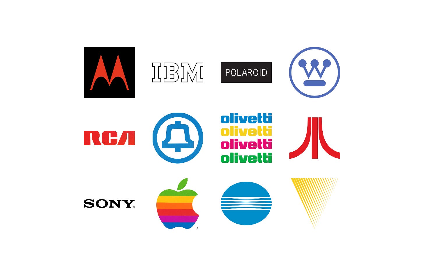
As radio, television, computing and photography moved from specialist equipment into ordinary homes and offices, electronics companies needed logos that could sit on products, packaging, screens and signage as comfortably as on a letterhead, and signal progress at a glance.
Many of these companies also grew quickly through new products, acquisitions and international expansion, leaving fragmented identities behind them. Designers such as Paul Rand, Saul Bass and Lippincott & Margulies were brought in to simplify and unify them.
Here are twelve technology and electronics logos, from Thomas Miller’s Motorola ‘batwing’ in 1955 to PAOS’ Kenwood in 1982, and the stories behind their design.
Key Takeaways
Simple marks that scale
Logos such as RCA’s three bold letters and Westinghouse’s ‘W’ were built to work on everything from small components and products to signage and advertising.
Keeping pace with change
Motorola, Minolta and Kenwood turned to new logos to modernise how customers saw them as their technology, products and competitors moved on.
Design as company policy
At IBM, Westinghouse and Olivetti, the logo was one part of a wider design programme that covered products, print and architecture.
Go behind the logos. Explore 200+ in-depth and meticulously researched logo histories revealing the designers, design decisions and ideas behind the world’s most iconic logos and important brand identities.
Continue reading to discover how twelve technology companies turned stripes, waves, letters and an apple into some of the most recognised logos in the world →

Motorola, 1955
In the 1950s, as Motorola embarked on a programme of modernisation, it asked Morton Goldsholl Associates to redesign its logo. The Chicago-based studio, founded in 1955 by wife and husband Millie and Mort Goldsholl, was known for being progressive and forward-thinking. This was reflected in the non-hierarchical structure of the company.
Known as the ‘batwing’, the logo is made up of two types of contrasting wave forms, the sine wave (the curves at the base) and triangle wave (the peaks). According to Motorola ‘the two aspiring triangle peaks arching into an abstracted "M" typified the progressive leadership-minded outlook of the company.’
Read the full Motorola story →

IBM, 1956
The logo and corporate identity design of International Business Machines (IBM) is perhaps most distinguished by its approach as much as it is by its results. Loose but profound and operating on the assumption that any theme or device is doomed to become “hackneyed” or “dated”, two constants were settled on, to reflect quality and “the contemporary”.
The second iteration of the IBM logo (1967) presents viewers with a cryptic visual language. Some have read the introduction of lines as being linked to the scan lines of a CRT screen. However, the truth lies in the idea of authority, and the notion that stripes appear like a security device to protect signatures from being counterfeited. These stripes were also meant to give the logotype the impression of speed, efficiency and dynamism.

Polaroid, 1958
Parallel to Polaroid’s growth was the evolution of its visual identity, guided from 1958 to 1977 by freelance designer Paul Giambarba who was hired to revitalise the brand. His first effort included the introduction of a formalised logotype, set in News Gothic Regular, and the addition of black-sided panels to packaging. The effect of this was, not just a standardised visual language for the corporation, but would also add distinction to packaging when seen on black and white televisions.
With the introduction of consumer-focused packaging of Polaroid’s instant camera and refill packs at the beginning of the 1970s–which required an eye-catching visual presence on shelves–Giambarba devised colourful ‘artworks’ that emphasised the new era of instant colour. These were striking, highly graphic and original in their composition of form and colour, which was then maximised by their coverage of packaging. Giambarba explored compositions as new products were released.
Read the full Polaroid story →

Westinghouse, 1961
At the beginning of the 1960s, the Westinghouse Electric Corporation was the fourteenth largest industrial corporation in America producing a wide range of electronics for nuclear power stations, public transportation and the home. The growing global presence and extensive catalogue which amounted to over 300,000 product lines across sixty divisions, meant that a new and more ‘conscious’ design policy be introduced to maintain a consistent image throughout the corporation and across all the industries it operated within.
With a stylised ‘W’ at the centre, Rand’s design solution echoes the basic compositional qualities and components of what came before, however, through simple adjustments, which included reducing the line weight of the diagonal strokes, it took on the appearance of a circuit board, with circles representing lights. During development of the logo, and in one meeting, it was pointed out to Rand that the logo resembled a mask. Although not intentional, it was Rand’s feeling that it was this anthropomorphic observation that gave the logo its memorable quality, with masks being a central part of many cultures.
Read the full Westinghouse story →

RCA, 1967
Radio Corporation of America, since its founding in 1919, had significantly changed. It had evolved from a manufacturer of crystal sets and other electrical products with sales of $2 million to a $3 billion corporation delivering advanced technological capabilities in a diversity of fields. By the mid 1960s it offered over 12,000 products and services, many of which did not exist a decade before.
The bold weight of the letterforms, the mirrored legs of the ‘R’ and ‘A’ and consistent squared counters was said to convey stability and strength whilst also being ‘conceptually pure’. As an ideogram it involved the viewer, with the three letters forming a single unified abstract symbol. The total impact was felt before the letters were read.

AT&T, 1969
By the 1960s versions of the bell logo had been in use for over 50 years and had become a recognisable and key graphic element. There was, however, little in the way of a uniformity, or a consistent design policy across the regional companies. And these had also adopted wildly different typographic directions. It was time for something new.
The new rational and formalised version of the logo–the sixth since the first bell was adopted in 1889–improved scalability across the many emerging applications as the business grew, and making it easier to unify the 23 AT&T subsidiaries. Further, it was intended that this new logo would help develop the image of the company, moving it towards one that was perceived as being modern and forward-looking while retaining a direct link to its history and maintaining some form of equity through continuity.

Olivetti, 1971
By the late 1960s the Olivetti logotype had undergone five distinct changes since its founding in 1908, with each lasting for around a decade. As Olivetti was originally a typewriter manufacturer, the design of the logotype was of ‘special concern’ with the belief that the typestyle not only reflect the spirit of a particular age but express the corporation’s contemporary concerns.
The final design, drawn by Walter Ballmer, saw each of the eight letters of ‘Olivetti' thickened to create a bolder appearance and emphasising a strong horizontal line. Curved elements were then used to add grace to the single mass formed by tightening the individual letters. The resulting logotype was seen as sharing common design language with the products Olivetti produced and effectively symbolised the company.
Read the full Olivetti story →

Atari, 1972
In 1972 the American electronic games maker Atari entered the arcade market with Pong. It would be an era and culture defining moment that would kickstart a global multi-billion dollar electronic entertainment industry and develop further into competitive esports that would later become professionalised.
Designer George Opperman described the logo as capturing something of the duelling energy of the game Pong, which he had seen prior to its release, with two forces being applied to a third at the centre, and then converging to form an apex and an ‘A’. In a 1983 interview with Video Games, Opperman downplayed the figurative nature of the logo, instead simply describing symbols as “just visual nicknames” that typically “combine first letters and interpretive design elements.”

Sony, 1973
In order to bring the Sony corporate identity into coherence and establish standardised rules for its use, in-house designer Yasuo Kuroki, working under the direction of Akio Morita and Norio Ohga, refined the wordmark in 1973.
Kuroki modified Robert Besley’s Clarendon, added uniform spacing and weight, and then introduced Helvetica as a secondary corporate typeface. Two blues were then added, as well as formalised grid systems to bring a continuity to advertising, vehicle liveries and other materials such as bags and promotional items that included matchbooks.

Apple, 1977
Jobs came to advertising agency Regis McKenna with the task of coming up with a logo for Apple, to be used on the Apple II personal computer.
The objectives, as later recalled by Rob Janoff, the designer in charge of the project, was to; make computers appear friendly; use colour; and appeal to non-users. After a trip to a fruit market, and after hundreds of sketches, Janoff landed on a simple memorable shape with a bite taken out of it to imply scale, and avoid it appearing like a cherry.
The logo would be made up of six colours, each given a Pantone colour value. An account executive, at the logo presentation, raised concerns about the expense of producing stationery this way, however, his concerns were waved away. Although a four colour process would later be used, much of the early materials featured these bright spot colours.

Minolta, 1980
As the company began to move from mechanical technology to advanced optics and electronics in the late 1970s, it engaged American consultancy Saul Bass (ALCOA, United Airlines, AT&T), Herb Yager & Associates to develop a new logo that would help the company outwardly reflect its new focus.
Fine linear elements focusing at the centre, as if passing through a lens, represented a company moving from mechanical technology to advanced optics and electronics.

Kenwood, 1982
By the 1980s, Trio had earned itself a reputation as a worldwide leader in the manufacturing of high quality audio equipment, in addition to wireless communication devices and testing instruments. What held the company back, however, was its neglect of the consumer electronics market. By prioritising professional ‘tastes’ and requirements, Trio (now Kenwood in the US) was surpassed in sales by a growing number of competitors.
After extensive research and surveys, PAOS developed four proposals from which the favoured design, a logotype and triangle device was selected as an expression of ‘quality’, ‘progressiveness’ and ingenuity’. The design was simple yet striking, displaying the brand name in an all-caps, geometric sans serif. In white text, it was unmissable and highly legible on a black background. For added visual impact and recognition, an inverted red triangle was added as a focal point – the angle of which was derived from the ‘W’ of the logotype.
Read next
For more logos made for electronics and computing, browse every electronics logo history in the archive, or see more of the best in the Top 10 logos of all time. Become a paid subscriber to read every story in full, richly illustrated.
Want more in-depth articles? Check out LogoHistories’ other articles on technology logos →


Thank you for subscribing to Logo Histories. If you enjoy reading this short you may also enjoy these resources from the same team:
Brand Archive – Research tool for brand designers.
LogoArchive Website – Searchable modernist logo archive & research tool.
LogoArchive Shop – Vintage design books & LogoArchive Zines.
BP&O – Contemporary design editorial.