Logo Histories' Top 5 Olympic Logos
Discover Logo Histories' Top Olympic logo designs of all time and the stories behind their design.
This post is supported by LogoArchive – The home of historical logos. Discover over 3000 of history’s best designs, from the world’s finest designers. Bookmark and collate logo inspiration for your next project here.
Logo Histories has spent the last three years documenting the stories of logo design of the past. These stories (and our archive) now exceeds over 120. As the Paris Summer Olympics approaches, now feels like a fitting time to share five of our favourite symbols from the Olympics of the past. I encourage debate and disagreement in the comments section. There’s some incredible logos that have been left out.
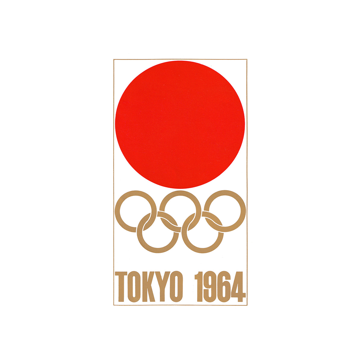
Tokyo 1964
Yusaku Kamekura, 1960
Yusaku Kamekura’s proposal, the product of a design competition, seems obvious now, but was daring at the time and kickstarted an era of modernist design in Olympic identities. A bold red circle (the Hinomaru of the Japanese national flag, representing the rising sun) was set above the Olympic rings. Not only was it progressive in form, it also pushed the limits of what had previously had been expected, and outlined in the brief. The use of the Olympic colours had been forgotten by the designer in his haste to generate his proposal. In Kamekura’s design, the Olympic Rings were presented in a solid gold, complementing and not competing with the volume of the red above. Kamekura described the red as less of a nationalistic expression and more of a symbol of passion and excitement for the Games.
→ Read more
Mexico 1968
P.R. Vázquez, L. Wyman & P. Murdoch, 1966
Greatly moved by the bold lines, bright colours and geometric patterns of Huichol art, created by the indigenous people of Mexico, and the movement inherent in Op Art, the team of Pedro Ramirez Vázquez, Lance Wyman, Peter Murdoch, Beatrice Colle, Jose Luis Ortiz, and Jan Stornfeld crafted a symbol that blend the five Olympic rings with the year ’68. With geometric flair, the five Olympic rings ‘expanded’ and created the numbers in concentric circles. With a simple yet mesmerising use of line and repetition, the final design alludes to Mexican folk art but projects this through a contemporary Op-Art lens – fitting for the ‘hippy psychedelia fashion’ of the time.
→ Read more
Munich 1972
Coordt von Mannstein, 1968
Despite an open competition in which thousands of designs were submitted, Otl Aicher offered up a simple solution, ‘a crown of light rays’, symbolising the spirit of the Munich Games with a ‘light’, ‘fresh’ and ‘generous’ image. There was, however, a feeling that the proposal lacked the distinguishing qualities that would afford it a legally protectable status. Aicher went on to develop further ideas but these were also met with the same response. Coordt von Mannstein offered a proposal that evolved Aicher's symbol, introducing a spiral that the designer would describe as making the emblem dynamic; suggesting a ‘Radiant Munich’ and developing a sense of ‘tension’ and ‘increased spring power’.
Coordt von Mannstein’s ‘Graphicteam Cologne’, which consisted of Hans Buschfeld, Siegfried Himmer, Winfried Holtz and Heinz Lippert refined the symbol, adding the Olympic rings, formalising its composition and usage so the emblem could be legally protected.
→ Read more
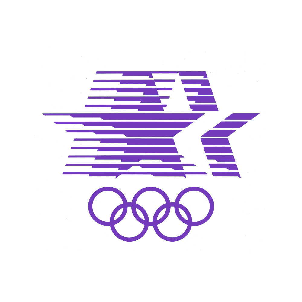
LA 1984
Robert Miles Runyan, 1979
The symbol for LA 1984 designed by Robert Miles Runyan weaved together a number of ideas. The three stars represented first, second and third place podiums, and the 13 horizontal lines, based on the Star-Spangled Banner, conveyed the speed and action of the Games. A red, white and blue, another gesture of ‘threes’, positioned the symbol within the proud culture of the United States of America. However, when it came to developing a unifying design policy for the Games, the emblem's combination of stars and stripes, in conjunction with colour, was considered somewhat inappropriate for an international event, leaning far too much towards a nationalistic rather than inclusive sentiment. Deborah Sussman and her design team introduced a dynamic and broad ‘carnival of colour’ to the visual identity of the Games, and used the symbol in a bold solid colour throughout, without diminishing the recognisable aspects of the symbol such as its lines, stars and use of negative space.
→ Read more
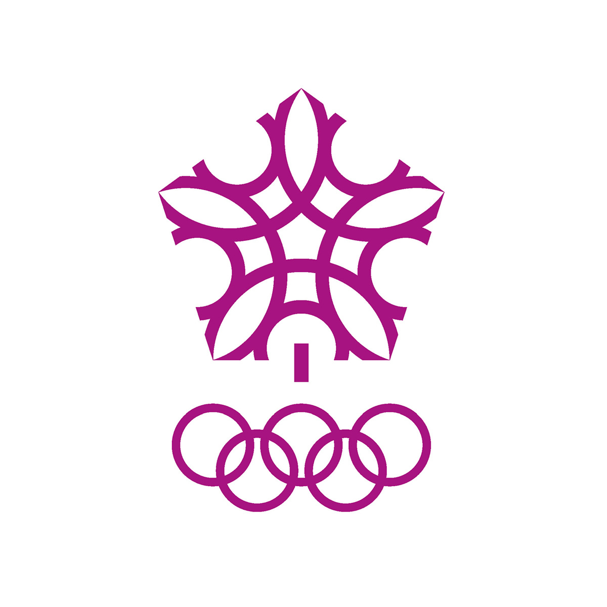
Calgary 1988
Gary W. Pampu, 1979
The motto ‘coming together in Clagary’ is wonderfully articulated within Gary W. Pampu’s symbol for the 1988 Calgary Winter Olympic Games. The design derives its form from the coming together of Calgarians and Canadians, represented by overlapping and concentric small and large letter Cs. The notion of ‘coming together’ was also manifest in the double image of a maple leaf, the emblem of Canada and, as a simple expression of winter, a snowflake. This was initially presented as part of the bid stage in red, and taken forward to the Games, with Justason & Tavender taking a note out of Sussman’s book and adding versions that were used in a variety of solid colours.
→ Read more
Did we miss your favourites? Want to see hundreds more logo stories just like these? Check out our archive or share your thoughts or memories of these logos below.






I'm not sure I've ever seen the Munich logo. That's gorgeous. The Los Angeles one seems very much of it's time, but also reminds me of being a kid; it felt like every one of us either had a hat or a shirt with the logo one it.