


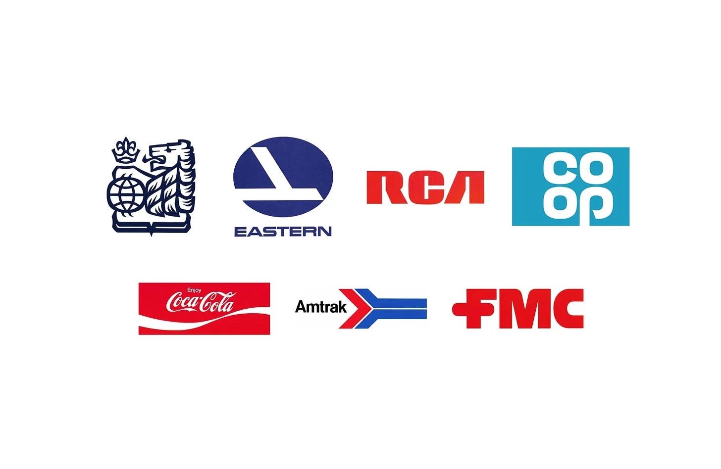
Few consultancies shaped American corporate identity in the 1960s and 1970s as much as Lippincott & Margulies. Combining research, naming and design, it helped banks, airlines, railways and manufacturers, including Coca-Cola, RCA and Amtrak, present a clear and coherent image as they grew and diversified.
In this collection, discover seven Lippincott & Margulies logos, from Royal Bank in 1962 to FMC in 1972, and the stories behind their design.
Key Takeaways
Research first
Programmes began with research, from over a hundred interviews at RCA to studies of passenger and employee attitudes at Eastern Airlines and Amtrak.
Names as well as logos
The consultancy often recommended new or shorter names, including Royal Bank, RCA Corporation and Amtrak.
Coordination across a corporation
At Coca-Cola and FMC, standards brought logos, colour and type into coherence across vast ranges of products, packaging and signs.
Go behind the logos. Explore 200+ in-depth and meticulously researched logo histories revealing the designers, design decisions and ideas behind the world’s most iconic logos and important brand identities.
Continue reading to discover the stories behind seven of Lippincott & Margulies’ most influential logos →

Royal Bank, 1962
Driven by market competition, the new headquarters and the need for continued growth and relevance, RBofC embarked on a design program to reinvigorate its image. More specifically, the intention was to present the bank as being contemporary, aggressive, reliable, global and forward-looking. To do this, the bank chose American design studio Lippincott & Margulies (L&M) to lead a rebranding effort.
The final design weaved together four key elements. The first two, a British lion and crown, were brought over from the previous seals. The lion; a symbol of strength and authority, and the crown; expressing a ‘royal’ symbolism, gave the bank a sufficiently ‘aggressive’ image. The globe added an international dimension while a subtle fleur-de-lis above the crown kept it from losing its Canadian roots.
Read the full Royal Bank story →

Eastern Airlines, 1964
Eager to restore the image of Eastern and show passengers that changes were being made, Floyd Hall reached out to Lippincott & Margulies (Amtrak, Coop). The consultancy was retained to conduct market research and produce a new, improved corporate identity that would encompass all aspects of the airline, from airplane liveries down to uniforms, tickets and in flight menus. This intended to, not only help shift perceptions amongst travellers, but also provide an opportunity for the airline to rethink its day-to-day running, streamline its managerial tasks and project a new sense of modernity and strength.
Lippincott & Margulies devised a new brand image, building the visual language around an abstract interpretation of the falcon that had come before. By combining two straight lines, a silhouette reminiscent of both the falcon and an aircraft was formed, and sought to evoke a sense of speed and direction.
Read the full Eastern Airlines story →


RCA, 1967
Radio Corporation of America, since its founding in 1919, had significantly changed. It had evolved from a manufacturer of crystal sets and other electrical products with sales of $2 million to a $3 billion corporation delivering advanced technological capabilities in a diversity of fields. By the mid 1960s it offered over 12,000 products and services, many of which did not exist a decade before.
The bold weight of the letterforms, the mirrored legs of the ‘R’ and ‘A’ and consistent squared counters was said to convey stability and strength whilst also being ‘conceptually pure’. As an ideogram it involved the viewer, with the three letters forming a single unified abstract symbol. The total impact was felt before the letters were read.

Co-op, 1967
In the 1950s the Co-op movement in Great Britain was suffering a decline. In response, a commission was set up in 1958 to investigate and address this. The result was “Operation Facelift”, a concerted and strategic initiative aimed at reversing a decline in sales which was being attributed to a substantial rise in consumer choice, and part of the post-war economic boom. This operation included a significant internal managerial change that brought in leaders with more corporate experience. Reflecting this internal change externally, and representing a new outlook for the Co-op, was the introduction of a new visual identity and logo design.
Working with the Co-op in-house team, American design studio Lippincott & Margulies developed a logo that, through the arrangement of the letters and making the most of the recurring forms and the ‘stem’ of the ‘P’, created the ‘cloverleaf’ logo. This was placed within a rectangle outline or knocked out of a solid colour. The introduction of the new logo and visual identity was announced in 1967 with the campaign “It’s All At The Co-op!”

Coca-Cola, 1969
With this in mind, the initiation of a new corporate identity programme in 1969 would seek to prevent infringement of Coca-Cola’s trademark rights. It would do this by reinforcing the Coca-Cola and Coke brand names by more effectively coordinating core visual assets, rejuvenating these without changing them too much. Further, the programme would also resolve discontinuities across its products and signage, which had become multiplicitous, undermining the combined effect expected of a large brand.
The biggest change came with the introduction of an additional brand element. The ‘Bottle Contour Curve’, later known as the ‘ribbon’ was a fluid graphic device derived from the shape of Coke’s iconic bottle. This better connected all the graphic components to the other key brand asset, the glass bottle silhouette.
Read the full Coca-Cola story →

Amtrak, 1971
After screening hundreds of verbal and visual options, alongside graphic design and symbols, ‘Amtrak’ was chosen by the corporation’s board of directors. A blend of American and track, the new name not only communicated the concept of an American railroad passenger service but also met the established criteria of a snappy, memorable title.
In the national colours of red white and blue, the logo (known as the Amtrak Arrow, motion-mark, or chevron) was comprised of two parts. This included the arrow logo, and the Amtrak logotype, a unique customised variation of the Helvetica typeface. The result is an uncomplicated, modern, and vibrantly ‘American’ design.

FMC, 1972
Despite being one of the nation’s biggest industrial advertisers, FMC was not recognised as the giant it was by its customers, financial institutions or the general public. As the newly elected President and Chief Executive Officer Robert H. Malott described it, they were likely the least-known $1.5 billion-a-year company in the country.
At the heart of the new design policy was the FMC logotype. The custom drawn bold uppercase letterforms had a graphic immediacy that was absent from previous versions, and made sure that each division became more visually integrated with the corporate body. Further, the style of this logotype was intended to give the overall impression of technological precision, a notion that connected all of FMC’s activities, despite their diversity. This technical precision was developed further through a colour palette of bright red and grey, and the unwavering consistency of the logotype’s application.
Read next
For more on the consultancy behind these marks, browse every Lippincott & Margulies logo history in the archive, or see more of the best in the Top 10 logos of all time. Become a paid subscriber to read every story in full, richly illustrated.
Want more in-depth articles? Check out LogoHistories’ other articles on American corporate identities →


Thank you for subscribing to Logo Histories. If you enjoy reading this short you may also enjoy these resources from the same team:
Brand Archive – Research tool for brand designers.
LogoArchive Website – Searchable modernist logo archive & research tool.
LogoArchive Shop – Vintage design books & LogoArchive Zines.
BP&O – Contemporary design editorial.